Constructive Feedback appreciated!
-
Hello everyone!
This is my first post on the forum so thanks in advance for stopping by. I'm currently in the process of illustrating my first childrens book and I was hoping to get some feedback on the artwork. I've chosen a select few to show you all.
What do you like about them? What could be improved? Is the style consistent throughout?I won't go too much into the storyline but the gist is that we meet Theo & Charkie who are off on a fun adventure and along the way come across new and exciting looking friends.
I would greatly appreciate any help as I'm currently at the point where I'm starting to doubt myself a bit only because I'm now starting to compare it to others (even though I know that's a major no no). Like you know when you just look at something for so long that you can't see what could be missing? So an unbiased opinion would be greatly appreciated.
Many thanks in advance
Chris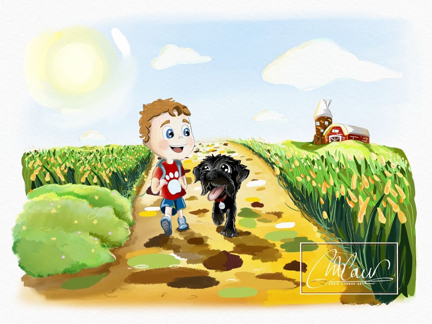
-
Hello Chris, how did you make these illustrations? Digital or traditional mediums? I'm not completely sure if that canvas texture is real or added on. I do think this will help in making a more focused critique that will feel reasonably applicable to your work.
Finis Coronat Opus
Instagram: www.instagram.com/madgcartoons/
Behance: www.behance.net/madgcartoons
Website: https://michaelangelodgo.wixsite.com/madgcartoons -
@Michael-Angelo-Go hi Michael, all the illustrations have been drawn digitally in Clip Studio Paint. The paper texture has been added on top as a layer. It can be removed easily if necessary.
-
Heyhey @ChrisConnor, Shani here, welcome to the forums
")
You're gonna love the feedback phase, you level up instantly. Kudos to you on your project and seeking to improve it!First off, do you have inspirational artists who you're hoping to "imitate" certain aspects of? That'll help us gauge where you're at vs where you want to be.
There's a lot to work with with these pieces. Thanks for providing multiple works as they show your range and consistent style.
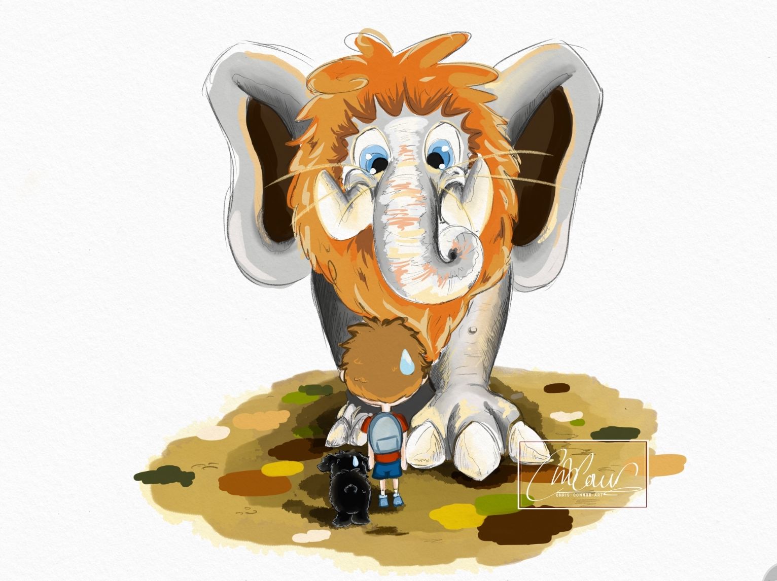
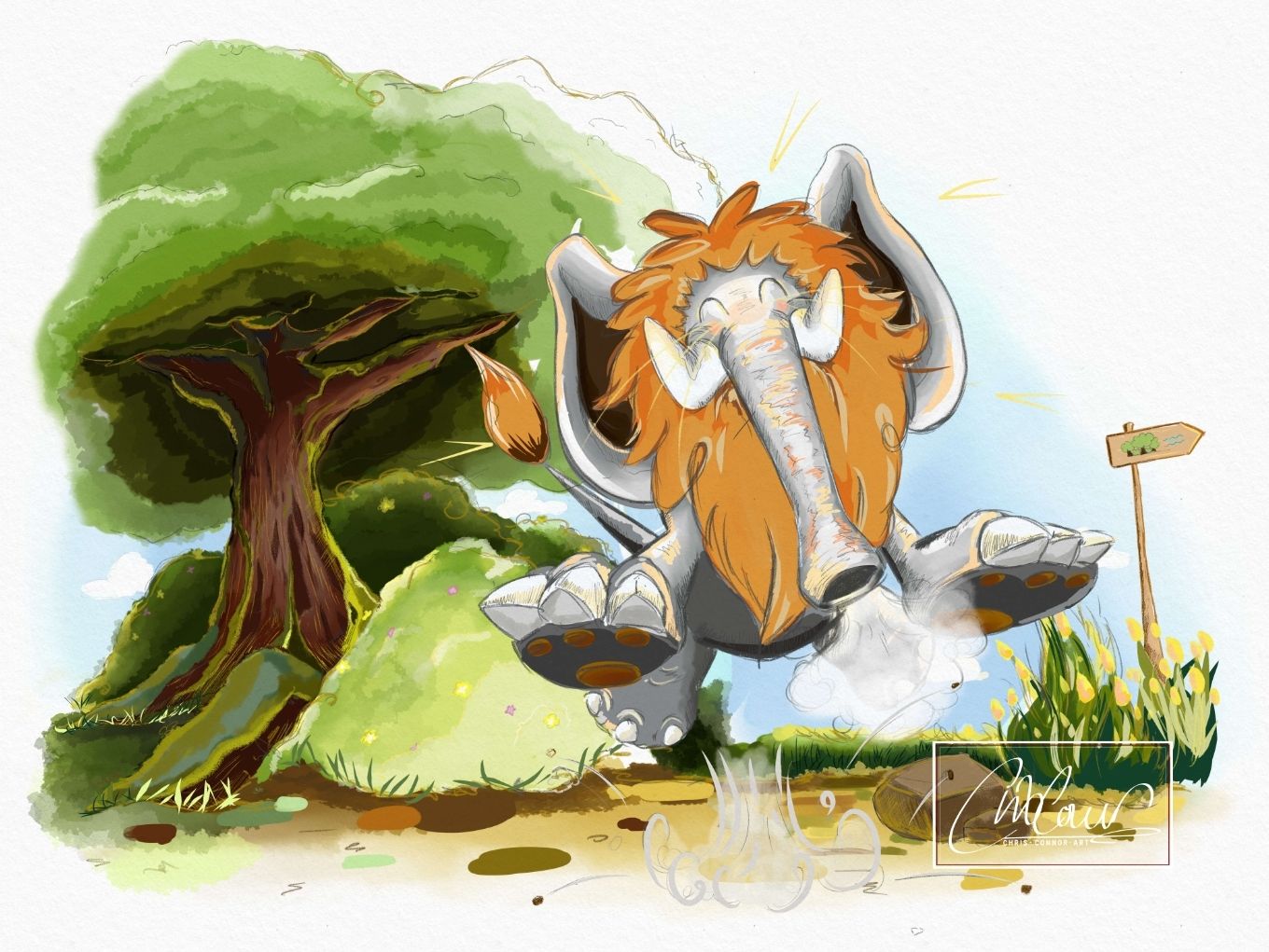
The thing that jumps out at me when I see your work is the emphasis on environments. A lot of the settings have multiple tones and hues (3+ just in the tulip (?) field). You carry this painterly approach with the lion elephant (see the warm hues in the trunk).
There are certain inconsistencies. I don't know if that's an issue for you or if it's something you did purposefully. With the Lion elephant you use hues, values, & crosshatching. With Theo and Charkie the colors are kind of flat. But even with the little boy, his shirt is gradiented (it's a word) out while his pants are three toned. Do you see it?
I really dig how painterly you environments are. I can tell the environment is intended to be vivid. I caution you with the value in the sky against the little boy's head, as they're nearly the same value. You can mitigate this by adjusting the values behind the little boy's head to provide contrast.So, the texture and style on the bush in Piece #1, and the tree trunk in Piece #4 are fire. Really well done! The trunk blowing the Lion Elephant into the air in Piece #4 is equally fire! (a good thing). Now look at how vibrant and dynamic those subjects are and compare them to Theo and Charkie. Those two seem out of place... flatter by contrast, do you see? I understand this is a visual storytelling technique - I suspect you designed these two simpler on purpose? If that's the goal, great, run with it. If you didn't intend to make them flatter, I encourage you to adopt some of the techniques you use for the rest of the piece to your rendering of these two.
In all, I think you'd benefit from adding a bit more contrast - in the general sense, but also with spot subjects: the bird on the tree in Piece #5 is very similar in value and hue to the sky, so it blends in at first glance; The boy's skin is similar in value to the sky in a number of pieces, to the Lion Elephant's foot in Piece #2, to the walkway in Piece #1 - if you add contrast to your hue and value choices, you'll be able to make things pop more and add depth, without having to use heavy outlines (it seems you don't want to use heavy outlines?).
All of this said, I love the way you approach your scenery, the barn and silo are legible even at that size and distance, the vegetation looks awesome, and you've got a strong command of color (see the Lion Elephant). You're experimenting with a few styles in these pieces, all of which demonstrate a good foundation to build on. I think you should be proud of your work and I'm looking forward to seeing how you improve on it!I hope this helps! Welcome to the group, happy drawing
Shani -
@TheArtBard Hi Shani, thank you so much for taking the time to send such a detailed response. I really appreciate it.
You're right about the differences in Theo's clothing. It was something I was aware of whilst painting as I was trying out different things. However I would like it all to match up to keep consistency so will edit those.
Thank you in regards to the bush and tree textures. For the bushes I used a rough wash brush which gave the exact desired effect. And then a textured blending brush to even out.
I use a mixture of different types of paints. Mainly oil for the most part other than the foliage. The tulip fields and blades of grass are using a line effect pen which give it a sharper edge. Do you think these need to be built upon /do they look flat?I should also add that I'm self taught and constantly trying to figure it all out. So this feedback is super helpful. Other artists I follow are Jim Kay, Will Terry & Aaron Blaise. I'm a big fan of fantasy genre so their work really captures my attention. I love the textures they create. That's still something I'm trying to learn, figuring out which tools work best. I really like the effect of crosshatching so I think I will definitely try and keep that consistent throughout because I didn't use it with Theo & Charkie.
I will go back to the drawing board and spend some time working on these contrasts and details.
I'll repost updates when ready! Many thanks Shani!
-
Hi Chris, I might be repeating some of Shani's feedback as I'm just trying to quickly provide some between other tasks.
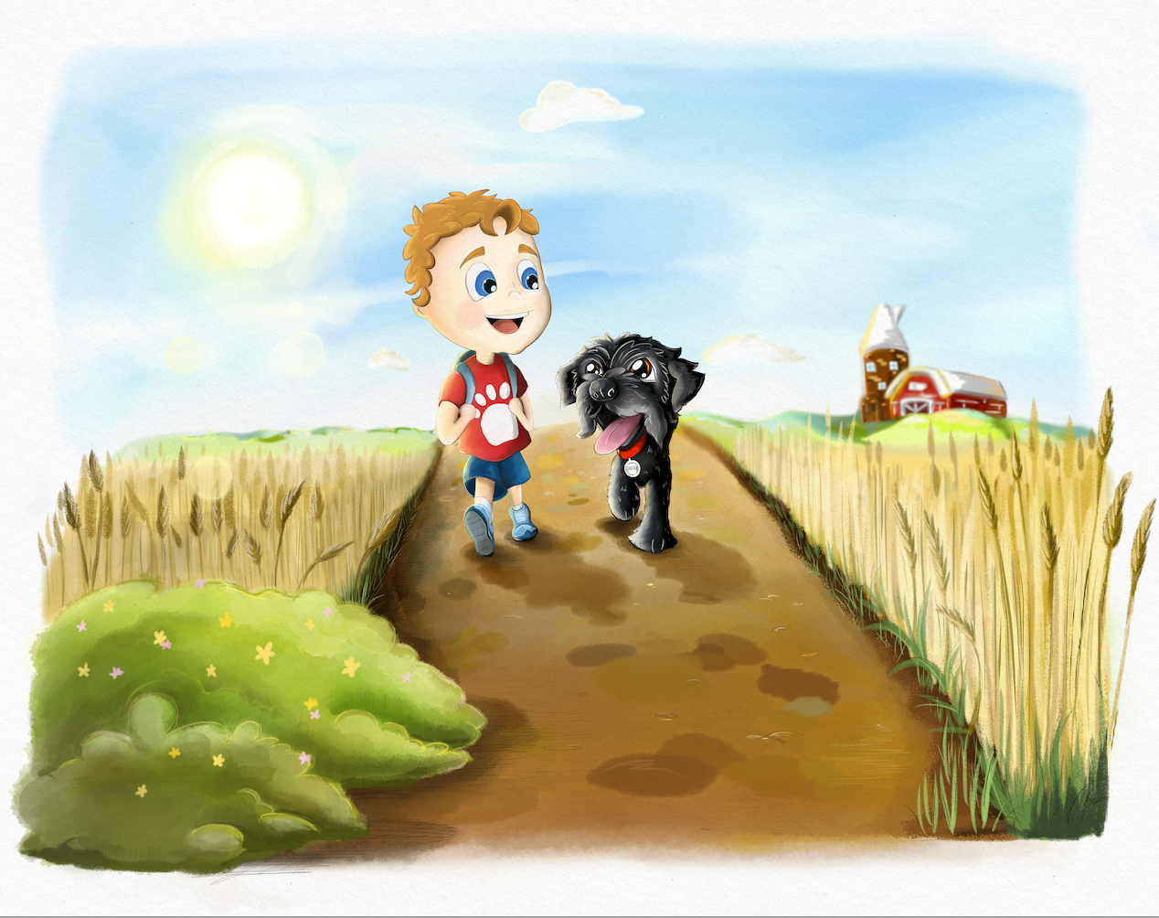
You have some really fun colours going on and I especially like how you draw the flowers and house in the first frame you shared.
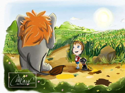
Aside from the focal points in colours and vibrance that Shani mentioned I think, one improvement point I see throughout is your tangents. For example, in image #1, Theo's silhouette doesn't stand out very clearly from the background. If you lifted him a little to stand more clearly against the plain sky, I think that would help empathize him.
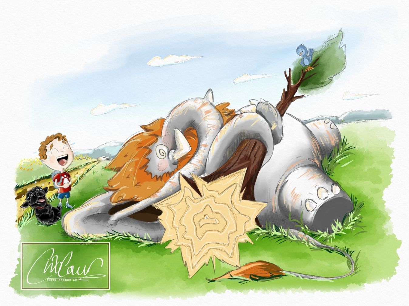
Similarly in image 2, because Theo and Chalkie are right in front of the elephant but have similar values, they don't stand out as very clear silhoeuttes. I think either they could stand not directly in front of the ele-lion, or their values need to be silhouetted more clearly. If that's what you want to go with, I'd also make sure that the left side of Theo's head isn't exactly on the line of the elephants leg. This makes the shapes blend together a bit!
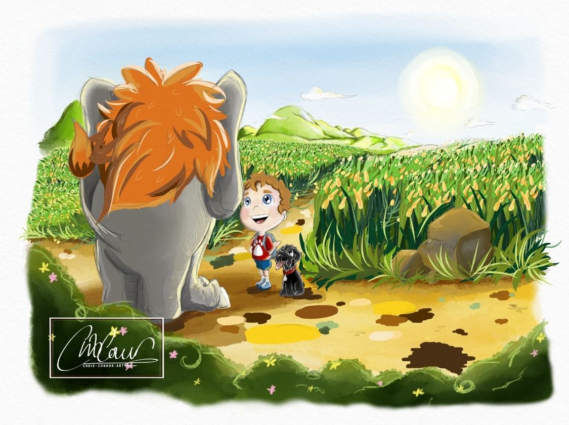
In image 3 again, Theo's head is just about touching the elephan'ts silhouette, and I think this adds nothing to the frame. If you moved theo and the dog a little to the right, both parties would have a clearer silhouette going for them. You could do a lot with the composition here, like forming a triangle between the sun, theo-chalkie and the elephant for the eye to follow.
But yeah, all in all I'd say definitely look at your images in greyscale and check if the values read! I think in many cases you'll find it hard to tell the focal point from a distance.
-
Just a very quick draw over example that might move the composition in a better direction. Definitly could take a few more steps though, and this doesn't account for value.
Hope that helps!
-
@Nathalie-Kranich Hi! Thanks so much for your feedback.
Yes I totally see what you mean and I think what you're suggesting is definitely something to implement. I will have a play around with it.Thanks again

-
This post is deleted! -
Nice, it really looks like a bright sunny day!
One thing I noticed with consistency is that the size of the dog changes compared to the boy. In the first picture, he’s as tall as his shoulder, in the next to he’s about at his elbow. (I know the dog is sitting in the third one, but when dogs put their back legs down like that their heads don’t get much lower.) It may help to do a kind of “character turnaround” page that you can use as your reference.
Also, I find the path a little busy looking. There’s a variety of colors and values, and it keeps drawing my eye’s focus. What if there was less contrast between colors, and between the darks and lights? I’m not sure how important this path is to the plot- like the yellow brick road is important in the Wizard of Oz. With the background plants, I think you did a good job with making them interesting but not distracting.
-
@LouD Hey, thanks for your comment. Yes the size of the dog I picked up on this recently so that's already on my to-do list
 .
.The pathway isn't important to the story so could definitely adjust. Original intention was just to create lots of colour but I can see how it could be distracting.
Thanks!
-
Heyhey @ChrisConnor - thanks for your patience
There's been a lot of feedback given since I last checked, so perhaps other artists have answered a few of the questions you were asking me? But in response:
-> For sure, experiment with what works best for your vision It sounds like you're doing that with Theo's clothes. Have you decided on the style you'd like? I checked out the styles of the artists you listed, it seems like a flowy, gradient style would best suit your goals (as opposed to the two/three toned, bold outlines).
I do this style by using a lasso tool to outline the subject (shirt, pants, whatever), and use the dry textured gauche, or a textured watercolor brush within the lassoed area. That way it has a nice clean outline but still looks vibrant and...storybookish. Same way you do the trees and bushes, but with a different texture. Perhaps that'll help you?-> So, for your tulip fields - keep in mind that the sharper you make their edges, the more defined they look, the less the viewers' eyes are directed to the focal points - they're too busy bouncing around all the little details. If it's your intention to add details, great, you're on it, just make sure you have a plan to direct the eyes back to your intended focal points - in leui of details (it seems your characters are cartoonish and not intended to be detailed) you can do this with a contrast in values, hues, and textures. I know that with the artists you listed, all of their style has an attention to detail with lively environments/backgrounds, so I know it's probably a goal of yours to maintain that level of detail. Just something to think about.
Does the tulip field look flat? Not all the time, not in all places. Keep in mind that the further away something is, the "cooler" it looks, lots of blue hues. The closer something is, the warmer it looks, lots of red hues. That's just the way light works over a distance. The further away something is, the less the contrast in tones and fewer details are perceived, and of course, the closer it is.... the more contrast and details can be perceived (sorry to repeat something you may already know).
If you want your environments to look like they go on forever (that seems to be the goal?), limit your palette, contrast, and details the further back you get, and use cooler colors (or fewer hues). For example, piece 1 - the hills by the barn could probably have the highlights a little lower to limit the contrast. The tulips could probably have fewer spots of dark green and incorporate some bluer greens the further away they are. Does that make sense? Same notes for Piece 3.
Experiment with those notes a bit and you'll find a way to give your pieces more depth.I hear ya on being self taught - for the most part, I am as well. It's incredible what time, patience, dedicated practice, a few youtube videos, and constructive feedback will get you. Kudos to you for going the extra mile to invest in your craft by joining a learning community like SVS. You'll go far with this kind of dedication! You can do it!
(PS - I saw there was a redraw of Piece 1 - I wanted to comment on it but now it's not here, am I missing it or was it removed? Lemme know, I'm happy to give feedback on the changes!)
All the best! Happy drawing!
Shani -
@TheArtBard the lasso tool is a game changer
 . I've been trying to figure out for ages to how to do what you just described and didn't even think about using that tool! So thanks for that pointer.
I did upload a new updated page 1, but I removed it as I noticed some more changes I wanted to make and didn't want to bombard the thread with loads of versions of the same picture. Thanks for those pointers on the contrasts. I noticed this the other day actually as I've kinda done this in the backdrop on the last image but not the others, so I will adjust those.
I'm so glad I found this forum which I didn't know was a thing until I read Will Terry's new book. It's so incredibly helpful to get advice and feedback from other artists. It's something I've needed for a long time.
-
@ChrisConnor great illustrations. They look fun! The biggest advice I could give to you right now is to follow the rule of thirds.
Portfolio: nyrrylcadiz.com
Instagram: https://www.instagram.com/nyrryl_cadiz/
YouTube: https://www.youtube.com/channel/UCbJCF1Im8ZO7hpGWTKOJMuA -
@Nyrryl-Cadiz thank you, I will take that into future practice!
-
Hi Chris,
Great job for taking the plunge and posting your artwork for critique. That's a big step forward.
It's natural to compare yourself with others. But you're right that it's not really helpful. I would study close-ups of Will Terry's work and try and fail to work out how he did it. Do you have a copy of his new book? I was just studying his picture of the zombie and his subtle use of texture is amazing. It would make me envious, but I've learnt to consciously force myself to take it as inspiration, rather than comparison.
I really like your artwork, composition design and line work. I think a lot of our peers have said good things to you already.
My only input is to work on improving your use of light and shadow, and depth of field. So a bit more contrast between your lights and darks. And remember that hills and buildings on the horizon shouldn't be sharply in focus. I think Will, Jake and Lee were talking about that in one of the recent 3 Point Perspectives.
Keep it up pro!
-
@Adam-Thornton-0 Hi Adam. So sorry for the delayed response. Thanks so much for your message. Yes, I've read it! Found it really insightful. His attention to the textures is amazing. I'm still finding what tools work best for that. Getting there slowly.
I'm actually already reworking the focus on the background and the lighting at the moment so on the same wave length
Thanks for the boost!
-
@TheArtBard @Nathalie-Kranich @LouD @Adam-Thornton-0
Hi everyone, it's been a while. I've pretty much redone most of image 1. I wanted to make it cleaner with the painting style as it was kinda messy. I've taken into account all your notes and applied them to it so I hope you see an improvement.
I could write out everything that's been changed but you should be able to see for yourselfI'm personally really happy with how this has turned out. I took way more time to pay more attention to detail and I think it's paid off. I just now need to match the rest of the illustrations to this
 (11 so far...and that's only half of the planned amount).
I have a question actually.
What dimensions do you generally go for when illustrating for a picture book? In pixels and/or inches...
I've been illustrating at a much higher pixel dimension as I like to really zoom in and go into detail but it obviously increases the file size quite significantly and too often makes the app crash on my tablet.
I've played around with making the canvas properties smaller of the existing illustration, but because it was originally done in a much higher resolution, it distorts the pencil lines a lot.
Or do you know of a way to compress the file size without losing picture quality?Would love to hear your thoughts!