Would appreciate your feedback...
-
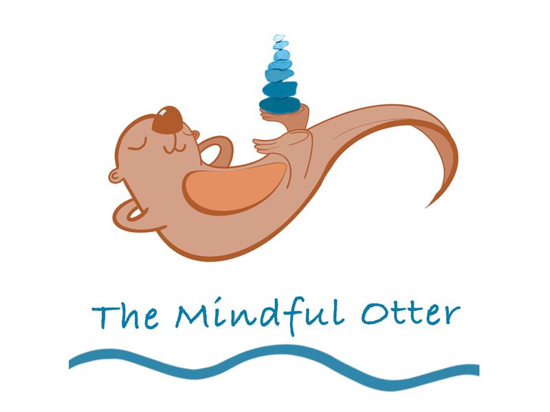
This is a logo for a new side project my husband and I are working on together - would really appreciate your feedback. Vibe is meant to be playful but peaceful and relaxed.
Does it look polished enough? Is concept clear? Any areas to be improved?
My idea is that the balancing rocks could be changed depending on topic or season that kind of thing. Also, is the texture on rocks distracting as nothing else has texture on it?
Thanks in advance or your help!
-
@MissMushy i like it! Great mindful espression

Crits: The back feet seem off in some way, maybe have the one closest occluding our view of that tummy circle a bit? Or if the tail was bending back and he was balancing rocks on that somehow? The thick line continuing through his tail makes the tail seem flat like a beaver's.
-
He looks very relaxed and honestly I couldn’t even tell there was texture on the rocks till zoomed way far in. It looks polished and complete. The only thing that’s bothering me is the other foot doing nothing, perhaps if it was in more of a pose or maybe using the tail to balance the rocks in the feet can be cross legged or butterfly pose or some thing? Just one opinion though. I think it’s lovely very simple and sweet.
-
@MissMushy I love how relaxed and fun your otter looks! Just chillin'!
")
I agree with @kylebeaudette as far as the legs go. I also think that the line going from his back to his tail, is kind of making it look like a lizard tail. Keeping the heavy weight stroke as the outline of the shape might help that.
Quick note: I'm not sure if your typeface for "The Mindful Otter" is just placeholder or the real thing, but I would consider not using Bradley Hand. My graphic design instructors drilled it into us not to use typefaces like Comic Sans, Papyrus and Bradley Hand when creating logos, as it will "cheapen" the brand since they are all overused. I would hate to see your super cute otter overlooked because of the font! Hope this helps.
Lastly, I really like your idea of changing out what's balancing on his foot. That opens up so many options! Great job overall!
-
@kylebeaudette ah yes, I see what you mean re tail. Yes, the feet bothered me too - originally, I had a sketch with both feet balancing the rocks but I thought it looked weird-maybe will play with that idea some more.
Appreciate the crit! -
@powsupermum thanks for the feedback! Yes, those darn feet have been the bane of my existence
 Will keep working on them. Tried a few different poses but liked the laid back rather than sitting up versions better.
 -
@JoshuaDages thanks for the tip re font. Good to know what professionals think. Was going to try to do by hand but my skill in this area is atrocious

Definitely will try idea re line weight to see if it fixes the tail. Appreciate the kind words and the crit! -
Ps re feet - in all fairness - the real ones are ridiculous though

-
@MissMushy Otters are the best!