SCBWI Narrative Art Award- Critiques wanted
-
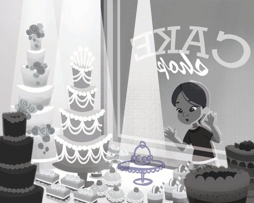
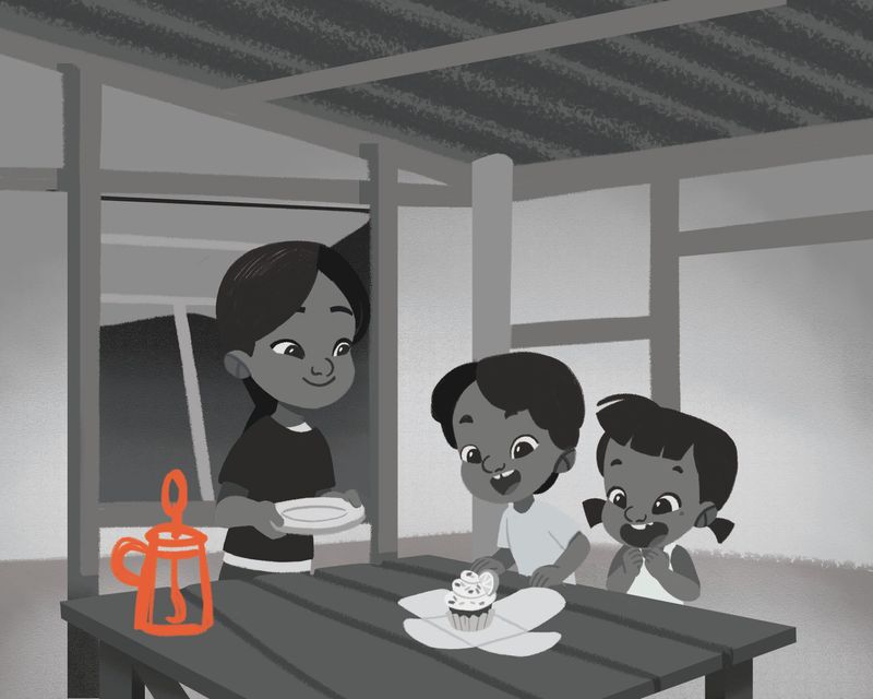
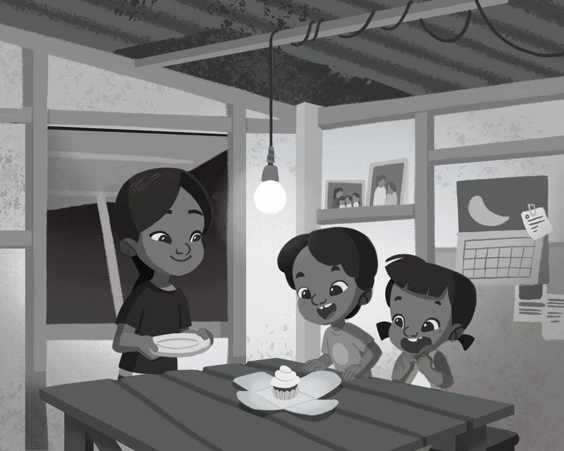
@Nyrryl-Cadiz I like the spotlight, but I'd maybe play with how pronounced it is - it just feels really strong.
Another thing that might be something to look at is make the spotlights on the cakes to the the left less intense than the main spotlight on the cake in the middle. That would instantly get the view looking right at the "money cake"

-
new update:
-
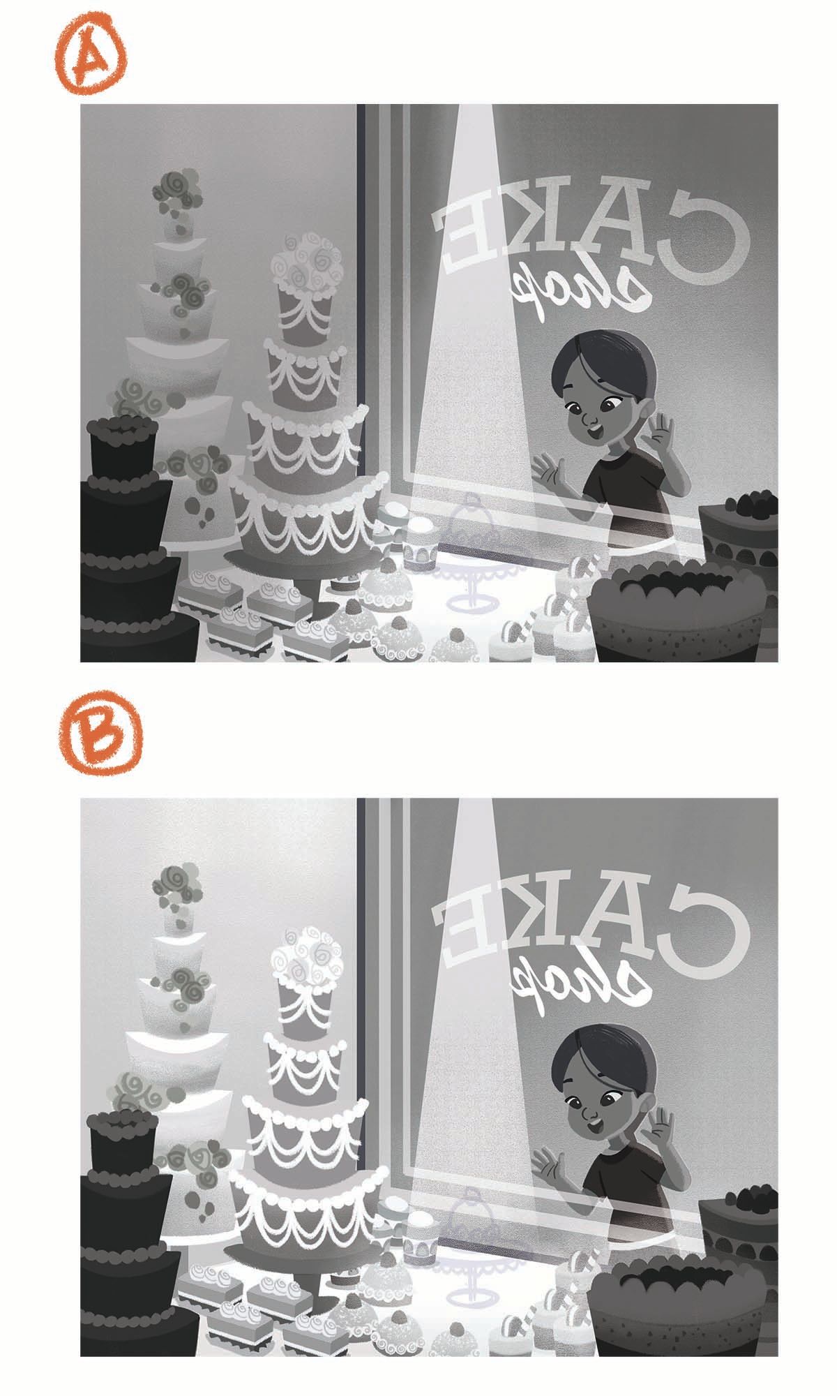
Hi guys! i'm stuck in this stage. Which one do you like better. My guts tells me to go with A but what do you think?
-
@Nyrryl-Cadiz definately A.
Quick suggestion if you want it
I m feeling that gigger highlight inside her pupils will make her expression more "oooh,I totally want that!!"
Just bigger white highlight.
My two cents!!Beautiful piece by the way. it s coming around really pretty.
-
@Nyrryl-Cadiz Hello! A for me too! It is the kind of lighting I had in mind. Bon courage!
-
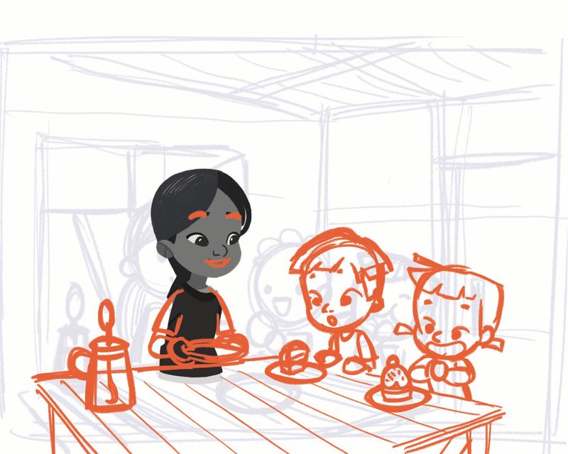
I've started working on the 3rd piece. I gotta get all of these done by Monday.
-
@Nyrryl-Cadiz I like A best. Be mindful of the hand touching the light. Isn't it a tangent?
-
@Julia yup, i'll have to fix that one
-
@tenmei @jdubz @Georgios-Christopoulos thanks for the help, guys!
-
new update:
-
new update:
-
Hi @Nyrryl-Cadiz, I like A.
Good luck!
-
@Jeremy-Ross thank you!
-
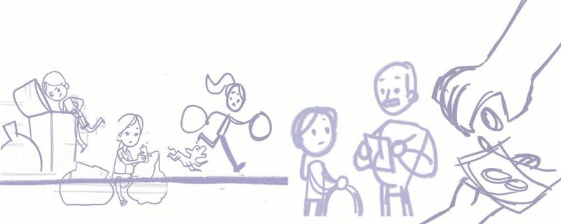
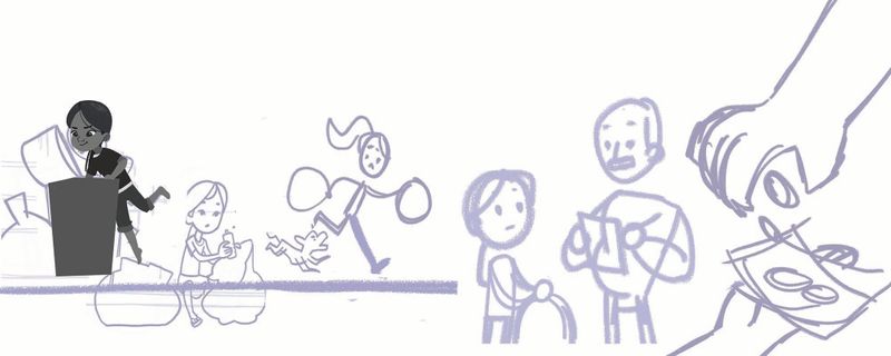
update:
-
Looks great! Good luck!
-
@Leah-Boulet thank you!
-
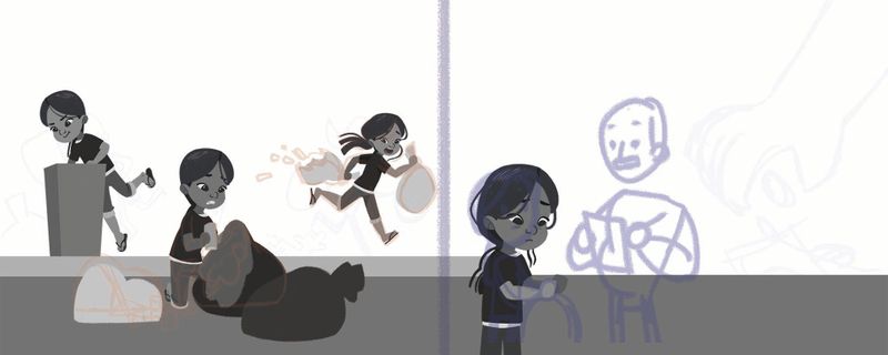
new update:
-
They are cute pieces, but the theme for this year is silver lining. The definition pulled from search result: Use the term silver lining when you want to emphasize the hopeful side of a situation that might seem gloomy on the surface. The common expression "every cloud has a silver lining" means that even the worst events or situations have some positive aspect.
The series of illustrations don't seem to fit in with the given assignment. I would rethink and try to come up with something that goes a bit more humorous, or grave. That would be my immediate reaction to what you have come up with. But if you want to stick with what you have, they are really cute illustrations.
I think that there is a huge difference in how the two girls looking in through the pastry window are rendered. The top one that is a bit more sketchy feels more appropriate for a middle grade book, than the bottom one. The bottom one is more cute, like what you would see in a picture book category. So if you are going for middle grade, is it possible to draw all the folks to fit the sketch of the girl on the top?
-
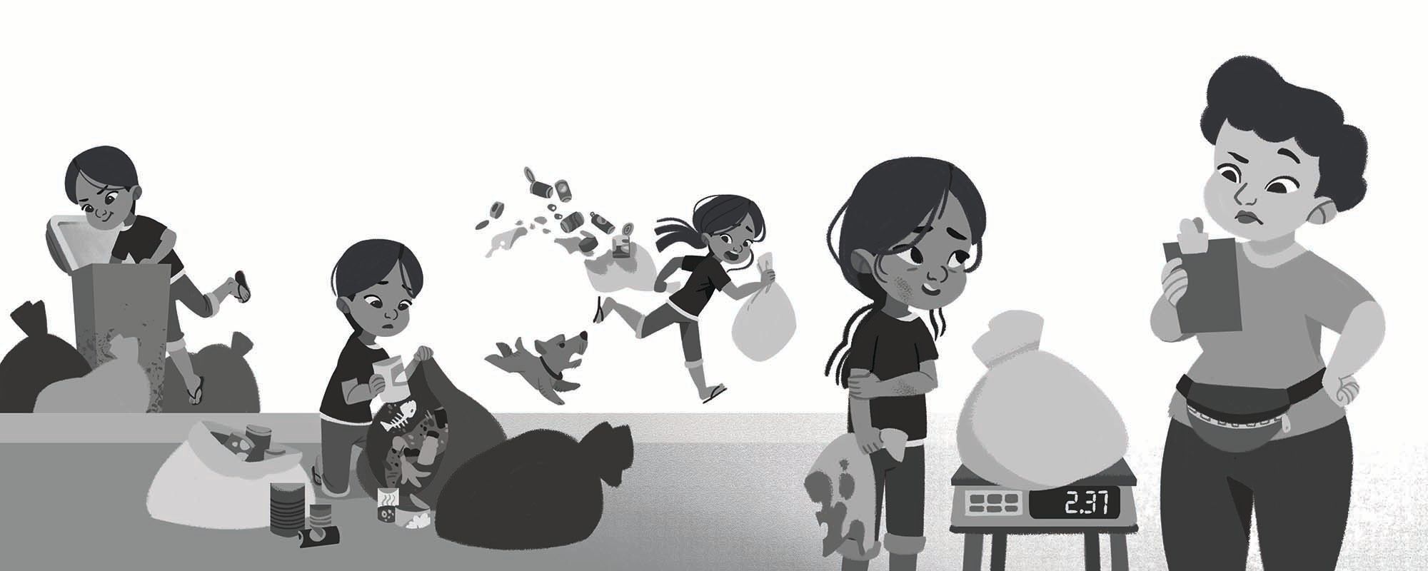
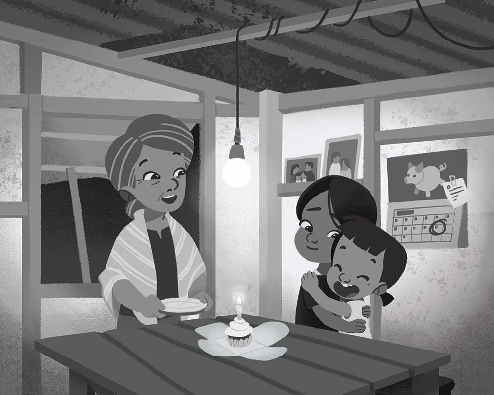
hi everyone! SO I just finished these 2. I'm really content with how they are right now. I changed the 3rd piece, I removed the little boy and replace him with the grandmother. I removed the hands exchanging money in the 2nd piece because it felt redundant for me. I'm planning of redoing the 1st piece as well but with only 2 days left, if I can't finish it in time, I'll have to go with the initial artwork. I hope I can complete it in time.
2nd
3rd
-
