Couple thumbs for oz, looking for thoughts 💭
-
@Coley - Looks good! I have been neglecting color studies lately, and i don't know why!
Yeah that draw-over from the contest was so great. It felt like I won the lottery, what luck! I had already added about 30 of the 50 animals, so i'm still working like crazy on it.
-
@carolinebautista can't wait to see your finished product!
-
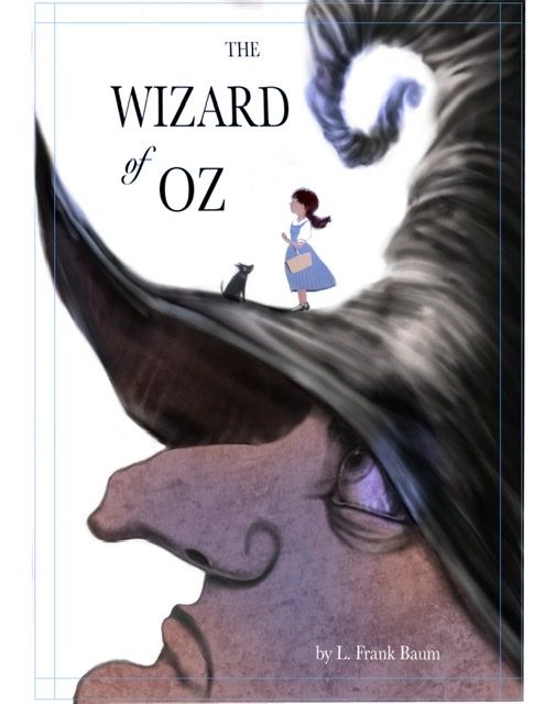
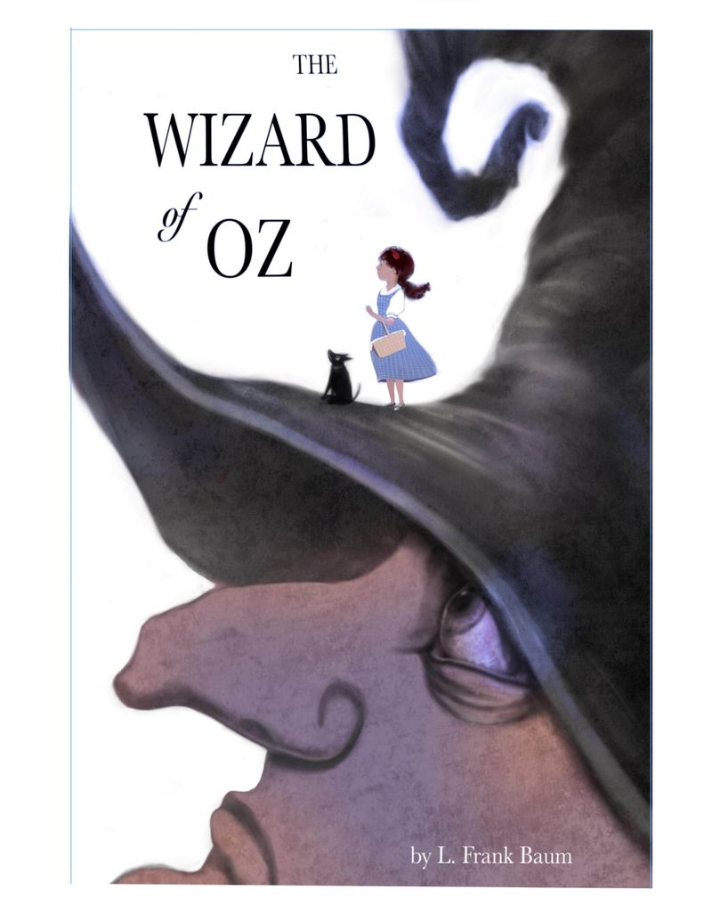
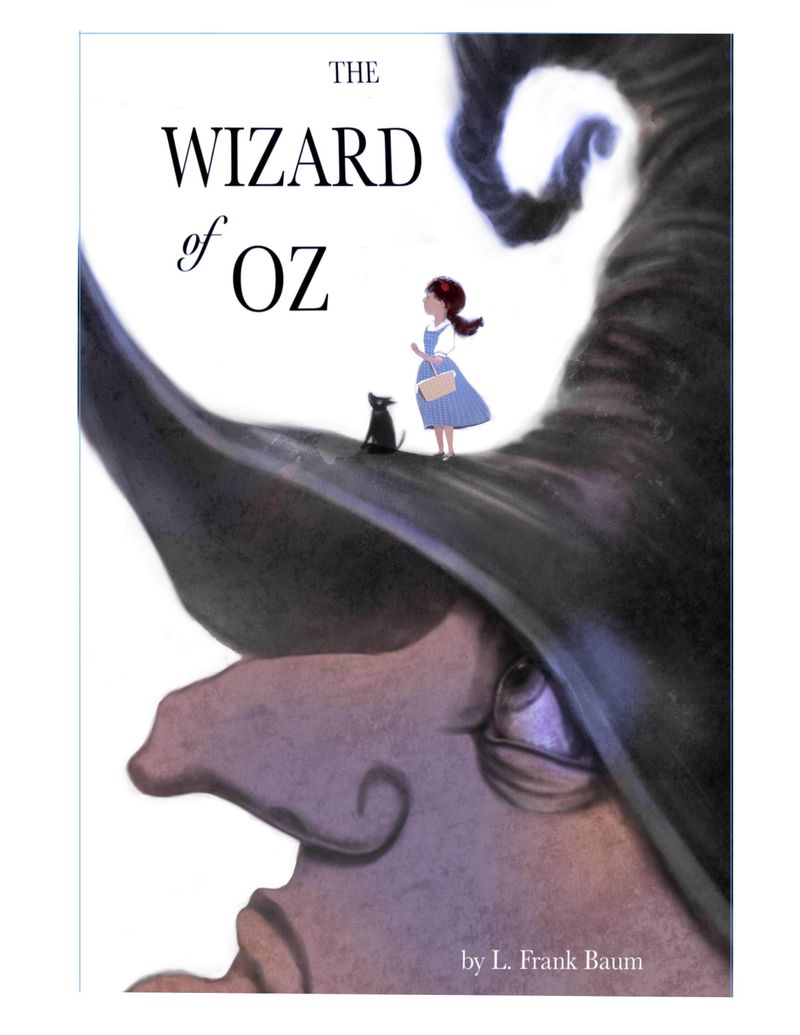
@Coley wow! I love the concept of this a lot! and I also really like the colors so far. I think the forms, shapes and textures are what makes this strong, so I guess only little spots or very subtle coloring like you did already is fitting for this

I personally would maybe go and work on some textures a bit more, I love her face and eye texture, but I think the hat is a bit to soft and could use a bit of roughness, maybe more defined edges and stuff while her nose hole is in contrast a bit sharp and dark, could be a bit softer, (and maybe longer/bigger) for now its the element with the sharpest shape and therefore gathering attention I think you didn't intend for.
Super excited to see your finished work
this is such an awesome challenge -
I prefer the last one. Love the idea!
-
@Freya-Chakour thank you
 I’ve been staring at it a lot and the softness of the hat and the hardness of the nostril is something I had been feeling too, I will be working on that today! I think I’ll harden up the hat in the area especially closer to Dorothy, as I want the focal point to be between Dorothy and the eye of the witch, so some harder edges there. I may just redo the whole hat but will try just some adjusting first. Great idea about smashing around some hard edges and textures !
@Aisleen thanks so much for the feedback!I did some more work late last night, softened black line on witches face, am putting Dorothy and Toto in now. They’re unfinished so far and I’m toying with how much detail to have I there, especially on the faces but even the dress. I might smash up the textures or the overall solidity of it, I had one done on a soft light layer and Dorothy was really washed out but it was kind of cool. So I’m figuring out the balance between hard and soft and details and lost edges. I’m certainly not there yet! I’m trying to get it pretty. I have finished before Saturday night so I can add to my scbwi portfolio showcase.
If anyone had any thoughts on how to position Dorothy and Toto that would be helpful. In one I have Dorothy and Toto both looking off sort of towards the title, Dorothy holding a poppy. The other has Dorothy holding a basket with Toto in it, and a poppy in her hair. And another one Dorothy holding the basket and Toto sitting and looking at Dorothy’s face, no poppy.


-
Finished enough to add to my Scbwi illustrator gallery tonight for the portfolio showcase.
I might do something else once I stare at it more. Possibly with the text but I'm sure I'll see stuff to fix and if anyone is still here and has any ideas, throw em my way

-
@Coley Looks great! The shape of the witch's eye is impressive!
It would be fun to see some different font options. Maybe one that is a little softer.
Also, good job making Toto look like a pointy-eared dog and not a cat; that's been my struggle the past few days, haha. -
@miranda-hoover omg ha Ha on the cat. I definitely have struggled with that stuff before lol and I'm sure I will again! My real life dog has pointy ears so I'm probably well rehearsed in the pointy ear department lol.
-
P.s. @miranda-hoover that entry you did from last month was awesome
 . Such a great image
  and then you had to go and put the cutest little belly ever on that monkey lol. Anyhow, I loved it and just wanted to gush a little about it
-
@Coley Haha, thank you
 I actually didn't plan the belly at first; it just kinda happened as I was filling him in. I'm glad it worked out