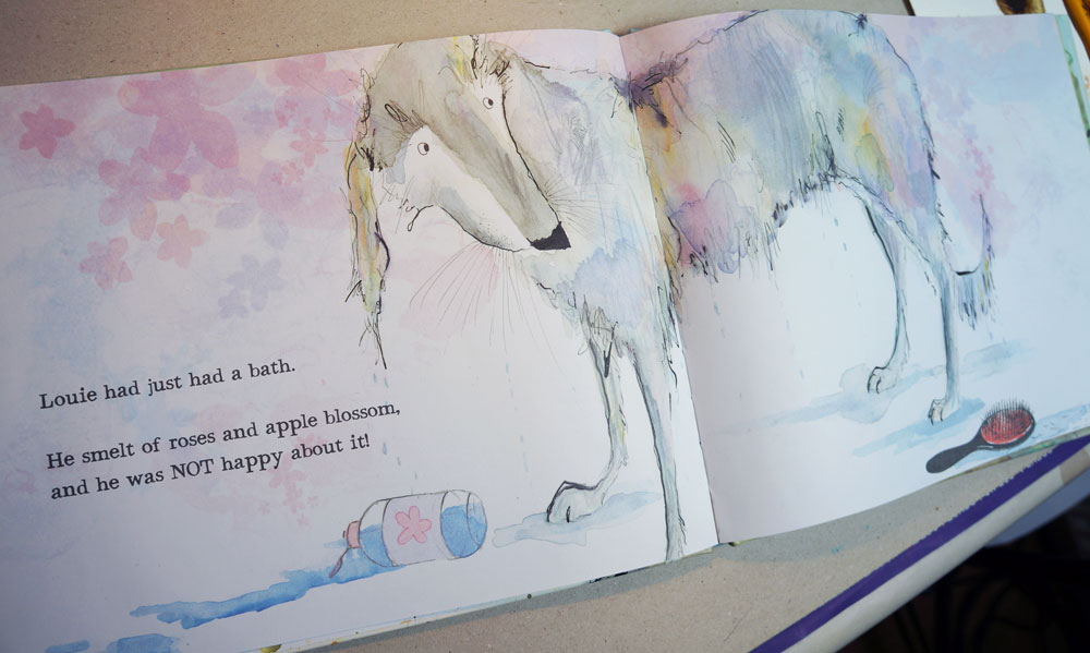
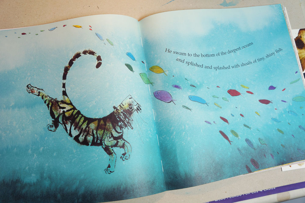
I’ve seen some great master copies posted on here recently and it’s inspired me to try one myself! Lots of reasons to do one:
- I haven’t done one before.
- @Lee-White recommends them as good practice.
- @Will-Terry said in a video I watched recently, that “if you’re not doing things like master copies then you don’t really want it badly enough” - so that rather threw down the gauntlet!
- I’d like to infuse a bit of whatever technique I learn from this into my 3rd Thursday piece.
So, this is my choice - a piece by Catherine Rayner, one of my absolute favourite children’s book illustrators, www.catherinerayner.co.uk I’ve researched her technique before because I wanted to emulate it but never done a master copy..she uses acrylic inks, screen printed backgrounds and spatters and crayons and so on to add texture. I love her combination of inkiness and graphic.
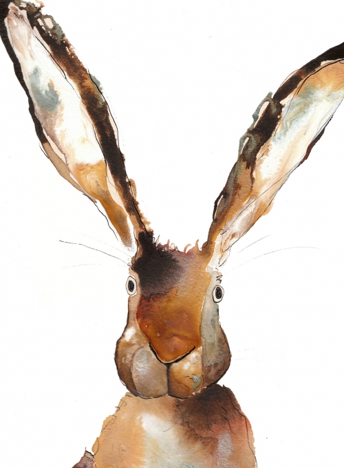
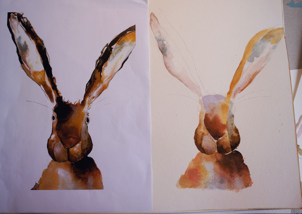
So, I drew the outline (no tracing!) and transferred onto paper. Then laid down undertones…
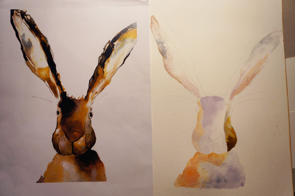
..This is halfway through the midtones…
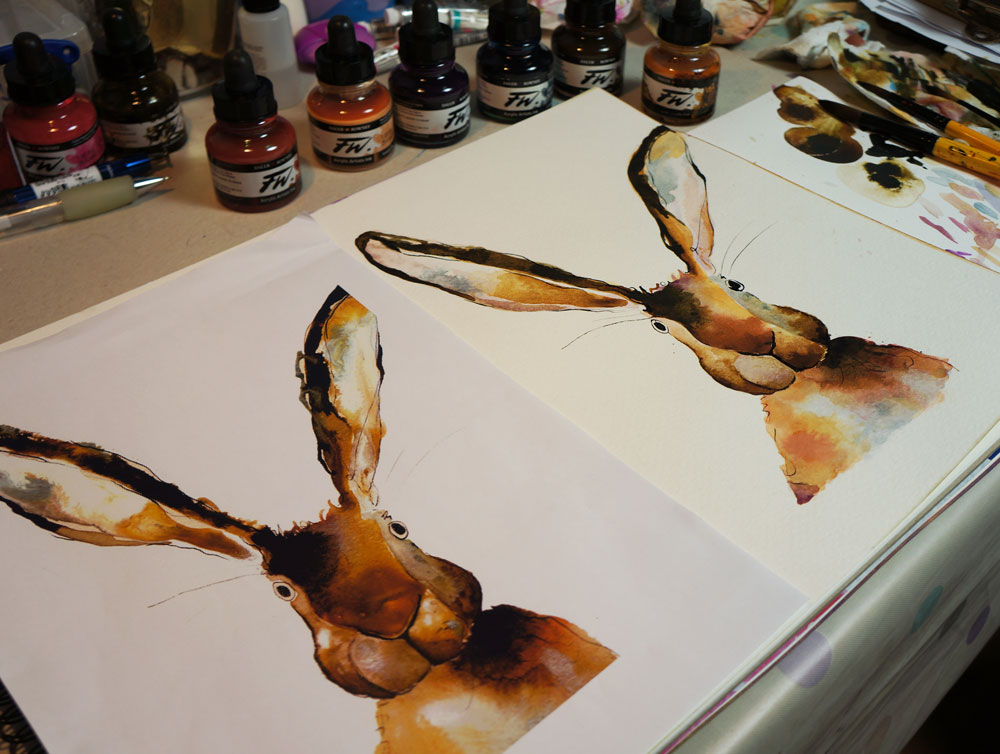
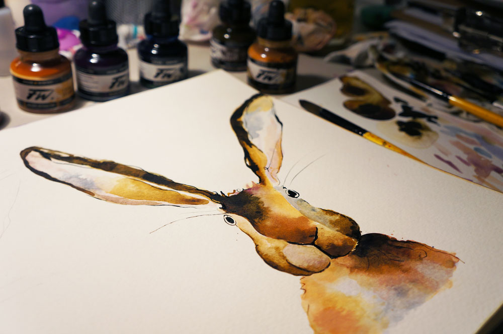
Then the darkest bits and inky lines. She apparently uses a cocktail stick to pull the ink about, didn’t have one but improvised with tweezers and a dip pen. Here's the finished version:
And here's how the scans compare (fixed the eye blob digitally..)
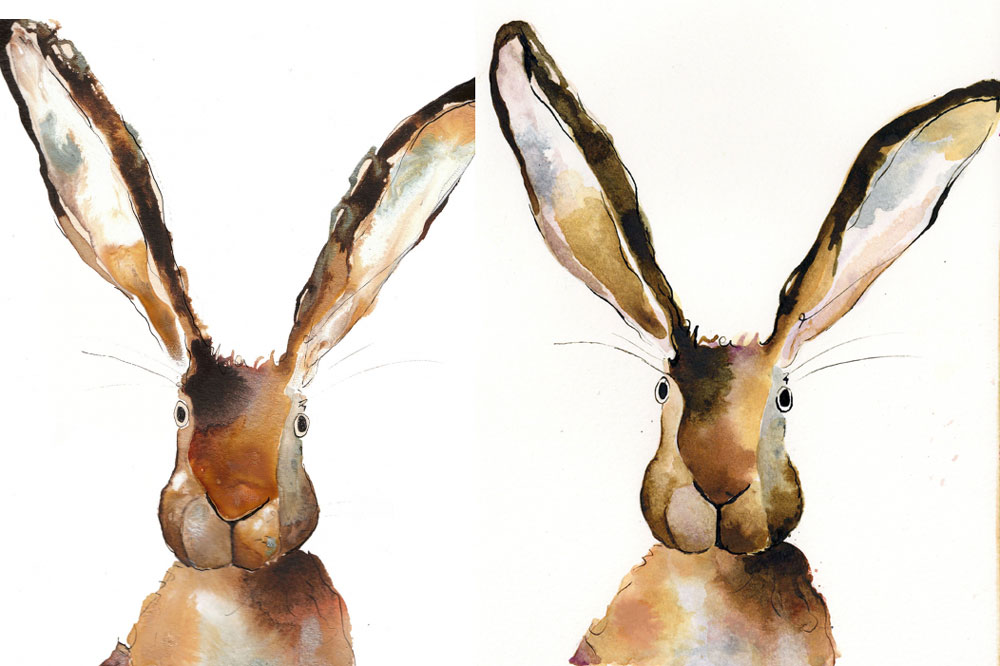
It’s not perfect but I do think it’s helped me understand much better how she works..it feels a lot different actually trying to emulate a piece, compared to analysing it visually. So hopefully this will help in future pieces 
