Not Sure How to Make This Better
-
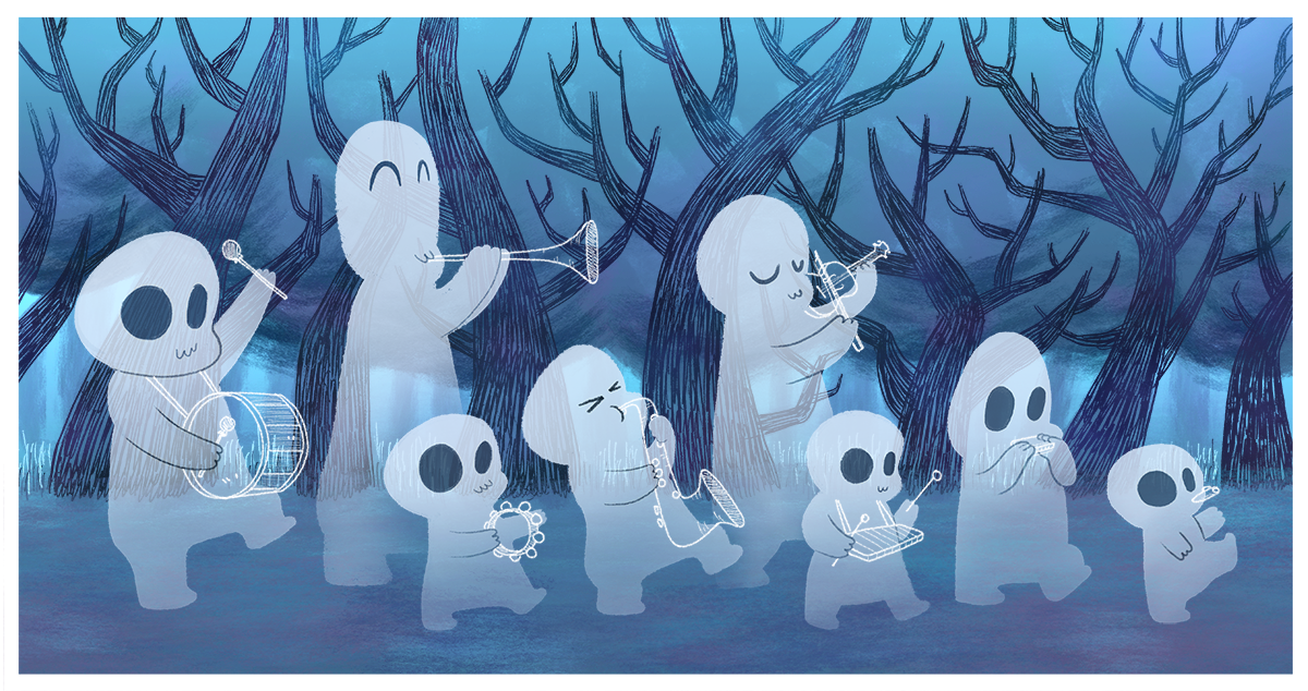
Hello lovely SVSers! I created this image of a few ghosts having a musical parade in the middle of the night, but I'm not sure how to make this image better. Do I need to do something with lighting? Color? Textures? Better shapes or gestures for their bodies? Maybe the background is too interesting/contrasty and is stealing attention away from the ghosts? Your thoughts/suggestions are most appreciated. Thank you!
-
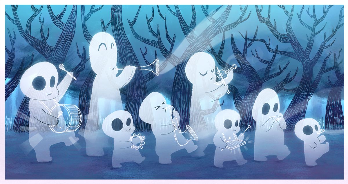
I think your painting looks great, but there are a few things that I thought might help improve it.
Music - There doesn't seem to be any energy in the instruments they are playing, perhaps by having some ghostly music notes coming out, or waves of some kind might help.
Glow - It may be in contrast to your style of paint so discard if so, but a glowing edge around the spirits might highlight them even more.
2 Tone Color - I think pushing the colors a little more will give some variety. Not much is needed but having a nice gradient might look nice.
Shadows - Do ghosts leave shadows? Probably not, but perhaps some faint area of contact to the ground will help ground the characters if they are not intentionally floating above ground.
I've tried to illustrate this in a quick paint over, so I hope some part of that might help
-
@aprilshin i actually like it as is. if you'd like to improve it further, maybe choose 1 ghost to be your focal point. maybe that ghost with the xylophone? maybe give it a brightly colored instrument. But like I said, I think this already looks lovely. i look forward to your final result.
-
So cute. I also like it as it is.
I am wondering if it will be fun ot add a bit more movement. @Gary-Wilkinson's suggestion on adding enegy to music already adds some movement to the image. You could perhaps also think about things like falling leaves, bats(since it is Halloween theme) to add more atmosphere. Maybe you can design the leave/bats in such a way that also function as "leading the eye". -
Thank you so much for your valuable feedback! @Nyrryl-Cadiz - I was not expecting to hear to keep it as is and dove right away into trying to fix it after I posted this, lol. But thanks so much for your input! It helps me be more confident in my art and I appreciate your feedback so much!

This is the road I started going down before I read all your helpful comments. @Gary-Wilkinson - As you can see, I tried to add a glow on my own but yours was done so much more elegantly that I tried to find how to do it on Youtube, haha. Omg this glow attempt is so embarrassing in comparison.
 And I was also thinking about shadows! I tried to have them light the ground underneath them instead, but.... that was a fail.
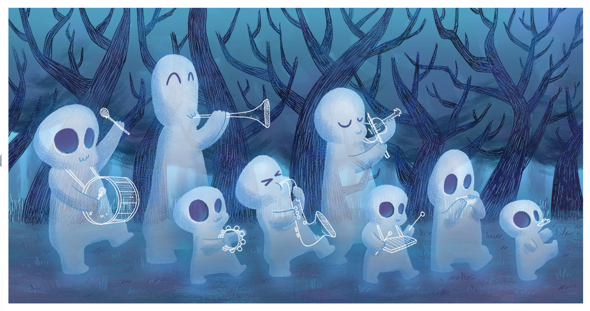
And below is the result after taking in everyone's feedback! I used an airbrush with "screen" as the blend mode to get the glow. I'm not sure if that's the right way to do it, but I think it's close! These ghosts look like they're having way more fun than my original post, so thank you all so much for your help!
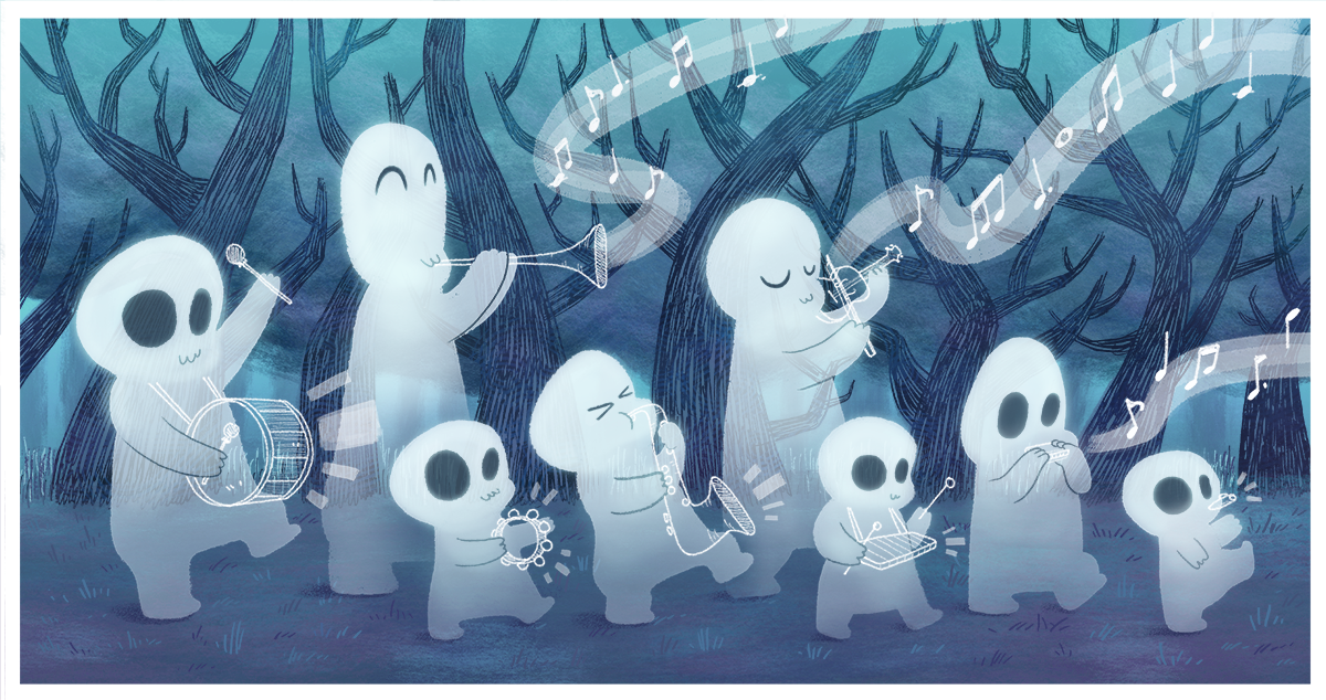
I do like @xin-li's suggestion about the leaves. Would it enhance the image if I added leaves or would it be too busy?
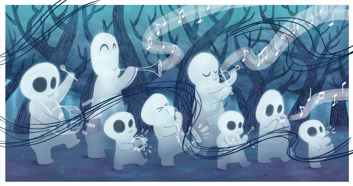
If there's anything else I can do to make this better or if I've taken your advice and applied it incorrectly, please let me know! Thank you again! So grateful for this community!


-
hi @aprilshin I think your ilustration is already lovely, the chracaters, the mood, everything fits really well.
But if you ask for things to improve I will say that everything is to much "rigid", they are playing music so I will add some pasion to it, you already have interesting poses but you can exagerate a little bit more, I did a quick sketch so you can see...

-
@Jordi-Ventura Ah, you are so right! That looks so much better. Thank you, Jordi!
-
@aprilshin , not sure it will help, but one thing you can think about is how your characters are spaced across the page. There's kind of a predictable regularity right now, which may be exactly what you want. You may want to consider making the characters group a little more randomly. Maybe push the whole crowd to the left a little to give them somewhere to go on the page. I don't know... just something to think about. Super cute illustration, though! Love it.
-
This looks so cute! If there is a little bit more diversity of them, that would be great. Right now all the faces seem to have similar shapes.
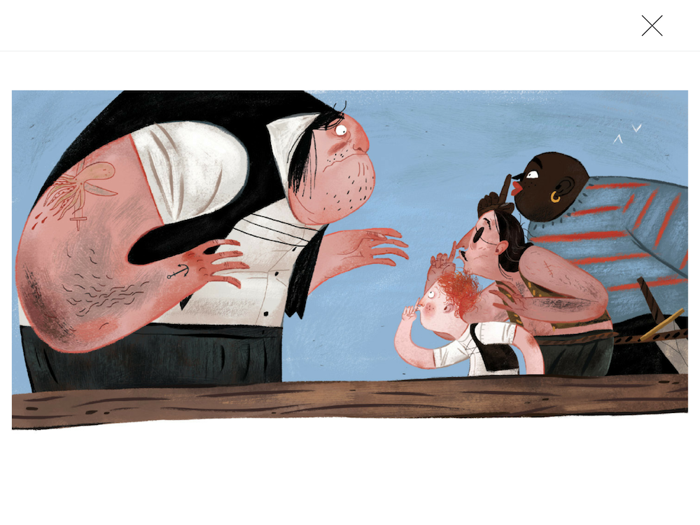
Check out this illo by Julia Sarda, diversity in its character design made it really fun.
-
@Eric-Droke I see what you mean~ in my mind I was placing them randomly, but now I see that I did not push it nearly far enough, haha. Thank you for the feedback! I’ll see if I can group them in a more interesting way.
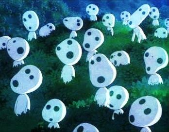
@idid I was actually thinking about whether I should differentiate them a bit more. I wanted them to be simple and took inspiration from the below image, but maybe the simplicity and sameness only works in Princess Mononoke because there are other varied characters within the movie. I wasn’t sure how to keep the simplicity of my ghosts without making them look too similar/boring. This is something I’ll have to spend more time thinking/exploring. Thanks so much for the feedback! It pushes me to be a better artist, which I really appreciate!
