Book Cover Layout Feedback
-
Hi!
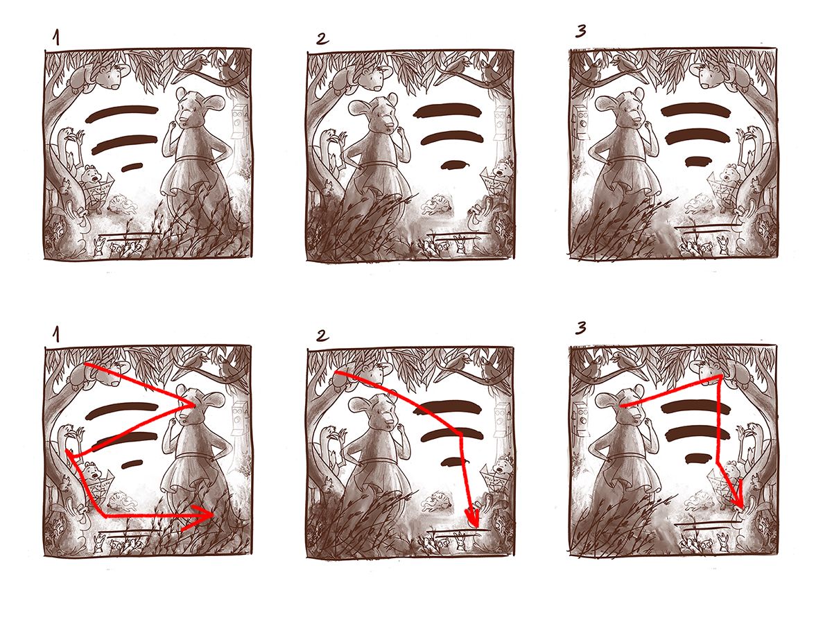
I’m finishing work on my first picture book and I need some input from you on layout design, on which is best in terms of readability. I have already agreed on a layout with the author, but I am not sure about the changes she suggested. The original sketch is with the title on the left (1). She proposed to have the title on the right, but I am not sure how I feel the sketch fits around it. In sketch (2) I moved the kangaroo to the left and some of the animals to the right and in sketch (3), I flipped the whole illustration.
My feelings are that the original layout is more harmonious and it has a clearer reading path. What are your opinions? Thank you for your help!
-
@Roxana-Antochi i like #1. It is harmonious but if your client wants the title on the right, then #3 is just as good as well.
Portfolio: nyrrylcadiz.com
Instagram: https://www.instagram.com/nyrryl_cadiz/
YouTube: https://www.youtube.com/channel/UCbJCF1Im8ZO7hpGWTKOJMuA -
@Roxana-Antochi I actually prefer 3. My first read would be the main character's face followed by the text which in 3, follows from left to right which is recommended.
In 1, you've started your line from the top animal on the tree, but I doubt that's going to be the first read mainly because it's small and towards the corner of the page. Which means the read would go the right to left from the main character to the text.
-
In my opinion i'd say that 3 has the best composition and flow. Our eyes tend to move from left to right when looking at an image and the kangaroos pose helps lead us to the text whereas in 1 it feels conflicting.
-
@Nyrryl-Cadiz Thank you for your help!
-
@Neha-Rawat I see what you mean, it might be indeed that the Koala wouldn't be the first read. Thank you for your input!
@Gary-Wilkinson, aha, I see your point also. Thank you. I'll use the 3rd sketch then. -
I like 3 as well. I've always tried to have any action/line of sight pointing towards the page turn as it encourages the reader to turn the page/open the book.
-
I like 1 most. Since I read from left to right, I see the Koala first, then I move between different animals. But for 3 I was not able to see the Koala at first. I just move from Kagraroo to texts.
So either 1 or make Koala in 3 a little bit obvious, both should work.
")
-
Thank you, @eriberart and @idid for your feedback!