Developing a 'graphic novel' style
-
My current drawing style isn't super well suited to children's picture books, but might fit in with children's graphic novels. I'm going to try and further develop a style that could work.
I'll post things I'm working on in this thread. If anyone else is too, post away
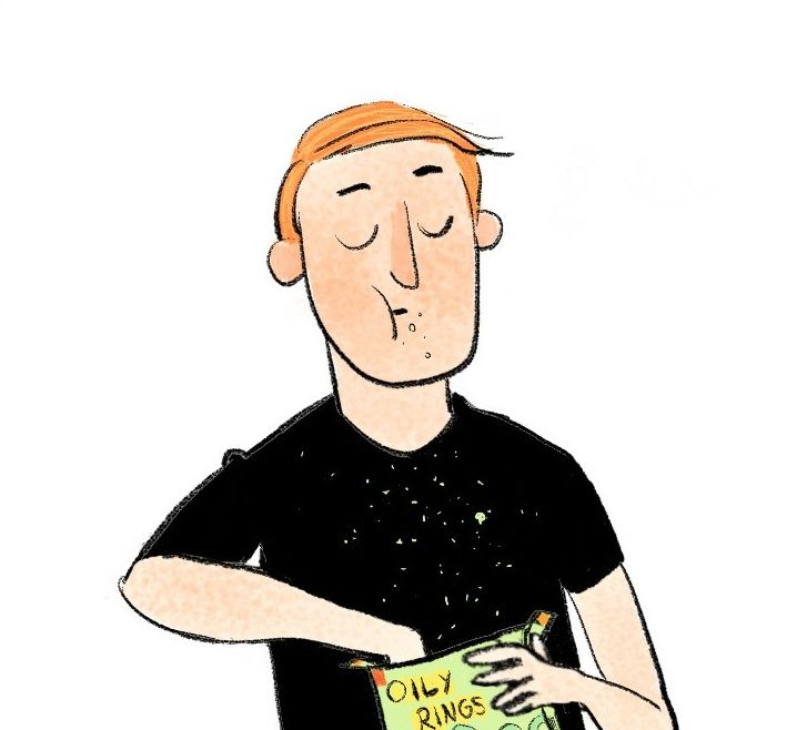
-
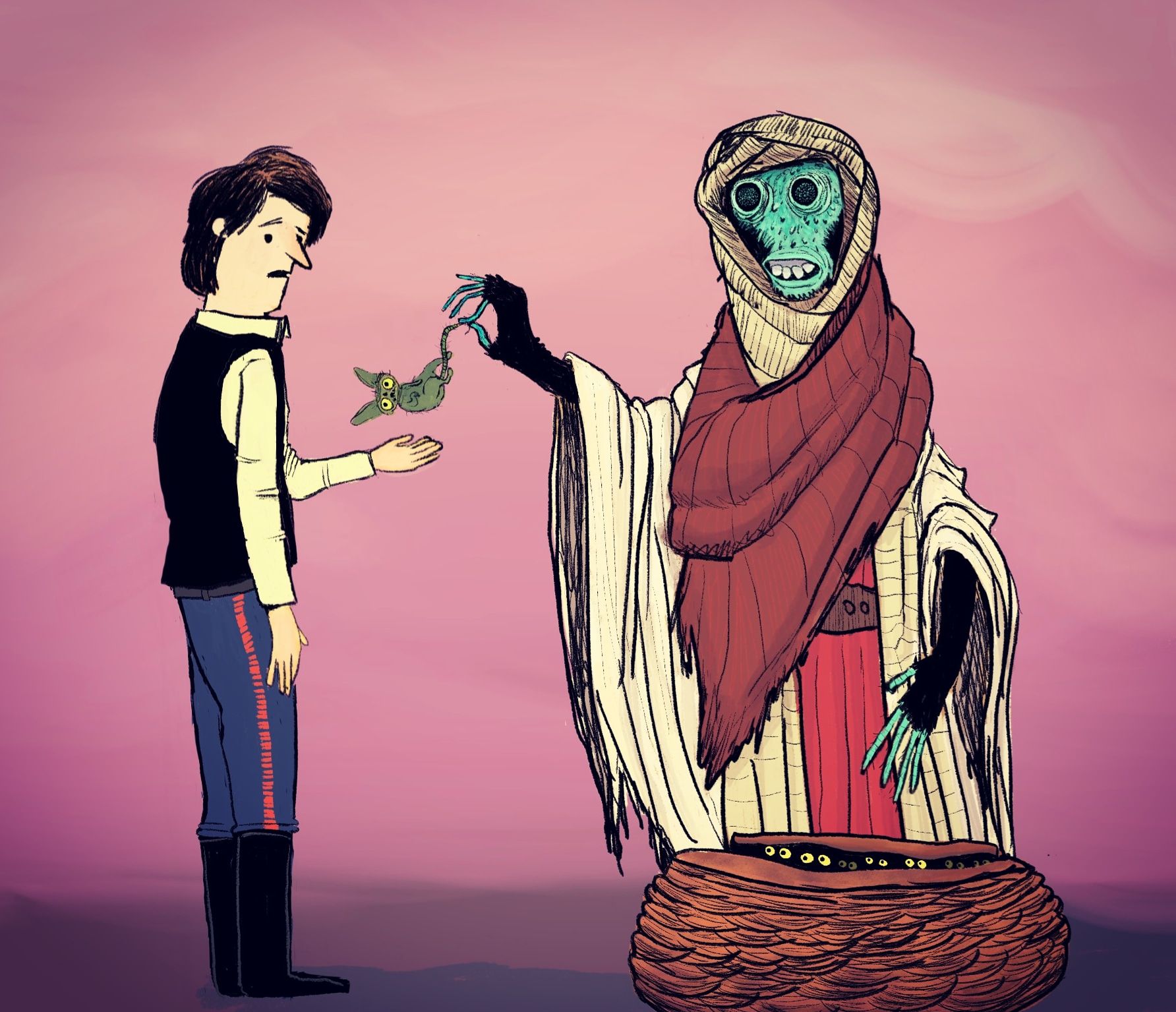
Hi Kyle, I think your style looks amazing, very natural an loose, the only thing that I would add, is the consistency of your line art, all of the drawing has the same line thickness which suggests that it's of the same size, but that little animal in the middle gives the impression that it was scaled down, the line work is barley visible compared to the other 2 characters. Other thank that its awesome, and nice sculptures btw, congrats!
-
@cszoltan thanks! Yeah that little guy was drawn exactly as you said, I noticed it but decided to leave it. Bad choice! I make weird, lazy decisions sometimes

-
@kylebeaudette hey you can just draw over it, with that pencil brush that you use for the line art, put a few thick lines here and there, nobody will know the difference, except you, and me of course

It's like 2 minutes of work and you have an amazing piece of art that you can show off! -
@kylebeaudette Cool man! I've been slowly trying to do the same thing over the years.
Do you have any particular inspiration on how you're going to be doing/solving environments and backgrounds? It's one of my bigger hurdles. I'd love to be able to manufacture panels quickly, but I tend to want to spend WAY too much time painting backgrounds.
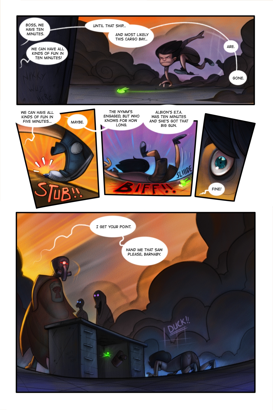
In my webcomic I solved the problem with lots of environmental effects. SMOKE EVERYWHERE!
I THINK if I keep trying I'll try and see if I can use those super simple graphic shapes for environments. Lots of swooping lines. I wanna go back to a style like this, but a bit different? If you get what I mean?
-
@Braden-Hallett hey man!
Yeah, exactly what I'm working on right now. The backgrounds! They gotta be simple, but get everything across. I keep looking at Quentin Blake, and a few other artists that say a lot by showing little.
I DO NOT want to do detailed backgrounds, and after purchasing a few graphic novels for kids, I can see that we're not alone
Just gotta find that balance. I think if I could finish a page in 5-8 hours I'd be happy.
Your comics are awesome!!
-
@kylebeaudette A lot of graphic novel backgrounds are only a couple panels, for establishing shots. You can get away with less!
The Prince and the Dressmaker's author, Jen Wang, writes that she didn't like backgrounds and only included them sparingly to establish the location. She uses solid color panels to hint at the environment and mood, and it works really well:
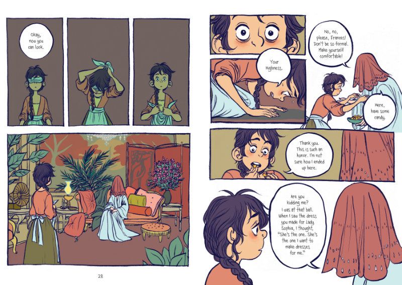
I tried to do a similar method with my Eragon short comic, only drawing backgrounds in a few panels. That way the focus is on the characters and their dialogue.
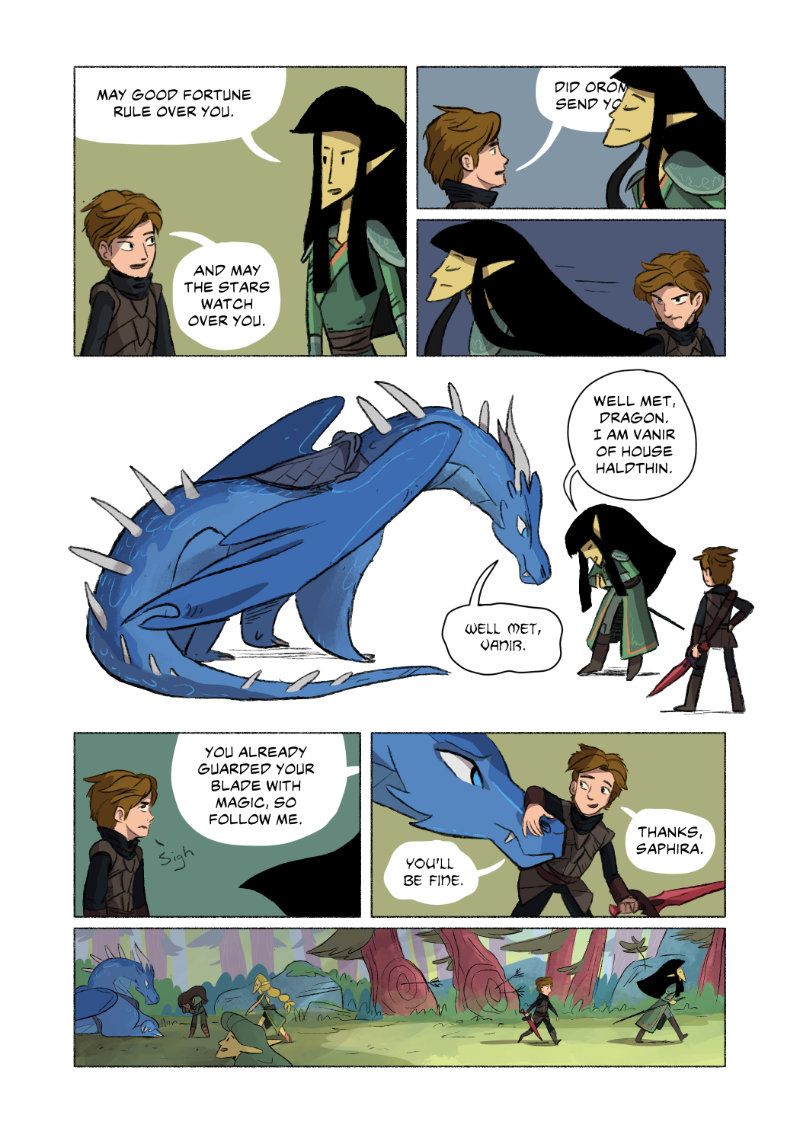
I think your work shows potential for graphic novel work! There is that weird balance to find where you have the style you want and work fairly quickly. I heard someone say once that to make a comic you need to be happy with your work at 60% power, since you have to make so many panels and can't spend forever to make them perfect.
-
@carriecopadraws great comic! That last panel is the perfect way to do the details after those other block colour ones. Nice!!!
Yeah, I'd plan to make use of lots of mood-colour backgrounds. It's all about those characters and their expressions/interactions/dialogue. Im no expert, but Ill give it a shot

-
@kylebeaudette I'm still learning too! Maybe you, me and @Braden-Hallett can start a comic group to cheer each other (and anyone else) on!
-
@carriecopadraws let's do it

-
These are really cool guys. @Braden-Hallett I think you have WAY more detail in your backgrounds that any graphic novel my kids read, so you probably can dial it back even to save time (unless you love doing it hah).
@kylebeaudette back to your initial question - I'd personally say it's both. Depending on the style of a picture book, your first image actually looks like something you might find depending on the style. I think it might just depend on what's specifically trendy at the moment (or what look the author had in mind).
I really gotta make a project to try and get into one. The age group really interests me because all my kids are reading this kind of stuff today. Plus, doing stuff at 60% is so my jam with how busy I am these days lol.
-
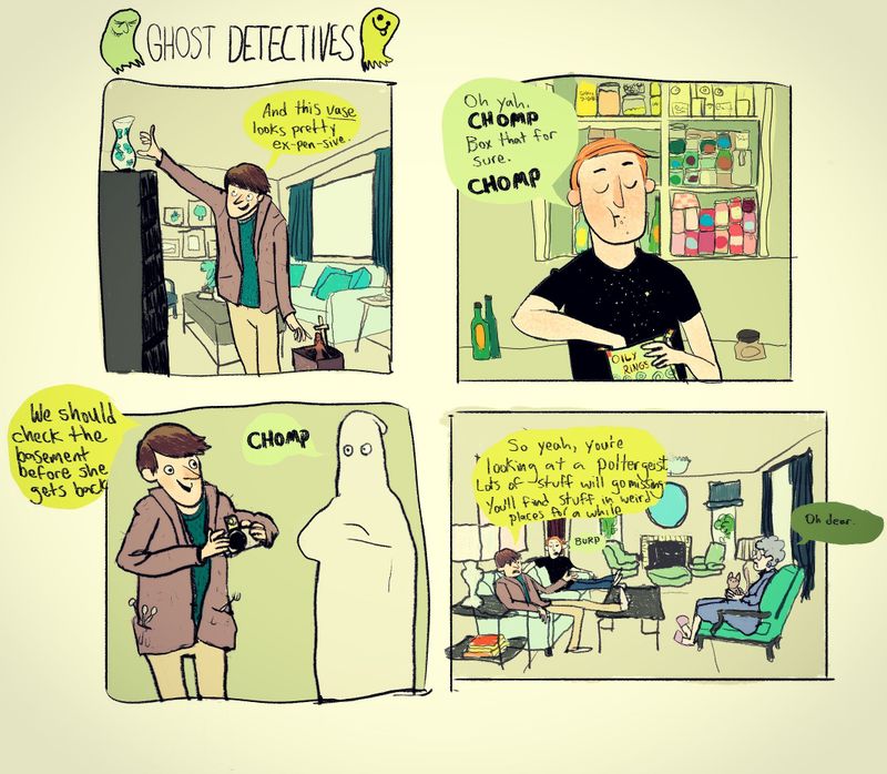
Finished this one today. The backgrounds are me tracing living rooms from google images
-
@carriecopadraws said in Developing a 'graphic novel' style:
@kylebeaudette I'm still learning too! Maybe you, me and @Braden-Hallett can start a comic group to cheer each other (and anyone else) on!
 !!!
!!! -
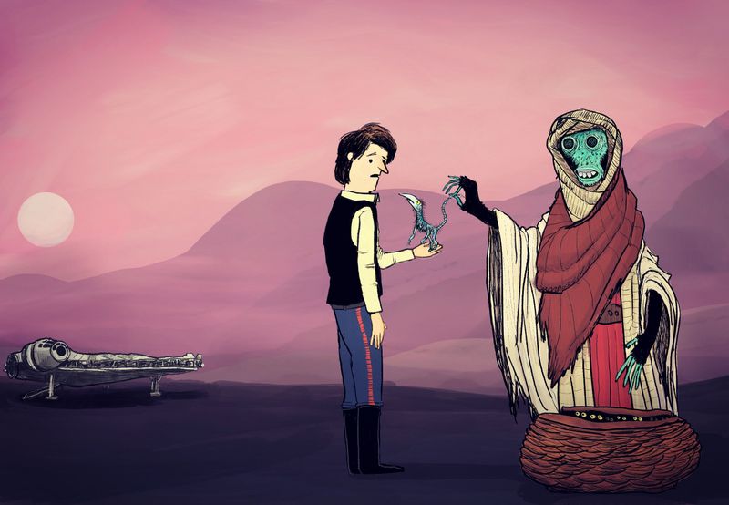
Changed the little creature, added some light background hills, and of course, the falcon. -
@kylebeaudette I really like your loose style! The updated piece is an improvement. Perhaps since the falcon is further away- thin the line work/limit detail so it doesn’t match the two foreground figures.
I’m also looking into developing a comic style. I’m still figuring out how and would love to join this group!
@carriecopadraws I love Jen Wang’s work and use of background. I think you executed the similar formula very well! And 60% power seems about right lol
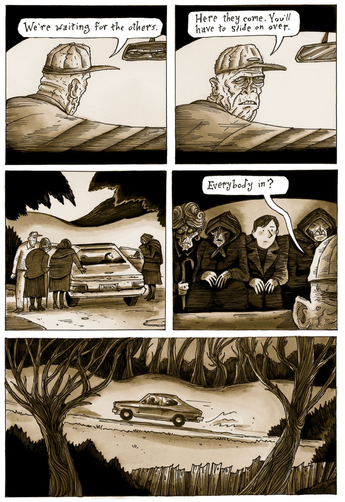
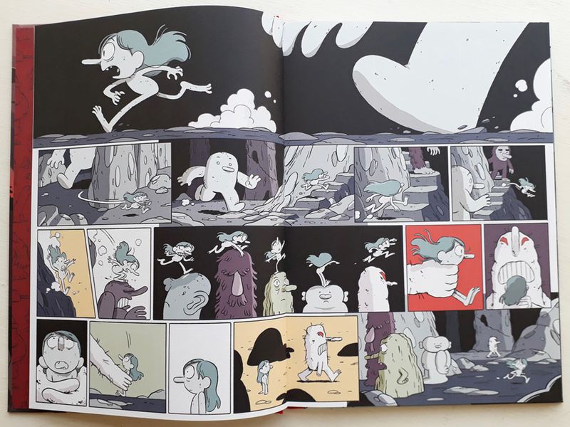
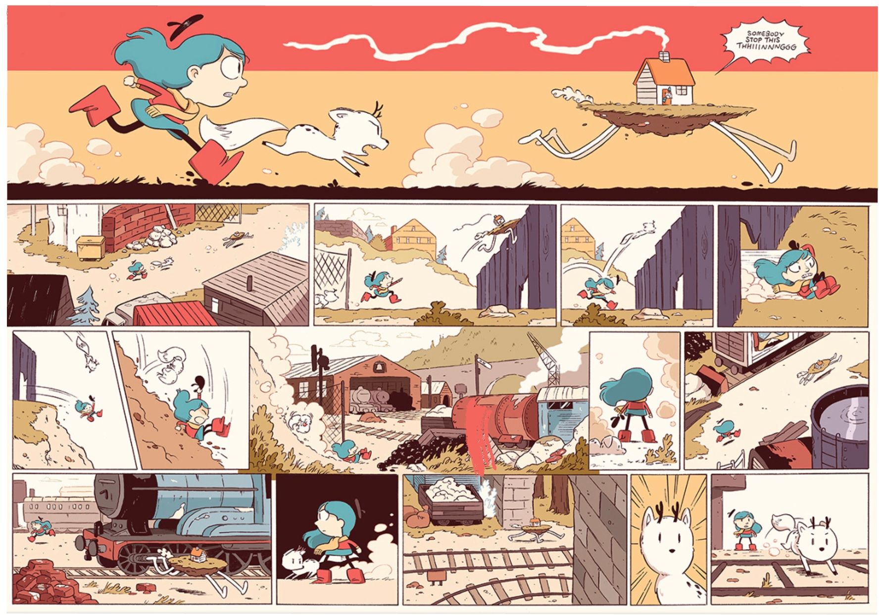
I’ll add in a few examples from artists I’ve been reading:
Richard Sala’s Cat Burglar Black
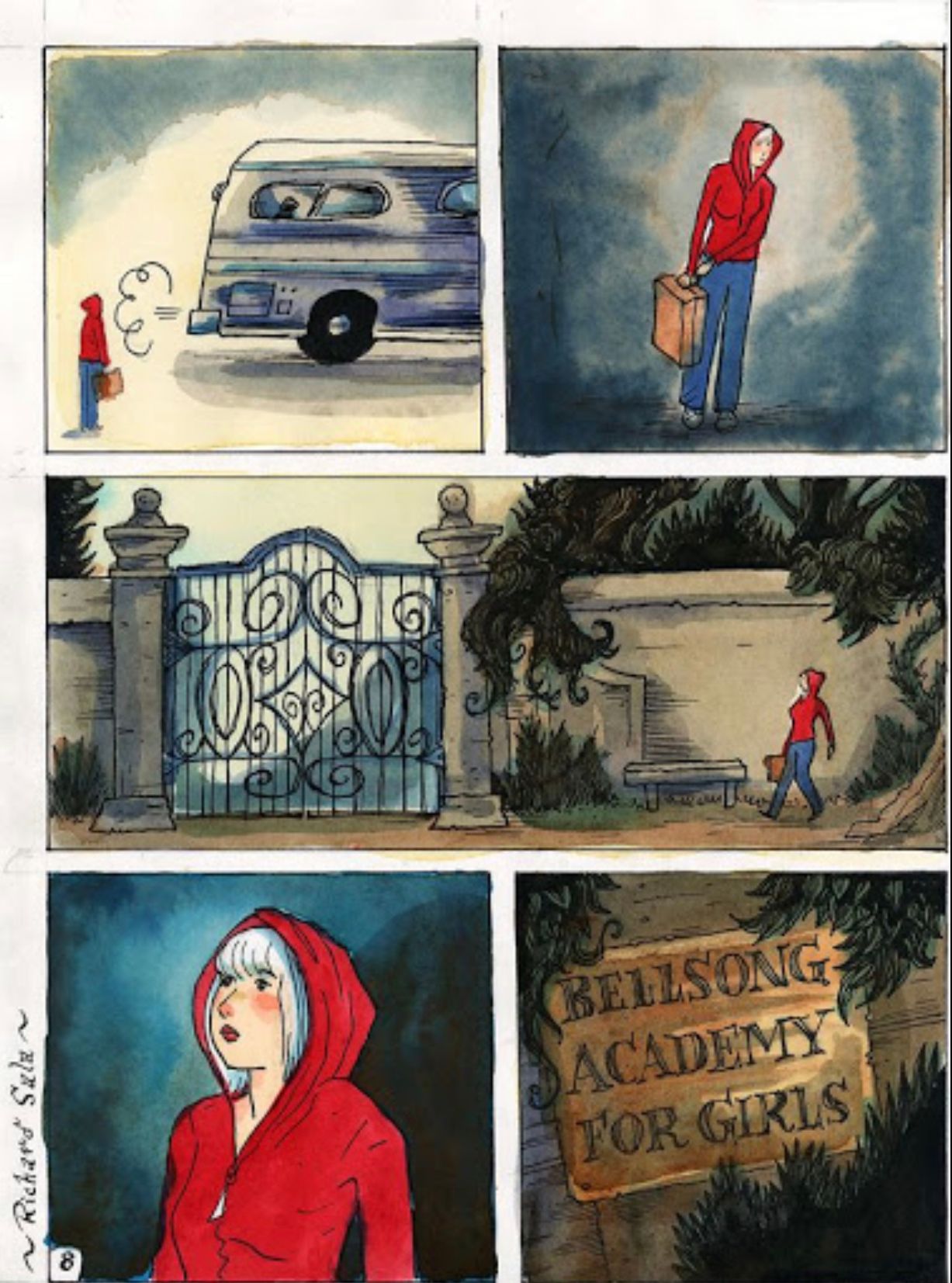
Delphine
Luke Pearson’s Hilda
-
@Jade-Vaughan love that Hilda, dont think I would ever be that good

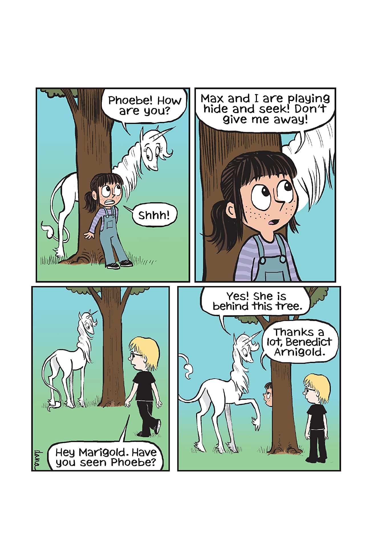
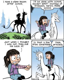
I bought a copy of a Phoebe and her Unicorn book to look at, (and also for my classroom this fall!)
The backgrounds are simple, the drawings are very animation-esque, and the focus is on humour. It's pretty good, I like the clean visual style.
 !
!
-
@kylebeaudette Very nice!! As you say the clean style does focus more on the character and dialogue. I’ll be checking it out
 I’m sure your class will enjoy it
 -
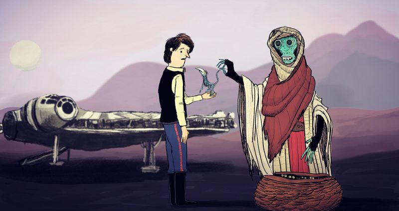
Can't stop futzing with this one.
-
@kylebeaudette have you thought about using a silhouette for the falcon with certain details (like the cockpit windows) picked out? Instead of a full render I mean?
-
@Braden-Hallett i took out the line work and liked that, but didn't play with it too much. I'll give it a shot
