Portfolio Advice
-
Hi all,
I am working on a new portfolio website (carrieannebrown.co.uk) and was looking for some advice. I want to start contacting art directors (and possibly agents) but I have only been commissioned a few times, mostly by the same company who always want work that is flat characters to animate and isn't the kind of work I want to get in the future. So my questions are:
Should I only show work I am proud of OR include commissioned work that was done with a very tight deadline and lower quality?I am also in two minds about whether to start contacting people for work now or wait until my portfolio has more children's book related pieces in it? I could do with making some money tbh, but is it worth the effort at the moment or will I just confuse the art director?
I also do graphic design as my day job and am trying to find a new job in this field (as I am currently furloughed and worried about the company closing) so I have my graphic design on there too because I don't want to pay for two websites. I'm hoping this isn't too confusing to either types of jobs.
Thanks in advance for any advice you can give me,
Carrie-Anne -
I really like your marching band picture, and the circus freaks one.
Maybe have more character pieces like those, with people in them? Such a fun style
-
@carrieannebrown I really like your portfolio and I think you have a real shot if you send it to publishers now. You will always be improving it, so don't wait for it to be "perfect" to send - it's always in motion. But I think you show enough children book type work that you won't confuse an art director. As for the commissions, the golden rule is that your portfolio is only as good as your least good piece. Don't put anything in there that you feel isn't as good just because it's paid work. I don't think art directors care whether your displayed pieces were paid for or not, they just want to see good work
") And only put in there the kind of work you want to do again.
And only put in there the kind of work you want to do again. -
@carrieannebrown your portfolio looks really clean and I think your background as a graphic design is a plus it shows an appeling style to your illustrations, I love the wizard of oz cover with the books, I think presentation is also really important and you have this totally nailed!
I will only put your top work in your portfolio, I mean artist usually are to much perfecionist and some work that you think is not worth included probably you can put it without problems!
I will start looking for an agent, Im in the same spot and I think we have to start moving!!
-
@Jordi-Ventura @kylebeaudette @NessIllustration thanks a lot for your help! I read something that said I needed to have proved I can complete professional (paid) work before getting an agent which sent me into a spiral. I'll try to work on a header today and start sending out submissions tomorrow
 .
. -
@carrieannebrown That's not true. Of course if you have done a lot of professional work it's a bonus and you may find it easier to get an agent. But it's not an absolute rule. Sometimes agents sign brand new artists if they like the portfolio enough. A good enough portfolio will get you both work and possibly an agent. The only thing stopping you is not sending it out... It costs us nothing but a few hours to send an email with a link to our portfolio to dozens of publishers and agents, so I'm truly confused why so many people hesitate so much
 Worst case scenario they say no, and you're in the same position you are in right now. Right?
vanessastoilova.com
instagram.com/vanessa.stoilova/Check out my Youtube channel for tips on how to start your career in illustration! www.youtube.com/c/ArtBusinesswithNess
-
@NessIllustration very true!
-
@carrieannebrown I recently signed with an agent. I do not have much prior work experience - only had one paid illustration work, which was with a local publisher in my city (Oslo, Norway). I wrote in my email when contacting agents that I am relatively new in the illustration world, but I have 10+ years work experience in another creative industry, and I am good at communication when workign with a team.
As @NessIllustration said, altimately, agents/publishers look at your portfolio. Having a bit of work experience is reasurring for them, but it is more of a bonus. I would leave out works I feel that was done quickly and I am personally not happy with. I also would make sure that my portfolio is very focused to the segments of the illustration world I want to work with (for example currently, my main interests is making kids books. I did not include anything that is not related to kids books in my portfolio.
Finding an agent can take a long time, it is good to start researching what type of agency do you want to collaborate with, and do not think too much, or take it personal about rejections - it happens all the time (I know it is easy said, very hard to do). My experience of agent searching is to really do as much research as you can. Each agency operate slightly differently, and no 2 agents are the same. The easist place to start is to figure out who represent your favorite artists, and then starting a list from there.
I do not know if you are familiar with IllustrationDept podcast.
https://illustrationdept.com/podcastThe recent 2 episodes of the show are both interviews with agents. It might be insightful. There were more interviews with agents/agencies in the past on the show as well.
Have fan with the journey, think of it as looking for a business partner :-).
-
@xin-li thanks so much for all the advice. I'll definitely try that podcast asap
-
Hi Carrie-Anne!!
Love the illustrations you've selected! Your work looks cohesive and gives off a great visual representation of your style. I did notice however when you select an image to look/read further into your text is almost overlapping or touching your artwork. Not sure if it's the template you selected but see if you could move the text over to the right side a bit or move it above or below the images. Great work!
I am also on the same boat of graphic design and illustration on one website. Please check out my portfolio if you have a chance I'd love your feedback as well.
Instagram: https://www.instagram.com/chiquis_studio/
Portfolio: https://sasharc.myportfolio.com/home -
@Sasha-Contreras oh no! Something weird must have happened when I changed the header. Thanks for letting me know. Websites are a nightmare.
-
@Sasha-Contreras I just had a quick look, I'd maybe swap the two sections on the homepage so that the woman with the water hair comes up first because it's so striking and beautiful. The duck image close up is a little blurry on my phone
-
@carrieannebrown I think you have a lovely portfolio. Like Sasha said, the text is bumping up against the images.
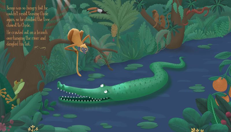
The only thing I would suggest is to reconsider the type on the Bongo spread. This didn't strike me so much before - i loved your contest entry. But seeing it in your portfolio now makes me pause. You have it nicely typeset, but the type design speaks of an entirely different format than a children's picture book. Type in picture books is sometimes partly for kids to read along as best they can, and so usually is much bigger, needs to be as easily recognizable as possible. This can be to help the kid connect it to reading on their own, and any other decision needs to be carefully considered. Cursive excludes kids completely until a certain age. Even without the youngest readers to consider, the high contrast thin white all cap font is something I would really dislike reading out loud with. This is a little detail I wouldn't point out if not for the header which says it's an illustration AND graphic design portfolio, so you're suggesting the viewer consider you as both even within one section.
To me, as a frequent end user of children's books in reading out loud to kids, it looks like you have not studied picture books in terms of picture book type design or placed the illustration in a design project fully (as in, you haven't fleshed it out to see which moment of the story it is and which bit of text it would be read with, but that is one of the most important things about spreads); and in that case it might be best to not pressure yourself to include all the text (I doubt anyone would take the time to read it when it's more than one line anyway), or just see if you like it on its own without the text, or with space for text. With any graphic design work you need to know your market to determine whether it's a good solution.
-
@carolinebautista I think you're right. I'll give it some thought and amend it. Thank you. I was already thinking I should take out the double page spread because important parts are disappearing into the page fold which looks like I'm a little clueless. I know I have a lot more work to do before anyone is likely to hire me to illustrate a children's book
-
@carrieannebrown goodness, it doesn't seem right to take it out! And it's a little thing, nothing that would mean work is unlikely for you. The gutter seems pretty well accounted for to me. Yours was one of my favorites for that contest. Maybe just try a sentence from the text in the top left corner instead? What about "Bongo was so hungry he couldn't resist teasing the alligator again, so he climbed the tree closest to Clyde. He crawled out on a branch overhanging the river and dangled his tail."
That way the foreground on the bottom right will show better too.
edited to fix a mistake, gah
-
@carolinebautista Hi, I reduced the text as you suggested. Could I ask for your thoughts? I'm not sure whether I need some kind of fade off behind the text....
-
@carrieannebrown Wow, this looks so good! Super legible now, and the color you chose is perfect! It doesn't seem to need a fade off but I will look at it again later to see if anything changes. My design skills are seriously rusty so take this with a grain of salt, but the straightest lines are the rays of light highlighting Bongo, so might be nice to keep the text where it is and right-justify it to go right along with the rays. It might help keep the eye in the page near the focal point rather than the frame of the image.
Actually, now that i've studied this image a bit, one of my favorite things is that Bongo is sticking his tongue out at Clyde. But his face is almost the same blue as the river, so if you want that to read as quickly as Clyde's expression, then maybe putting more contrast in that would help it stand out. The main contrast in Bongo's face right now, is the top of his head and the whites of his eyes.
Really lovely portfolio!
-
@carrieannebrown No problem!! Thank you for taking the time to look at my website as well! I will definitely update that image to show something more recent. Looking forward to seeing more of your work on this platform and on instagram!
