Help! Which composition should I use?
-
I'm illustrating a children's book and there's one spread where I can't seem to settle on a composition. Any feedback would be greatly appreciated!
A -
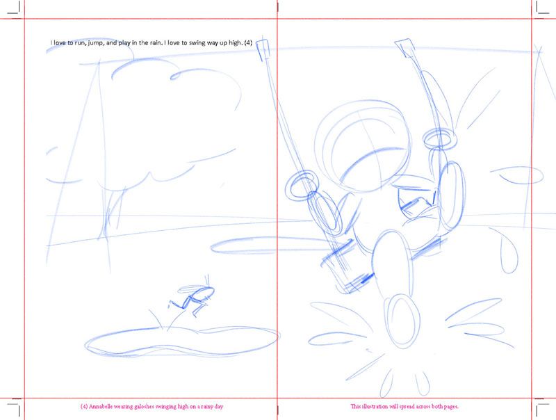
I really like this one although I'm worried that the angle doesn't have a clear-enough outline, requires fore-shortening (which is tricky to get right) and I'm not sure it conveys the height of her swinging. Plus, I felt like it could use something jumping in a puddle, so I added a grasshopper, but if I do that I feel obligated to repeat him elsewhere in the story, which isn't terrible, just a little extra work.
B-
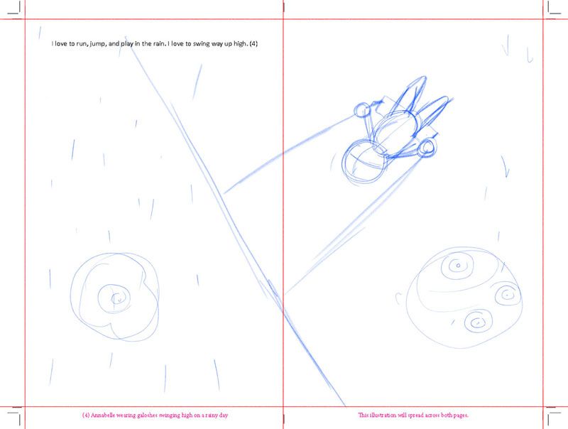
I think this may flatten the image too much and negates the feeling of her swinging way up high. Perhaps if I made her bigger it would convey that better? With the ground in view I could add footprints that indicate she was running and jumping prior to swinging as well. What do you think?
C-
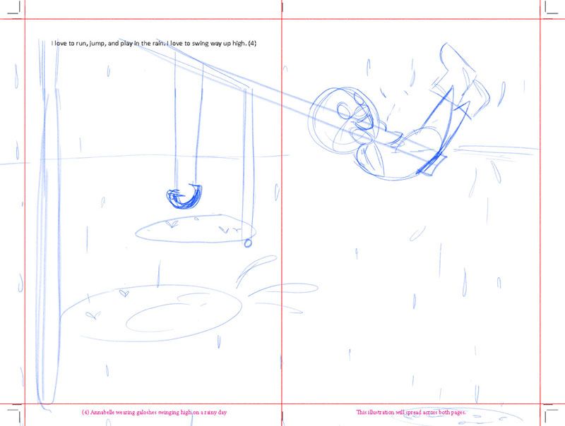
This one has clear outlines, but feels boring to me. Not very dynamic, but I guess not everything has to be. What do you say?
D-
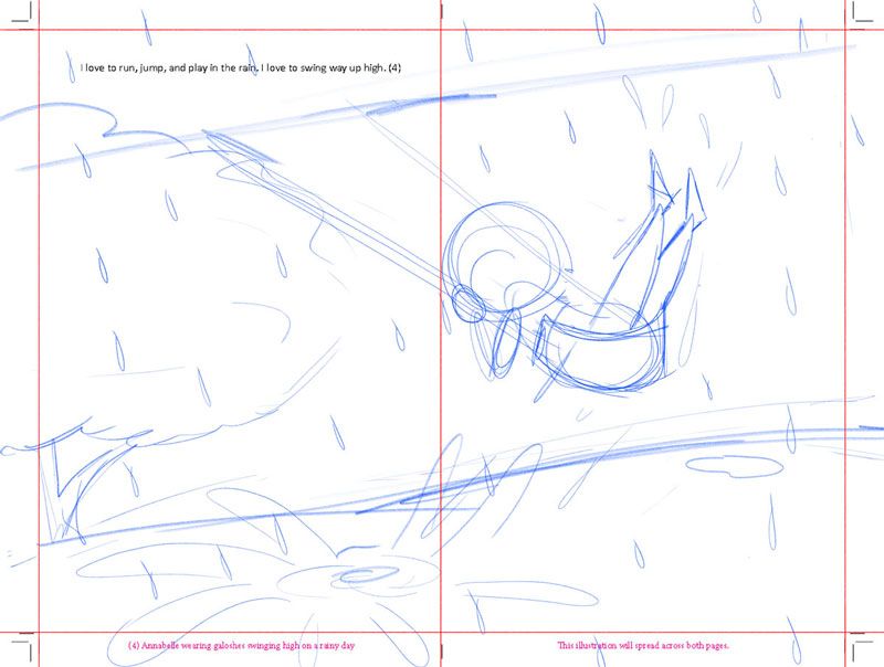
I like this one, I didn't incorporate a grasshopper here, for this one I'm trying to emphasize the action of her having kicked the puddle on her way up in the swing, and making a big splash. I think her angle is a good combo of a strong silhouette and displaying her height. I don't know if I should have the background tilted though, as I'm doing that on the next page (see below) and I don't want them to seem repetitive.
Thank you so much for looking - I've been puzzling over this for 2 weeks now
 !
! -
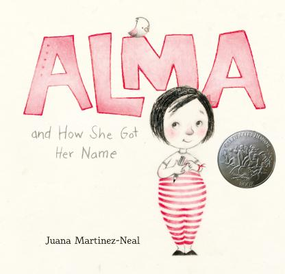
I can see why you are puzzling over it because it's hard to decide! With the first one, I think that's the one that stood out to me the most when I first glanced over the post. I think the idea of the grasshopper occurring throughout the book is cute -- I noticed a lot of picture books have an animal character that interacts with the story and adds extra visual interest. I'm thinking in particular of the little bird in Alma and How She Got Her Name. But I also think your concerns with the spread are valid.
I agree with you that the second spread appears too flat. I think it's because the line of the swingset cuts diagonally across the page. This might work if it were more zoomed in so that the figure was larger and that diagonal line wasn't so prominent? Because I see how drawing the child in this position is simpler and can pop really well.
For the third, I think if it feels boring to you on a gut level you should try something else. I fall into that trap a lot where I design something and I think "well this isn't exciting but I can imagine it looking good" and then it looks awful because I don't have that magic spark when I am drawing it!
I like the 4th one too! The tilted background emphasizes the fast movement of the swinging, and I see the splashes and raindrops making really interesting shapes on the page. The only thing I would change about it is to move the child further from the middle line so they don't get caught there.
Really cute baby sketch, I looove those pudgy little legs and tiny shoes. Good luck with this!
-
@amlilui I think that you're on point with showing the character up close and wanting to emphasize how high they are swinging.
I actually like the "boring" composition the best because for me it tells the best story. I feel you can omit the framed structure of the swing and just show the swing coming in from the top. I would also keep the horizon line very low to emphasize the height.
I really like the idea of adding a grasshopper through the book! It's quite a popular trend and kids would love to look for it on every page.Here are some Pinterest links I liked which can hopefully help you with the composition:
https://pin.it/6YhtWH6
https://pin.it/3bdXmEK
https://pin.it/5cGNjxn
https://pin.it/oasuXXfSome of the characters in the references are turned away, but I think it would be nice to have them face the camera so that you can see their expressions.
-
i feel for the grasshopper.
its a cool addition.
you could tweak it more on this, maybe have it like in freeze frame, like both legs upwards forward, perspective abit and the face are framed by the feet. and you could have that cool splash which i feel also, like have a trail of it from behind a little lower, like he splattered the water to the sides?
and that grasshopper is trying to be as cool as the kid with his weak and flimsy jump.there can be so many options.
i would go for what feels most emotive for you.
whatever that is, and work on your composition with other devices, like contrast, shapes, edges, lines...etc, if you think the items that needs more attention. -
@lora_chaudavis Thanks for your feedback! Pudgy babies are my favorite, lol! It is definitely tricky trying to infuse enthusiasm into a piece I find boring...I think that may be why I may be reticent to choose the "straight" layout even though it has a strong silhouette and composition.
@neha-rawat Thank you for those pinterest links! I've been looking up a bunch of references, but photos and not illustrations ( I think I normally avoid those cause I don't want to copy anyone ) but seeing how other illustators interpret a similar scene is actually kinda helpful.
@arielg Thank you for that! You know, after all this I may consider that additional grasshopper character a little more...I like the idea of having a little sub-story depth in the illustrations.
Thank you all so much, this has been really helpful! I will post an update as soon as I have one

-
My pick would be D. I like that the swing cuts across the pages, it feels very dynamic. I’m concerned that the kid might be too close to the seem though and that part of the drawing will get lost in there. Just something to keep in mind!
-
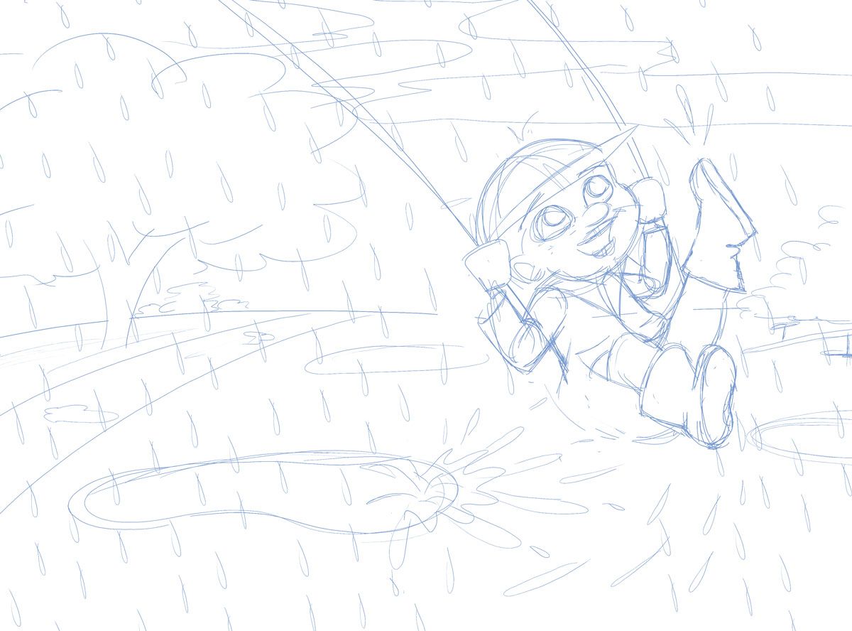
So here is my rough sketch for the composition A, what do you think?? This was the hardest angle for me, so let me know if you see where improvements could be made with anatomy or perspective.
I'm still on the fence about the grasshopper. I don't know if he would truly fit into the rest of the story...but as I complete all of the rough sketches I'll see how it feels and I may go back and add him throughout.
Thanks for the extra

 on this
-
@Griffin thanks! I really liked D too but after much deliberation, I finally went with A.
-
@amlilui
aw, super cute! My only suggestion would be to make the chains curve in the opposite direction or to keep them straight Looking forward to see your children's book when it's published!
-
@aprilshin Good point! Thanks
