Running away from an explosion - critiques wanted
-
Hi everyone,
I’ve been off the forums for a while with life stuff but am still drawing and giggle like a ninny whenever a new episode of the podcast comes in
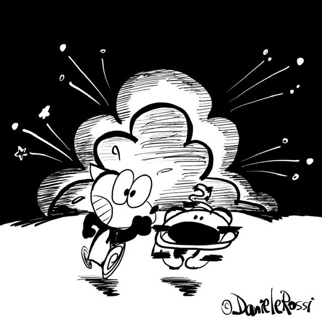
In the meantime, I’ve been working on an illustration of my cartoon characters running from an explosion. I thought of sharing it here to have a number of third sets of eyes have a look. Anything that needs tweaking or fixing or something looks out of whack?
In case it’s helpful to know, this illustration is simply for posting on my Instagram. I am drawing it in hi-res (in Adobe Fresco) just in case I can use it in other means (like how Jake Parker gives his drawings 3 or so different lives. But for now, it’s simply an illustration to tell a story. I plan on asking my Instagram followers to share their thoughts on what might have caused the explosion (the tiger is a character who always unintentionally causes trouble). I’m planning on drawing and posting a prequel illustration showing the cause at a future date


-
Cute style! My only critique is that I find the tiger's face a little hard to read. I can make out the nose and eyes, but I'm having trouble telling whether those are teeth or tongue sticking out of the mouth line. Perhaps a little white space to separate the nose from the mouth might make it read better as a face? Though that could just be the character's design and constant look, so I may be way off base here, haha. Explosion and running from it all reads well though.
-
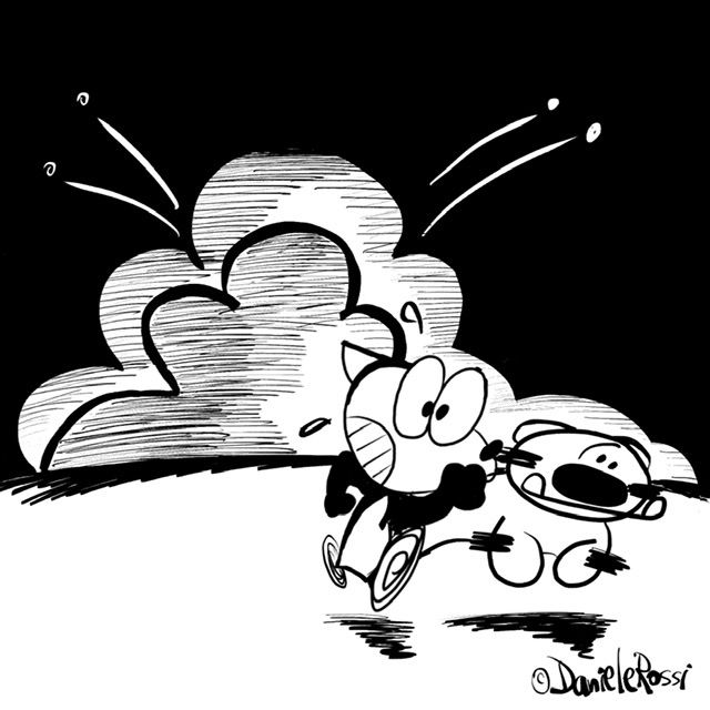
@danielerossi maybe move your characters more to the right and move the explosion more to the left.
-
@danielerossi
 might have to sit on it for a couple of weeks now
 -
@Kasey-Snow Interesting observation! That’s actually the character design of the tiger but I see what you mean — things seem to be a blending into each other. I’ll try separating things a bit. That’s actually his mouth and teeth (:o]
-
@Nyrryl-Cadiz Great suggestion. I’ll give it a try. I guess I’m used to the idea of having the “camera” right in front of the explosion and the running. Looking forward to giving this a try, good thing it’s digital and all in layers!
-
How about this? The tiger is proving to be very difficult for me to draw


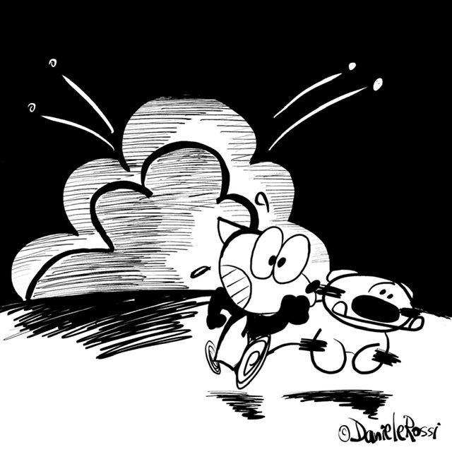
Or this?

-
Movement looks good, and the tiger's face reads much better now.
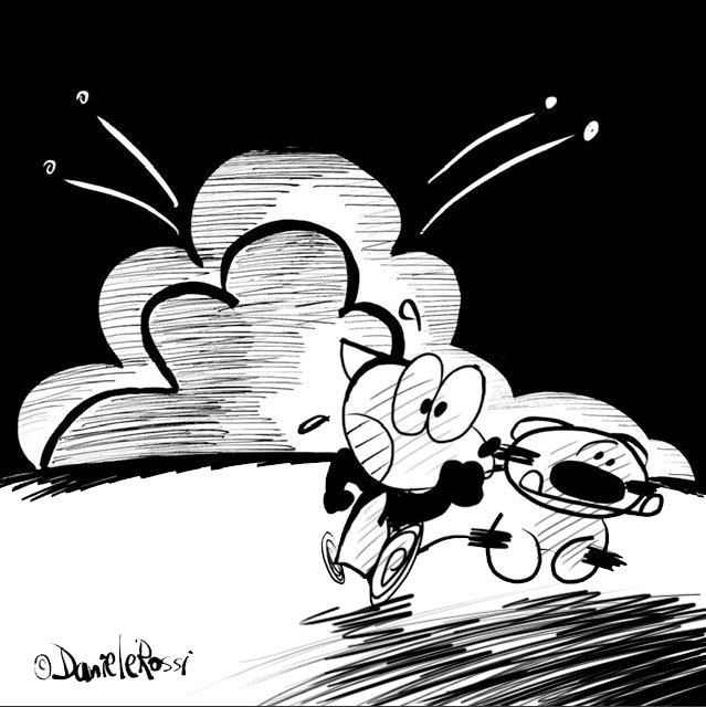
 If you want to break up the white space on the bottom half of the image, I'd suggest doing the shading like you have in the second image, but in the lower right corner instead of right under the explosion, to do more for the light. Maybe even a little shading on the interior of the characters to increase the illusion of rim lighting. Something like this maybe:
