My Inspired work in progress (Zoe Persico)
-
Hi.
@KajsaH made a work inspired by one of Zoe Persico's and I too want to do likewise. If you are interested, the link for seeing KajsaH inspired work and Zoe Persico's work is found here:
https://forum.svslearn.com/topic/9566/featured-student-for-july/35?_=1593733947554And I am also tagging the other two @Dima-Eichhorn and @baileymvidler who also enjoyed that particular magical work. I am making this thread to keep my word and to get input along the way. I have in the past had the unfortunate tendency to start a work and not complete it do to a lack of time; so I intend to work on this as I work through my classes. And ideally continue this practise for the future.
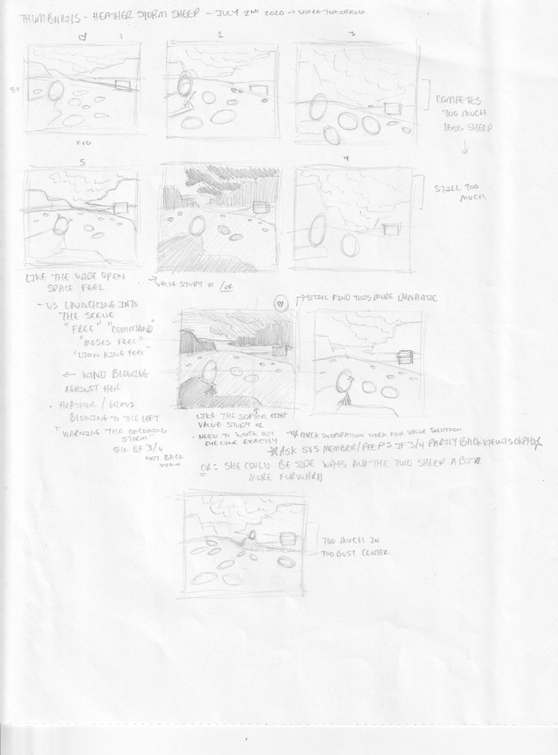
So these thumbnails are where I am at. My story is about a little girl looking after her family sheep. A storm is coming (mood/atmosphere inspired by Zoe's) and she tries to warn her sheep on the top of a rock surrounded by her sheep and the field of heather (I know but I have wanted to do a work with meee in it for a long time, lols). I am also inspired by the shape language in Zoe's rocks/cliffs but changing up colour to purples and yellows. The feeling I want is "freedom" with the large landscape and lion king announcement but also a bit of tension with the oncoming storm and the little girl attempting to warn her sheep.
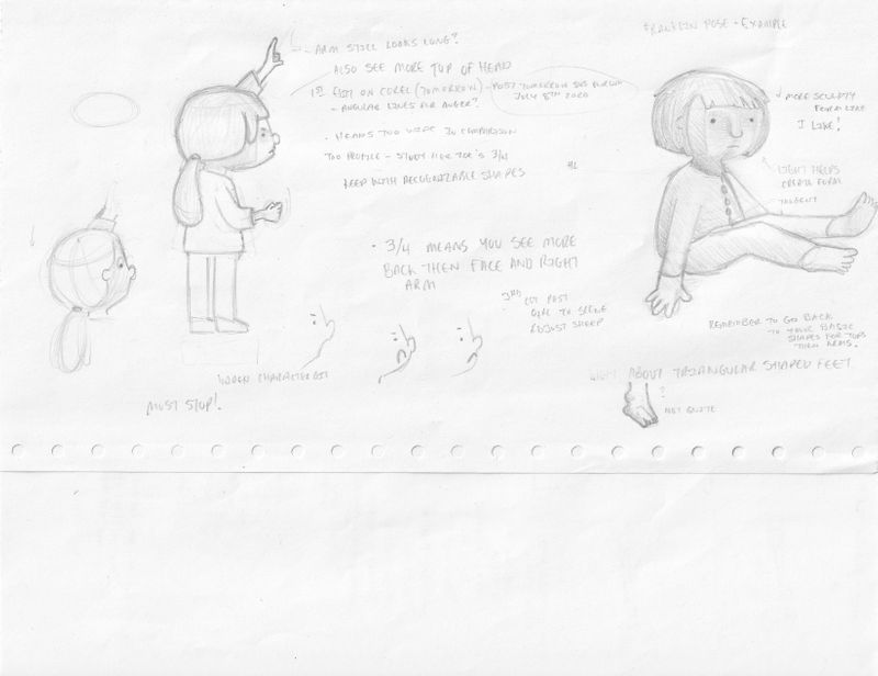
I have one question. The thumbnail with the circled heart is my favourite however my girl is facing away from us. Now I can adjust her more 3/4 s to have her face us a bit but I don't like her being at profile. Question then is, is there another solution or is it okay if she is turned a bit away? Anyone always can comment and feedback on anything else that might help me.
Instagram: www.instagram.com/heatherboyd.illustration/
Website: https://heatherboydillustration.ca
Shop: https://www.inprnt.com/search/products?q=HeatherBoydIllustration
Ko-Fi: https://ko-fi.com/heatherboydillustrationBe blessed,
-
@Heather-Boyd I'm so happy that my illustration inspired you to do a piece of your own! Zoe Persico's work is amazing and she really is a master of atmosphere and mood, I love it
 my biggest challenge when I did mine was to stay loose with my brushstrokes. I tend to get too much into details and overwork things and I really like how interesting textures Zoe has in her work. And the colors of course!
I like your concept a lot, I think it will tell a dramatic story with the storm clouds coming in and the worried girl looking out for her sheep. Maybe you could turn her face just a little bit towards the camera, so we're able to see her facial expression? I think that would help tell what's going on.
I'm looking forward to seeing your process!
")
-
@Heather-Boyd Hi, thank you for tagging me, so I can see your thumbnails. I agree with you and your favourite thumbnail. And abaut the facing away from us and looking towards the field and the storm is actually so cool. It will give a great mood. It reminds me of some famouus painting( I can't remember the name but I will Google it and later post it here. ) I really want to see your next step.
-
@KajsaH Thanks, I will have to figure out how to use pastel pencils more loose (at least in some areas). I have a few more thumnails I want to try to have her face more visible!
-
@Dima-Eichhorn Thank you and I look forward to see it.
-
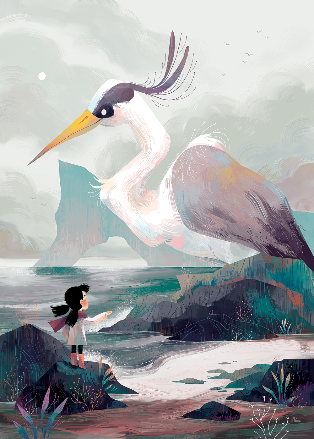
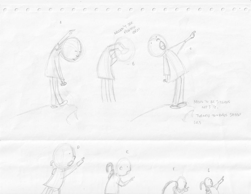
@Heather-Boyd This is awesome! I really love the story you've got. Your composition is solid. I feel like it's important to see the girl's concerned expression. 3/4 view would probably work. Zoe seems to do that POV frequently. (see below.)
Or, what if you have the sheep in the foreground, the girl is placed in the middle-ground, and the storm clouds in the background? She could be looking concerned at the sheep and pointing to the clouds? "Hey, Sheep! See those clouds? We should get out of here!"
Really excited to see how this piece comes along! I definitely want to hear your thoughts when you get to the rendering phase. I love Zoe's brush strokes so much, and I couldn't quite figure out how to crack that technique. I did a master study once. I'll have to check if I still have it in my back-up drive. If so, I'll share it here.
Looking forward to seeing your progress!
Bailey Vidler
Portfolio: baileyvidler.com -
@baileymvidler Yes I thought of the girl in the field but I prefer the openness of the field left to the sheep, but thank you that would solve the predicament as well. Thank you also for sharing with me Zoe's 3/4 view that is very helpful! I have a rough idea how I will solve it with an story element that ties everything together (sort of what you were saying about the sheep). The rendering will be a few experiments for sure and I will look for feedback.
-
@Heather-Boyd Go with your favorite! We can help you make sure her body language communicates so that you don't need to see her face.
-
This is a fun thread.
 will be watching! I hadn’t heard of Zoe perisco so I looked her up, her work is amazing !
 -
@carolinebautista my solution does have her face, but I will seek help for her gesture too, thanks.
-
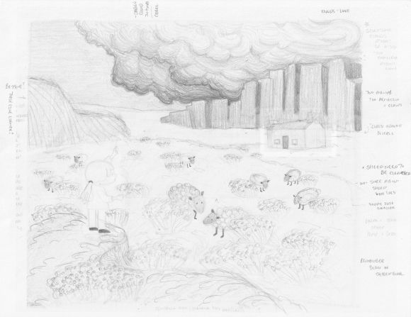
Monday and I am back. I found my eye line and drew in my Scottish house as best I could and shaped my sheep a bit more roughly for perspective angle purposes (plus the additional one). My question is whether the house is too large or too small for the location it is in and as well the size of the sheep in comparison to the house and to the general size of the yet to be drawn girl (I will look at tomorrow)? Also the raised mound in the front on the farthest right side does that need to be in perspective like the protruding left side and if so how (it is very front facing)?
I appreciate you helping me out as you already kindly have,
Thanks,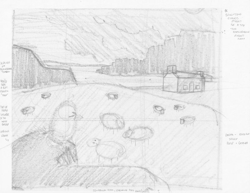
-
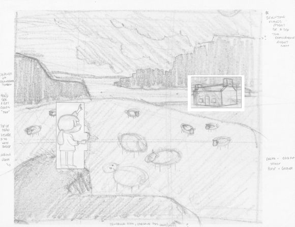
@Heather-Boyd The house seems much too big, but I'm not sure why except that making it smaller would make the landscape look vast. It might be better flipped horizontally, so that the door faces the center of the drawing. I think the mound in the front can be that shape, it's so much in the foreground that you can make any shape work. The shape you have might work better compositionally if the edge gently moves to the bottom of the frame and the other edge slopes up more, depending on how high up she is.
The size of the sheep compared to her tell me she is not very high, is that right?
-
Thank you, this is what I need. I am at a point where I want feedback questioning my thinking in order for my work to clearly and creatively tell the story I want to tell.
All your points are good - my character is less made up. I need to decide how much detail I want to add to her, especially in her face -partly determining how big she will be.
I will adjust the house size for sure -I certainly want to create a vast expanse with what I have started with. I will consider flipping it.
-
So update with feedback corrections, character beginnings and gesture. This week has not gone as planned so I am 3 days behind but this is what I have to update you with. Let me know what gestures you like or have any further suggestions/corrections. As I got more into her gesture, I had more fun.
-
I've decided to keep my character's gesture simple because her environment is more turmoil. I am working on value study and then figure out how to ensure my colours line up with the value study.
I haven't drawn these clouds in this style for awhile but it works well with the movement in Zoe's work. Just need to move it from pencil to pastel.
-
@KajsaH @Dima-Eichhorn @baileymvidler @carolinebautista @Coley
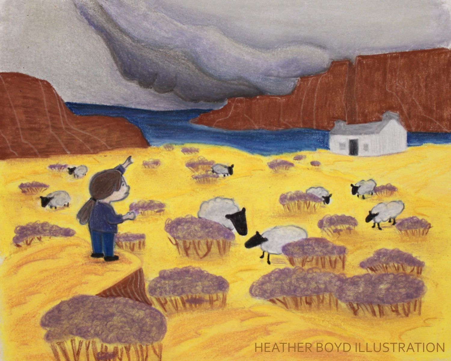
So I finished but I am not overly pleased with it but I am glad to have it finished not perfect. I underestimated my frustration with pastel beyond it's messiness. I had more colour choice with soft pastels but didn't have the control I have with the pastel pencils. So I liked the composition part most on this one. I do like how I did the mountain/hills, the wave in the grass and I liked my character draw but not the final. I improved better in my values. So it's good learning but I miss my white paper/space. One of those 100 try outs.
Thanks for all your support and help,
Do you guys know other children book illustrators that use white space?! ALSO children book illustrators that draw pencil overtop of colour? I seem to gravitate that way naturally.
Instagram: www.instagram.com/heatherboyd.illustration/
Website: https://heatherboydillustration.ca
Shop: https://www.inprnt.com/search/products?q=HeatherBoydIllustration
Ko-Fi: https://ko-fi.com/heatherboydillustrationBe blessed,
-
@Heather-Boyd the yellow with the purple is quite nice too! The sheep are super cute

I think prefer the character draw a little more too. But not a whole lot! It’s really hard to maintain the initial drawing, my characters change so much too.
I think micheal martchenko sometimes uses a bunch of white space? He’s one of my original inspirations. And he’s all traditional. But watercolor over pencil, I think

-
@Coley Thank you
I'll got look that illustrator up. -
@Heather-Boyd Yay! I'm so happy to see the finished piece! I like the vibrant yellow you used for the field. It nicely contrasts the dark storm clouds! Thanks for sharing your progress.
As for white space... I'm not sure if this is exactly what you're looking for, but I think Blythe Russo very effectively uses white in her images. It makes them feel all nice and airy.
Bailey Vidler
Portfolio: baileyvidler.com -
@Heather-Boyd it's beautiful! what size is it? soft pastels are the most irritating things to work with!
Are you thinking about the style of your hot chocolate piece? what did you use for that one?