Introduction to Prop Design - Looking for fellow 'classmates'
-
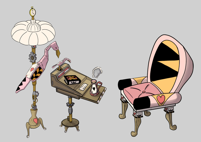
And, here is the rest of my prop ensemble! I learned lots throughout this course, and I'm ready to tackle the next one
 Any comments or critiques are appreciated.
-
This post is deleted! -
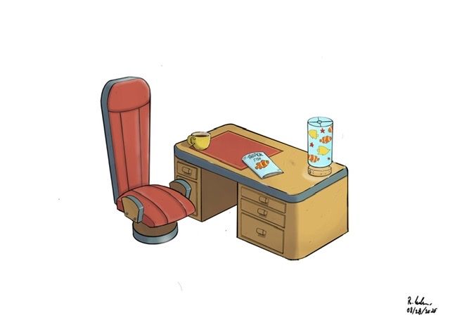
Finished the assignment. This is what I came up with
-
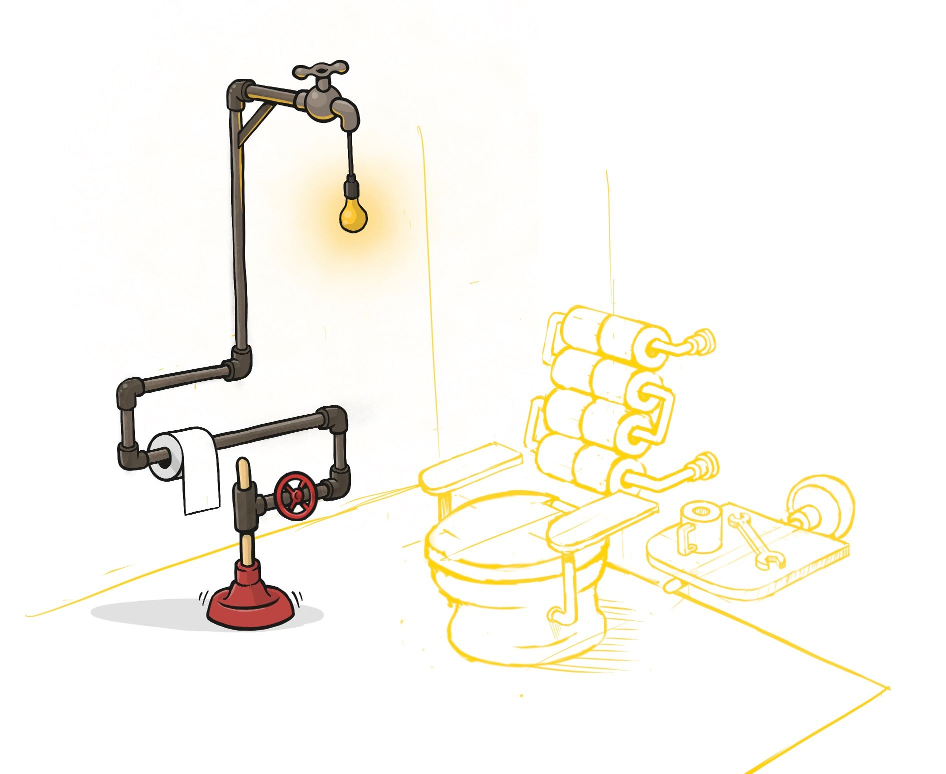
Been a while. Completely forgot about the rest of the assignment. Here's my sketch for a chair and table to go with the plumber's lamp... :-]
-
@PieterVanDerBeek I just started into this class but had to out it on the side to finish other things. But will post my wip when I get back to it, even though you've almost completed the class if that's okay?
-
@Heather-Boyd Yeah sure! Love to see what you come up with :-]
-
Love the colors! And the patterns and different materials! :-] Really like how they are all unique on it’s own but also related and connected to eachother...
-
@PieterVanDerBeek The chair is awesome. It definitely goes along with the lamp!

-
@PieterVanDerBeek Thank you so much!

-
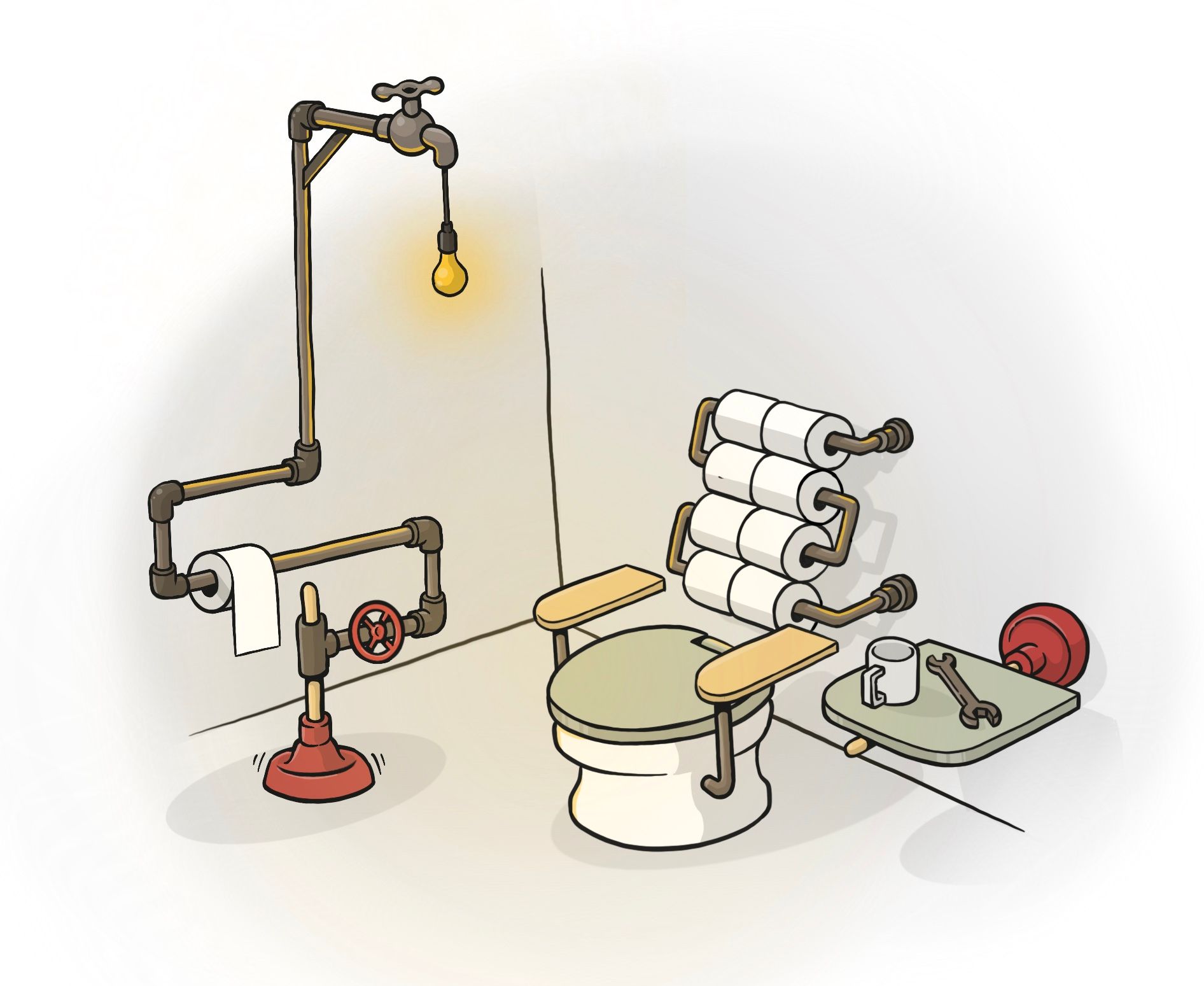
Rendered! :-]
-
I just finished the course and came up with a very very simple first prop idea, ‘cause is my very first time doing this and I wanted to start with a more simple structure to then do a more complicated project for my portfolio later on.
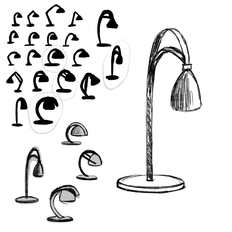
So my very simple idea was an Art Deco inspired lamp. I did 20 silhouettes and ended up choosing the more elongated lookin one.
I also tried to do the horto for an extra challenge, also because I have a lot of problems visualizing the objects in 3D so this helped a lot!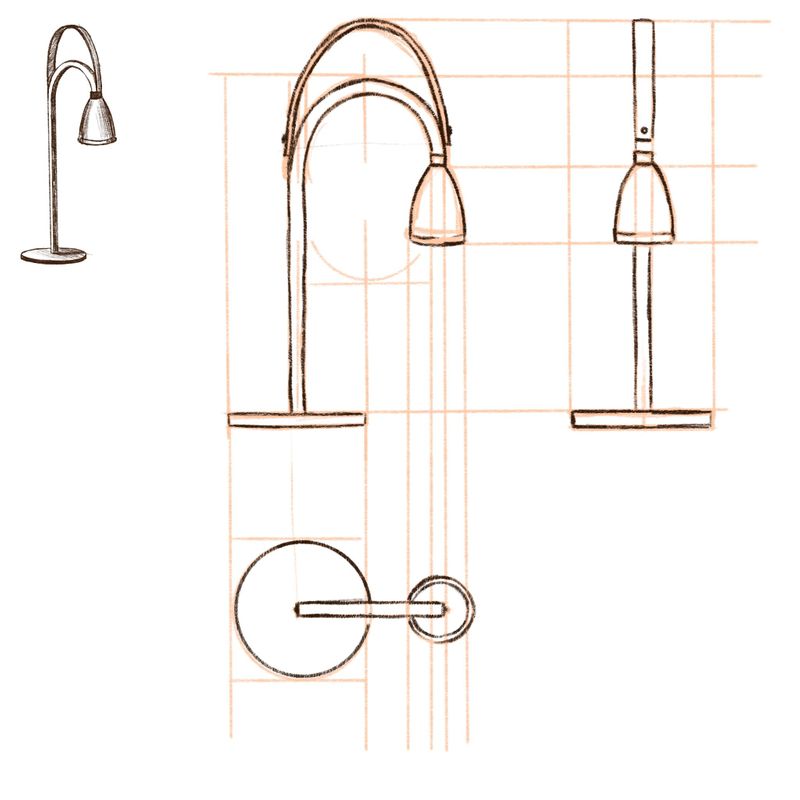
This is the final design, lights on and off. I am pretty happy with the result, structurally speaking, even if seeing all your super creative ideas made me want to try to realize a more complicated idea, so now I am even more motivated to do that ahaha
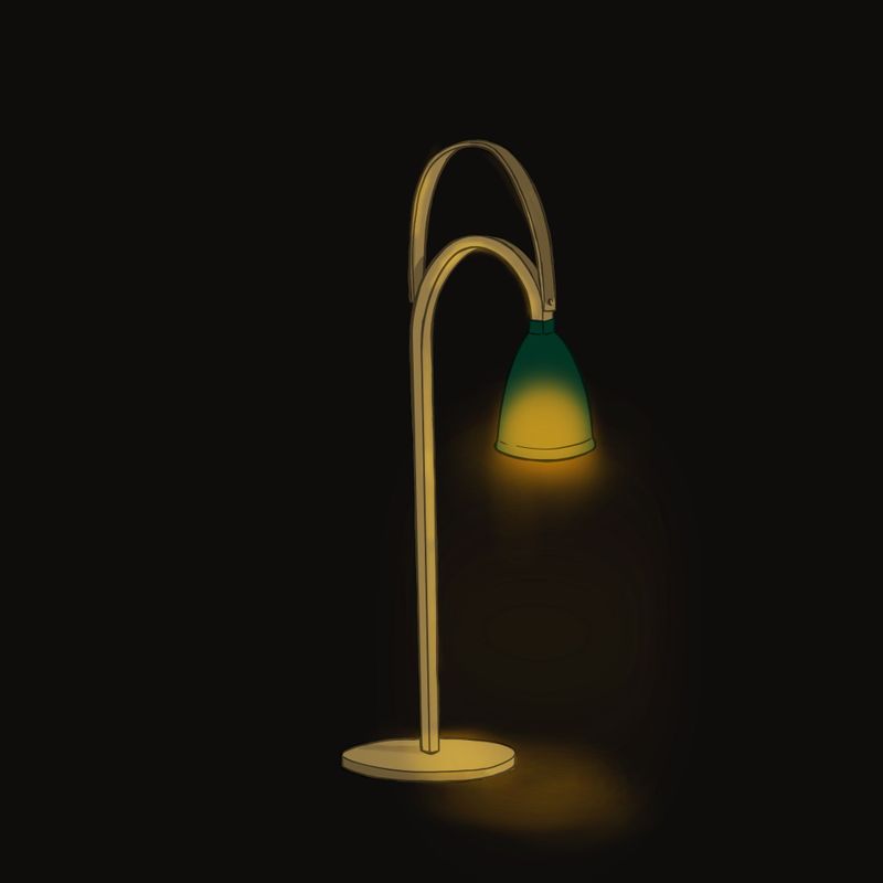
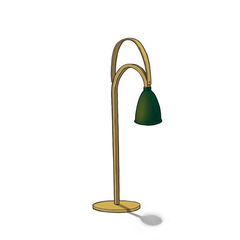
I am currently working on the rest of the prop ensemble, I’ll post that too as soon as I finish it! -
Lots of great art here!
Here's where I ended up with this.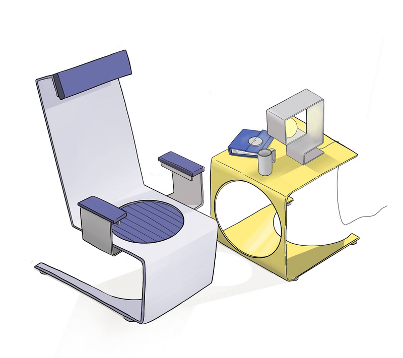
-
Great work. This is awesome.
-
@robbery thanks

-
@PieterVanDerBeek I’m in love with your font haha. I need to add to my inventory in that department and I think I’ll start by stealing this one haha.
I assumed that since you were doing the vehicle design course that you had completed the prop design course already? Maybe you’re going at them in reverse or just a different order. I was looking forward to bringing a crew with me to the Character Design section of the Curriculum.
Have fun with the props! They were a bit challenging for me but beneficial for sure.
-
@granger49 Really nice! Love the slickness and thin materials with the punched-out shapes! :-]
-
@DaveLeekArt I finished my prop designs a while ago. Currently still occupied with the vehicle design class – going slow but steady. A little too early for me to start with character design already, but please go ahead, and I'll try and catch up! :-]
(FYI, the font is loosely based on a classic serif, Bodoni if I remember correctly...)
-
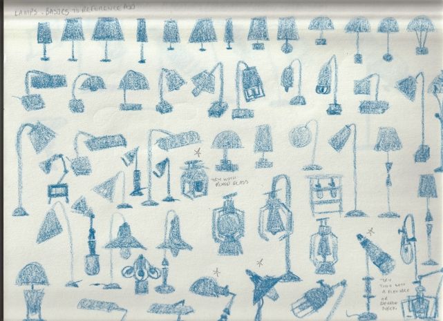
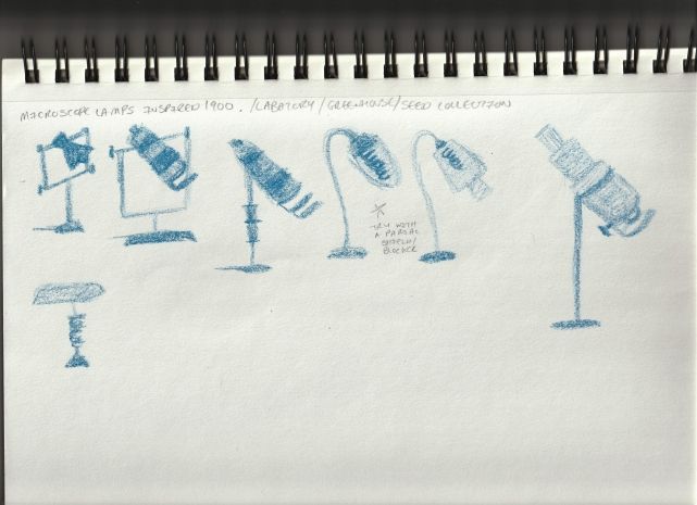
Prop Class finally started. So this collection will be around 1900s inspired but I still need to simplify it for children's picture books, which puzzles me a bit. But anyways,
-
Feedback requested!
I noticed my first step silhouettes had a bit more detail so I wasn't sure if I had actually made the second step thumbnail sketches with a few of them. So I added more detail and now I am unsure if this second step turned more into the third step.
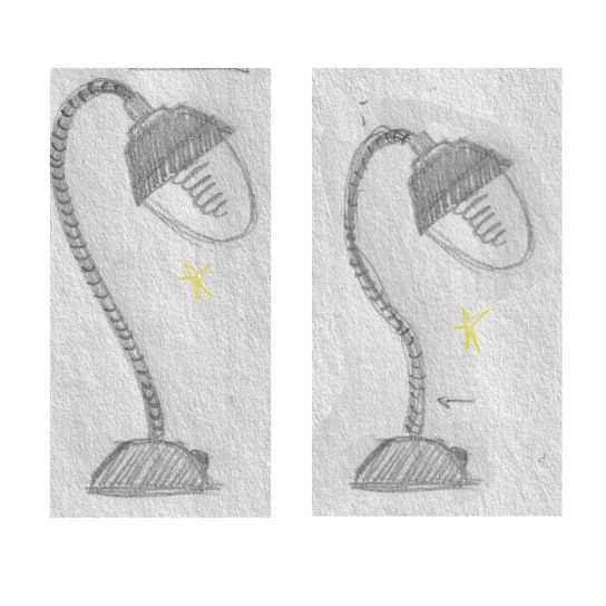
Also I have a question for step 3 detailed sketch -I am working more with shape and less with outlines (lines -like comic/ Jake's style). Should I still follow Jake and make line art detailed sketch or stick to shape detailed sketch like below and let me know if I need to go deeper for this step 3??? Also I am trying to simplify my shapes to keep them in a children's picture book style that I like.
-
I'm not sure if I remember all steps correctly, but I understand the dilemma – whether to go for a more comic-style render or to digitally paint the shapes with less emphasis on line work.
I think the gist of this assignment is in creating a set of props that have an obvious purpose / origin (who made it, where would you find it, how / when was it made, etc). I would choose a (rendering) style that fits you and/or the context for your lamp. :-]