March Contest finished a little later than I wanted
-
I got started too late to get my entry in for the contest. But I wanted to share it for accountability and consistency.
I’m back in the saddle again after crazy times...but with renewed desire and enthusiasm.
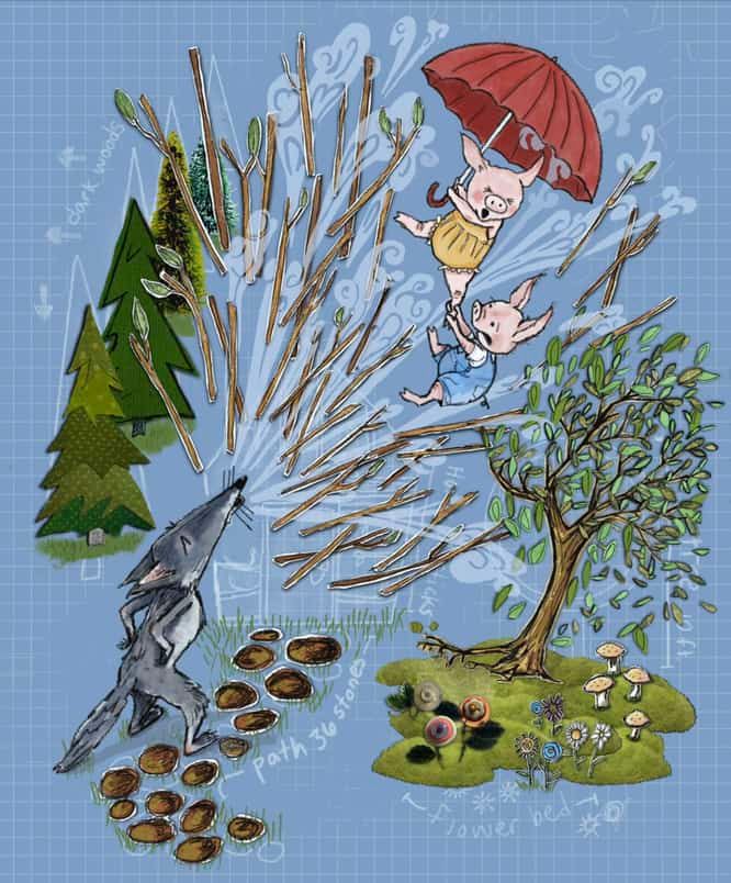
My concept was a take on the three little pigs. I wanted it to look like the house was made on top of the blueprints. The Wolf comes and blows the house “right off the Map.” I attempted a collage style with paper cut outs. I love the work of Melissa Sweet and others like her. (Not that my stuff looks like hers). But one can aspire!
I like the image ok but my problem is I fee like it is too “tight”. Would love for the to be more loose and free. I know these terms are personal to everyone. Any tips for loosening up?
Does it read as a blueprint and the pigs and their stick house being blown off? Does the paper cut out / collage effect look right? Any other criticism is welcome and Appreciated!

-
Hi @JennyJones, what a great design. I can see the blue print and it reads clearly. Good comment on accountability!
-
@Jeremy-Ross Thanks so much. I am trying to use this quarantine time to level up. Or at least just to try to be consistent.
-
I think this is so clever! I think my main critique is that there are a ton of small shapes everywhere and the image is getting a bit cluttered. I would consider unifying the shape of the tree- and possibly the path so they are solidly blocked out, but with the collage elements on top. I think it would help keep our eye on what's going on in the center. Another random idea might be to keep some of the sticks at the base of the house with some sticks flying off of it and maybe clearing up the center of the image a little so we can see the blue print of the house better.
Take my comments with a grain of salt. This is a super fun idea.
-
This is a really cool concept! I think Tessa's given really good feedback.
I would like to add that maybe you can try having some of the sticks go beyond the blueprint background (into the white space). It'll emphasise the idea of "right of the map".
-
@TessaW and @Neha-Rawat thank you for the input. I was concerned about there being a bit too much clutter too. I guess I could ease back on some of the elements and add a bit more focus on the main action. I want to add the piece (tweaked perhaps) to my portfolio along with a few others in the little pigs storyline. I want to be able to show the progression of a story and sustain a character. But I could reserve some of the elements I included in this illustration and tell pieces of the story or concept in additional illustrations. I really do like the concept with the blueprints. But putting it all together has proved a little daunting for composition.
I’m going to take a small break from it and work on a robot piece for this month. But then I am going to do some tweaks. The pigs and I need some time apart

-
This post is deleted! -

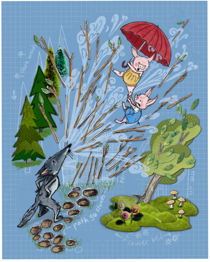
Well I got to thinking about the changes I could make to the image and I just went ahead and did it. I love it now and am looking forward to making the next pigs images.
Thanks again to those who helped me come up with a few changes. I intensified the color in the blue pig, took out several sticks and rearranged a few to be coming ground. I added one breaking the grid above the umbrella. I completely changed the tree and took away the visual clutter there. I also took away the extra flowers from the flower bed and toned down the stepping stones’ color. Fixed a few of the shadows too. Now it is more like what I was hoping for.