Finished Children's Book-- Looking for Critique and Guidance
-
Hello SVS!
It has been a long time since I've posted here-- even just in the comments. I'm glad to be back!
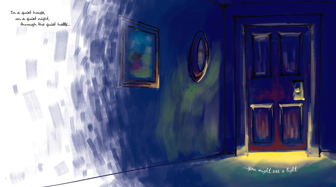
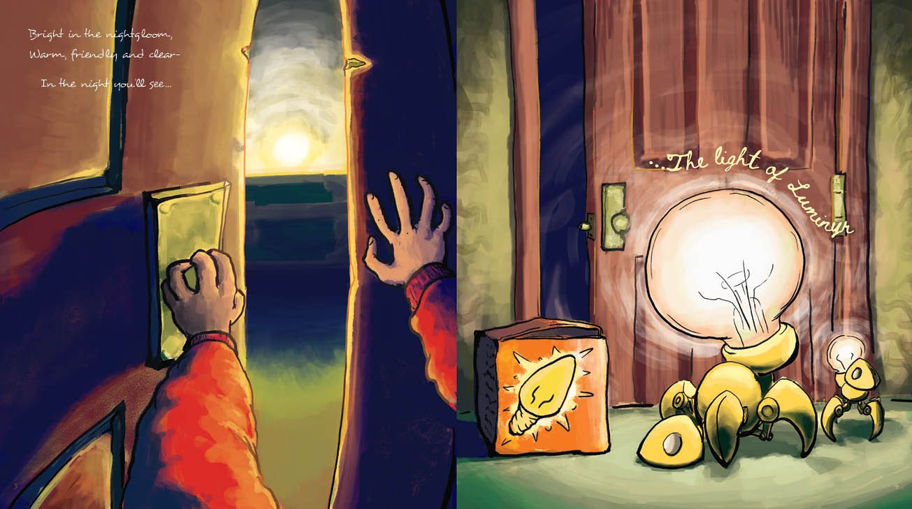
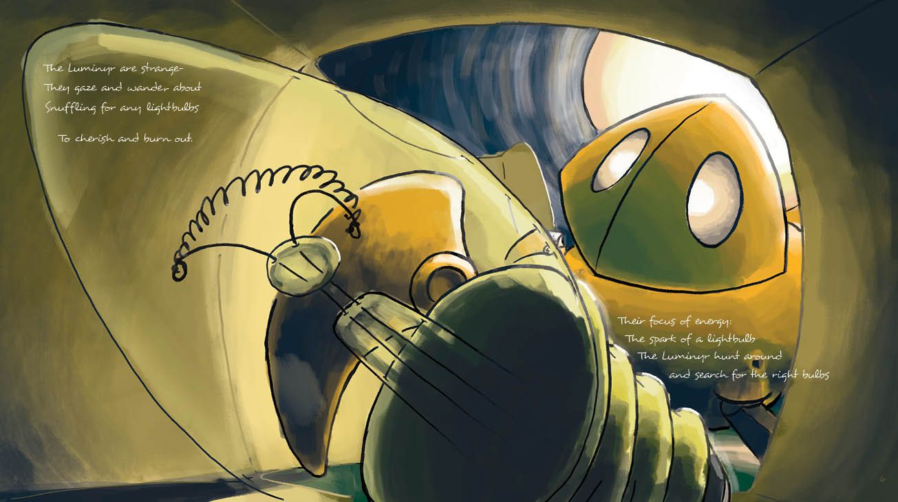
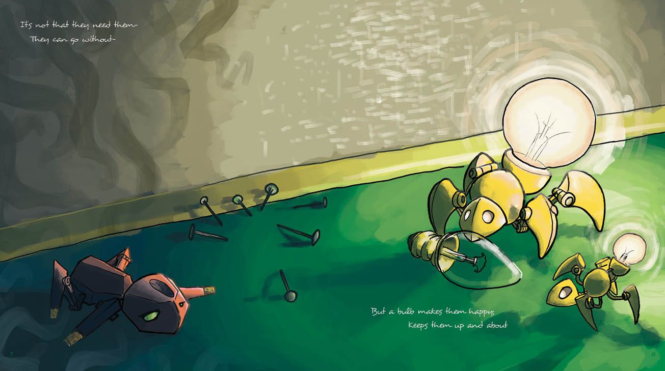
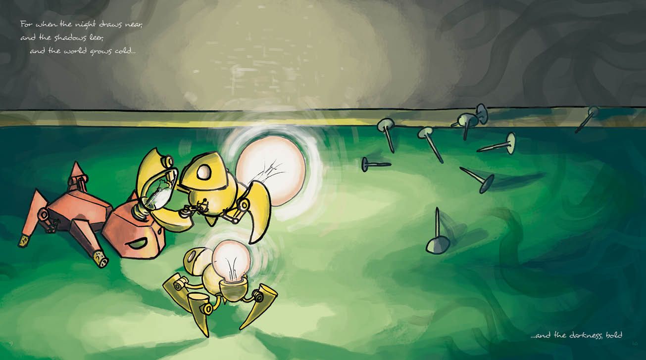
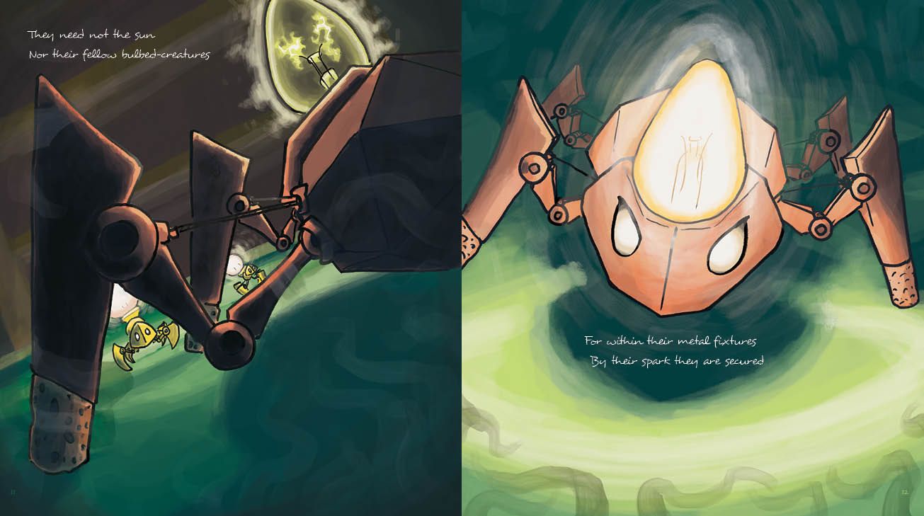
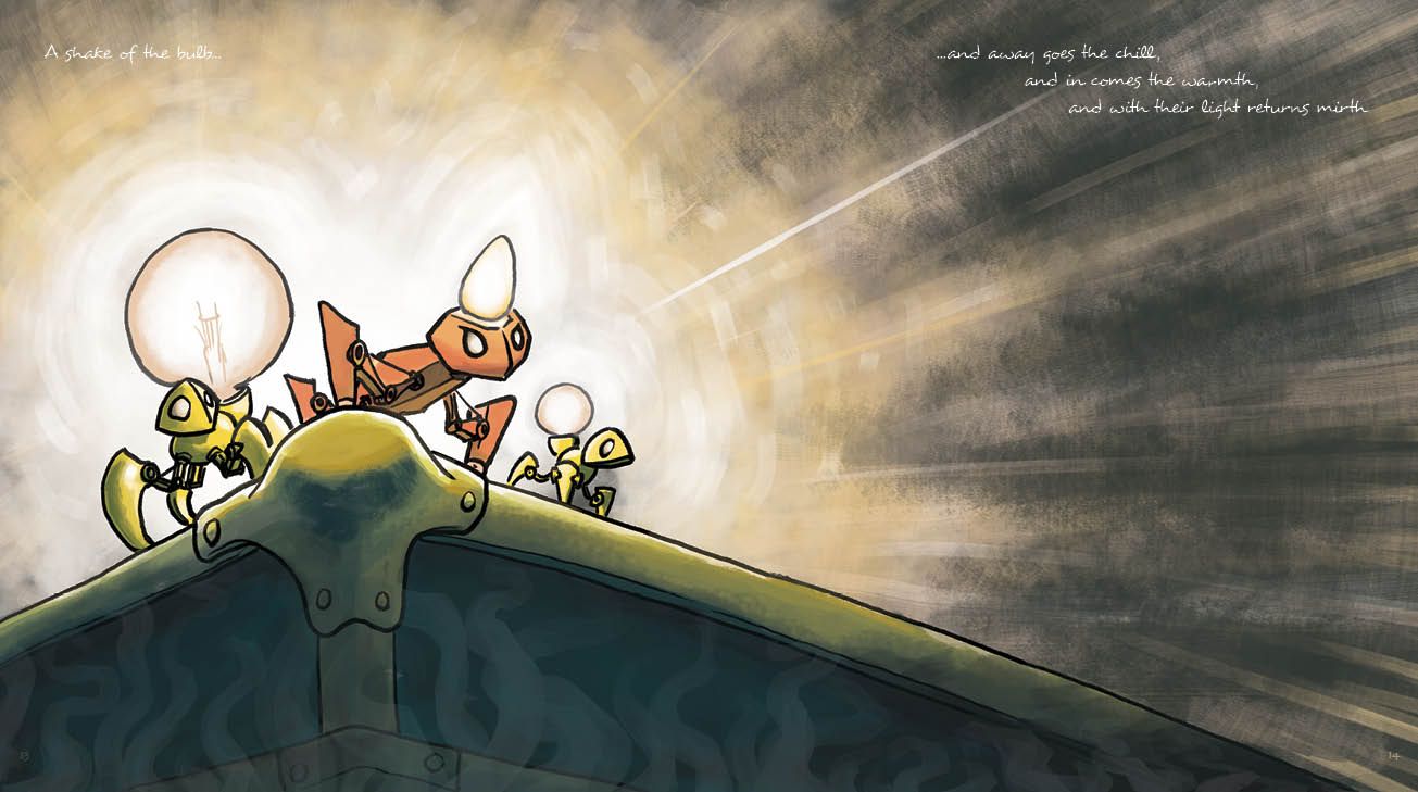
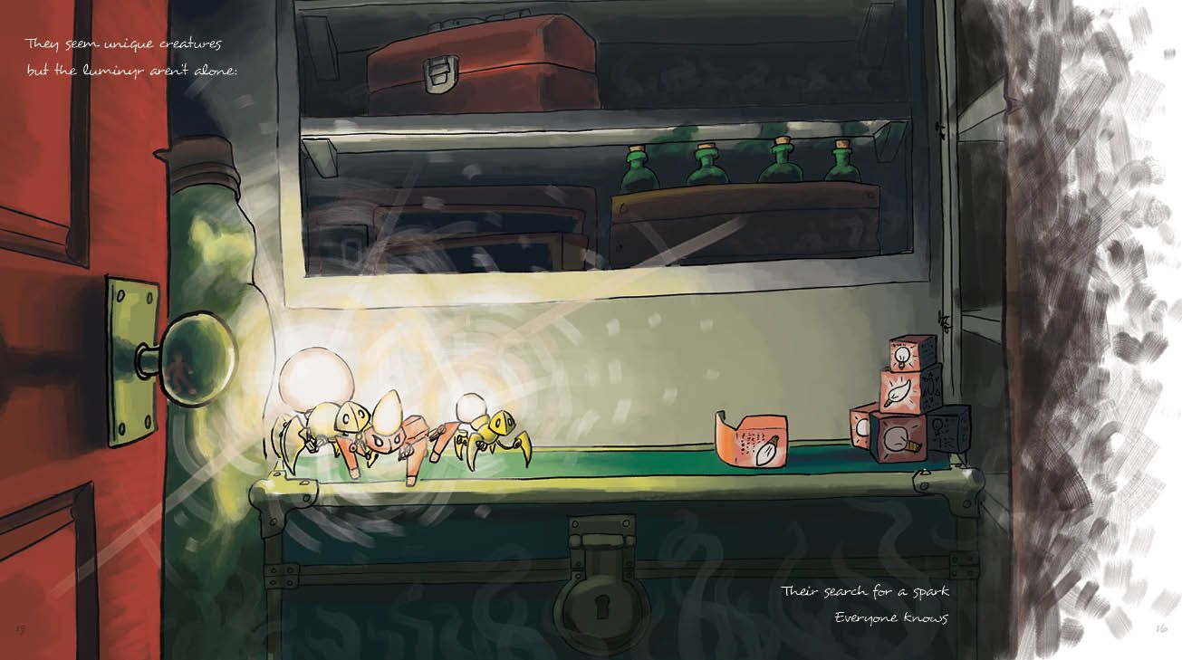
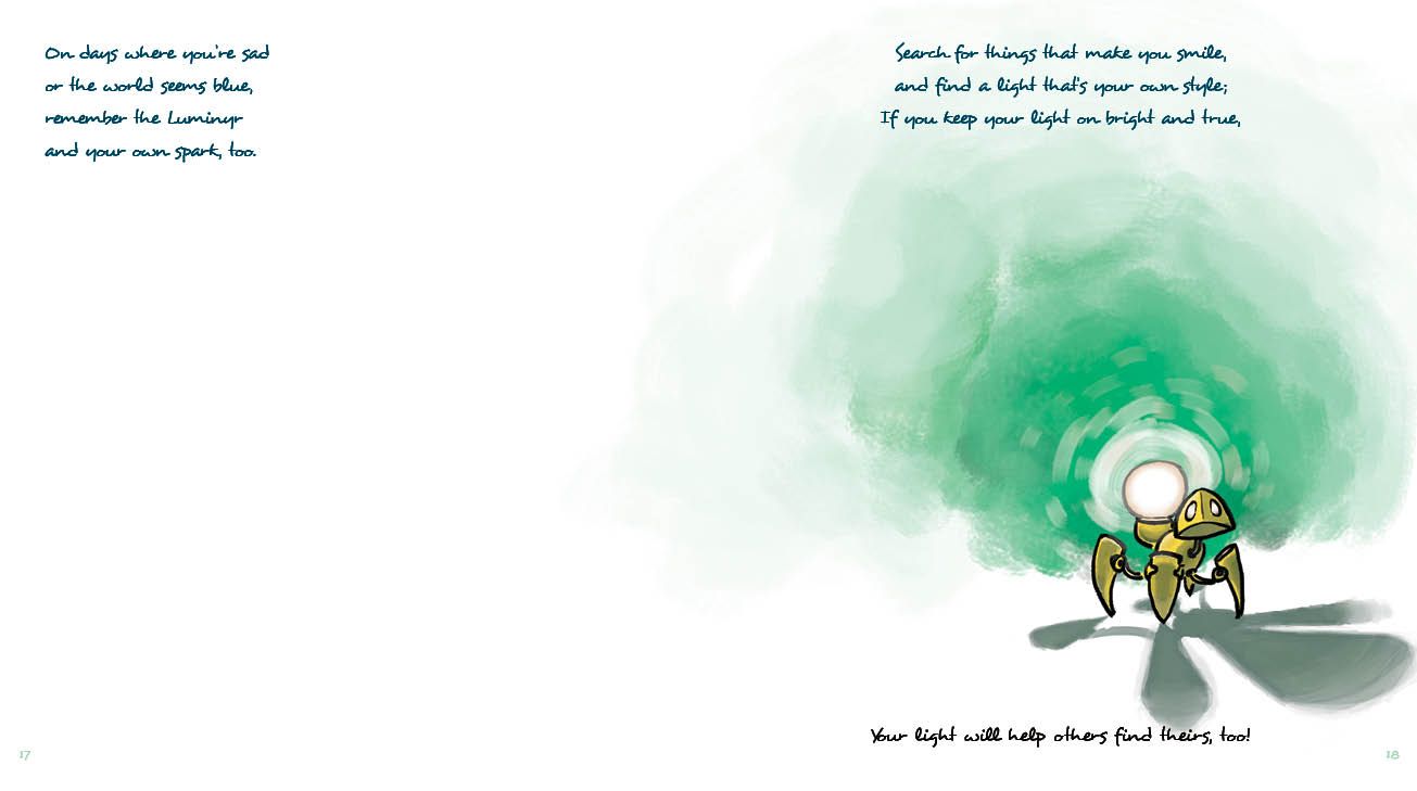
I come looking for what's in the post's title: Crit and advice/guidance. Critique because I don't know how else to grow, and I could use more constructive feedback. Advice and guidance... because I need to figure out how to push the idea. A little background: For an Advanced Illustration Class in my college's program this past fall, us students were tasked with creating and bringing to print a publication. It could have been anything. I had one classmate do postcards themed around tea, and another talking about his own journey with depression. I chose to do a children's story about creatures that I've brought to the forum before: Luminyr. I hammered at the project and it came together as fast as I could get it done-- just over 100 hours over the course of 6 weeks. Since then I've held a kickstarter, distributed a small number of copies, and looked in to printing larger runs to distribute around the place I hope to live soon.
For now, that's enough of the background. Take a look-- let me know what you think!
Pax
-
I think this might have gotten lost in the time of posting/hubbub of the forum (bump)
-
Hey! This is unfortunately going to be a short critique, because I have to admit...I couldn't read the story.

I struggled with how tiny the text is, and how difficult it can be to read cursive/handwritten fonts on-screen. My vision's not the best, so that's on me...
...but you also have to remember that your audience is NOT going to be skilled with reading handwritten fonts like this one. Depending on what the age range that you're targeting, you will need:
- larger typesetting
- with more legible letterforms
- with kerning (space between the letters) that makes sure that letterforms are not getting visually mixed up with each other.
With larger type, you may have to rethink where the type happens on each page, so it's not crowding the edge of the layout.
I hope this helps you think about your story a little more! I'd be interested to hear what age range you're targeting this book at. I feel that forum members will likely have much more targeted advice if they knew who you were imagining your readers will be.
-
@Tracy-McCusker Thank you so much for your feedback. It means a lot that you've taken the time to put it together-- thank you, again
")
Let me give you some details, since it seems I posted to few of them:
The book has been printed at 18x10 per spread 9x10 per page) and has a ~24pt handwritten typeface for the majority of the book, but a cursive typeface for some of the key phrases. These were selected for the older and organic ethos that handwritten and cursive typefaces carry. Originally, the book was entirely set with the cursive, but I moved to the handwritten after getting this same feedbackAs for the target range, I was a bit out of my depth from the start, as I'm not sure what to expect from different children of different ages. Let's say it's targeted at kids that can read well, but that also have begun to understand significant meaning in the text-- so maybe 3rd grade on up?
These things in mind, I'll look through my digital typekit again to see if I can drudge up something more legible. Thank you again for the feedback!
Pax
-
@Jabbernewt hi! My biggest critique with this piece is the font style and size. Your work will do better if you use a bigger and more simple font. Also, given you book’s subject matter, I think it would do well as a middle grade book.
Portfolio: nyrrylcadiz.com
Instagram: https://www.instagram.com/nyrryl_cadiz/
YouTube: https://www.youtube.com/channel/UCbJCF1Im8ZO7hpGWTKOJMuA -
@Nyrryl-Cadiz Thank you for the feedback!
I'm glad to get a solid read on the sort of market the book should be marketed towards-- and also that the typeface just needs to change
I'll try to get on that in the next few days and post about the typefaces I check out.Thanks again for the guidance!