Introduction to prop design Assignments
-
I'm about to dive into the final assignment, if anyone has some tips or observations, now they'll be greatly appreciated

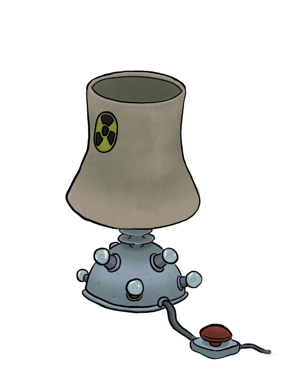
The theme I went with was the word "Nuclear" and in the end I decided to go for some sort of lamp that looks like it's powered with nuclear energy (at least to me lol)
I didn't do the side view for obious reasons

-
@Adriano I really like the bottom portion with the light bulbs and the red button -catchy. If the head of the lamp look more like a nuclear missile silo that could add a dimension esp since you have that red button -even have a sticker that says don't press the button -as a joke/teaser/temptation.
Editted: sorry just noted you specified "nuclear energy" not weapon -in my defence you had a red button -nothing more needs to be said. Also in my defence you had mushroom tree like lamps; my mind wandered.
Theme is cool!

-
I think it's a fun design! I don't have any critiques on the design itself, I think you've done a great job playing with materials, shapes, and large/medium/small shapes. I have a couple of comments on rendering and perspective:
-
I think you could play up the rendering of the materials slightly more. Pop a highlight on the red button and put some scratches or stains on the nuclear stack.
-
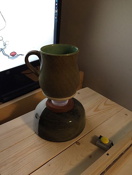
It feels like the perspective is a bit off when you compare how much of the top ellipse we see versus what we see of the base and the button. It feels like maybe we should see the ellipse be narrower or go the opposite and see more of the top of the base and button.

-
-
Thank you both for the feedback!
@Heather-Boyd : I wasn't very sure of where to go at the beginning, I just had the word "nuclear" in my head, so the first thing that popped in my head was, of course, the bomb. Also, in case someone's is wondering what's going on with the 4th silhouette, well...it's a radioactive waste barrel with a lamp head on top

@TessaW : Wow, I really appreciate you taking the time to take a reference photo to help me out.
Yes, the perspective is way off, I thought I could already skip drawing perspective lines for such a small object, but I guess I was wrong lol.
Also, I agree about the top of the lamp looking a bit flat, definitely needs more details on it. I will correct it or completely redraw it in the final assignment, when I put all the props together. -
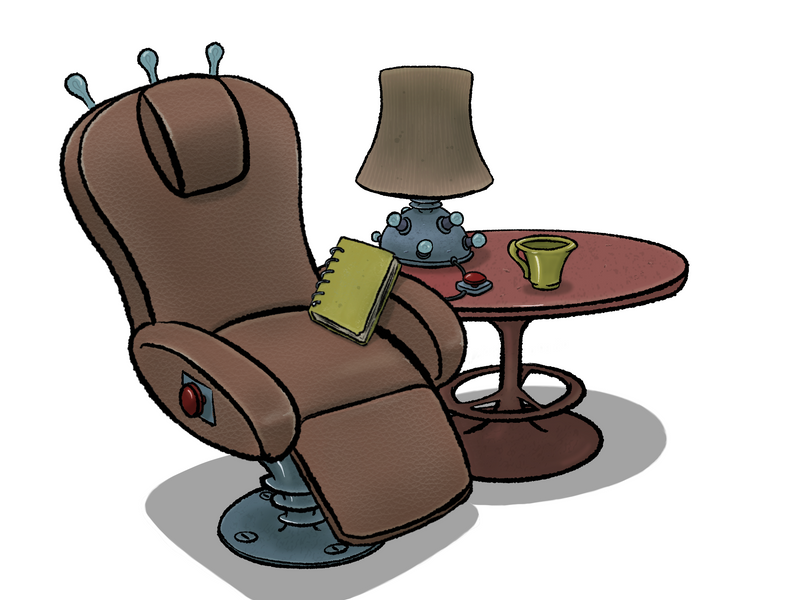
I have finally finished the last assignment.
I think some props could benefit of some more texture, especially the armchair (it's supposed to be one of those massage armchairs), but I was having a hard time finding ways to make the scartches and wrinkles look natural, so in the end I used a textured leather-like brush
Overall I think I'm satysfied for this first attempt at prop designing and rendering even though I think it can be greatly improved, but I first need to experiment some more with the use of lines and ways to render.