Portfolio/Website critique Reqeust
-
Hello dear SVS fellow illustrators, I am preparing my website/portfolio before submitting to agents. I am so NOT confident at this point and not sure if I am ready to apply for agent. Feedback/Advice are definitely welcome. If you feel my portfolio is not ready, please feel to let me know too.
Target market -- mainly PB and some MG.
Any suggestion counts, whether it is style, characters, topics I covered, a specific piece, or flow of the website, etc. I also wonder if my style is consistent enough, there are both traditional illustrations and digital one, and I often feel some pieces do not blend in quite well.
Thanks a lot. Link in my Bio

-
Hi, I just took a look at your website and I think it looks great! The style seems very consistent to me and it's very easy to navigate. The only thing I would suggest is that some of the thumbnails seem to be cropped a bit weird. Like for some of them, it's cropped in the center of a spread where there's a lot of empty space. If you can, maybe try making the thumbnail centered on the focal point of the image so they can see it right away before they click to see the full image. Other than that, it's looking good and I think you're ready to send it off to agents.
 Good luck!
 -
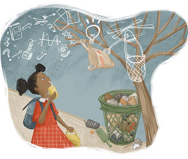
Overall I think it looks really professional and if you submit to agents you'll probably get good feedback. For me, the one image that sticks out is this one.

The way that texture is handled is not as strong as your other images and the style looks a little less developed. It is the only one that immediately jumped out to me as apparently digital. If it were me I would take this one out. I noticed that it is the only image you have including a darker skinned POC. You have a mix of white/european/american and chinese but you may want to consider doing an image or two that have more variation in skin tone and body type.
I also second the comment on the thumbnail cropping - change that if you are able. On the first image the boy's head is being chopped off and in the second to last the girl's foot is cropped off.
-
@Melanie-Ortins Thank you! I totally did not noticed thumbnails were off. I have changed it to full image thumbnails and no head is cropped now!
-
@StudioLooong Thank you! Good point! This one comes from a book project that I only had one month to work on, so the style is a little different. I'll work on including more brown POC pieces and replace this image soon.
-
@idid Looks good! Yeah, I think it works a lot better with full image thumbnails
-
Hi @idid, what a timely post!
https://forum.svslearn.com/topic/8942/websites-and-online-portfoliosFor what it’s worth, your work looks amazing! Go for it!
-
@Jeremy-Ross Yeah! thank you! what a timely post, will absolutely check it out.
-
This post is deleted!