Newbie critique
-
Hi All,
I've just joined SVS and this is my first post. I haven't really done any illustrating before - I'm a graphic designer and I also do fine art in my spare time. I was recently asked to illustrate a children's Christmas book for Kindle which I found quite a daunting prospect as I never considered myself any good at drawing characters or perspective. But since making a start on the book I'm really getting into illustrating now and already the couple of SVS videos I have watched have helped.
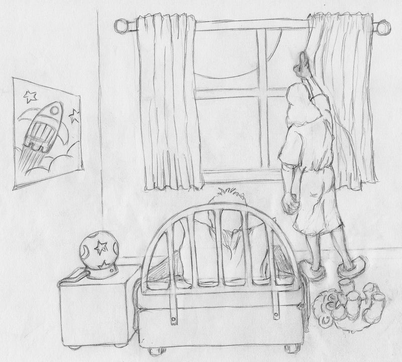
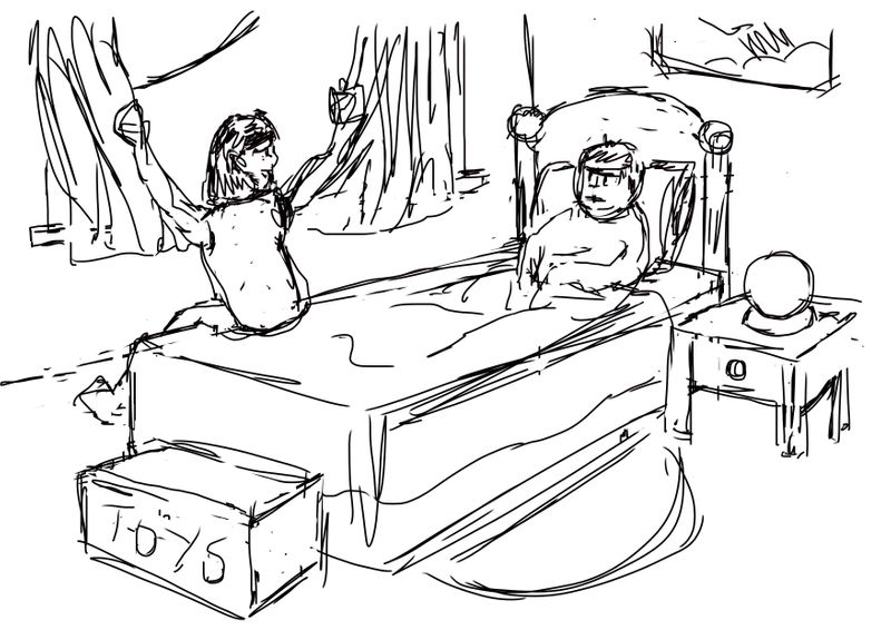
So I thought I would give the monthly challenge a go and enter the Nightfall competition. This illustration is part of a rhyming story about a boy who is poorly and his mum is taking care of him.
"If you have a good sleep you will feel better soon."
Then she pulled tight the curtains and shut out the moon.Please let me know your thoughts on my initial sketch - I'm not sure if the perspective looks correct - the idea was to zoom into the room more and have the bed larger but I felt I had to complete the bedroom furniture to get it looking right. Thanks for looking!
-
Hi Lisa!
Lovely start and best of luck with the childrens Christmas book, I know how daunting a project like that can be.I can see that you've gone for a 1 point perspective and whilst the majority of your objects look spot on I think the bed could do with a tweak. I've done a quick draw over to show what I mean. It's mainly the left hand side of the bed:
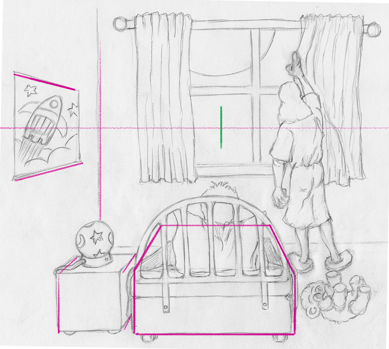
Also another option that I think might be worth trying is to have a go at a different viewpoint. Maybe a side view of the bed with the window behind, the mother leaning over and closing the curtain. This would allow more of a focus on the both the characters and emphasize their interaction. At the moment the child is getting a it lost behind the headboard/railings. Just a thought

I look forward to seeing your progress.
James
-
@Lisa-Pickard I feel like this composition/angle is just a bad choice to represent this scene. The bed and night table would likely be propped against the wall, which means our point of view is through an invisible wall. This is obviously not a point of view we are used to seeing, so it feels very odd. We also can't see the little boy at all. I would suggest doing thumbnails first (fast mini sketches the size of your thumb) to figure out which composition will work best first, before putting in this much work. Like how about if you turn the bed 90 degrees and prop it against the wall with the rocket poster instead? This way we see the boy and the angle feels less alien. I would also suggest having the mom turn her head towards the boy as she closes the curtain so we can see her face too. We're not seeing thr faces of either characters right now so it's very hard to grab on to anything. The mom is also very broad shouldered and reads as a man right now (I thought it was a man before reading the text).
-
One thing that helps is to look at references for that environment. Otherwise your drawing is good. That little bear on the floor is very qute! If you can change the view, so we ca see the faces of the characters and add expression to their faces that would really help!
-
Welcome Lisa! Congratulations on your book project.
I agree with the others. I think a different angle of the bed and the kid would make for a stronger image. I initially thought the mom was a man, so maybe some character exploration might be in order.
My suggestion would be to look at some reference of illustrations set in kid's bedrooms. Maybe type in "Illustration bedtime" or something similar into pinterest, and see different options of viewpoints other illustrators have chosen. Pinterest is good at bringing up focused, visually similar results, and I find it very helpful in searching for art reference. Take layout and perspective cues from the illustration reference and do several rough thumbnails (maybe 2-3 inches on longest side). That way you get plenty of ideas to choose from without a lot of drawing investment.
-
Hi Lisa, I like the moon and its size! So my thought is that drawing reflections of the Mom and son's faces onto the window panes, could keep the room arrangement as is, as it provides the facial expressions /character identities at the same time and would involve them intimately with the moon. And it maintains your unique positioning of the reader's viewing point, which I like.
-
Thanks everyone for all your input - I still have a lot to learn! Lots to think about so I will go away and do some more sketching. Not sure why I didn't do a few thumbnails first - I always start my paintings off that way. Be back soon with my new ideas

-
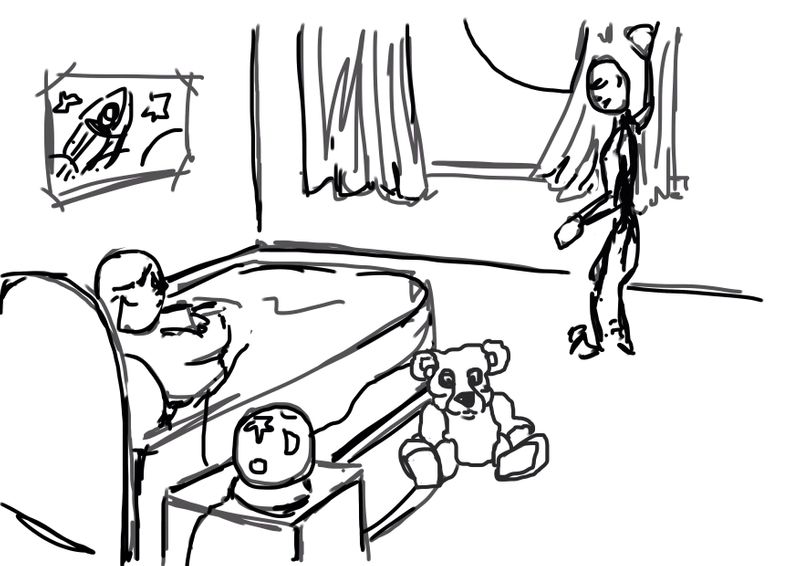
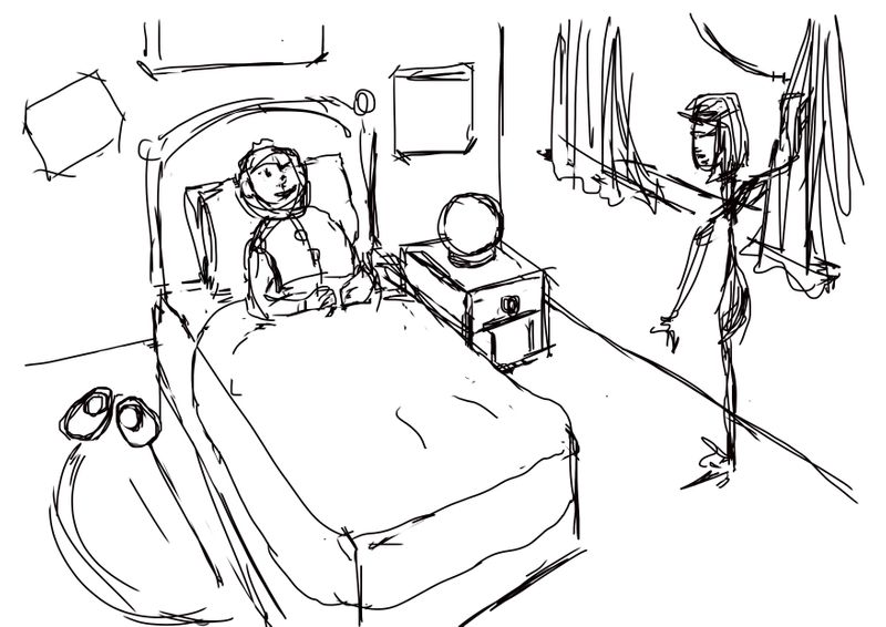
So here are my latest efforts - less overthinking and more doing! The first one is more what I was trying to achieve in the beginning, the second one looking down into the room and the third coming from another angle. Appreciate your feedback then I can work on my figures and how I'm going to tackle the final illustration technique

-
@Lisa-Pickard I think these are much improved! Great job. I think all of them work well and I'd just choose your fav. I'd just be cautious and make sure your teddy bear doesn't steal the show. Also, in #2, I think the mom's pose could be played with a bit. It's fun as is, but might work better if her body is facing toward the boy, rather than outward.
Again, great job!