The BFG cover - critique very much appreciated
-
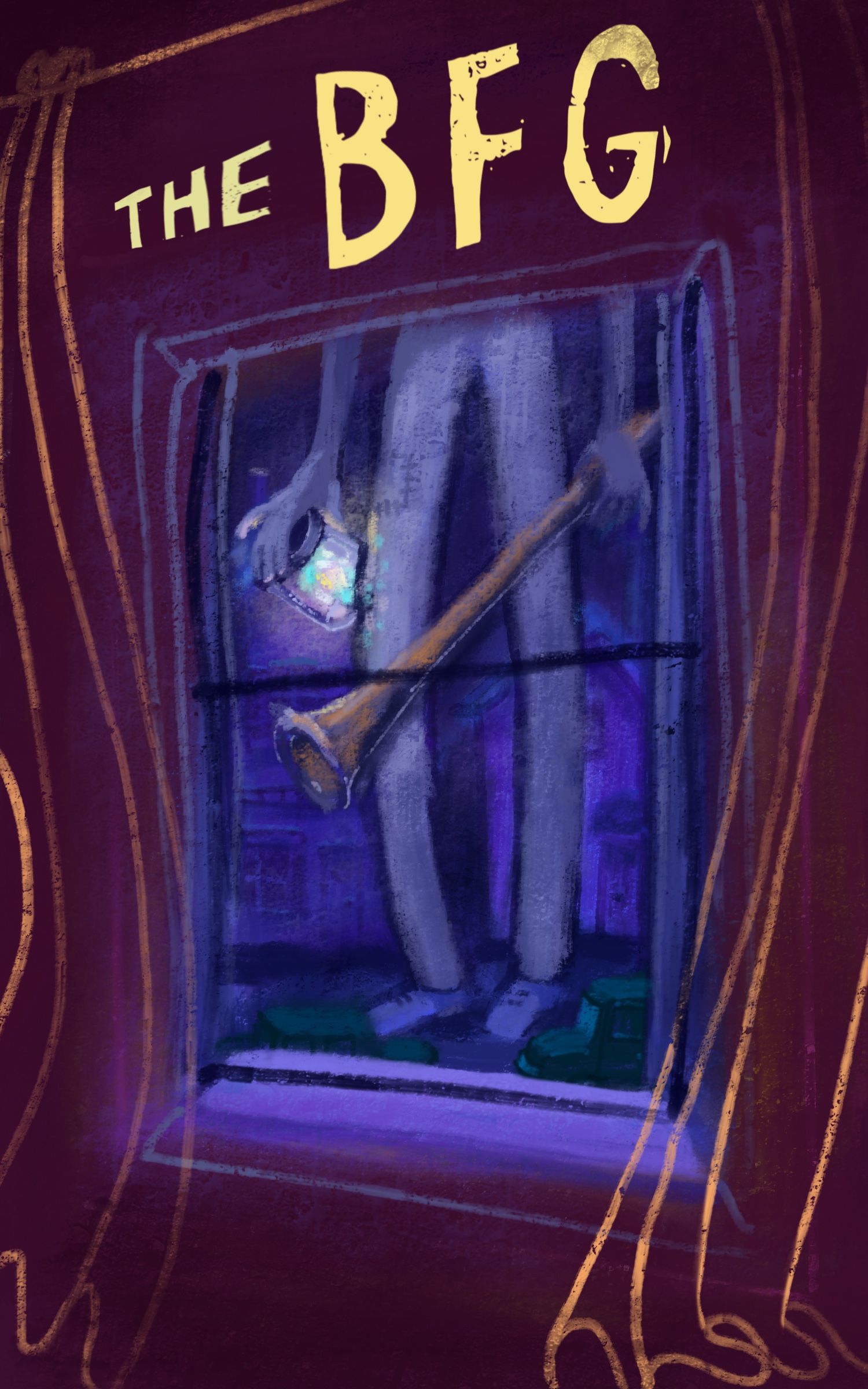
Hello SVS amigos, I’m experimenting with digital styles, and I wanted to try something more loose and textured. I think what I have so far looks really “digital” though. I’d prefer the end product to not look so strikingly computer generated.
Do you have advice about composition for this book cover? I plan to add Sophie in the foreground at the bottom.
Also, I find I lean towards dark colors. Are these colors working, or is it too dark?
Thank you for the help!
-
The first quick things that come to mind when I see this piece, critique wise is
-
I'm kind of wanting to see a slight bottom strip of his shirt. It feels slightly like a tangent to me, as is.
-
I'm wondering if you should darken the foreground even more. The foreground is pretty light and saturated for what's going on outside the window and it doesn't really allow for the glow of the moonlight or the jar to really show off it's dreamy and mysterious quality. If it becomes too dark overall, I'd err on the side of lightening what's outside the window, rather than the wall of the foreground.
This is a great start! Can't wait to see what you do with the curtains and see how you incorporate Sophie into the comp.
-
-
I love working with dark colors too! One tip that works is to check the values of the image. Just convert the piece to greyscale and see if it still looks distinguishable and easy to read.
Ideally, if you have multiple dark objects/areas, you'd still want each to be distinct.I did a quick value check for your piece and right now the walls and the view outside are all the same value. So nothing is popping.
I agree with @TessaW solution to increase the contrast by darkening the walls and lightening the view outside.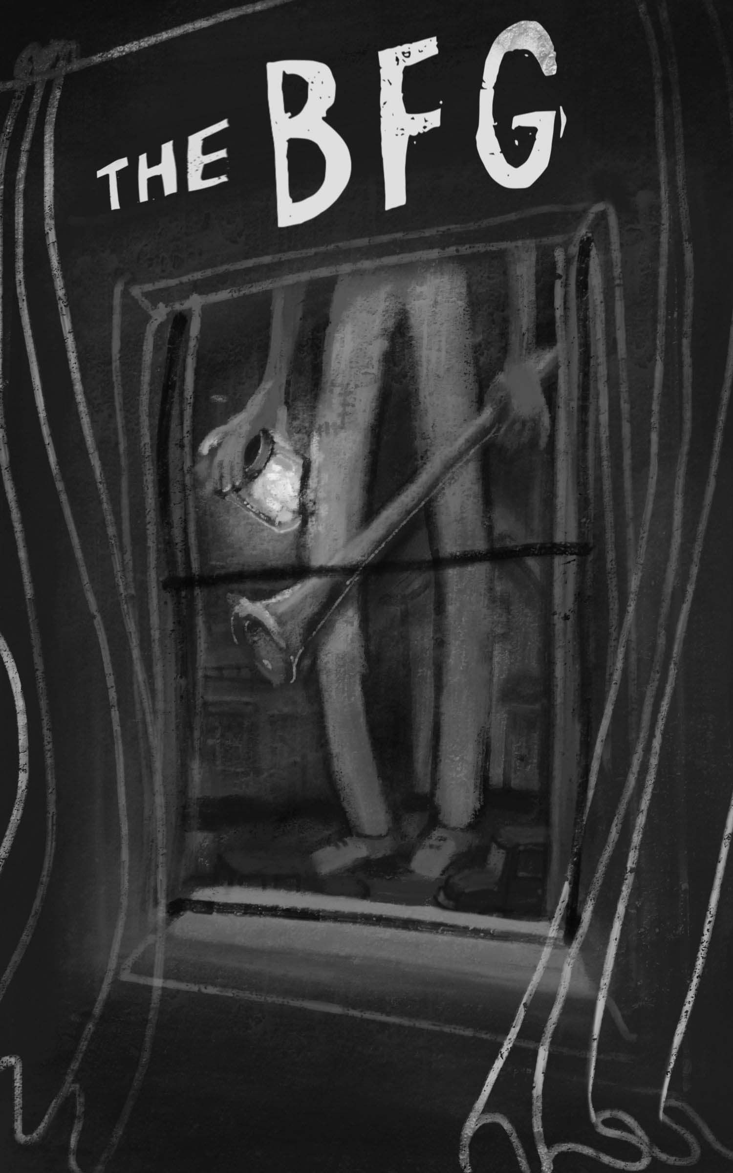
-
@KathrynAdebayo I love the book BFG. If you want to make the digital work have a more traditional feel, @Lee-White has done a wonderful texture tutorial on youtube. I think his techniques work both with photoshop or other programs such as procreate.
https://www.youtube.com/watch?v=N7DedDc7aU0&t=11sHave fun
")
-
@KathrynAdebayo Nice! I've been tempted to do some Mr. Dahl books for fun, but Quentin Blake is just so iconic.
I actually don't get an instant digital vibe from this. After a bit of hunting I could see some telltale signs, but it wasn't an 'oof that's digital' moment or anything.