Nightfall WIP Feedback Request
-
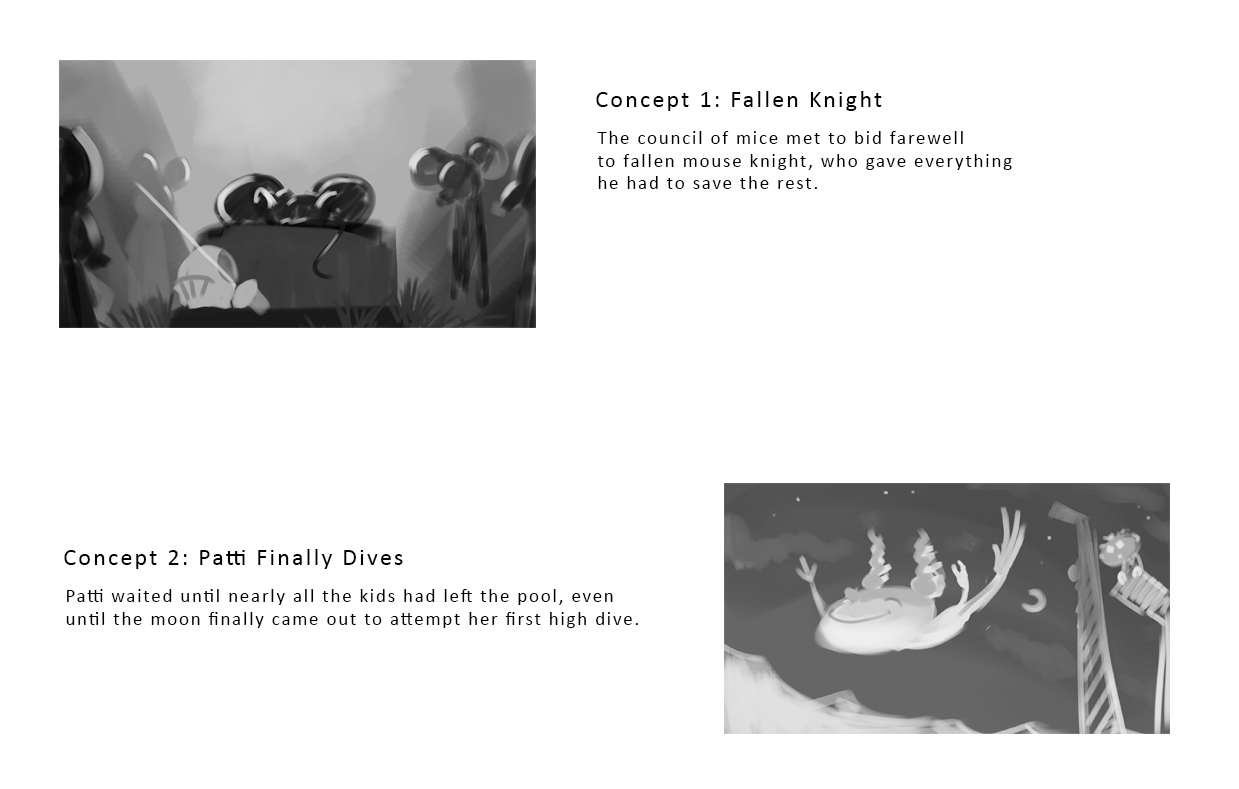
Hi everyone! Man, this monthly contest was drawing the biggest blank for me. I think I finally had some ideas today that I felt good about and put some roughs together. Two totally different directions - one a bit more whimsical and one a bit more heavy. Does one seem to work better than the other at a glance?
-
@jdubz I love the knight idea but the jumping girl reads as a better composition.
-
@chrisaakins Thanks for the feedback Chris! I think you're right - its a bit more clear. Maybe I'll thumb out some of the mouse one too to see if something works for that too.
-
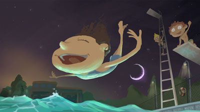
@jdubz I like concept #2! It's the easiest one to put 2 and 2 together and get 'night' and 'fall'.
-
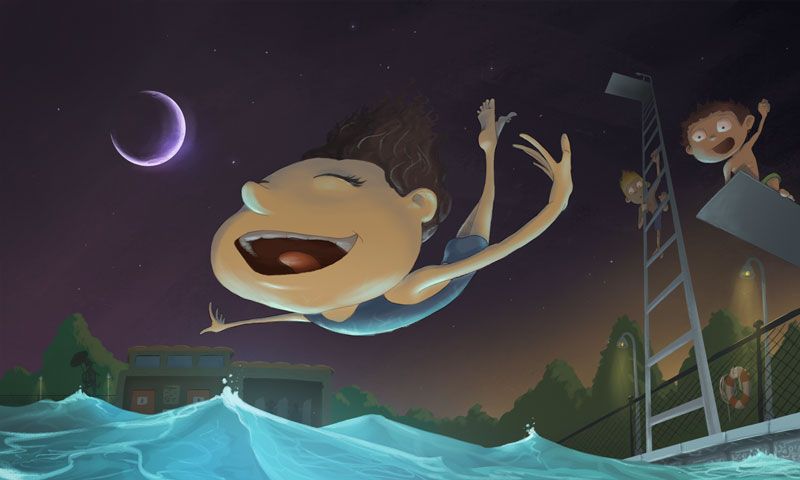
@Braden-Hallett Thanks that's good confirmation 2 for 2 on which one reads best. I've started to sketch that one out more fully. I'm getting the impression I'm going to struggle with the perspective a bit so it doesn't look wonky
")
-
Finally had some time to start working through this - here's a color thumb with some more definition and how i was kind of thinking of doing the colors.
My biggest concern is the perspective. Does it look like it's coming together? Or does it look off?? I feel like I've just looked at it too long lol.
-
I reworked the ladder a bit and adjusted some of the fence to hopefully match perspective a bit better. Does this one look better than the first one? I really want to try and get the perspective right before I move on and make the larger version or I feel like it'll be REALLY hard to fix

-
@jdubz Oh and I also swapped the sunset/moon positions because I felt like maybe it was getting too busy on the right side. I'll probably crop the left side significantly but I was hoping the moon would draw the eye back into the picture.
-
@jdubz Love the new placement of the moon! That really balanced out the composition. Great work!!!!!
-
@Kaela-McCoy Thanks for the feedback! How does the ladder look to you? Does it look natural or weird?
-
I love this perspective and the reflection of color from the water on the diver's face. Very nice!
-
@jdubz It definitely looks in perspective to me! Nothing about it really stood out to me as being off. But I suppose, realistically, it would have some handrails and a sturdy platform like the picture here! But I wouldn't want the ladder to take away from everything else in your drawing, though. Personally, I like it as-is.
-
Awesome thanks I appreciate it!
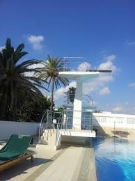
@Kaela-McCoy what's so funny is thinking back to when I was a kid how much less safe everything was back in the 80s even (at least where we lived lol). I remember the "high dive" which was probably really only maybe 12 feet but it felt so high up to us. It had no railings, just steps to the top board and there were these side-grip-like things just to hold on to before you jumped.
I'm going to try and carve some time out today to start blocking this in on the final size.
-
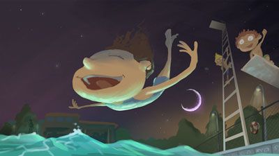
This is so fun! Brings back childhood memories of renting out the local pool for parties at night. I was a kid in the 80s/90s and I remember the design of your current diving board.
I'm wondering what a little bit of a directional splash would look like coming from either side, close to the corners? Just a little one, similar to what you have going on under the left hand.Great job!
-
@TessaW That's a good suggestion, I'll work on trying to incorporate that in the larger version.
-
@jdubz this is looking great. Her face is gonna hurt in a few minutes.
-
@chrisaakins said in Nightfall WIP Feedback Request:
Her face is gonna hurt in a few minutes.
This is true

-
Put together the final size and I'm almost there. Blocked in the colors yesterday and then worked on the lighting this morning.
I've got some clean up to do and a few more details. And then I'll try and mess with contrast and some color balance and maybe a texture for the final.
Can you guys please critique me on something specific? On the last few critiques I've got, a consistent theme is that my foreground details are a bit "ham fisted". Really not sure how to address that because I was purposely not trying to over illustrate and detract from the focal point. But it sounds like that wasn't the right approach, so I'm really trying to be intentional about not doing that and spent a lot more time on those front details.
Any feedback would be appreciated!
-
@jdubz my only concern is her hand. Her wrist almost looks broken. But I also like it because it looks like its flapping in the wind. I think it wors overall but some people may not like it.
-
@chrisaakins The one on the right you mean? I bet pivoting it to the right might solve that even if it's just a little.