Bristol Board/Hot Press/Cold Press test
-
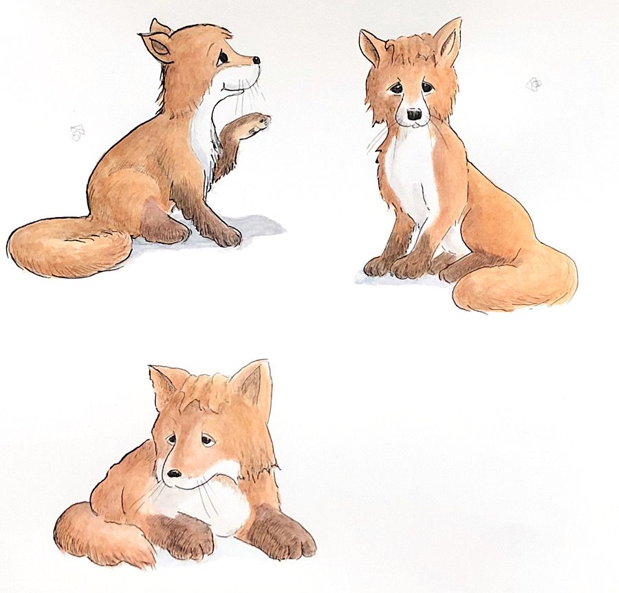
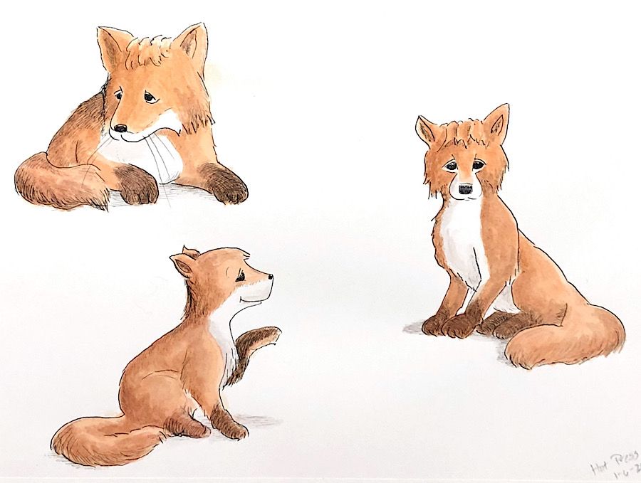
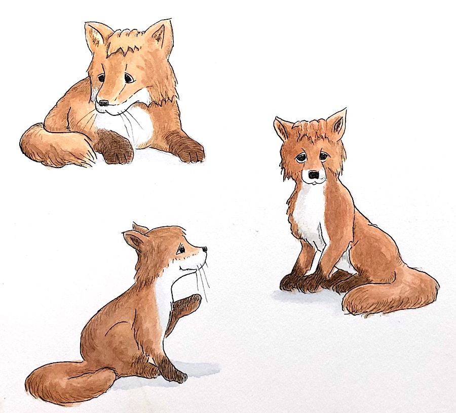
I have been working with ink and watercolor and decided to do some experimenting on which paper works best for this combination — Smooth Bristol Board, Hot Press watercolor paper, or Cold Press Watercolor paper. I did three foxes on each using dip pen for the line and Windsor and Newton pan watercolors for the paint trying to achieve as much consistency as I could between the three. (I did move one of the foxes on the Bristol Board because I wasn’t paying attention!) I took a picture of all three in the exact same lighting and then adjusted the white balance with the exact same settings to try to give a fair comparison. It isn’t the most rigorous experiment but for what it is worth, here are the results and my conclusions:
Bristol Board

Hot Press

Cold Press

-
In the pictures, the Hot Press photo is closest to the real life painting. The colors in the photo of the Bristol Board look a little more washed out than they do in real life maybe because Bristol Board is a little shinier. The colors in the photo of the Cold Press are a little darker than they are in real life. In real life, the differences between the colors in the three are not as acute though the Hot Press is slightly more brilliant.
-
The cold press watercolor painting was much darker overall before I adjusted the white balance and that’s something I have problems with all of the time when I try to photograph anything on cold press. I have managed to get better at photographing it and adjusting it but it’s definitely fussier than photographing the Hot Press.
-
Bristol Board is definitely the easiest to ink since it has virtually no tooth. Hot Press is nearly as easy. I can do ink on the cold press (and have done lots of line and wash on it) but the tooth catches the nib of the dip pen making fine lines harder, and if I did a lot of inking, I’d have to replace my nibs more often.
-
Cold Press is the easiest to paint. Both Bristol Board and Hot Press have a learning curve (and you can see some mistakes on my photos.) After some experimenting and reading, I learned that the secret with those is to first wet the area where you are going to put your wash, let the water soak in until it dries to a dull sheen, and then put your pigmented wash over that. Let the paint dry absolutely completely (to bone dry) before you add additional glazes because if it’s not absolutely dry, it will lift.
My conclusion right now is to use Hot Press for anything where the ink shares a lot of the work of the illustration. My next experiment is to import something I’ve done on Hot Press into Procreate and try putting a texture layer over it to see if it can emulate cold press. That would make the inking easier on the Hot Press without having to sacrifice the texture of the cold press.
I may be the only one who cares about any of this but I thought I’d share it anyway

-
-
Interesting comparison! Lovely foxes. Never tried Winsor Newton hot press paper before. Do you know how is it compared to other brands like Arches?
-
@demotlj thanks for putting this up. I am currently experimenting with watercolors as well.
It is so good to experiment to know what your tools can do!
-
@idid The paints are Winsor Newton but the watercolor paper is Arches. The Bristol Board is Strathmore because it happened to be what I had lying around.
-
@theprairiefox I saw your work on the light and shadow thread. When I took that course, I did it all digitally but as I was looking at what you have done, I was thinking that it would be great experience (and a lot harder) to try doing it traditionally, but I'm not sure I'm brave enough
