Critique my already-published book cover?
-
First, a little context:
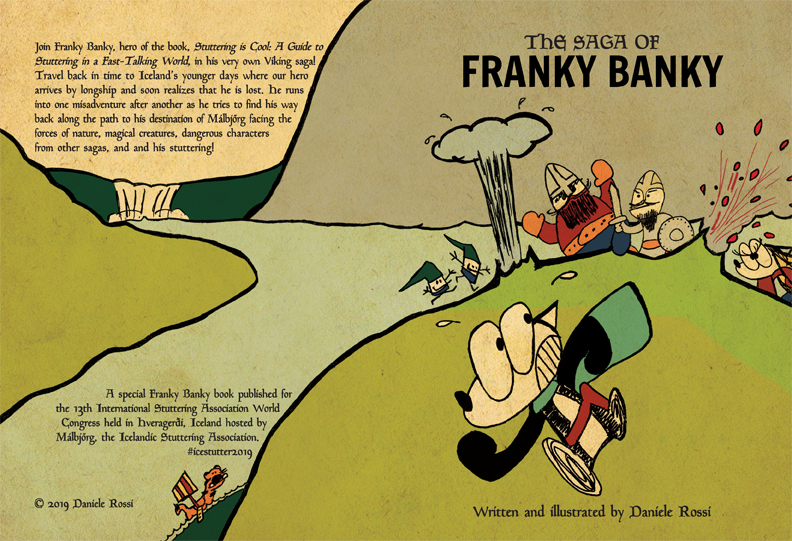
Back in April, I had an idea for a very, very, very short story to write, draw, and print in a ridiculously short amount of time. Two weeks! It was for a stuttering conference in Iceland I had attended in June (my "main" comics are about stuttering) and I had planned on printing out a few copies to hand out as a way to promote myself to speech therapists. I mentioned this idea to a friend of mine who was also the conference organizer and next thing I know, he offered to pay for printing and include it in the swag bag! The book ended up taking a month (still a ridiculous short amount of time) but I did enjoy the project.
Around that time, the 3 Point Perspective podcast had put out an episode that talked about book covers (I don't remember if it was a segment or a full episode about the topic). So I applied the new knowledge I gained into the design of the cover. Yes, in the ridiculously short amount of time and long before @Lee-White's excellent video about 50 thumbnail sketches (boy did I smack my forehead!).
Since then, I've always wondered what kind of critique/learnings I could gain if I shared the cover with on the forums. I admit, I was really self-conscious since I do like the outcome of my cover design (though I'm not too happy about the small sized characters in the background but I had a hard time fitting everything into the safe printing area) and plan to print it out and frame it as a testament to a self-imposed ridiculous timeline project of mine
") But now I figure I can only grow from critiques
But now I figure I can only grow from critiques A bit more context:
The story is a parody of Icelandic sagas and I knew that many of the attendees were coming to Iceland for the first time. My aim was to introduce Iceland, its beauty, its moss, its ever-changing weather, the sagas, and add a few (positive) stuttering jokes in there. I checked with my friends in Iceland to ensure I wasn't being culturally insensitive in the content.Since it was a parody of an Icelandic saga, I designed the book to look like a book made from 1000 years ago. Hence the subdued colours and grainy paper.
I really like the Iceland landscape and in particular the moss. Hence, the book cover being very greenish brown
Through the design, I wanted to convey a string of misadventures, mayhem, and "uh-oh" calamity.
Even though I won't be changing the design (maybe as a spare time hobby though!), I am looking to learn from critiques to improve myself for future book cover designs.
Enough text. Onto the critique! What you see, of course, is both the front (on the right) and back (on the left) cover of the book.
Thanks in advance!
-
That is awesome!
Literally the only thing I can think of to improve it is moving the text on the back cover so that it's not so close to the black outlines.
What a cool thing you've done, and will be doing!
My son has a slight stutter. Where can I find your comics?
https://www.instagram.com/febbieg/
Art isn't life, life is art.
-
It is really fun. Love your design choice on color and texture. Love your sense of character design.
I have some miner composition comments:
- I would try to push the edge of the mountain (where the smaller character stand and place of the explosion) either a bit more up or a bit more down. Right now it is almost cut in the middle, making the image calmer than it should be :-).
- the explosions are placed in a way that dividing the edge line into 3 somewhat equal parts, I will try to see if I can make them vary more.
-
@Debra-Garcia Head on over to stutteringiscool.com. I'm planning more comics in 2020! That paragraph and mountain edge got on my nerves
I even tried to reword everything in order to give it more more space but no dice. In the end, I decided to live with the "design tension" due to the self-imposed time constraint (the design was in many pieces in the Photoshop file). I'm thinking for future covers, I can design parts that are more independent with each other.@xin-li You're right. Things are too orderly and give the impression of calmness. I hadn't realized that.