Slovember Piece Changes Based on Critiques
-
I wanted to apply what I could out of what Will and Lee had said about my Slovember entry. I'd like to see if I could apply those criticisms and come out with a much better piece.
What I wrote down from the critique was:
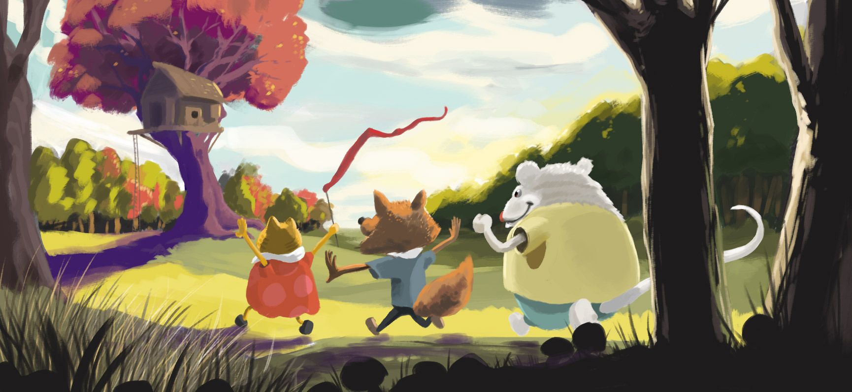
- Silhouettes were inconsistent - the mouse felt good, but the cat and the fox started to get lost. It wasn't 100% identifiable as a cat also.
- The "volume" of the tree shadow was just too loud compared to the other colors. It was drawing you past the characters.
- Needed more finishing marks across the board.
Here's the original:

-
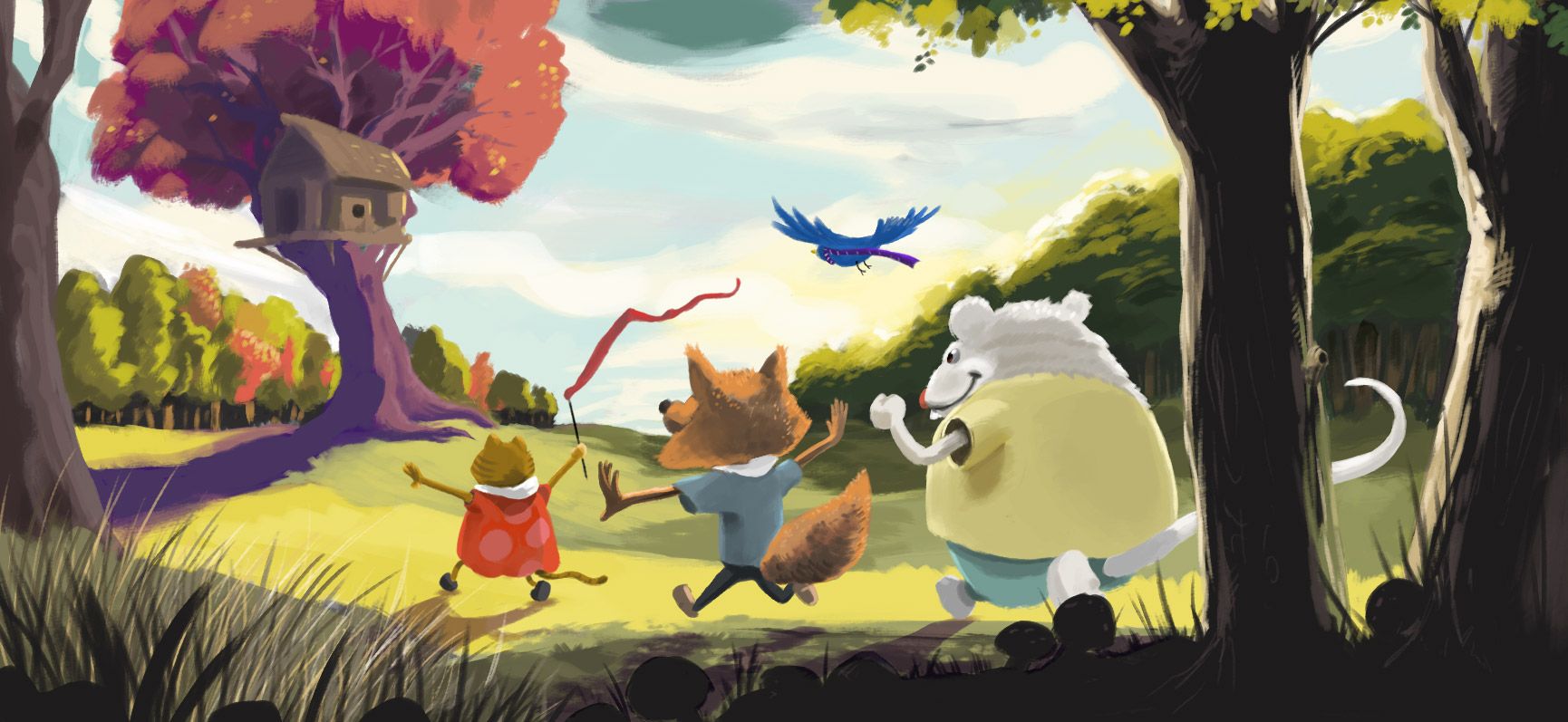
Here's what I did:
- I reworked the cat and middle characters to build what I hoped was a stronger silhouette. I also pushed the color palettes further on the characters.
- I toned down the brilliance of the tree shadow so that the lead character had more saturation. I also thought I really liked that brilliant purple, so I introduced another character - the bird - above them that could bring that purple back in with another higher saturation color that made sense
- I'm not 100% sure how to address the 3rd comment. So what I did was simplified the shapes in the distance, and added more details in the mid-and-foreground.
Here's the revised one so far:

-
Hi Josh- are you still up for critique? I have some thoughts on color, but not sure how much you've committed to it. Can I ask what you're trying to achieve with the color? What the lighting scenario/time of day you're conveying as well as what the local color of the tree with the tree house is supposed to be? Do you see trunk of that tree as being a different local color than the foreground trees?
-
I was shooting for it being a different local color originally. I was really attempting to go with brilliant more uncommon colors being dominant. Mainly I was trying to separate the main tree from the other trees as it's the one one of the clearing. The time of day was late afternoon.
-
Hi - I think it's great that you're attempting this. I do see that the animals do stand out away from the background now. You might have lost a little lighting on the cat. I liked that. I'm not sure I see a difference in the tree shading yet though. I thought they meant the shading on the tree with the treehouse, but maybe not. They didn't get my story, so I was kind of dead in the water. I have thought about ways I could improve mine, but haven't attempted it. I might now though. Thanks for the inspiration!
-
If I recall correctly, Will and Lee talked about the saturation of the colors in the tree in the distance, particularly the shadow, and I think they may have mentioned that the color of the tree trunk and the tree shadow weren't different enough given the local color of the trunk vs. the grass on the ground.
I'm enjoying seeing the changes you're making. I did a re-vamp of mine based on their comments, too. That critique was super-useful, even though it was so short.
-
@deborah-Haagenson Hmmm thanks for that - I'm seeing the loss of light on the cat also. I was afraid of losing the outline of the cat making it too bright but I'm going to revisit that.
@CosmoglotJay interesting. I'll play with that. I only remember (or maybe only wrote down) that it was too "hot" of a color, which is why I bumped it down. Not a ton because I really liked that color, but maybe I'm just trying to keep it around too much lol.