December Prompt WIP - Feedback Please!
-
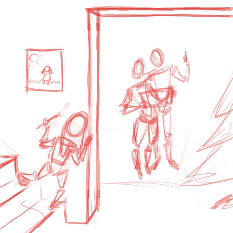
Please tell me how I can improve this composition! I'm also interested in ways to make the father character's pose more enthusiastic about what he's looking at.
But most importantly: does the narrative come through? Is it clear via the hints I've provided what the parents are looking at?
Thanks in advance!

-
@Basil-Godevenos I’m not certain what they are looking at. First thought was a mistletoe but then they had a present in their hands and I wasn’t sure. A little more of the story would help, thanks. Keep at it.
-
@Heather-Boyd Thanks Heather! You've made it clear that I need to ditch the Christmas tree from the composition. It's unnecessary and distracting.
That being said - I'm happy you thought about mistletoe - that means the parents' posture is communicating that they love each other

-
I think maybe they're looking at a piece of his artwork.
-
I think when the sketch is in such a rough stage, it’s ok to describe the scene a little more (in words) so that thr viewers can give helpful feedback. The rectangular thing could be a present, an art frame, a box of Christmas decorations, anything. It’s clear that they’re looking up and the man is point at something so a mistletoe would be a Good guess based on the Christmas tree. If the tree is removed, he could be pointing to anything.
Though it looks like the girl is holding a brush so the parents are probably looking at her painting.
What I mean to say is, the amount of detailing in the rough stage is good, but we need a little context to understand the scenario. Good luck!
-
@deborah-Haagenson The story here is that a little girl has been tucked in for the night and she sneaks downstairs to find her parents admiring a painting she's done. So yes! Artwork!
@Neha-Rawat I'm glad you noticed the brush. As you say, in the finished piece the details should clarify things a lot. The parents will be gazing down at the painting, and the father is pointing up through the ceiling to the girl's bedroom. I will probably add some words to the piece to clarify the storytelling a bit better.
-
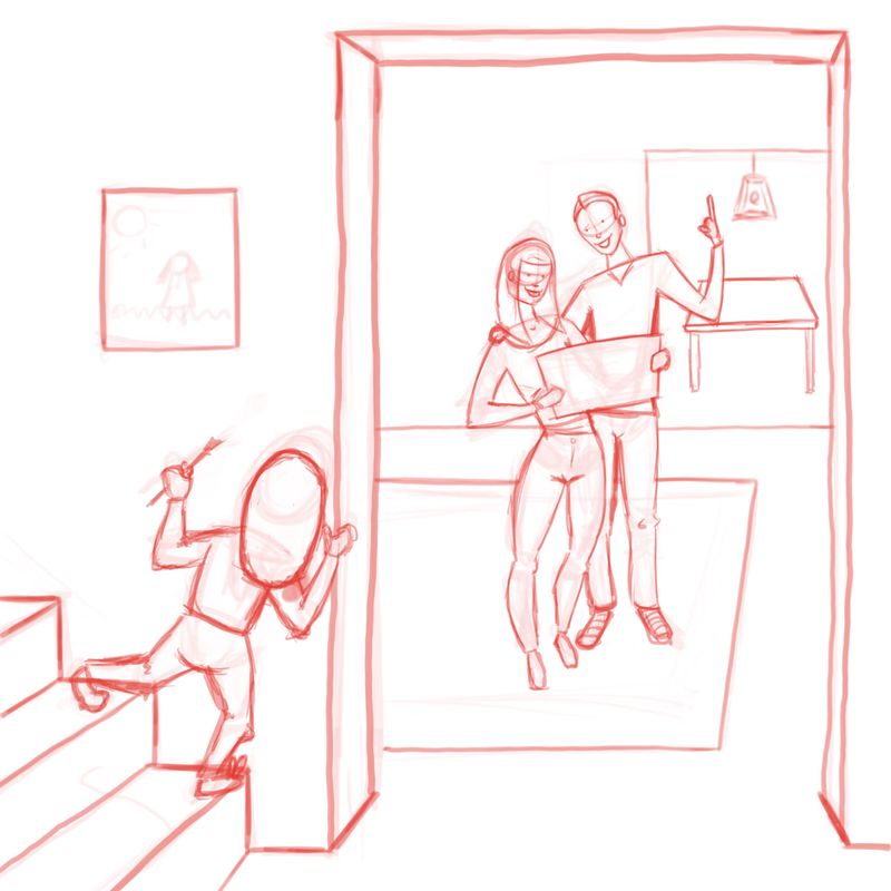
Okey-Doke. The main feedback I got was that it was hard to give feedback because it was so rough. Here's a more detailed approach with a few edits. Thoughts?

Does the table and light in the background distract too much? I felt like there was too much blank space...