6 Character Design - Challenge
-
I have been stewing on my character design and lack of consistency with it. That was one thing I discovered as I reviewed my dream portfolio vs my portfolio is that my characters are NOT consistent with each other. Partly because I am so new and haven't developed a settled character style.
So, I came up with a challenge for myself that will hopefully help me learn from masters and master my own design consistency.
Each week for the next 12 weeks I will be taking a famous character and doing a 3/4 view of drawing each of them in the style of five illustrators that have similar design principals to mine. Then I will draw the character in my design style. I will be taking these from pencils to inks (no color).
I plan on sharing these on social media using #6CharacterDesign and I will share here as well.
Hopefully, this will help grow my social media platform as people tend to respond to famous characters and master illustrators.
Here is the list of character prompts (I tried to mix sexes and ages):
- Harry Potter
- Superman
- Annie
- Gandalf
- Wednesday Addams
- Princess Leia
- Lucy Pevensie
- Spock
- Anakin Skywalker (kid)
- Mary Poppins
- Pippi Longstocking
- Batman
The master illustrators I will be emulating are:
- Mo Willems (Gerald & Piggy Style)
- David Shannon (No David Style)
- Will Terry (Bonaparte Style)
- Clau Souza (https://www.behance.net/claudiasouza)
- Luke Pearson (Hilda Style)
For my own style, I will be using these basic rules.
- Large head, 1/2 height or more for kids and 2/5 height for adults.
- Large hands & feet
- Eyes 1/3 head height for kids and 1/4 head height for adults
- Whatever else I determine through this process... as that is what it is for.
I would love to hear your thoughts and if you would like to join me! If you have any thoughts on how I can make the challenge more effective let me know.
-
@theprairiefox Cool project! Look forward to seeing what you put out for this.
-
Harry Potter
Let me know how you think I missed on the other artists. I got to say David Shannon was much harder than the rest...
It is interesting doing Will Terry as he has actually drawn a bunch of these characters already.
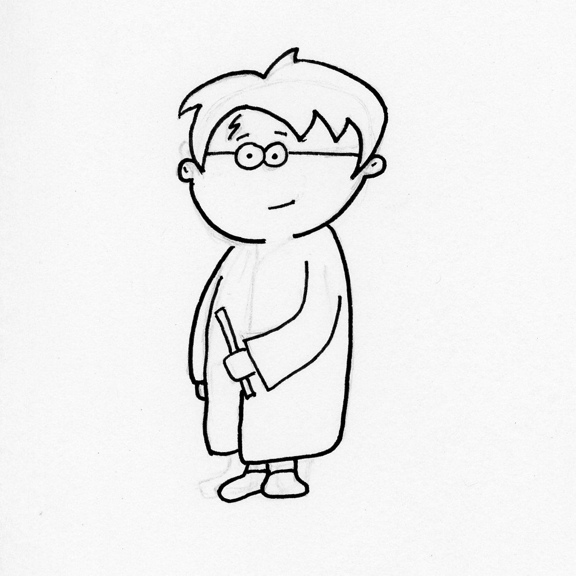
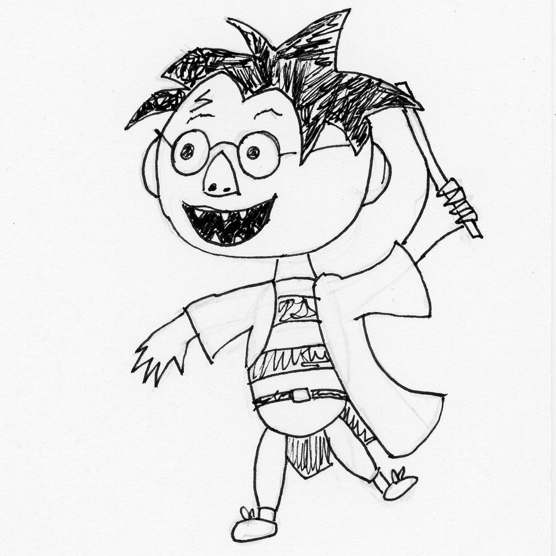
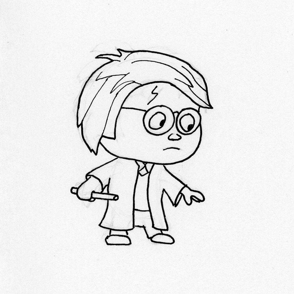
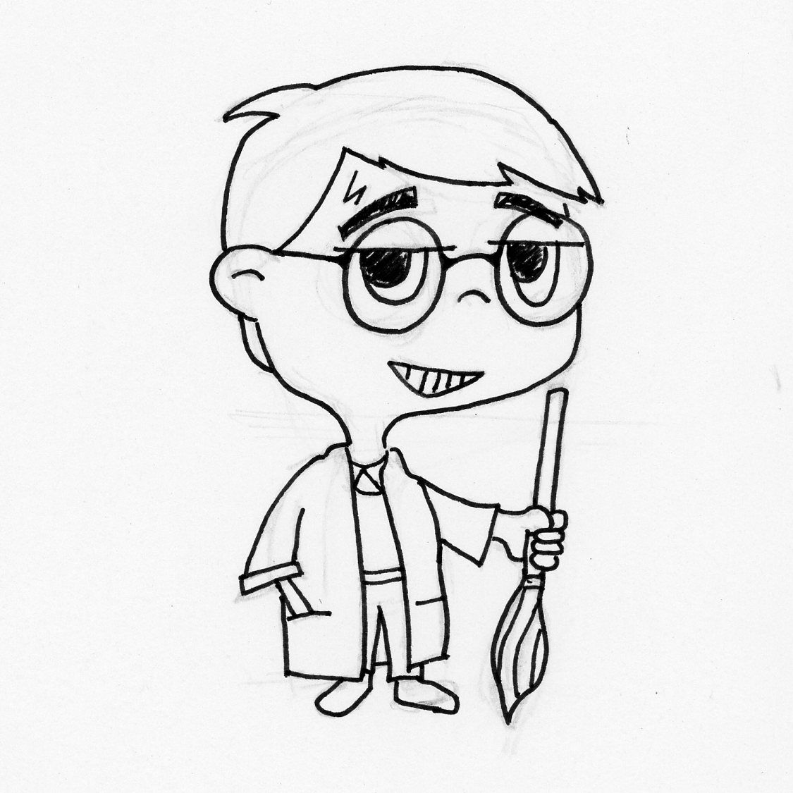
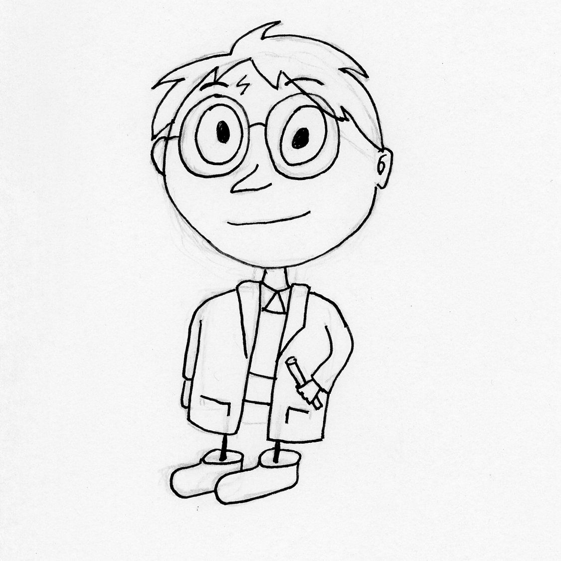
And finally mine.
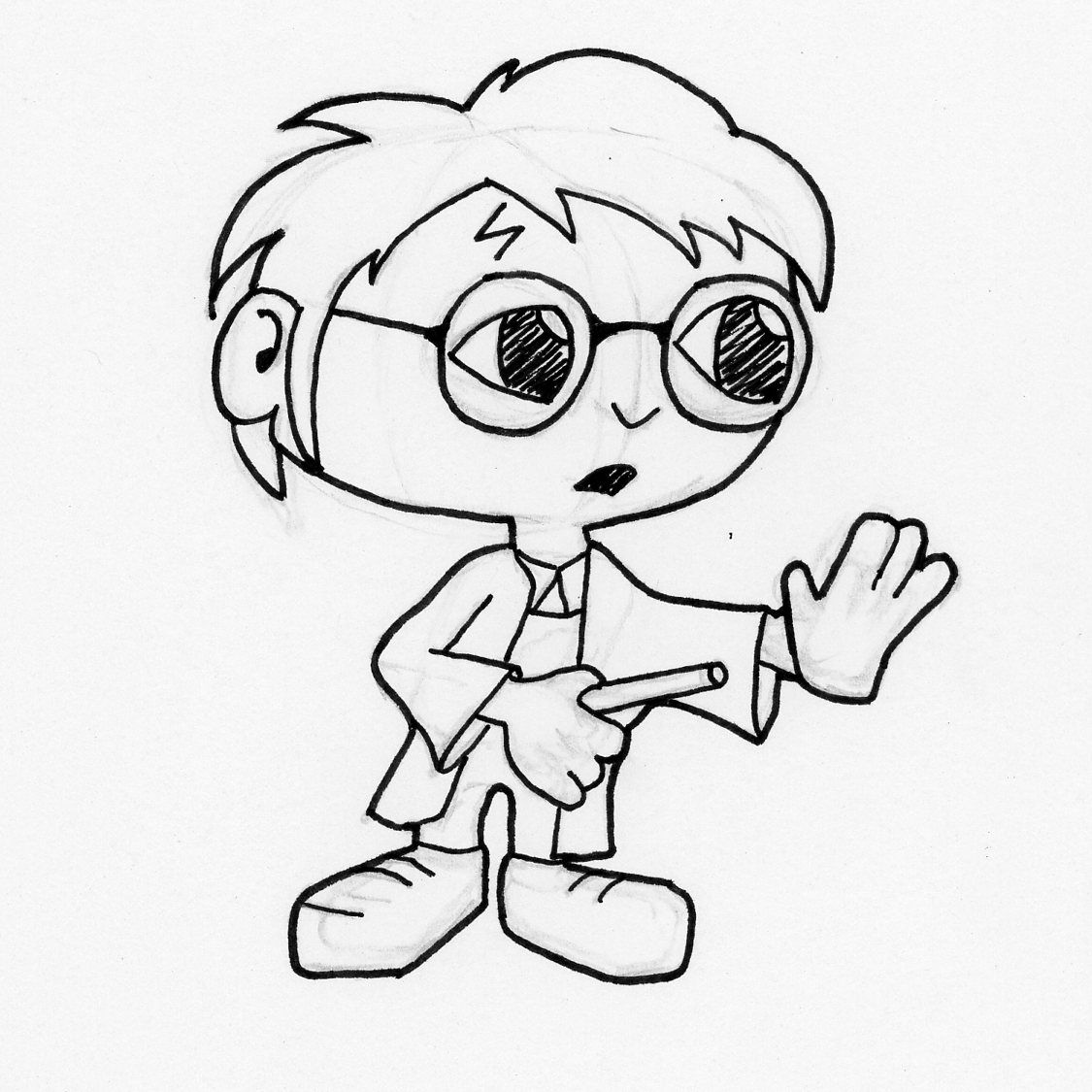
A couple things I noticed about my style:
- Eyes are less round
- Hands are bigger than everyone else's
- I don't do eyebows
-
@theprairiefox This is a great idea! I will watch along as you post here (and also keep an eye on Ig).
-
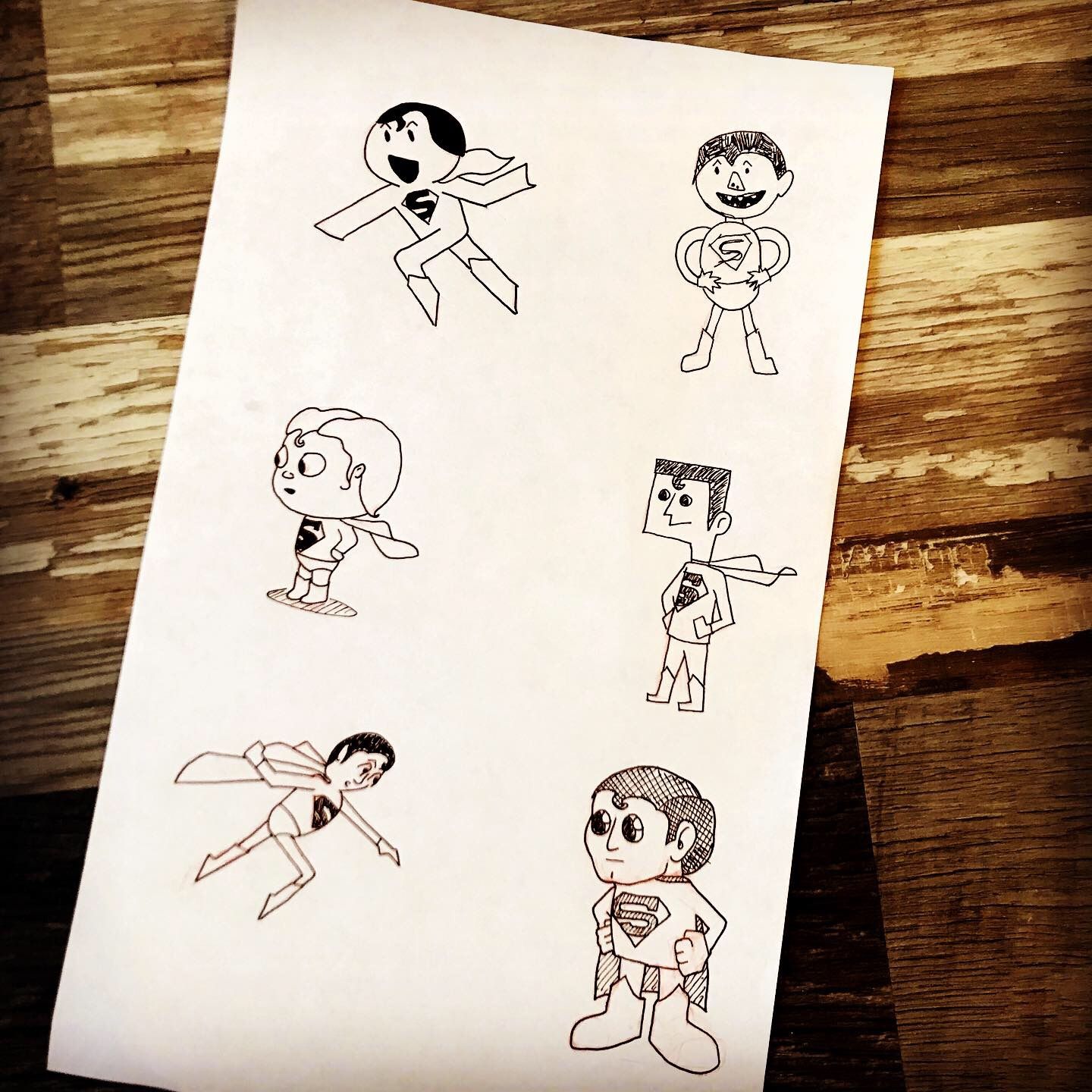
Here is this week's installment... Superman!
Learning about the rules differences (or not) of each illustrator between adults and children. Next week will be my first female... it will be interesting to see how each illustrator changes their character design!
-
I love this challenge! I might have to borrow a version of it for my own purposes.
 I'm very familiar with the first three artist's work, so it's fun seeing your interpretations of them and recognizing the styles shining through. I'm enjoying reading your goals and analysis- it's very well thought out.
 -
@TessaW thanks... it has been helpful for me already to dive into why I am drawing what I am drawing.
-
Finally back in the studio!
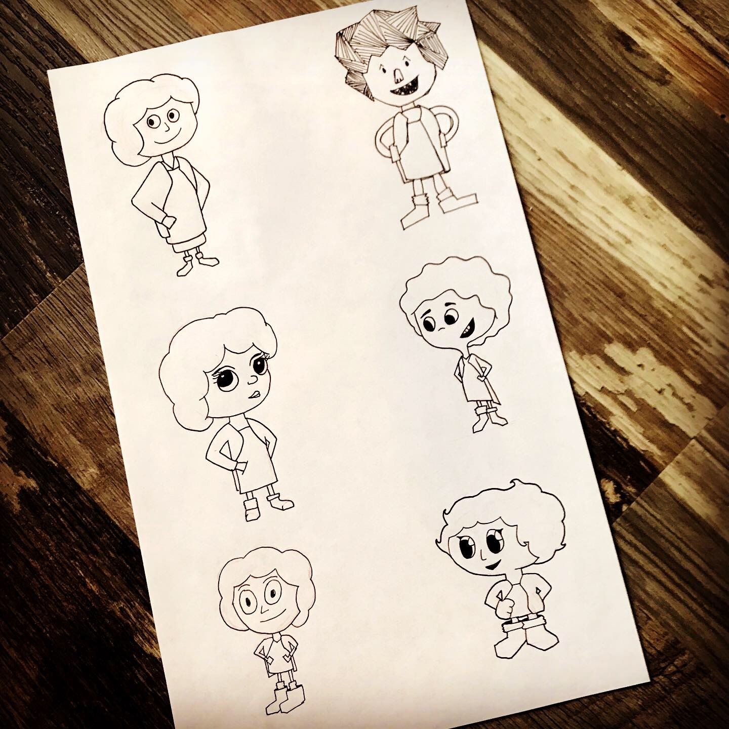
Here is Little Orphan Annie. I learned a lot about little girls and curly hair.
I am not sure I did the other illustrators justice. But I guess that is how I learn.
-
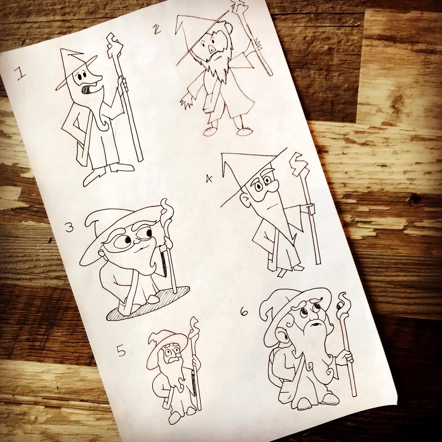
And Gandalf!
I had a lot of fun with this one! Love how they all came out.
It was interesting to compare the one in the style of @Will-Terry with his own. They were similar(ish) but he removed the beard to make it look like 'baby Gandalf' and I think it really throws the character off. I think it is much harder to see 'Gandalf' if he doesn't have a beard!
Anyway, enjoy them!
-
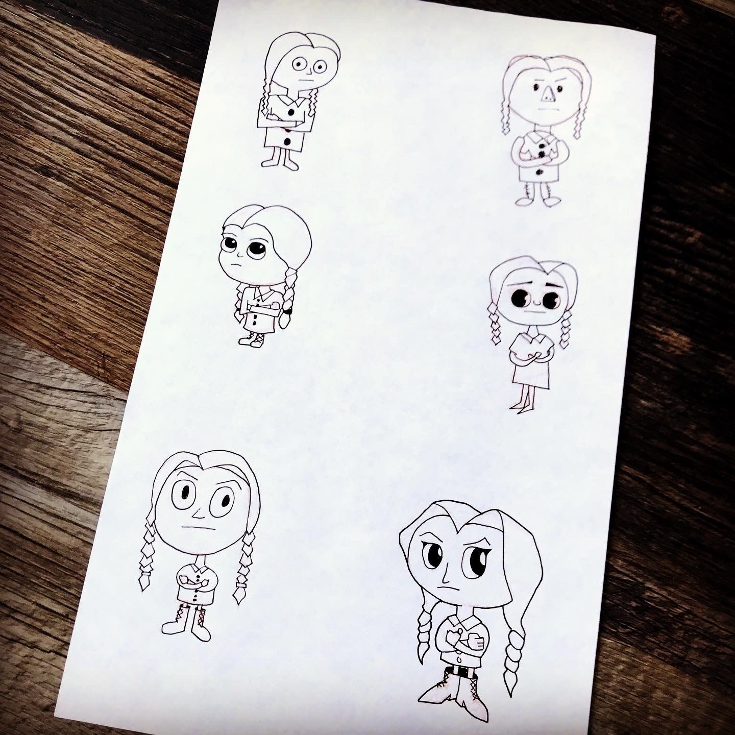
Wednesday on Tuesday?
Wednesday Addams was next. the most difficult with this one was getting the expression right in all the styles. Not sure I accomplished it 100% but it was good to try.
-
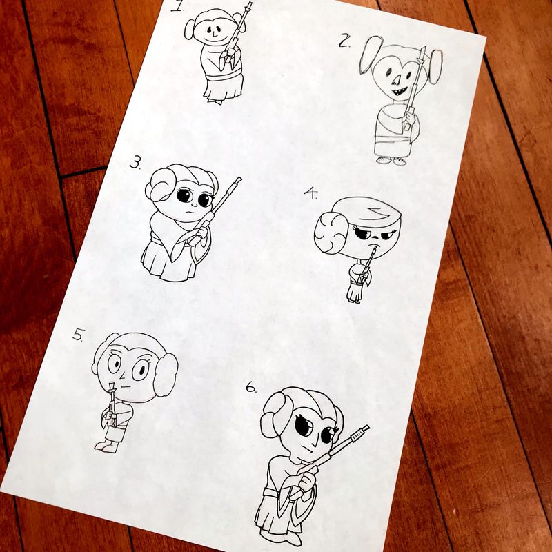
Princess Leia was fun. I based these off of a reference piece. I noticed when I had finished sketching the one in Will Terry's style that I got the body all wrong and it should have been MUCH smaller.
But I am learning, and consistency is part of that...
-
Such a sweet challenge, @theprairiefox! Seeing all of your drawings in this thread made me smile. Can't wait to see all the rest!
-
@animatosoor thanks. It has been really fun AND I am learning a lot.
It has has been very informative to learn how each illustrator handles differences in sex, age, situation, species, etc. And it some of that has gone into how I have been approaching characters in my world-building as well.
For example, most of the illustrators have much larger heads on their children than their adults. The adults tend to be proportioned 'closer' to reality (usually still very exaggerated but closer.) I have decided to do the same thing in my style. Children's heads are wider and their bodies are 1:1 with the head. For adults, I am using round heads and their bodies are usually 1.5x-2x the head height.
For another project, I am building out fantasy races and this comes even more into play as I am using proportions to help define the races. It is nice when one project informs and reinforces another project... got to love synergy.