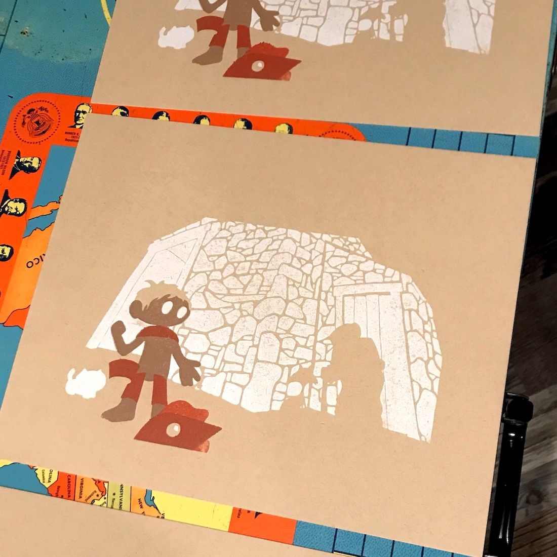
Slowvember WIP - Barn
-
I have not been posting my Slovember progress. But thought I would put this up for your thoughts. I am working on a spread for a story I am writing. The text for the spread is:
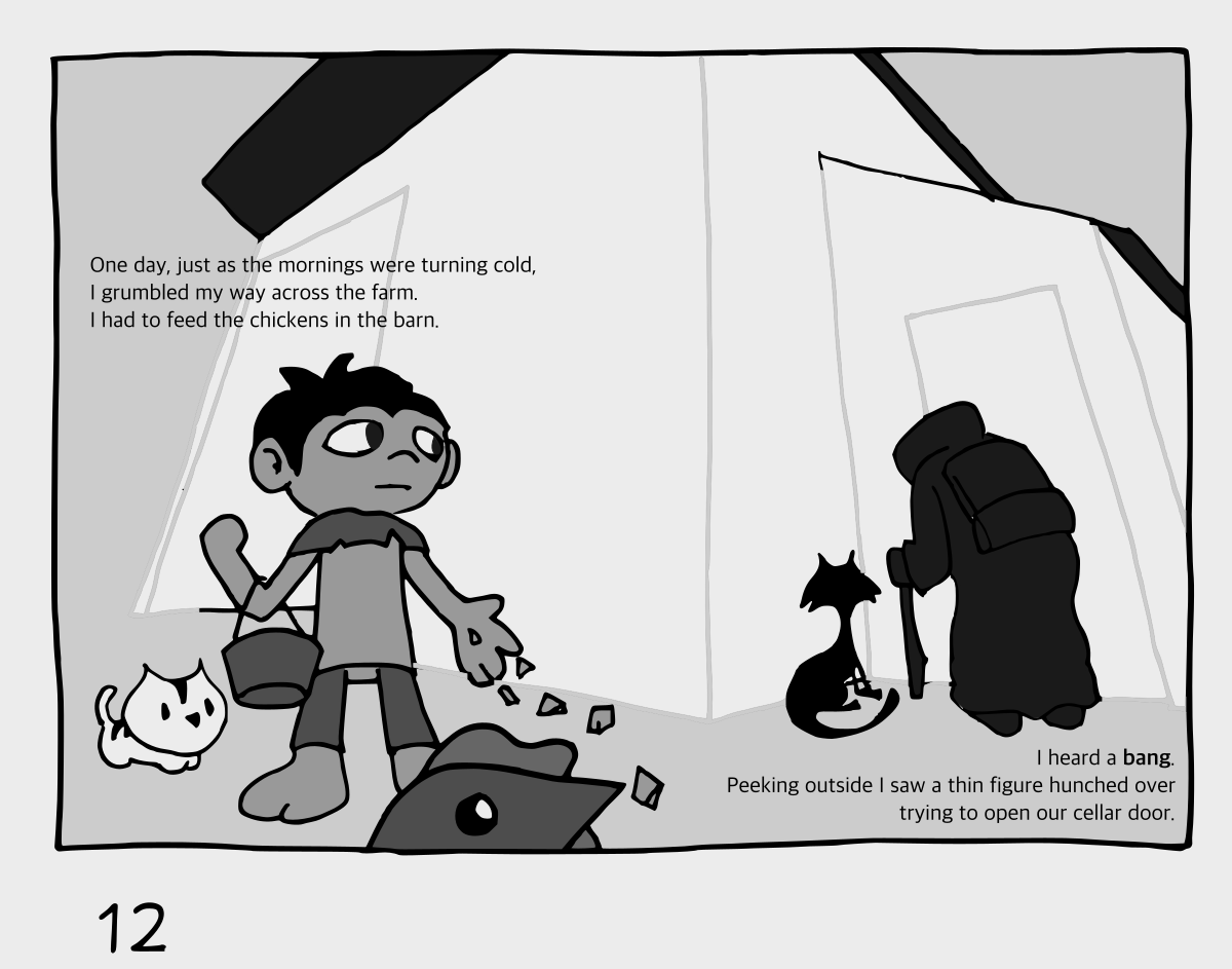
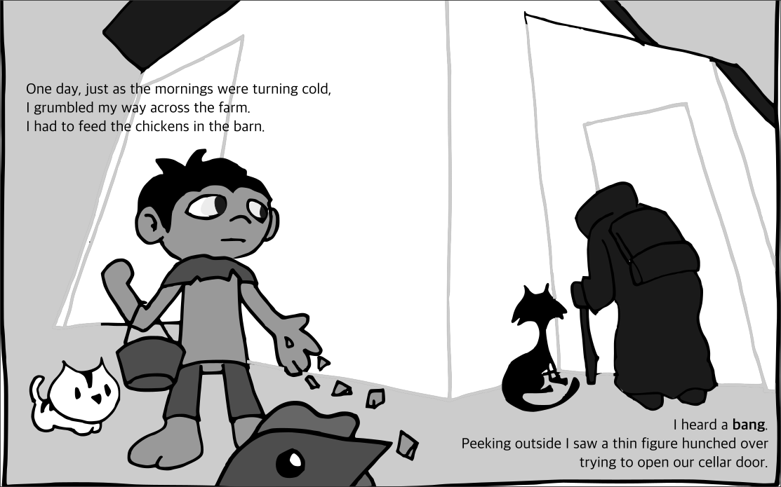
One day, just as the mornings were turning cold, I grumbled my way across the farm. I had to feed the chickens in the barn.
I heard a bang. Peeking outside I saw a thin figure hunched over trying to open our cellar door.I have done character development and research to get to my style and characters. Note I am planning on the whole book to be done with woodcut plates.
Couple Pinterest boards (if you are interested.)
Barns
Dream Portfolio - Finish
Dream Portfolio - Character DesignI did a character design test print:
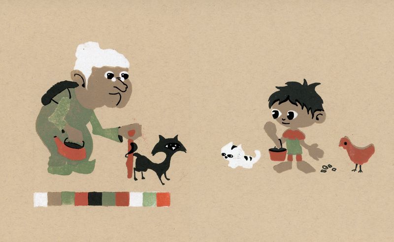
I believe I will use the colors here as the base for the book.
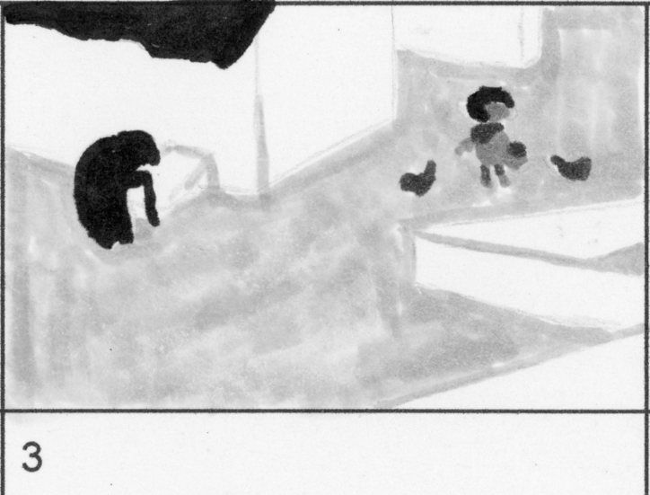
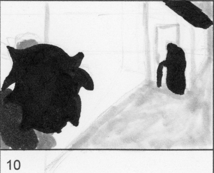
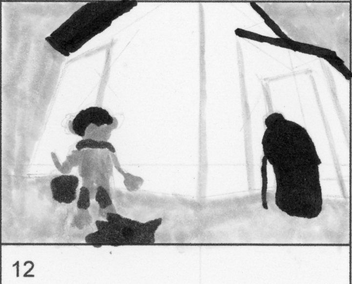
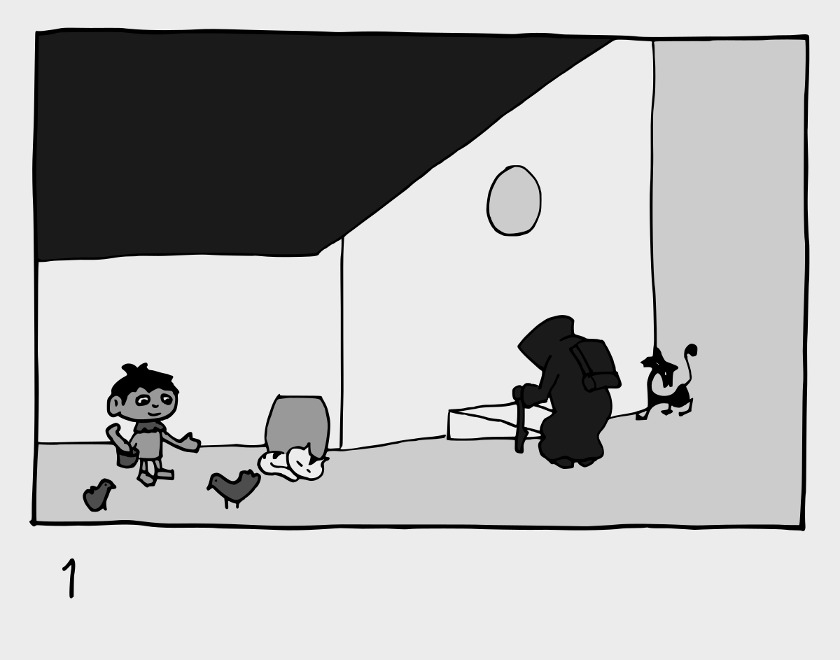
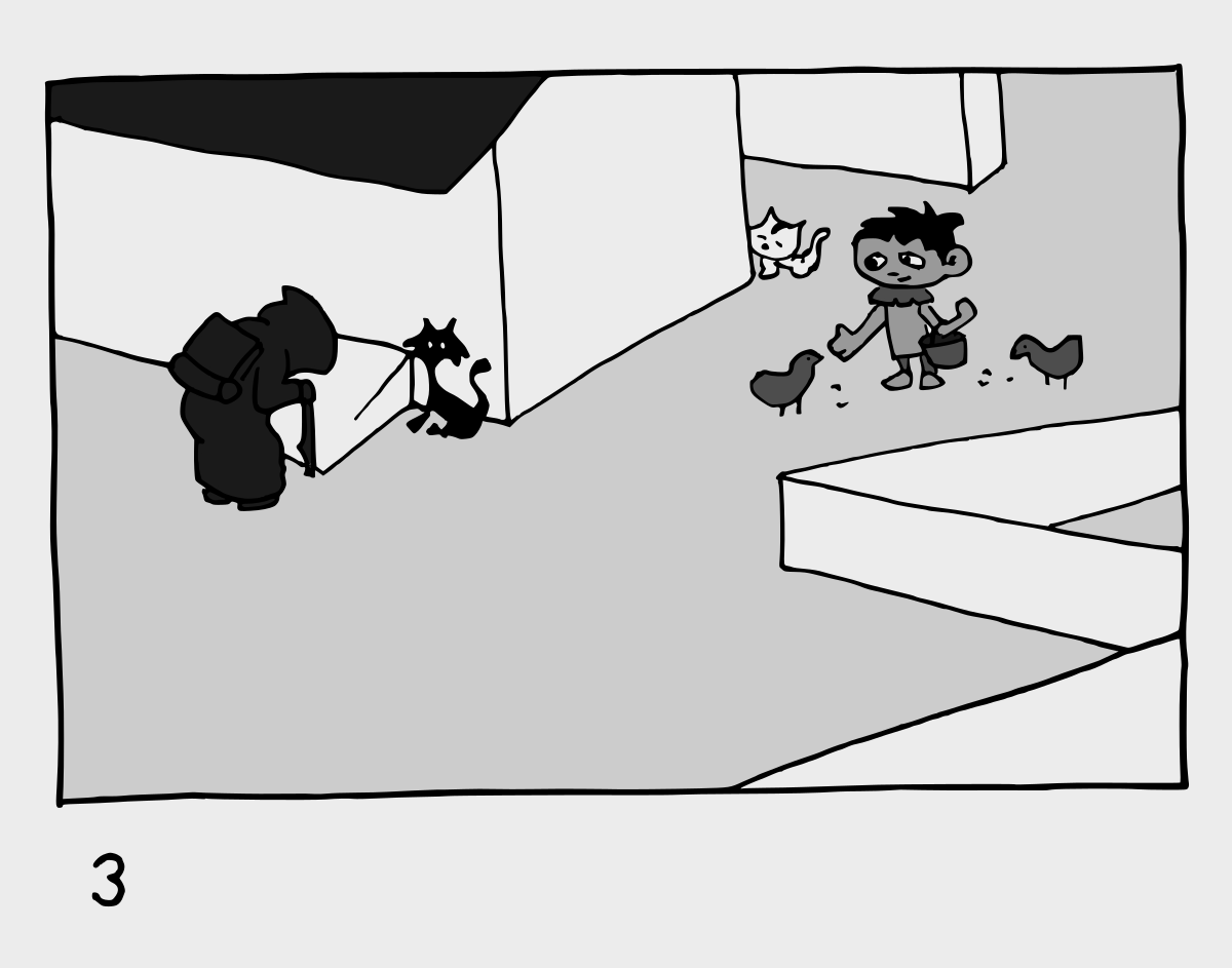
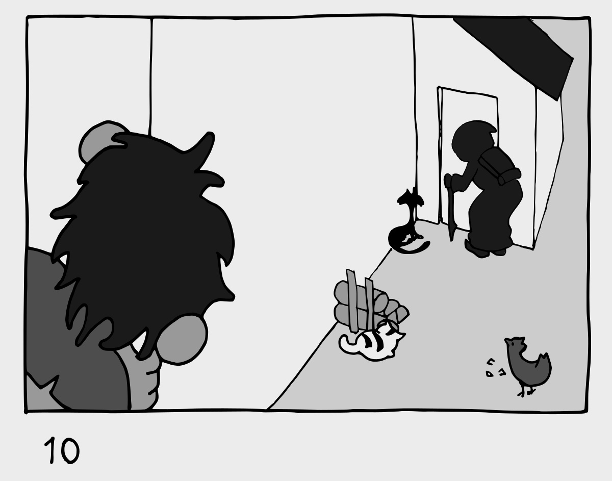
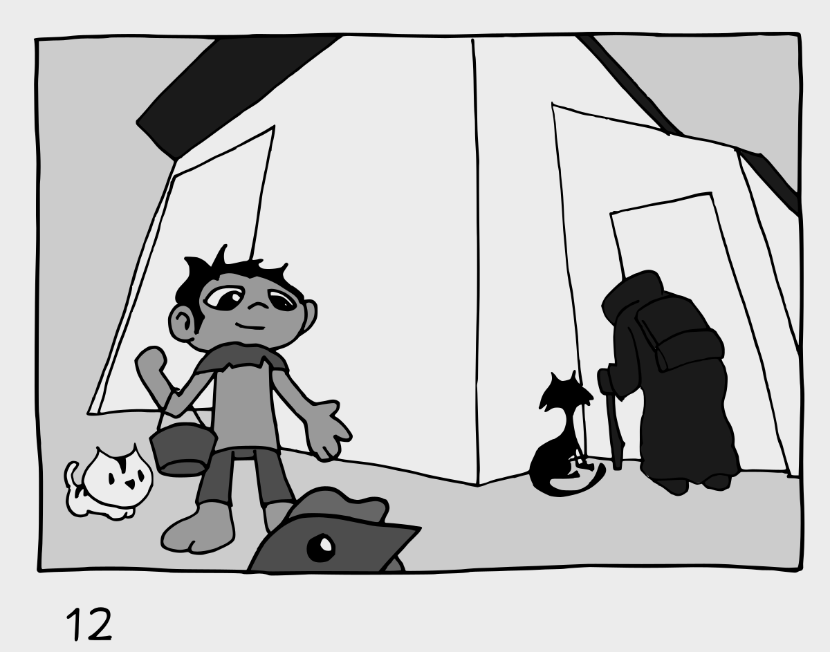
I have done 30+ thumbs and here are the top 4 that I did value studies of, please chime in on which one you like best.
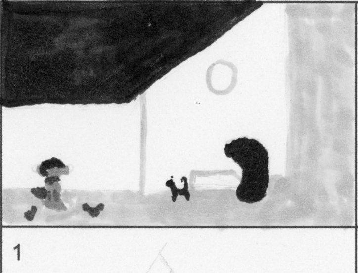
Number 1, I am imitating a flat (almost perspectiveless) design.
Number 3, I really liked the implied lines leading back to the unknown person.
Number 10, the reader is seeing the figure as the boy does.
Number 12, is really seen from the chicken's point of view.Let me know which you think is strongest.
Not sure if I will finish on time but will be moving forward on this one regardless.
-
@theprairiefox #3 is good, but I really like #10! Any composition with a huge foreground shape tends to turn out

Lookin' forward to seeing how this one turns out!
-
Yes, I agree - I really like the composition of 10. Nice colour palette too.
-
@theprairiefox I'm going to put in my vote for ten, too. There's something about that one that just seems more solid than the others
-
@Braden-Hallett @Rachel-Horne @JoannaH thanks for the input.
I am working on sketches today and will post all four when I am done. I started with 10 (no particular reason) and I am really liking it so far.
-
I agree with previous comments, 10 is the most interesting. One question: is the kid in a higher position than the other character? He looks like he's on a tree or wall or something. It could be interesting to leverage this and show where he actually is more explicitly. Looking forward to seeing your next steps!
-
@Elena-Marengoni he is not on something.
I just finished my sketch of this and had to redo the perspective a bit as things were off. Glad you caught the oddness.
-
Okay, here are my sketches with value added. I tried to match the values as close to what the finish should be to get a clearer idea. Note that white when printed is about 7.5% grey and black is about 90% and the paper I am using is about 20%.
@Elena-Marengoni Interestingly enough, when I redid the perspective on ten, I thought I fixed it so he didn't look like he was standing on something. And that is the way it looked to me until I added value and now he really looks like he is standing on something? I think it is fine either way. Just interesting the unintended things that happen.
Let me know your thoughts...
-
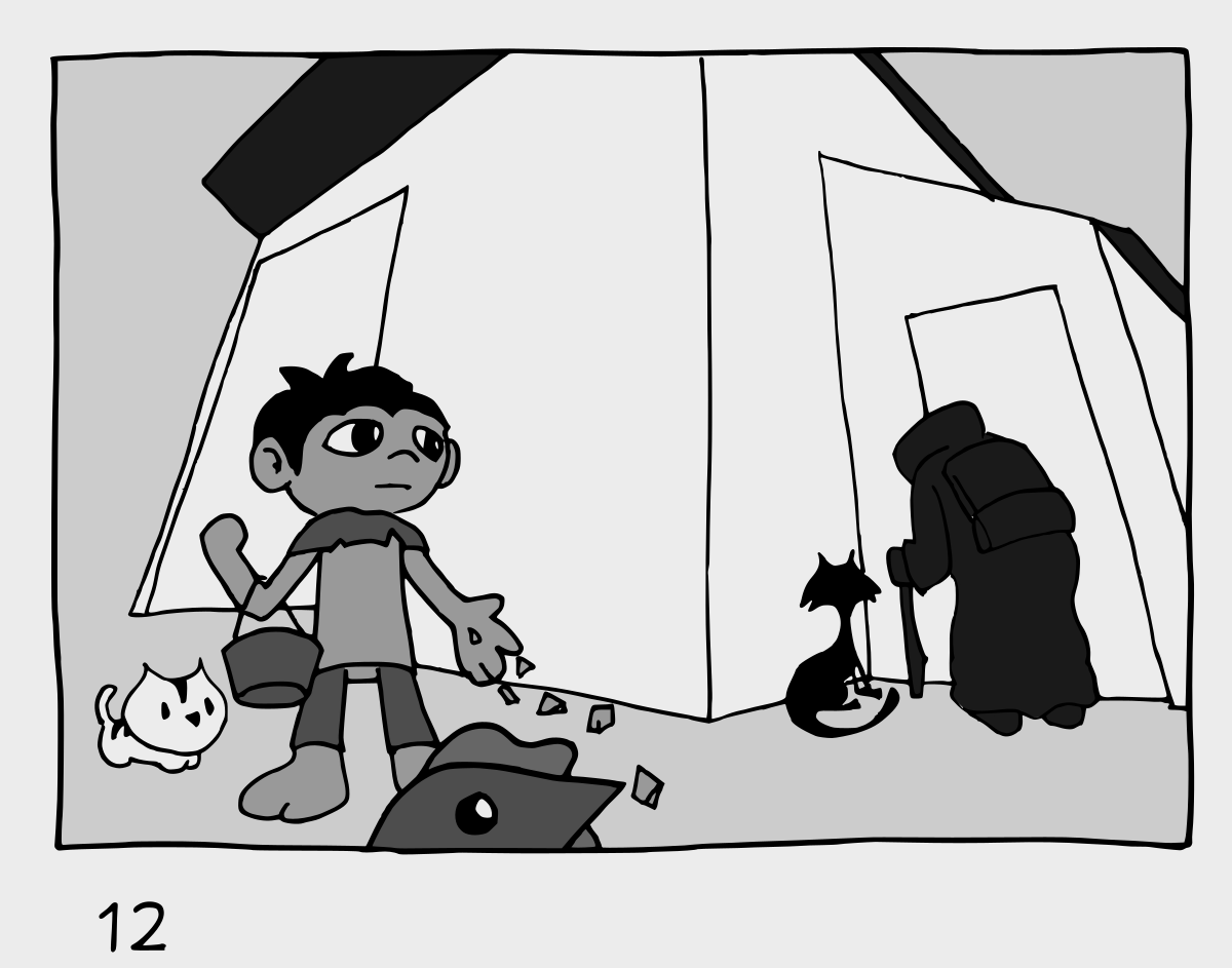
@theprairiefox My favs #12. I kinda wanna see the boys eyes looking at the figure as seed falls from his hand. A moment during instead of a moment before if you get what I mean

-
@Braden-Hallett yeah, I will play with that. I am having a hard time deciding which I like most.
I was thinking that 12 could be really fun if I took that POV for the rest of the book as well!
-
@Braden-Hallett what do you think of this?
-
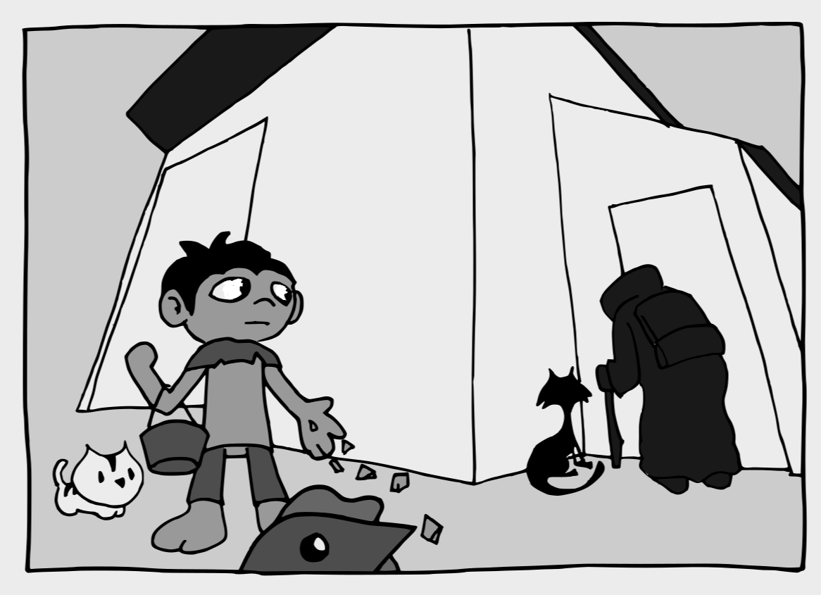
@theprairiefox close! How aboooooooout this!
-
@Braden-Hallett yeah better... I added the change. Also playing with the placement of the text. Let me know what you think.
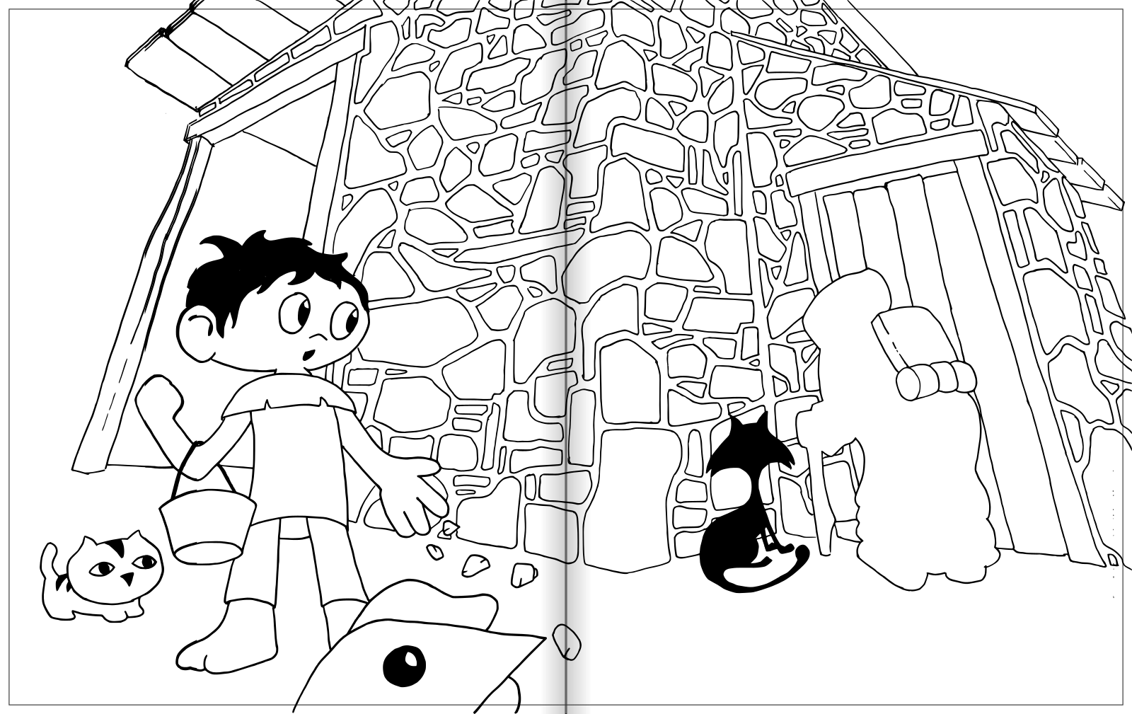
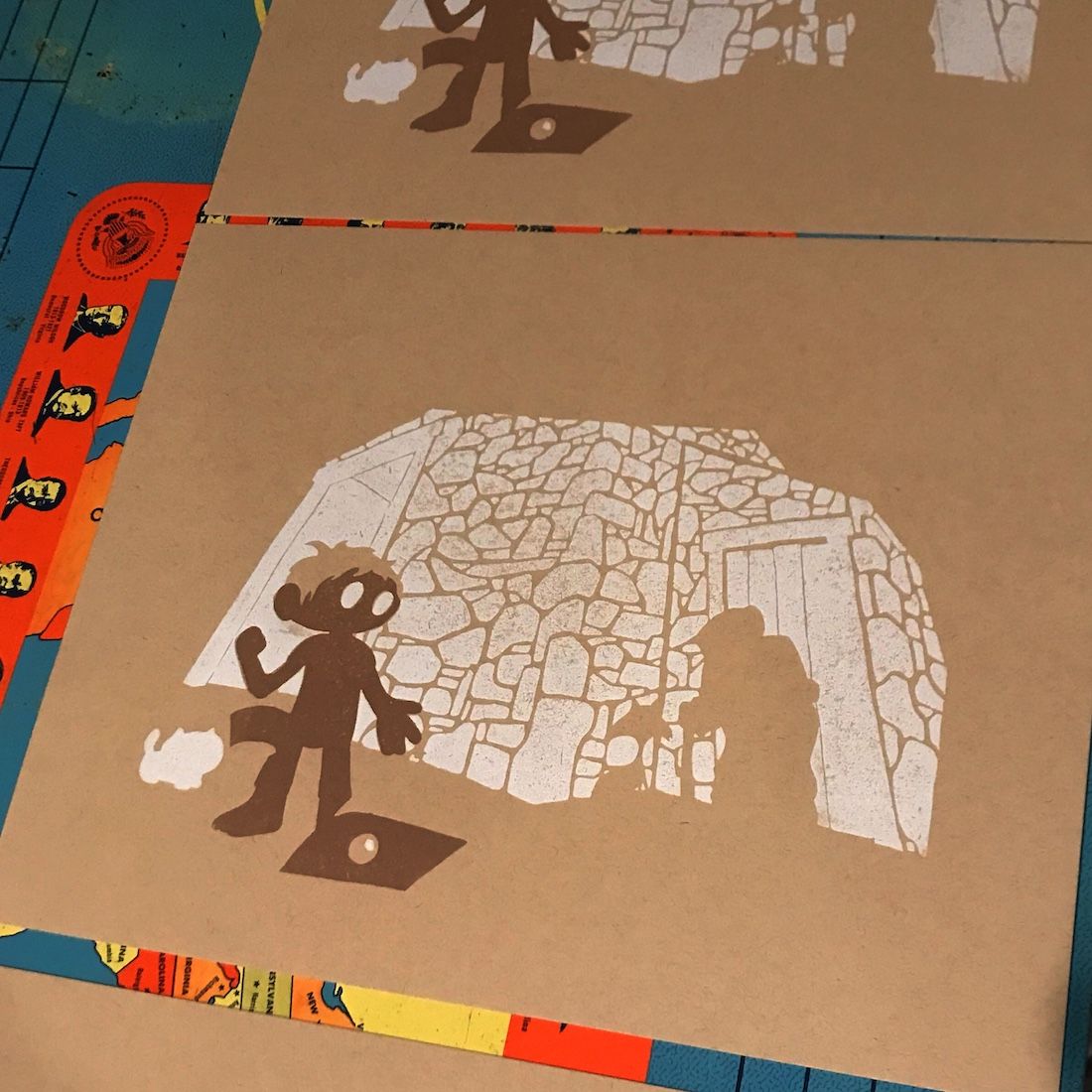
Note the variation of the lines. They will not be black but just cut away from the white of the building so the paper will show through. I am thinking the building will be made of rocks. I tried to show that here.
-
@Braden-Hallett playing with sizing up to the next size, I figured out my dimensions were off. Here is it trimmed to the correct dimensions. Kind of like it better.
-
Here is my final sketch that I will be using to create my plates for printing!
The rocks and wood will be white with the paper showing through in the gaps. And the old lady will be a very dark green (her backpack will be black.)
If the print works... now I race to get it done tomorrow. Wish me luck!
-
@theprairiefox said in Slowvember WIP - Barn:
now I race to get it done tomorrow. Wish me luck!
Good luck

I really like the stones of the house. Puttin' the page fold down the middle is a good idea, too!
-
@Braden-Hallett yeah, the line around the outside is the bleed as well. I am planning on putting this in a book dummy so I setting it up so I can print it using blurb and they have a 1/8 inch bleed.
All the things you have to think about if you are really going to print!
-
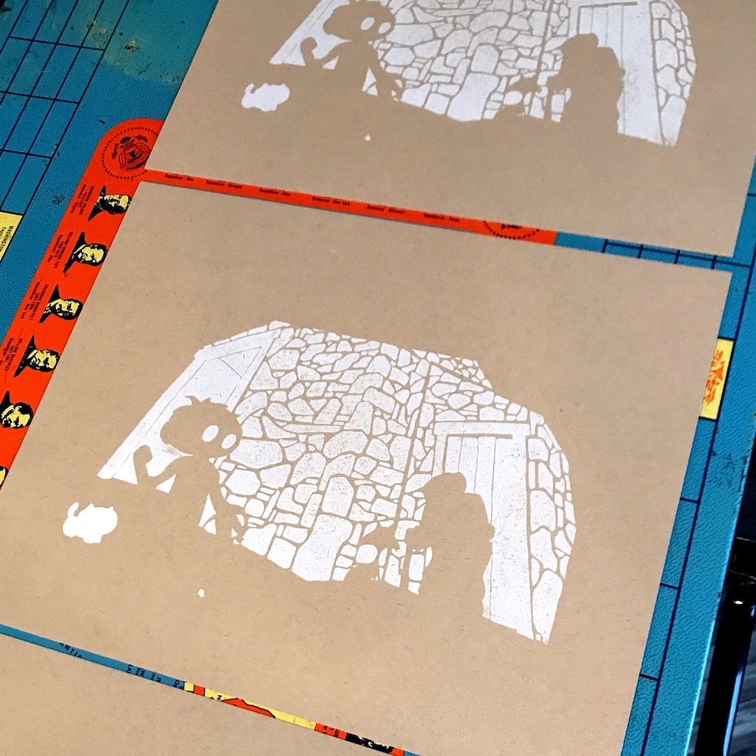
The first plate printed... let's hope it is dry enough to print the next plate in an hour or so. I added lots of ink drier and added fans.
-
Plate 2, had a problem and the GlowForge messed up the plate so I had to recut and got slowed down... hope I make it!
-
Red is done...
