WIP CD Cover Illustration
-
Hey y'all! I'm working on a cover for my brother's first EP, and obviously I want it to be as good as possible, so I'd welcome any feedback you could send my way.
 I'll write out some basic info so you can understand the direction we wanted to go with the image.
Genre: Folk / Folk Rock
The concept: There's a verse in one of his songs, which goes "our demons follow us home." That's the inspiration for the cover. It's a contemplative song about strengths and weaknesses.
Mood: Fairly relaxed. The demon/gargoyle isn't particularly sinister. He's familiar, if a bit ugly.
Design: We wanted a high-contrast graphic, without detail in the background. The title of the EP will go in the upper right quadrant of the image, and my brother's name will be across the bottom/ground part.
Now, for the art!
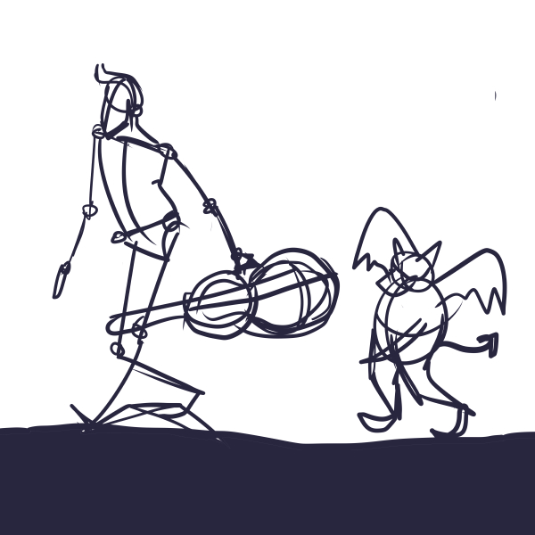
Initial sketch:
Silhouette:
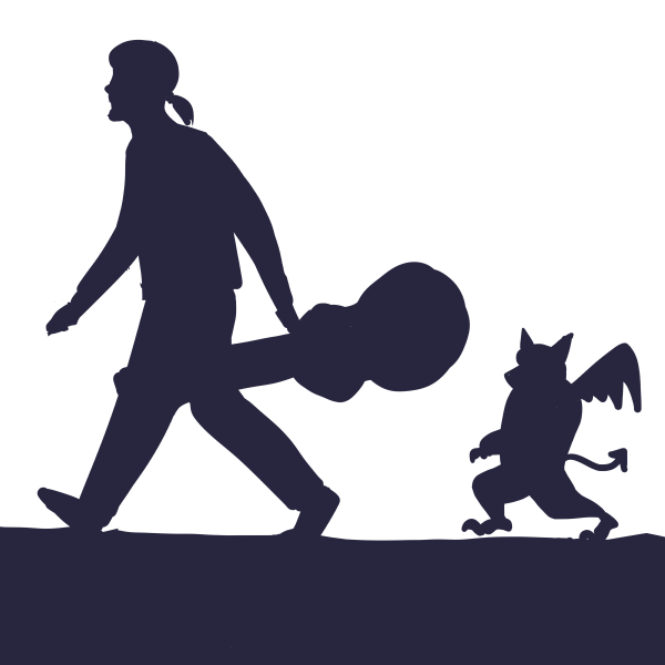
Thought I should remove one of the wings to make the gargoyle read more clearly, so I did.
We liked the pose of the figure in this image, but needed him to be thinner/taller like my brother. Oh, and the hair was inaccurate, but that was just in fun.
Value thumbnails:
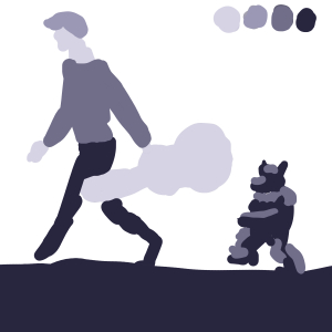
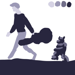
Preferred the dark guitar case, but I'm not sure if I was right? Went with it.Cartoon version:
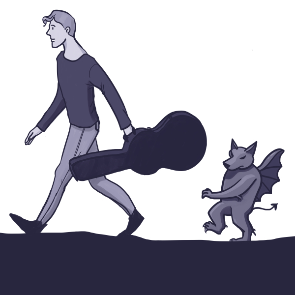
I measured the proportions, fixed the hair, and kept the one wing. Now I'm not sure if I should have the second wing poking out somewhere or not?I am going to be doing a few more versions/revisions at least. My brother would like me to try combining the lose, thick line work of my initial sketch, with some of the details of the cartoon version, to see if I could come up with a sketchbook looking version. So that's what I'll be working on next.
I am a beginner at doing a project like this, and any tips or advice will be received gratefully. I'm having fun working on it for sure!

ETA: Sorry about the other post I deleted, I thought I posted it in the wrong sub-form. xD
-
What a nice project to do.

I totally agree with your brother: From the first moment I fell in love with the guy in the initial sketch. Actually, I experience this a lot, that the sketches are often much more dynamic and appealing compared to the polished version. So, I guess it is a great idea to keep a sketch-booky feeling.
I cannot wait to see where you go with this.
-
@K.-W. I feel like the gesture is lost from your initial sketch. You are missing the tilt of the head and shoulders and the twist of the torso creating a very stiff image. I would imagine that is what your brother is drawn to in the initial sketch.
-
@Jana Thanks for the encouragement and feedback!
 I almost always have that sketches > polished problem when it comes to drawing humans from imagination, and it's probably largely due to my need for a better understanding of anatomy and more life drawing practice. I need dynamic reference.
@seanwelty You are absolutely right. And I did change the pose consciously for reasons involving the my confusion about the perspective and lack of reference for it, but I am definitely scrapping it in favour of going back and finding that original gesture! Thanks a lot for taking the time to crit!
I will shoot some reference with my brother this week, and work on exaggerating and capturing the movement of the pose.