(WIP) My First Mural!!! Feedback Welcome
-
Hey all!
I've been commissioned by my workplace to do a mural for our office entrance. It's my first mural, and finished piece of this size. Scary but exciting!
Luckily, my workplace is very open to ideas so I had permission to go pretty out-there if I wanted. Awesome - plenty of room to play.
I work for a digital marketing agency called Redback (which is also the name of an Australian spider). I wanted to play with the idea that this spider was out there catching all parts of the internet. I thought it would be fun to have the logos running away from this spider from capturing them.
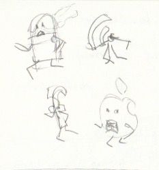
Here is my brainstorming session of how it could look. To give you some context, the immediate left of the wall is the hallway into our office. This is the main wall you see when you enter. To its right is another wall which has a TV playing.
Here are my little thumbnails to flesh out some ideas:
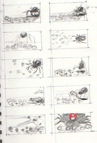
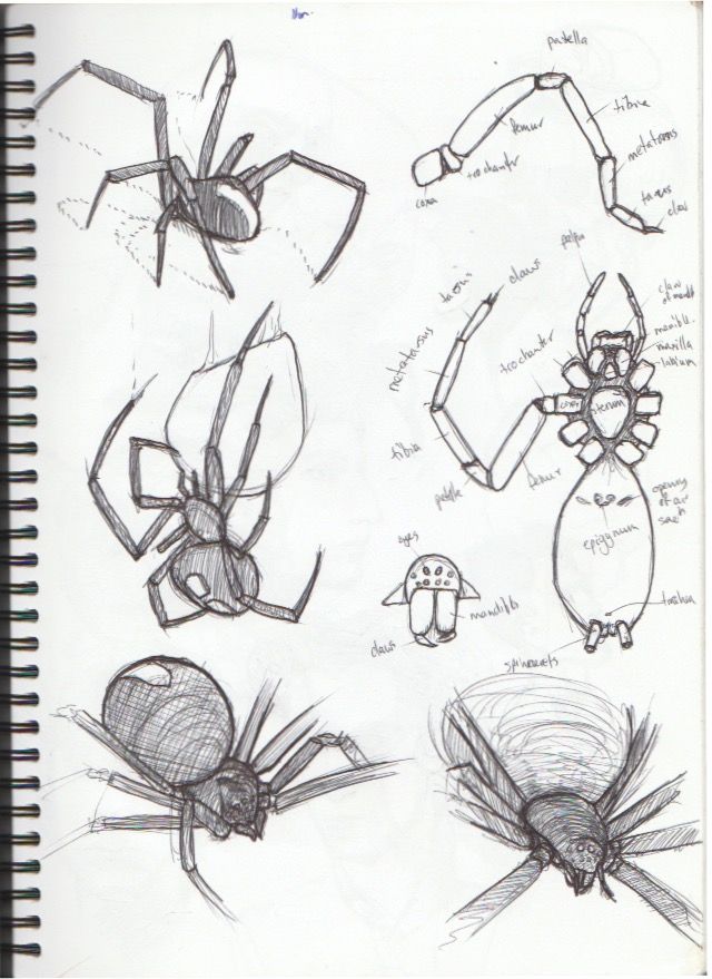
I realized I had never drawn a spider before, so I also did some sketches to see how they work:
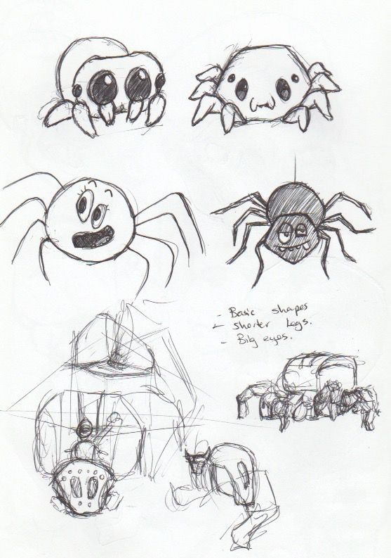
I ran the idea past some coworkers, however some people are (understandably), not fans of spiders. I agreed and had a look at how other people have "cutsied" them up, or made them less intimidating. I felt like making a robot spider would be the best options. Its something I would enjoy the most, it would look cool, and fits in with the whole "digital" marketing side fo things. Here are my sketches.
Around the same time I fleshed out the concept a bit more, and coloured the one I liked the most. Its still got the more organic cutesy spider design, but I changed that up later. I added the guy on top of the spider, just because I thought it would be funny. I thought it would be great to have the different icons interacting with one another. Eg Android and Apple fighting. Instagram taking a selfie. Internet explorer as an old man.
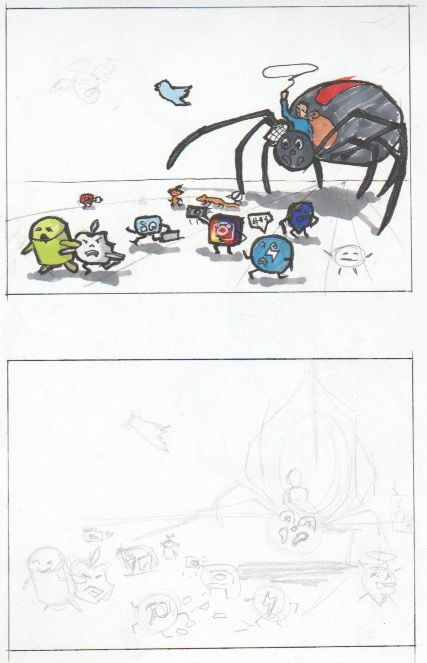
I thought I'd flesh the idea more on photoshop. Because it is a busy piece, having the flexibility of moving things around will save me a lot of headaches and time. I'll then project it on the wall and do the outlines in pencil before painting

Here is where I'm at at this point in time. (not the perspective lines will not be in the final piece)
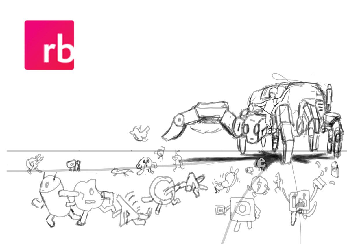
I'll likely add some more logos in, then look at the tonal composition before refining the sketch.
Feedback is most welcome guys. The main feedback I'm looking for at this point in time is composition - how everything is set out and placed.
Thank you

-
How exciting, sounds like such a fun project! Love the direction you went of turning the spider into a robot, definitely fits the digital marketing field and is a good alternative to those who don't love spiders.
I'm no expert but one thing I noticed in regards to composition is that the person riding the spider gets a bit lost. Have you tried having him ride on the very top of the spider instead (I guess that back instead of the neck)? It could be a nice silhouette that would be legible from far away.
Super fun though, love all the personalities you added to the logos too, can't wait to see how it turns out!
-
Thanks @Kerisa
I totally agree that the rider gets lost in the spider. I was thinking of giving the spider a darker colour, and the person a brighter colour to get that contrast going. But I'll try out your feedback, play around and see if anything sticks

-
So I took on the feedback and put the person ontop. I also played around and put other people ontop of the spider with him. I think it makes it more dynamic. What do you guys think? Which composition do you prefer?

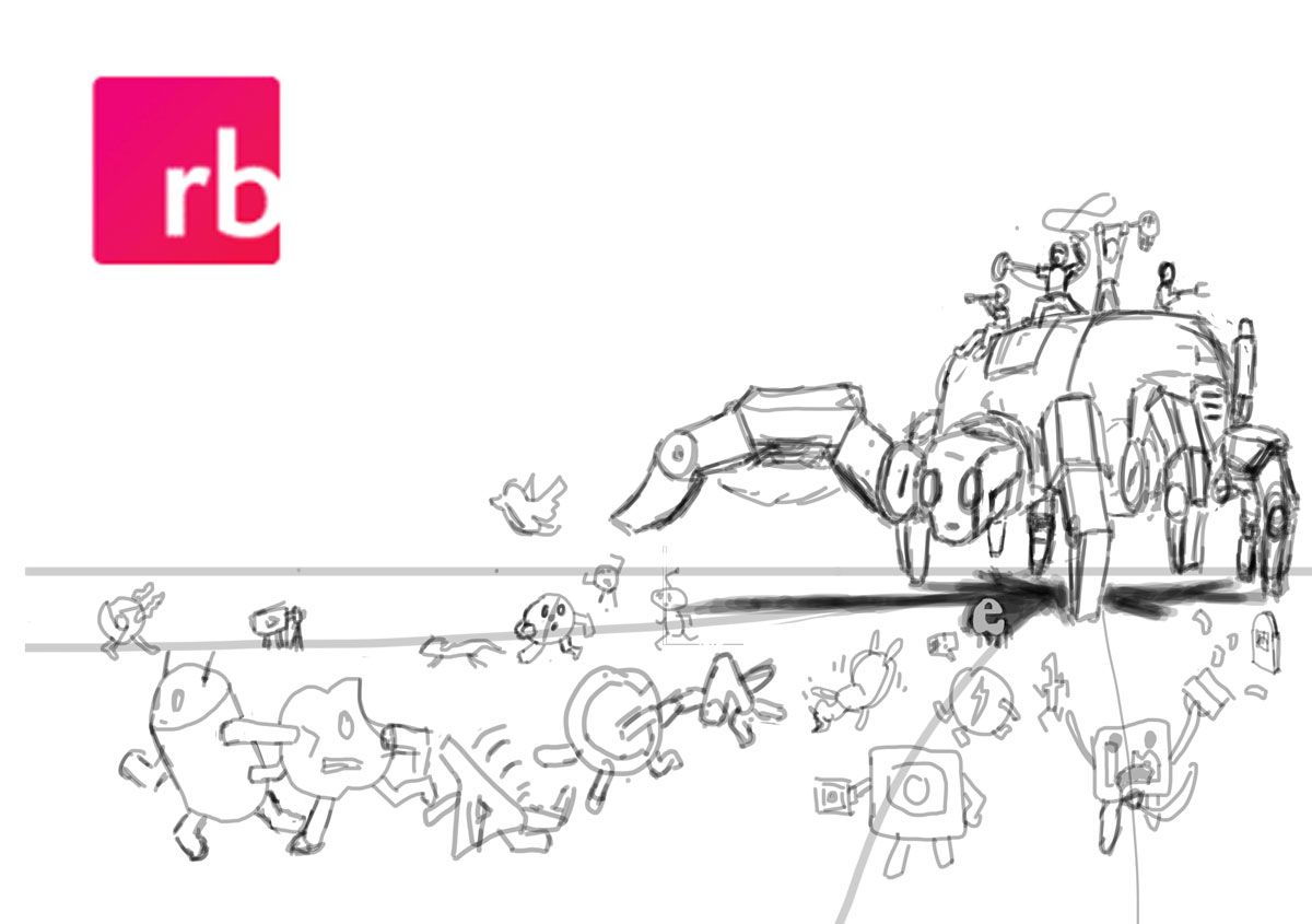
I also showed some of my teammates yesterday. Everyone loves it, and it got some good laughs, so I'm on the right track

-
Oh, yeah!!! I loved this last version!
It's amazing to be able to see your progress. I can only imagine how great this is going to look, big on a wall.
@Kerisa's feedback was definitely in the right direction. And you even went further and improved it even more. Right on!Be sure to post it here as you paint it, ok? I am dying to see how it's gonna turn out

-
Thanks for the feedback guys. Good to know I'm heading in the right direction.
I've gone ahead and done a bit of a value composition.

The values of the logos are influenced by the colors of the logos, however, the value for all of them is pretty consistent across the board. As a result, I push the darkness and contrast in the spider to make it more stand out more and seem more imposing and dynamic. There are no straight black values in this peice, I will use black for the outlines. I'd love to hear your feedback on the values I've chosen, whether I'm on the right track, or you can see room for improvement.
I also added shadows to make it less "flat". The cast shadows also help show a sense of perspective too. As I'm writing this, I'll likely add in some form shadows too to give the characters and spider a little more weight.
Once I'm happy with everything I'm going to go back over and do the linework :smiling_face_with_open_mouth:
-
@Nathan This is really a fun idea and project. I worked for a web-based software company and this is perfect.
One thing I noted in the last revision is that the second leg on the right side is not reading too well. You might want to do something with value around it or have set down on the ground. When I first saw it I thought it was a back leg.
I just thought you would want to know. It is coming along nicely though.
-
This is really nice. I like the addition of all the people on the spider's back.
I'd think Android would be pushing Apple under the spider instead of pulling him along (or vice versa). Maybe in reality the operating systems are friendly, but the users that are die-hard.
-
Thanks for the feedback @theprairiefox & @TwiggyT. You can see my updates below
I've updated the value around the leg so it reads better. Is this what you were recommending @theprairiefox ? Or did I get the wrong leg? :smiling_face_with_open_mouth_cold_sweat:
Android and Apple are definitely not getting on in this piece. I've just tweaked some things to show that Android is pushing Apple away. The only "Logo" helping out another logo is Google who is helping out Google Ads (because money...
 ) while pushing over Bing.
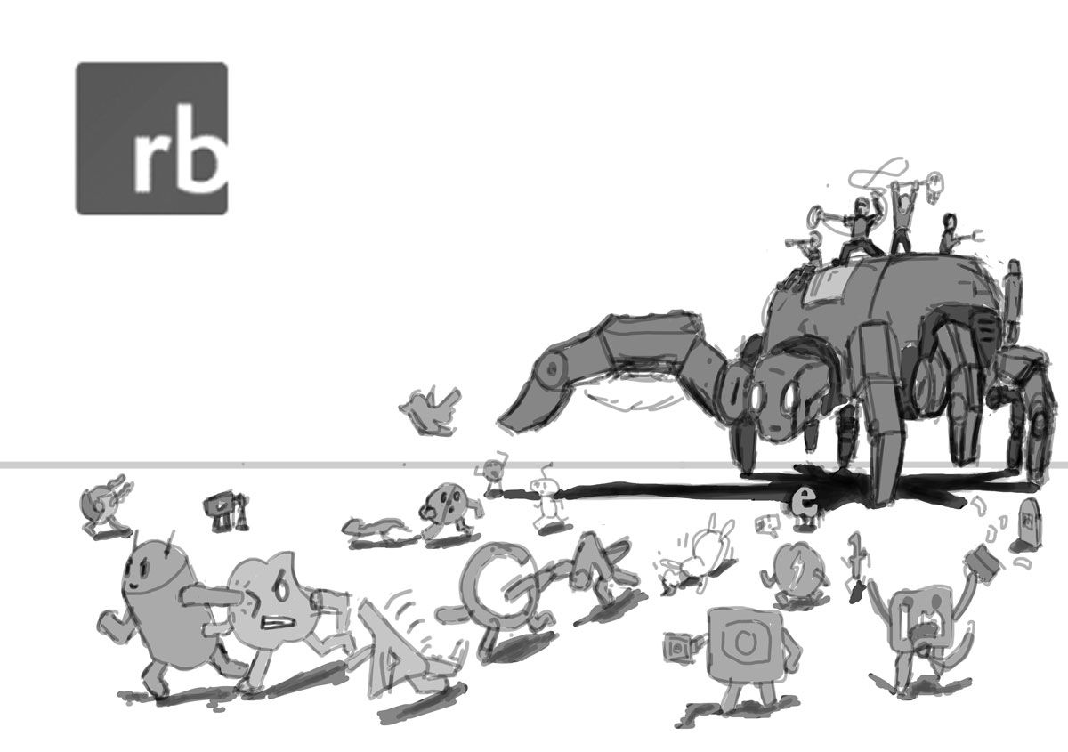
I'm pretty happy with where this is at compositionally (though, any feedback is greatly appreciated
 ). The next stage will be linework.
 -
@Nathan yep, that leg show up better now!
With the darker values behind, it now pops to the front where it should be.
-
I love the wicked grin on Android's face. :smiling_face_with_open_mouth_closed_eyes: