T-Rex Digital Painting - Critique welcome
-
Hi people
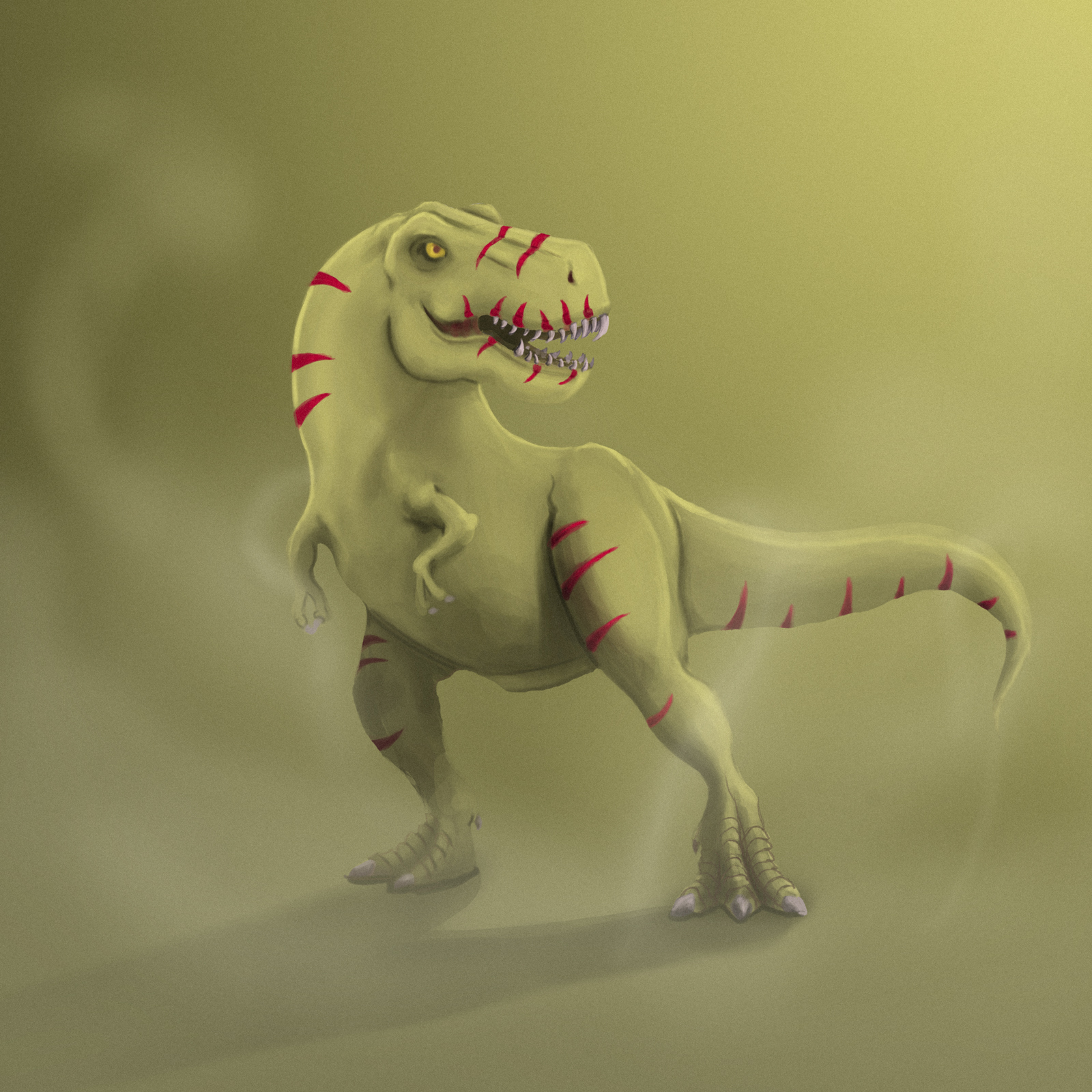
") I've been away from painting in Photoshop for a long time, then this last week I did this T-Rex thing, just to get me into painting again and to have some kind of benchmark to improve upon. This was purely a piece to practice my craft on and I know the concept is a bit boring
I've been away from painting in Photoshop for a long time, then this last week I did this T-Rex thing, just to get me into painting again and to have some kind of benchmark to improve upon. This was purely a piece to practice my craft on and I know the concept is a bit boring ")
Well... I was wondering if you would be so kind to give me some kind of feedback to work off of. Some kind of notes to take into the next thing would be very appreciated!
Cheers!
-
Dinosaurs aren’t boring lols not by the least. I’m doing dinosaurs next.
Personal notes I would have made the stripes a bit more larger, with all that similar colour (dinosaur and background) they seem like an afterthought. Also play with where they are located, they get a bit confusing around his mouth with similar shapes to his teeth. I do like on the top of the head where you can see the shape of it with the use of the markings. On the background note either choose a different colour so your Dino would pop out or if it’s purely concept I would go with a white background so there’s no eye clutter to get lost in.
Thanks for sharing. -
Thanks for the reply! I agree with your notes. Will think of these things going into other paintings
-
@ Hi Johan! I agree with @Heather-Boyd 's notes. Other than that- I don't know what your color goals are, but something you might want to try in the future is making the shadow colors not only darker, but just slightly more saturated (just a little) than the light side, maybe even shifting the hue warmer or cooler. It wont' work in every case, but that's a general rule that I've learned from several classes, and I try to follow where applicable.
-
Nice start!
I agree with the points @Heather-Boyd made, especially on the background: When the ground is flat, there usually is some sort of gradation and color change around the horizon. So plain black or white (think of a studio setting) would be your best bet here.
The rendering is done well overall. You can easily increase contrast though. Don't hesitate to use even darker and lighter colors!
I really like the feet, nice level of detail. That however makes them another focal point. Do not make anything other than the main focal points (the head) too detailed.Most critical in my view is this aspect:
The stripes on the tail should be on the back of it, not underneath.
Animals generally have their backs colored differently than their front:
The back tends to be darker or more colorful and has more striking patterns (like you applied already). The front, e.g. belly, is usually lighter.
Pull up some references for this one.Eager to see the next piece!
Cheers -
Thanks you guys! Those are some great points