Button Your PJ's critiques
-
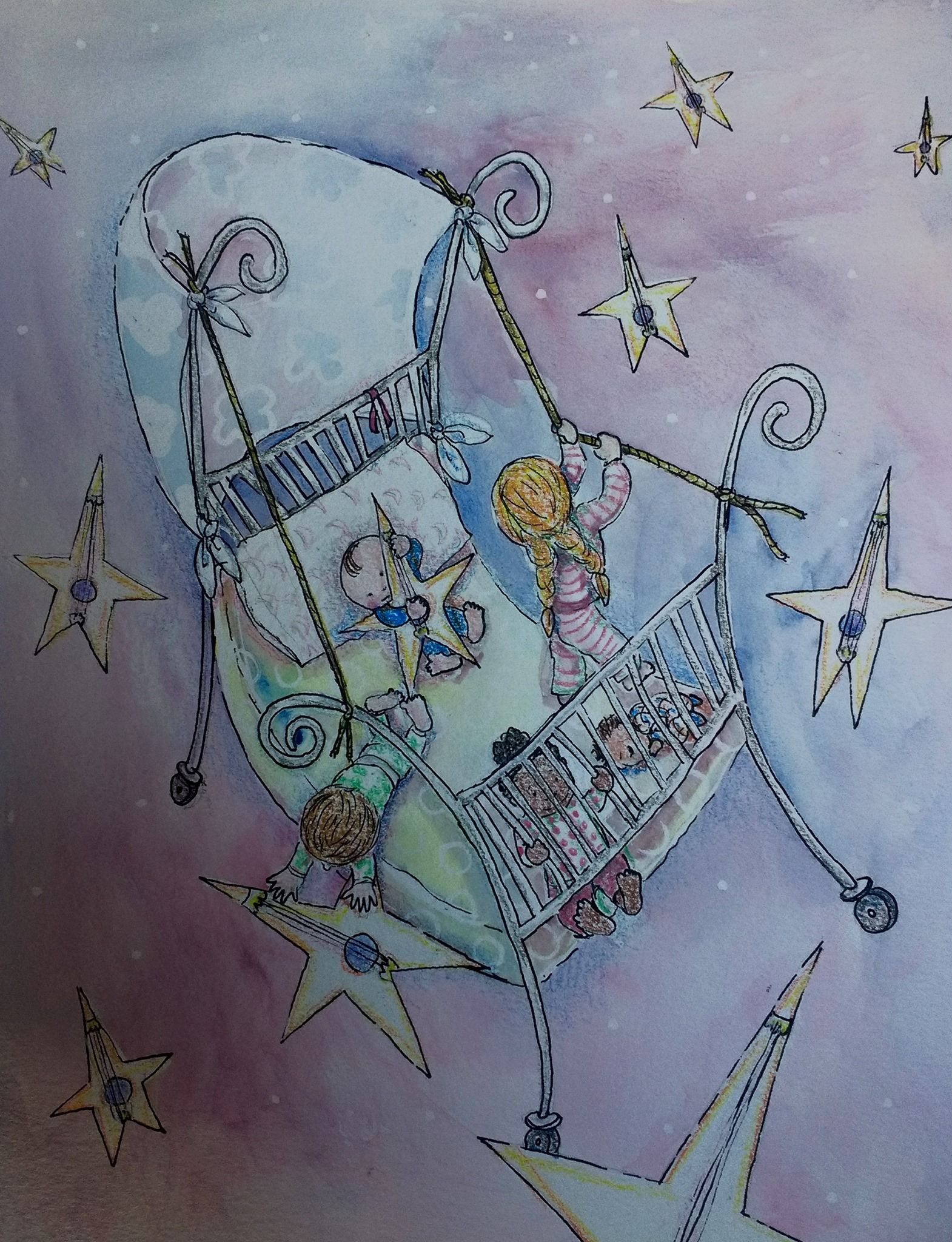
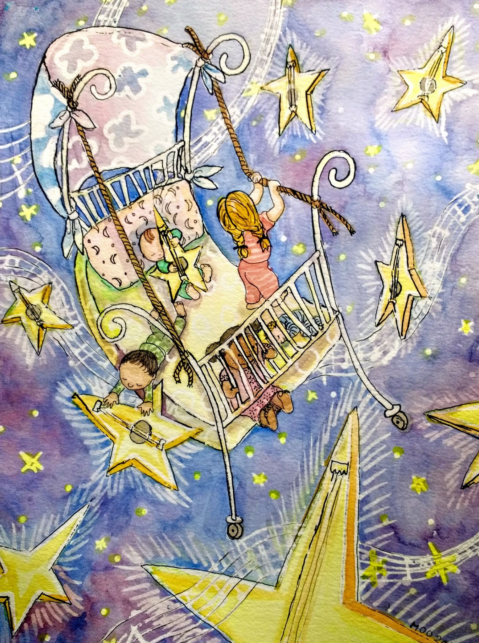
Not a great photo but, please give your tips. Watercolor and prismacolor so far and a uniball pen (which will bleed if I get it wet...Ugh)
-
@Marsha-Kay-Ottum-Owen I love how the stars are musical instruments. So envious of this kind of imagination!
-
@BichonBistro thanks

-
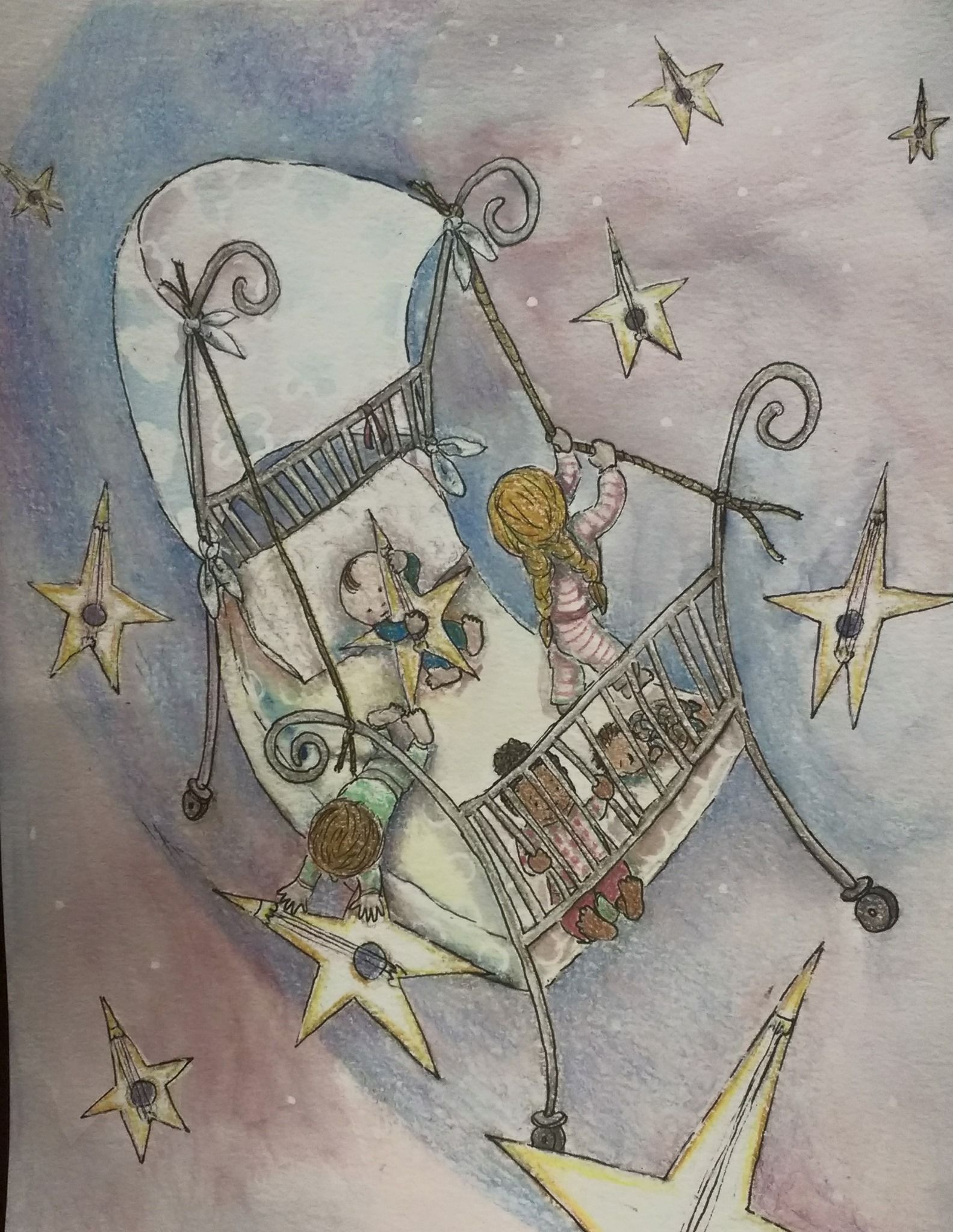
Again, not a great photo but I made some changes. Can you tell?
-
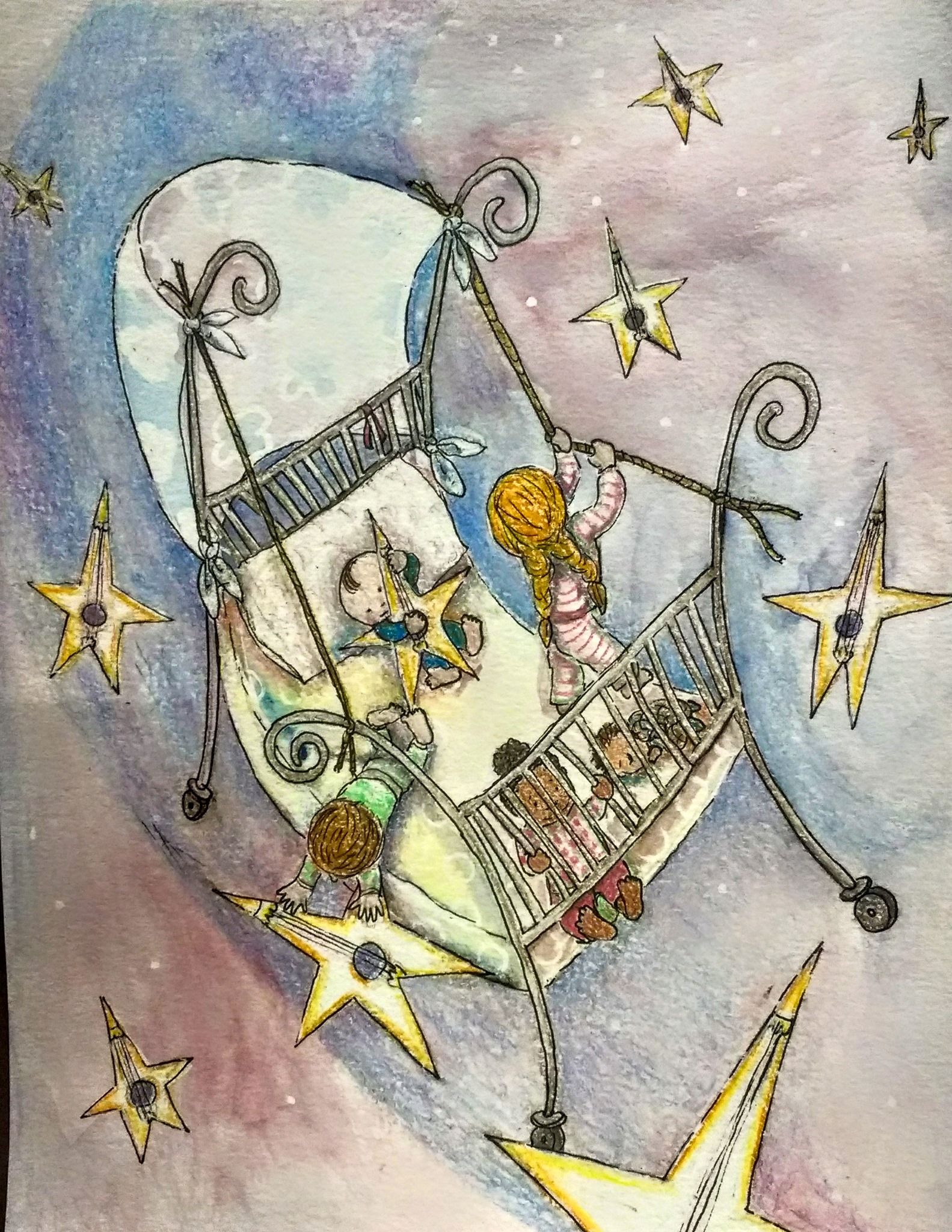
I enhanced the color and light and popped this a bit with my phone. I think it looks better.
-
@Marsha-Kay-Ottum-Owen it’s hard to tell because monitors differ so, but to me this one seems to add more black, which I can see appeals for contrast, but it might muddy the delicate colors in the sky—not sure that’s happening but it looks that way on my phone.
I wouldn’t want you to lose the initial feel of the sky. -
@BichonBistro I think so too
 I might need to redo it. I will maybe try it with india ink and pen so that it will be more water proof and skip the prismacolors. I used them so I wouldn't have to rewet the paper and run the ink pen. Or maybe I'll scan it and see if I can alter it digitally. It would be good practice.
 -
I actually like it a lot! The idea is adorable and the illustration itself has soooo much charm to it
 I don't consider myself a render specialist and I can't notice anything fundamentally wrong with it, so it seems all fine here for me.
The star instruments bother me a bit though. When I look at the shapes, I appreciate the fact that they vary in sizes, but they all seem so flat. Personally, I'd twist and turn them around in space and perspective a bit. That would make this seem much more dimentional, I feel...unless a flatenned effect is what you're looking for, of course! :smiling_face_with_open_mouth_smiling_eyes:
-
@IgorWoznicki Good thoughts! I hadn't really thought of the stars being moved around though I did realize they were flat. If I end up redoing it I will play around with that. I was thinking of adding a bit of an edge to them but never did....hmmm....Thanks!
-
Here's my revised painting. The picture was taken last night with my phone. I definitely need to scan it and play around with it in GIMP, I think to make the colors better
.
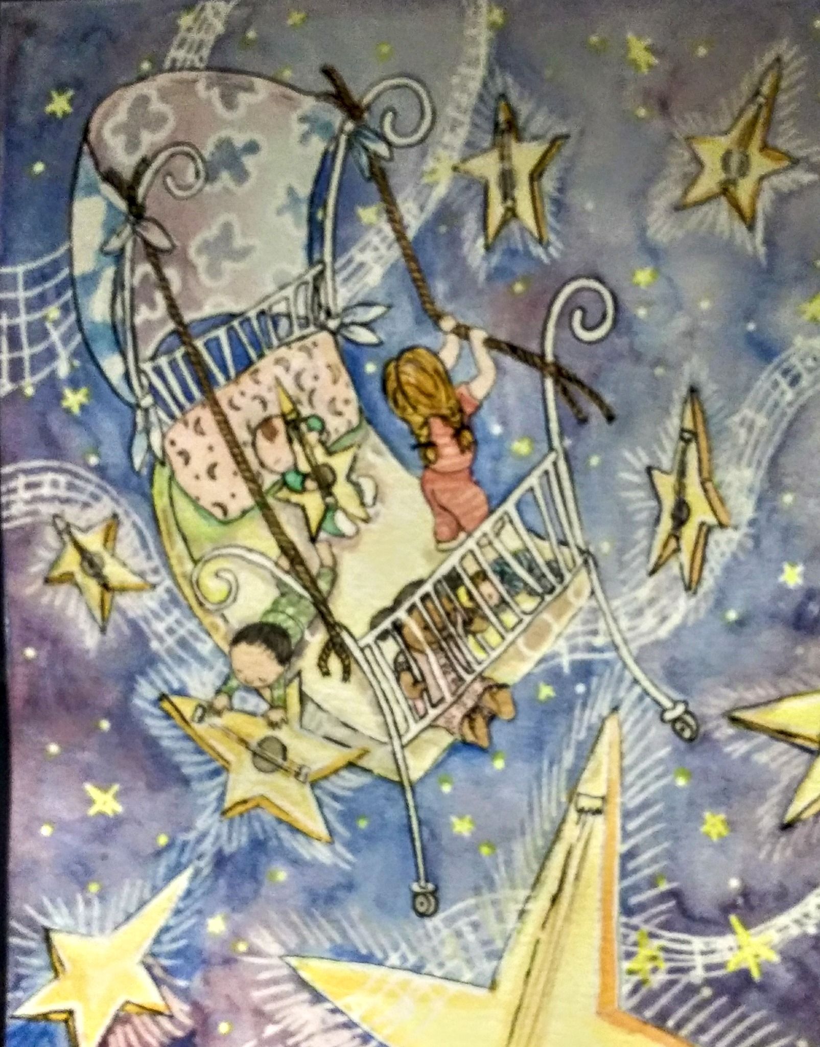
I think the photo looks worse than the actual painting but, here's the enhanced (with my cell phone stuff) version. It's amazing what a difference it makes!
-
This is the best I've seen you photograph and edit your work and it makes such a huge difference! Great job. The star instruments are such a creative idea!
-
@TessaW Thank you, Tessa! That means a lot coming from you

-
I love this! It’s just adorable, really. And you did a great job on the revision. Just love it

-
@Kat Thank you!
-
I always love seeing how you apply all the feedback you get!

I've seen some people asking for feedback and never actually doing anything people suggest them to do...Heck, I've even done that myself!
Seeing how serious you're bout that is quite motivating
-
 ️ Thanks
 -
@Marsha-Kay-Ottum-Owen wow, great incorporation of @IgorWoznicki idea to give the stars dimension—the color looks wonderful too! This is a really fun piece
 ️
️ -
@BichonBistro thanks
