Portfolio Piece
-
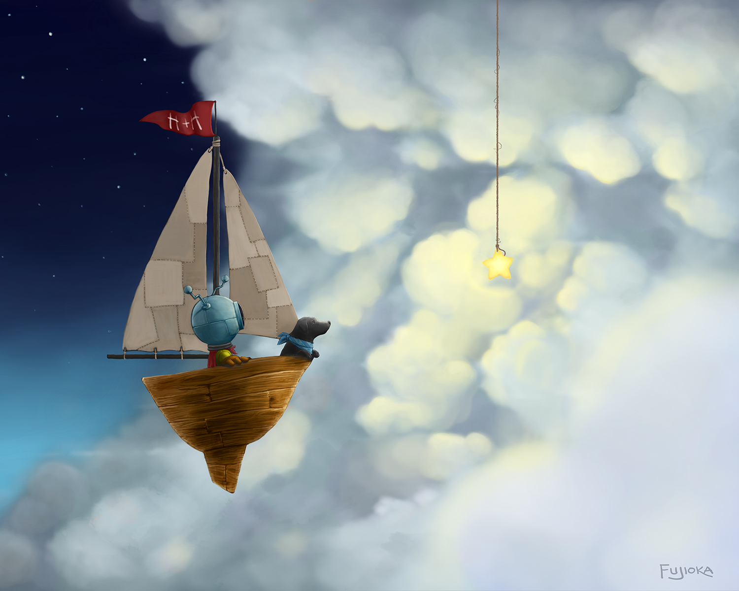
This was done a few months ago and is part of a personal project that I am hoping to continue for several years at least. But I'm also thinking of including this as a piece in my portfolio. As such, I'd appreciate any feedback on it
 (Note: It's been brightened for print so the star looks a bit washed out on the monitor.)
-
a very lovely piece Shinji. I don't know if it's a critique but I would hit the edge of the sail with same amount of light as you did on your dog because their distance don't appear much further to receive different amount of light. The star seems to be very close because of the string and size of the star yet it gives a lot of light to background cloud but not the foreground.
-
What a fun piece! You did a wonderful job balancing the image in value and visual interest. I agree with adding light on the front sail to enhance the contrast. Can't wait to see more from this project as you go along.

-
Good point. I'll try to adjust the lighting to be more consistent.
-
Very nice piece and of course include it in your portflio! It's perfect as is, but if it were me I would patch the sails with subdued different fabric pieces like he invaded his moms fabric scraps. Not too bright to overpower the actual art that exists. I love the star on a rope, character proportions and wood texture on the boat. A very real and organic feel! I could definitely see this in a book!
-
Hi Shinji,
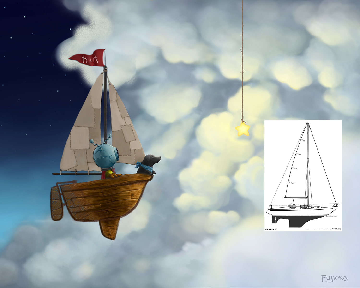
You've already received some great comments. Your image is very professional - it's at that point where you only need a few tweeks in my opinion. I think you're missing out on highlighting that flag with clouds back lighting it - so I made that alteration. Also, I think it's important to follow the construction of traditional objects. You gave your sailboat a mast, main sail, and jib which follows a very traditional mono hull design - but the hull breaks away from the traditional design a little - so I made that alteration as well... Again - minor adjustments. Thanks for sharing!

-
@Will-Terry Thanks for the drawover! The highlighting of the flag really makes a noticeable difference. And as you can guess, my nautical knowledge is about as good as Shaq's free throws.
-
It's always good to get reference
 ...also that center board is 180 degrees the wrong way - the bevel should point forward. I used to do a tiny bit of sailing when I lived on the east coast. It would seem like these things don't matter that much but when you start to rise in the pro world they really do matter - and it's easy to check your work with google....again - really nice job!
 -
Such an interesting image and such great rendering. You are really putting out some top quality work @shinjifujioka
-
@Rob-Smith Thanks!