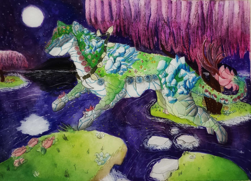
Stone Panther Illustration-- Feedback/Critique Welcome!
-
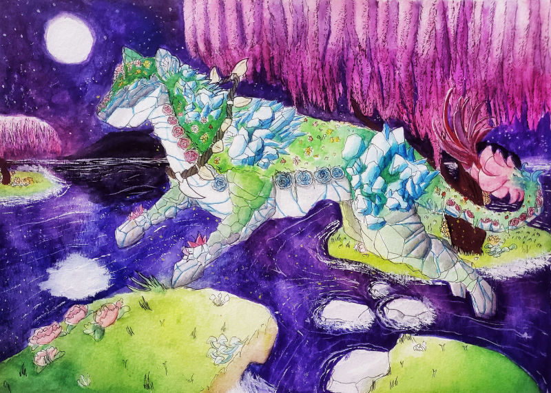
((Better quality image posted later in chat))

This was my first time using gouache! The quality of the image is.....eehh but my phone camera is like that a lot. So as far as critiques go, I am aware of the image quality.
The concept of this character is of a design from someone on instagram. On IG, there is an accompanying short story.
I was sort of in a time crunch, but I think for what this is, which was a test trial of gouache, I think this turned out quite well.
-
@rinovarka Looking good! It is fun to start in a new medium (always frustrating too until you learn the ins an outs.) I like your use of value to make the panther stand out from the background.
The one thing I would say to watch is the legs and tail. They seem to blend into the tree and island they cover and are hard to read because of that. A color or value change there could help.
-

@theprairiefox So I went and took a better picture of this image and went into Photoshop to color correct for what this image actually looks like in real life. Sorry, I uploaded the original picture and didn't realize how dark it was. I need to get a quality scanner honestly.
As for the legs and tail, to keep in mind for another piece, should they be brighter or darker compared to the background?
-
@rinovarka What you don't want to happen is that the edges of the foreground object blend into the background object. Because the greens as so close with the knees and island at first glance you cannot tell which is which. The same is true for the tail feathers. The purple blends into the purple. There are different ways to handle this.
In your case I would say that the background should be darker and the panther lighter. I say this because that is how the rest of the piece reads as well. You could lighten the feathers to match the pink on the tail and I don't think they would have gotten mixed into the tree leaves. For the islands I would say you could have made all of the islands darker to match the rest of the background.
Ideally as the islands moved away from the viewer they should be getting darker as well as there is less light to see them. Kind of like you did with the land mass in the very far back.
Good luck, I can't wait to see your next piece.