Please critique
-
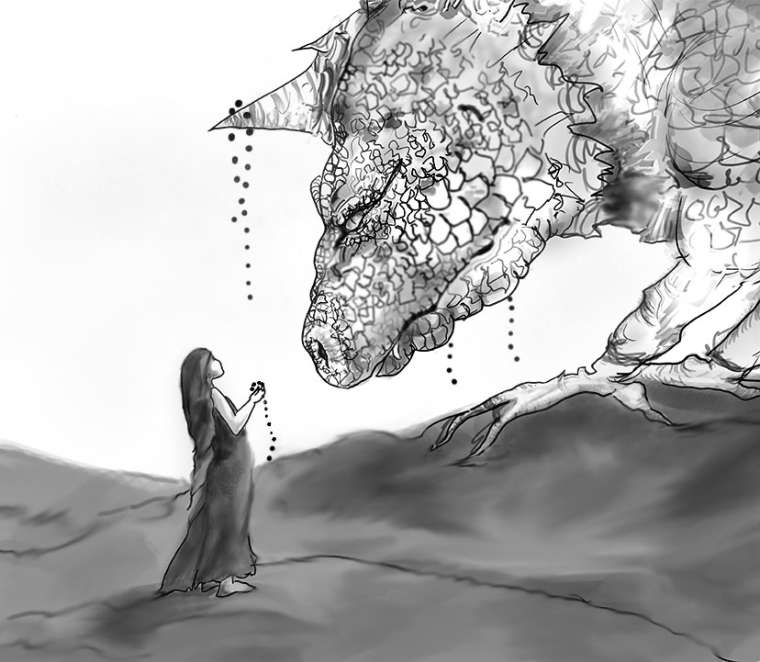
I posted in gd about submitting an illustration that will be part of a month long exhibition. This is the first time I've participated in anything like this and need some honest, skilled peepers looking at this for me!

I will go in and detail her feet and hands and his talons. I'm undecided regarding the background. Would you recommend detail, blurred detail, or leaving white. What about the beast..will I knock back the detail a bit? I will be more careful with the scales in the final rendering I think..maybe less so on the body with greater care on the head. I'm debating turning the girls head somewhat toward the viewer so as to capture more feeling..Just looking for some feedback at this point! Much appreciated.

-
Hey, congrats on the exhibition! It sounds like a lot of fun. This piece is really cool. Here are my thoughts about how this image could possibly be improved.
-
Background and foreground- I do think that as is, the composition would benefit from something in the background. I would suggest adding in a tall landscape feature on the left of the comp, to help balance it out. Keeping it a light value, with little contrast should keep it from being too distracting. I would also consider adding something closer in the foreground. Perhaps if the creature has a tail, maybe it could swoop in from the right and curl around the comp, leading the eye back to the woman.
-
Creature details- I feel the piece would have more of an impact if the creature was looking at the woman. You can achieve this by placing the pupil more left in the eye. I also think it would benefit from having it's features emphasized more, either with line work or light and shadow- especially the eye, mouth, and nose. It's not so much of an issue when viewing this up close, but from far away, they get lost in all the details and it's not necessarily apparent that it's a creature at first glance. If some one is approaching it in the gallery from far away, or if someone is viewing this on their cell phone, having it easier to read at first glance will make a much stronger impression. I like your idea of putting less detail on the body and focus more detail on the head. I think that will really help the focal point.
-
I don't think you need to turn the girl's head. I'm liking the interaction between them. If you turn her head, it could change the tone and make it feel like she's perhaps scared of him- which is not a bad thing- but just something to keep in mind.
Anyway those are my thoughts. Again, congrats on the exhibition! You should take photos of it when it's hanging up and post it here. That would be fun!
-
-
@TessaW These are some valuable thoughts... [I had to laugh at the great tact taken with your, 'it would have so much more impact if the creature was looking at the woman' Yes, indeed. lol Thank you]
I love the addition of the tail and definitely see the improvement with a hint of a forest added. It adds some story and depth..wonderful..thank you so much for taking the time.