Society of Visual Storytelling

    SVSLearn Forums

    • Register
    • Login
    • Search
    • Recent
    • Tags
    • Popular
    • Users
    • Groups
    • Search

    Me vs. Heroes... help me break these down :-)

    General Discussion
    3
    5
    505
    Loading More Posts
    • Oldest to Newest
    • Newest to Oldest
    • Most Votes
    Reply
    • Reply as topic
    Log in to reply
    This topic has been deleted. Only users with topic management privileges can see it.
    • Sarah LuAnn
      Sarah LuAnn SVS OG last edited by

      So I finally narrowed down my list of illustration heroes to 8. I limited myself to living, working illustrators (bye, N.C. Wyeth, J. C. Leyendecker, Beatrix Potter.... the list goes on...), but even then it was hard to narrow it down! Here is what my layout looks like:

      0_1527911440167_MeVSHeroes.jpg

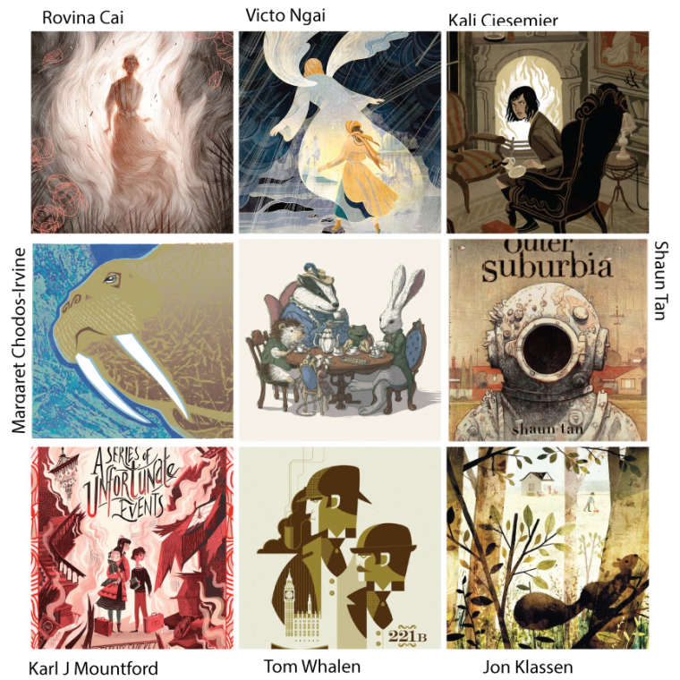
      So, what commonalities are you seeing between my heroes? What do I need to work on? A lot, obviously.... this is an incredibly humbling exercise!

      Whats jumping out at me is:

      Strong, deliberate silhouettes and value relationships (something I am DEFINITELY working on!)
      Muted and/or limited palettes
      Texture
      Selective detail

      I feel like there are more but I'm having a hard time finding words. Help?

      sarahluann.com

      Miriam 1 Reply Last reply Reply Quote 2
      • Miriam
        Miriam @Sarah LuAnn last edited by

        @sarah-luann I agree with the things you mentioned. What else? ...

        • mysterious feel
        • 1 to 3 characters
        • a strong frame around the subject
        • subject in the center
        • graphic-style, bold shapes (rather than realistic, natural shapes)
        1 Reply Last reply Reply Quote 0
        • Sarah LuAnn
          Sarah LuAnn SVS OG last edited by

          Good ideas! Thank you.

          sarahluann.com

          1 Reply Last reply Reply Quote 0
          • Heather Boyd
            Heather Boyd last edited by Heather Boyd

            Commonalities I see Include:

            Dramatic Use of Line
            Emphasis on Shape
            Mono tone colour palette / or Pastel
            Sharp crisp line
            Not overly blending colours

            In these image selections I like Shaun Tan's colour palette and comic look, and Jon Klassen's texture and subject matter.

            🙂

            Instagram: www.instagram.com/heatherboyd.illustration/
            Website: https://heatherboydillustration.ca

            1 Reply Last reply Reply Quote 0
            • Sarah LuAnn
              Sarah LuAnn SVS OG last edited by

              Good ones. I think I would re-word "Not overly blending colors" to "using mostly flat colors with texture". Which is not a huge difference, but I think its what I am drawn to. Thanks 🙂

              sarahluann.com

              1 Reply Last reply Reply Quote 1
              • First post
                Last post