Ongoing Art Thread (Critiques Welcome/Wanted)
-
Hello fellow artists,
I've been a member of this fantastic learning resource for a few months now. The information on here is so good, and so is the community. Because of this I wanted to start a thread here to hopefully get some feedback on my work.
I haven't had any education in art other than my own life experience and the internet. I also haven't had any sort of critiquing since everyone that sees my work is either a friend with no art knowledge, or Instagram where people just say "Good job." So even though my style isn't in the majority here, if you would like to leave any sort of advice, critique, compliment, whatever, it would all be very welcome. Right now I'm having a lot of trouble figuring out my values. I can never seem to get them right.
I will try to keep up posting on a somewhat regular basis, but to start I'm just gonna put up a few of my more recent works.
-
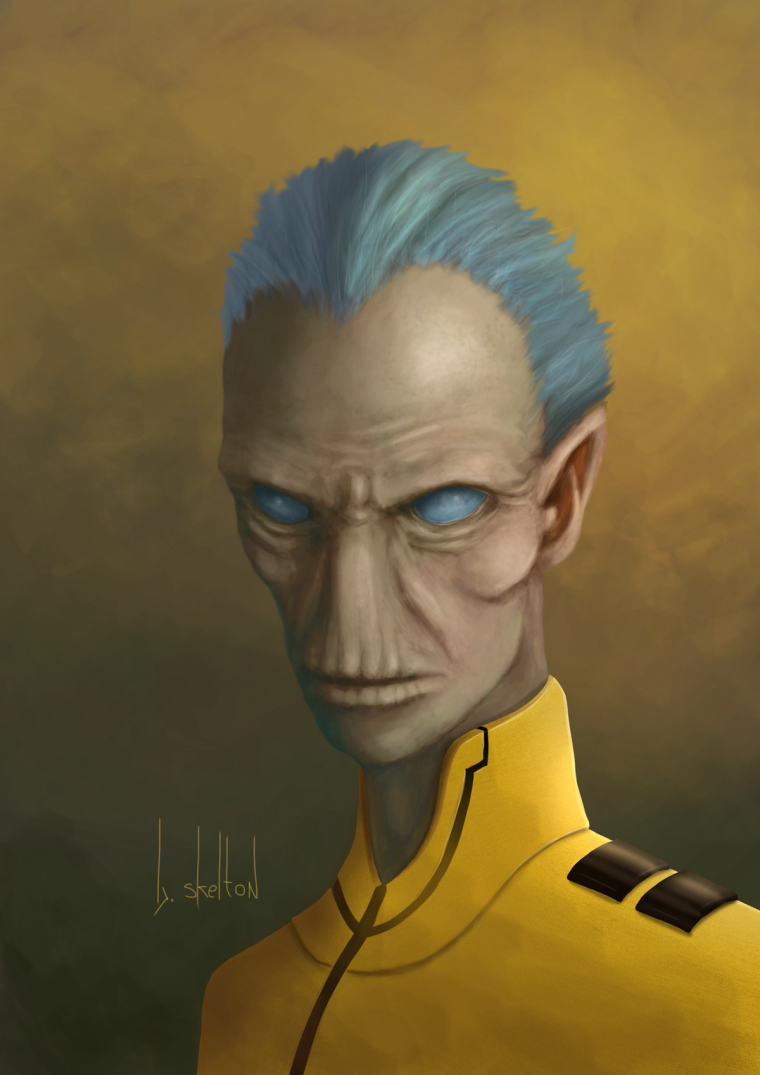
After watching the new Avengers movie I had a new favorite Marvel character, so naturally I had to attempt to draw him. So this is what I came up with yesterday/today. Had a really hard time with his clothes, still not completely satisfied with it.
-
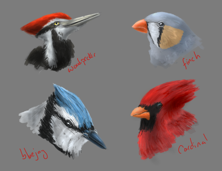
Started on the "Design100 Somethings" as suggested by @Jake-Parker. I wanted these to be quick (less than 7-8 minutes each) from inception to finish. I can already tell from these first few that I'm starting to like the later ones that I didn't think of in the beginning because I'm getting the "easy" ones out of the way and forced to answer real design questions.
-
@buddy-skelton Hello! Nice to see your work.
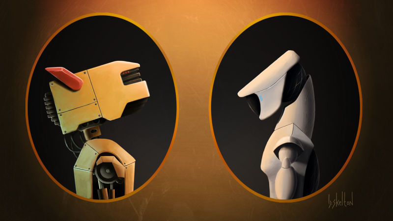
Your robotic portraits (4th illustration) are real slick and clean edged so I was confused why when they hit the bottom edge of the portrait frame they are neither blended nor cut off/behind the orange frame.
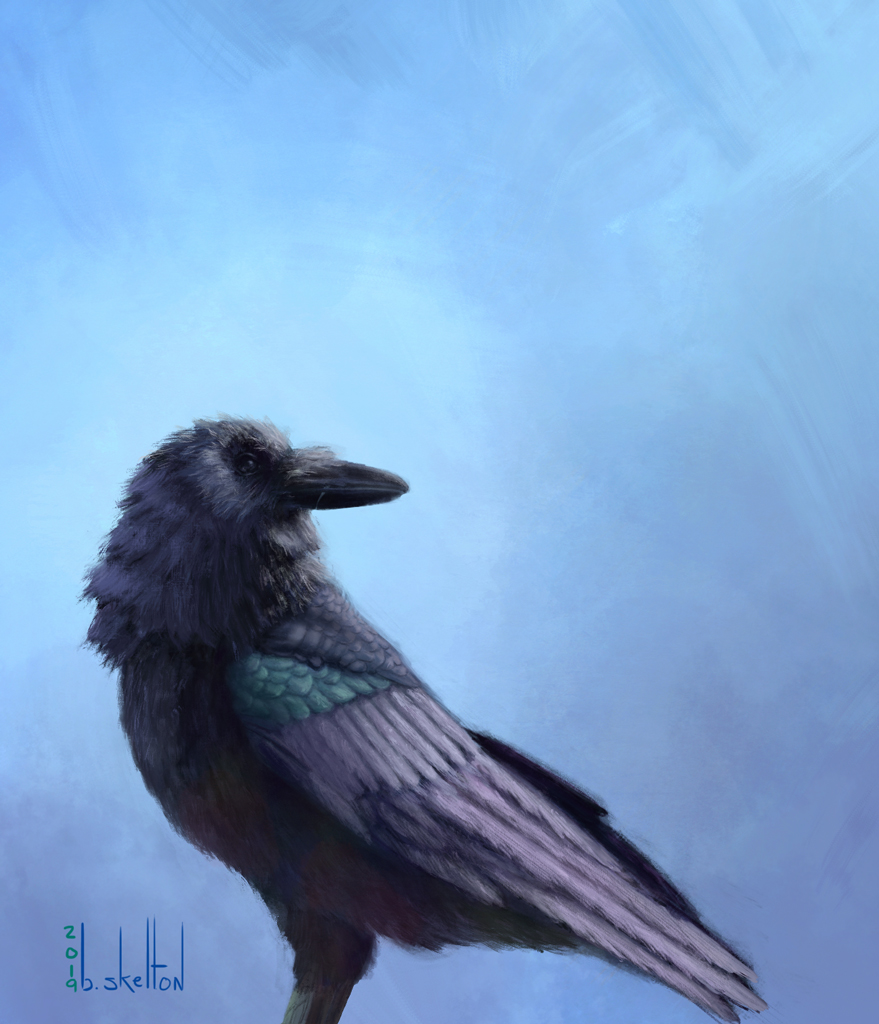
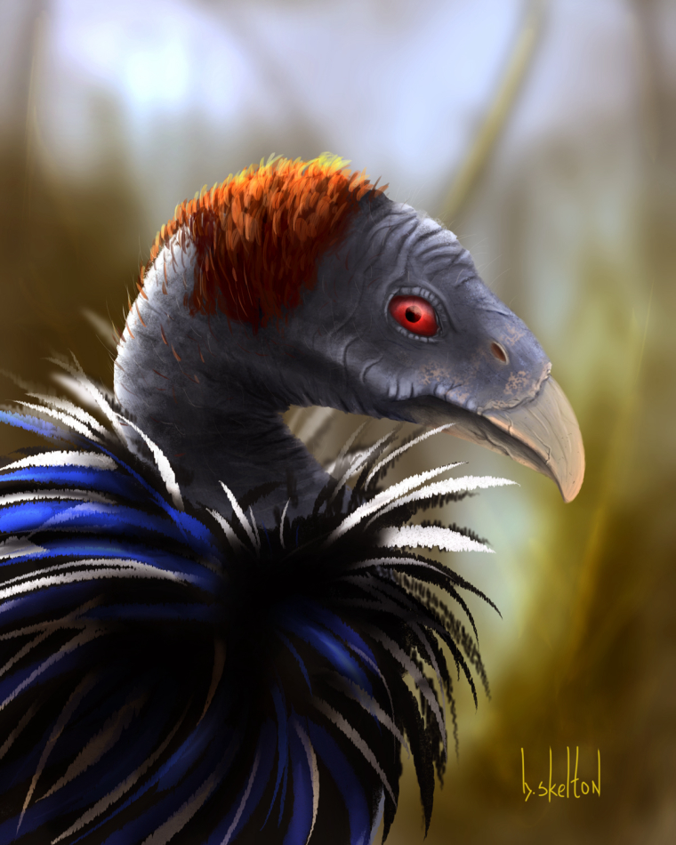
For your vulture (the last bird) you have more definition on its head and less on its featured body. I find it a bit unbalanced. Less definition in the background is understood but I feel the feathers need similar attention as the rest of the bird, seeing that the features are even closer to the viewer.
 I hope this helps. Your style treatment to your robotics is really attractive!
Heather B. -
Thanks for the comments. As for the robots I guess I just uploaded the wrong file. It has been corrected. As far as the vulture goes I just had no clue how to render feathers at the time so I just used a brush to quickly put them in. One day I might go back and redo it.
-
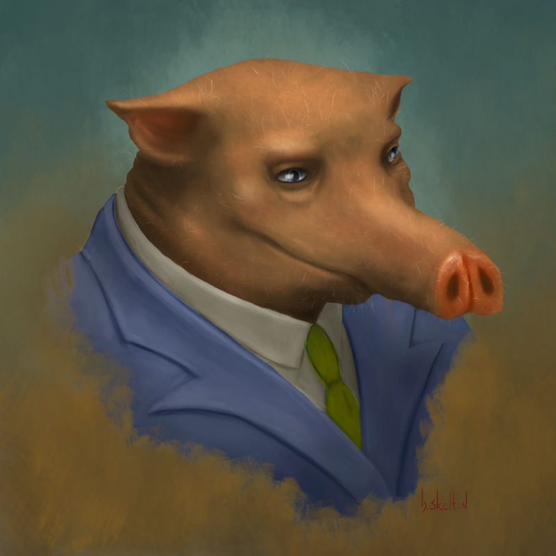
Some random pig in a suit.
-
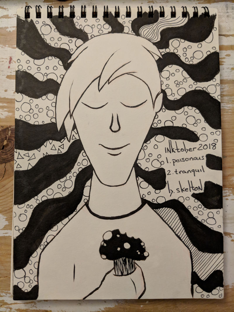
So I decided to try something new for Inktober this year. I am going to mash up two days prompts into one drawing. I have a pretty decent idea for most of them but I can already tell that some will be a challenge.
This first one is a combination of Poisonous / Tranquil.
-
@buddy-skelton LOVING the mash up concept! Great idea and image!
-
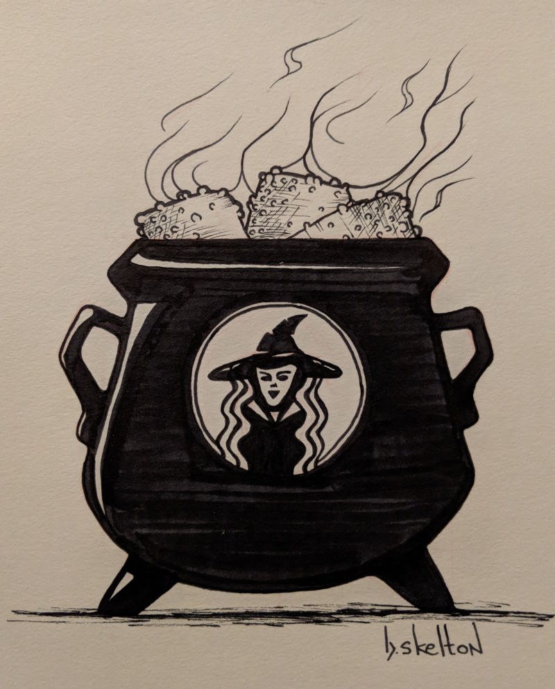
Days 3 Roasted / 4 Spell
This particular "Spell of Awakening" required the delicious ingredient of roasted marshmallows.
-
Oi! Now I'm craving marshmallows - what a way to wake up.
Also, I remember seeing your Pig in a Suit drawing a few weeks back, and he's really sort of stuck with me. His snout makes me feel kind of uncomfortable - kind of has a Howard the Duck feel about him; or maybe a three-little-pigs pig who finally had to grow up and go get a job and then got really good at it and now feels superior to his day dreaming brothers. -
Inktober Days 5 and 6. I didn't mash these two up because I didn't like how what I made turned out. So to meet the "deadline" for both of them on day six I just made two separate quick sketches.
Day 5: Chicken
Day 6: Drool
-
Inktober Days 7-8 Exhausted / Star
Patrick really needed a nap after such a large lunch.
-
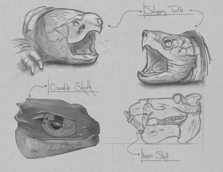
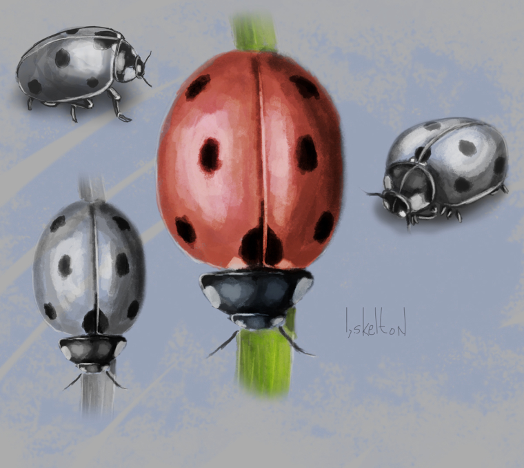
More pencil practice this past week.
-
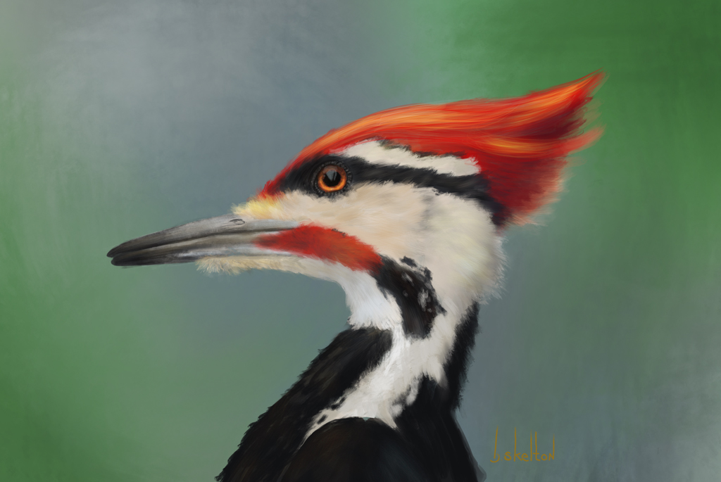
Apparently I have a thing for birds.
