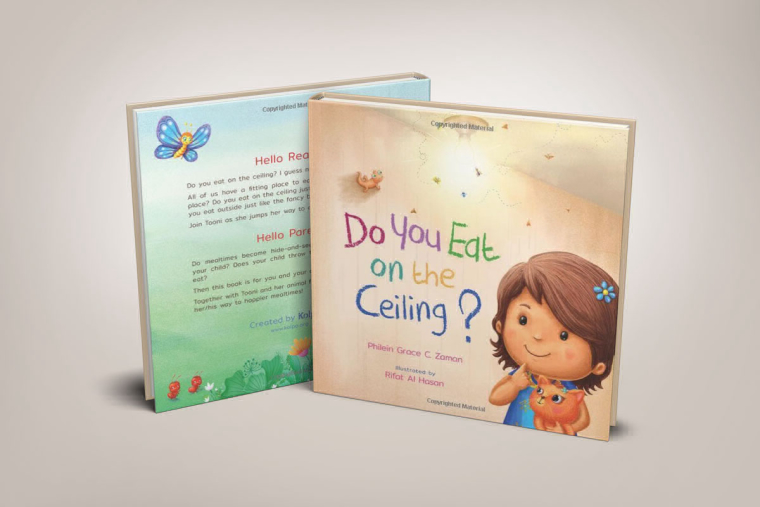
Hi, I am RIfat a self tought Illustrator. Want to do more works for kids :) This is my first post here. This is the cover and some of the inner pages of my first book:) C&C are most welcome
-


-
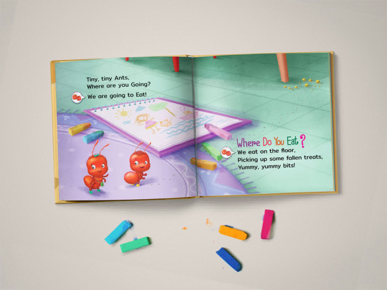
Hi! Welcome to the forums. You have as sweet style. Those have to be the cutest ants I've ever seen. haha
-
Very nice, Rifat! I would not have guessed you were self-taught. Looks very professional. You should be proud.
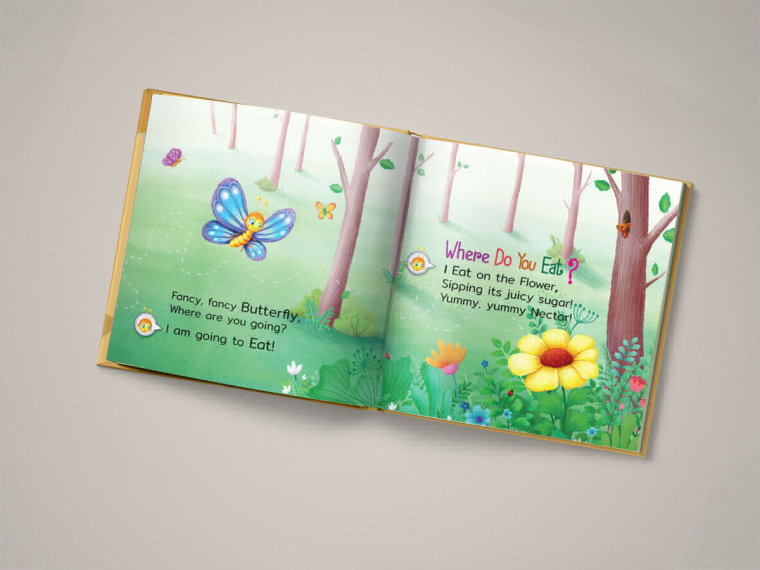
A couple things I will say. Keep in mind these look great and you should not feel the comments mean the illustrations are unsuccessful. They are colorful, sweet, and well-composed.
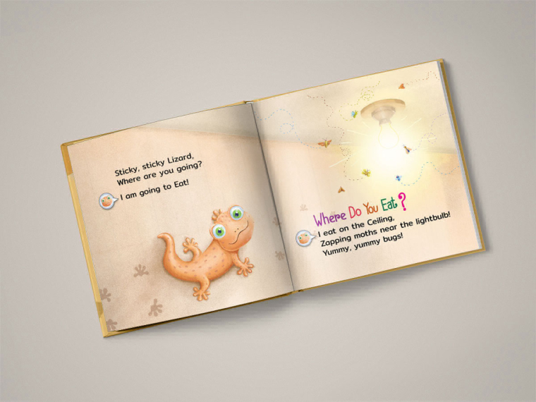
The lizard on the cover and the one on the inside spread are two very different sizes. It looks this way because the light bulb appears to be the same size in each picture. The lizard on the inside spread does not look like he is illuminated by the light bulb despite being so close to it. That is a strong light source. The cast shadow on the lizard on the cover is not quite correct, but it's believable enough for this style. I think making the lizard on the inside about half as big and giving him a bit of highlight and a cast shadow from the light would help. Doesn't have to be a lot, I don't think, because of the style you are working in. But that light bulb is so bright that it almost demands some kind of light effect on the lizard.
Oh, and why are there foot prints in front of him on the inside spread where he has not yet been?2nd point is that the paper on the floor in the ant spread and the tile floor have two different perspectives going on. The tiles in the upper left of the spread are irregular and elongated, too. If the perspective is done correctly they should all appear to be square tiles (assuming you were going for square tiles). The perspective on the pad of paper is too much. Yes, an object appears to get smaller as it recedes into the distance, but this effect on a small object like a pad of paper on the floor in front of us would barely be noticeable at all from the angle we are seeing in your picture. This will happen if your vanishing point is too close to the picture plane. It also appears to angle down into the tiles instead of laying on top of them.
But still very successful and adorable images. Those are very small, picky points just to be aware of. There is not a kid in the world who would care about anything of what I said. Well done!