WIP Re-coloring Red Rabbit - Comments and Critiques Please!
-
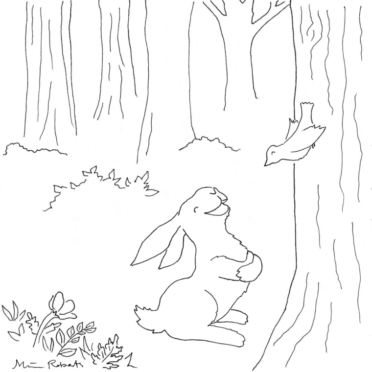
Hi! This is my red rabbit drawing that I did for the SVS bunny wall.
(SVS Bunny Wall blog post: https://www.svslearn.com/news/2017/9/29/send-us-your-bunnies)
(Pinterest SVS Virtual Bunny Wall: https://www.pinterest.com/societyofvisual/bunny-wall/)
For my submission, I printed it out & tried hand-painting it with water color. It turned out ok, but I have a lot to learn, so I want to give it another try, and I thought I'd try digital painting this time. I also changed the bird's beak to give it a more engaging expression.
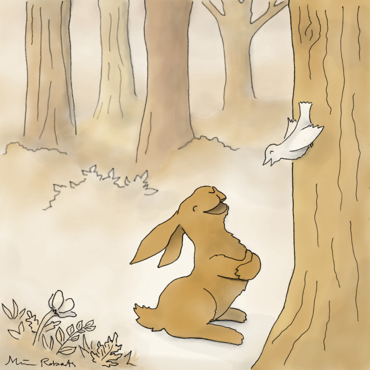
I don’t know anything about shadows, tones, or color, so I am working on learning more by watching Will Terry's 10 Step Digital Painting class. I've been working on painting the drawing along with each video segment I watch. Here is my progress so far (which is 1/2 way through the steps):

I want to do a couple versions--one with a red rabbit and another one with a natural color--like brown. I'm not sure if I should do two whole separate color schemes--but I think I'll just change the rabbit and leave everything else the same for the two versions.
If this goes well, I'm thinking about submitting this piece for Will's FB critiques, and/or the SVS homepage images Lee posted about.
Please share any comments & critiques. Thanks for taking a look!
-
This is looking good! I want to see both versions, specially the red one. I think the rabbit will pop out a bit more.
If you wanna learn more about value, shadows and light/color, there are a few classes here at SVS that are really helpful. You might want to try "Light and Shadow", "Painting Color & Light", "The Magic of Color", "Choosing Color for Storytelling".
Keep at it, and keep us posted

-
@boris-bayo
Thanks!
Yes, all those classes are definitely on my list!I'm trying to follow Lee's advice of really studying a class and getting in more practice rather than binge-watching videos. It's hard to find a good balance when I have so much to learn! I'd really like to be able to create finished pieces, so I need to figure out how to paint / color. Maybe I should go ahead and watch those videos to get an overview, then go back to study them in depth later.
-
Yes, that's good advice! As they say, watching is not the same as learning. You can totally take the classes at your own pace, they have excercises to do and put things into practice. You can also learn from other people's critiques as well. I personally like to draw along while I watch the videos.
And I don't see anything wrong on having an overview of the whole thing either. You can get the big picture first and then come back to do each one in depth, (If you want to do that and have the time to). Repetition of theory and mindful practice helps the concepts and principles to sink in. I've done a few of them twice now and I'm glad I had.
You get to choose your own pace and way to learn here. I love that!
-
@Boris-Bayo "watching is not the same as learning" Exactly!
Yes, I love watching critiques, and was excited when Will said he'd be doing some on Facebook in February. I have learned a lot from watching critiques of other people's work. There's even an example in this drawing. I remember one where Will gave advice about showing the interior of the mouth (instead of seeing straight through), so I made sure to do that with this rabbit. I hope the bird's beak is ok without it. In the first drawing, it's closed, but I think the revised beak in the second drawing is ok. What do you think?
I agree. There is so much information in the videos that watching them multiple times is still interesting and you are right that it helps you really learn what they are teaching. This is my second time watching the 10 Step Digital Painting Class, and I'm noticing the difference of applying each step as I watch this time around.
Oh, if you'd like to get an idea of how the watercolor turned out, I recreated it digitally and moved things around to create a banner on my profile page: http://forum.svslearn.com/user/miriam
This was before I started watching the 10 Step Digital Painting class, and you can see that I don't have any shadow or use of tones. I wanted the rabbit to really pop, and I wanted to use a red similar to the SVS logo, but I think I should have made the colors more cohesive.
-
In regards of the beak/mouth interiors, I think it's a matter of perspective. If the animal is under the horizon line, we would see the tongue probably. If it is avobe, we would see the palate. If it is right on the horizon line, we might "see through", like the beak in the picture. Does it make sense? Of course, animals and characters move around, so it varies. You would "see through" when they are on a profile too, I guess.
By the way, the watercolor looks great, I love the rich red, it draws the eye really quick to the focal point. If you use the "80/20 rule", you can slip some accent colors to catch the eye (20%), while the rest of the painting has a more "cohesive" palette (80%).
Oh, and If you want to quickly add some value, it might help to think about the direction of the light source and the shapes in three dimensions.
By this I mean, imagine a wireframe around the rabbit, like it were a 3D sculpture (it helps to have an underdrawing with basic shapes, like Jake teaches in "How to draw everything"). Now choose a direction for the main light source. Where the light hits the form of the rabbit, have some highlights, and then gradually add value and shadows where light cannot reach. Use the "wireframe" to imagine where the light starts to fade and becomes shadow. Add occlusion shadows where almost no light can get (mouth interior, where the paws touch the dirt, between the arms and the chest, etc).
Eventually you can take it a bit further by adding bounce light, playing with different kinds of light sources (direct light -sharp shadows, diffuse light -soft shadows, etc).I think the secret to create value is to think about light & shadow.
I hope this helps!
-
@boris-bayo
Thanks! Yes, your comments have been very helpful!I was thinking the bird's head was in profile & about eye level, so you can see straight through the beak. That's a good point about seeing down onto the tongue or up into the palate. I will have to keep that in mind in the future.
Oh, I'm glad you thought the colors worked. I did want the rabbit to be bold and stand out. I just wasn't sure if I went too far with the contrast. The 80/20 concept makes sense.
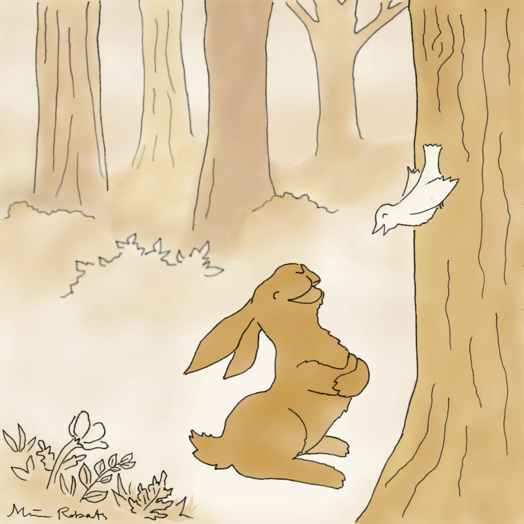
I tried to add shadow before I added the tones. Maybe it's not enough? I wanted the light to come from the left side in a downward direction, but from a little lower angle for a soft morning light. I want to keep the image light--like a bright spring morning.
Here's what it looks like without the shadow layer:
