Looking for critique!
-
Hey guys,
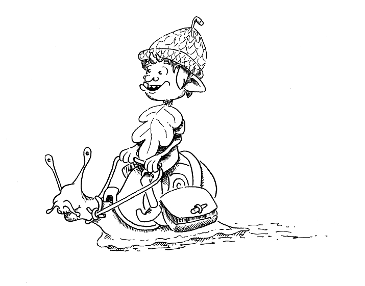
So.. I have been trying so many things recently, but I always come back to good old pen and ink. I will be watercolouring the image as it is for a book that I have written (completely motivated by SVS!!!!). Could I please as you guys to be kind enough to give me any pointers with my style of working? (The image is actually only about 3.5" square).
Many thanks
Adam
-
Hey Adam,
Are you looking for a critique of your style or the illustration itself? As they are now, both look pretty good. One thing I would suggest is that your characters (elf and snail) show a bit more expression in their eyes. Right now the elf is just staring forward, and the snail appears to be looking at the viewer. Maybe have them looking at each other, excited for the apparent journey they are embarking on. A bit more story in the illustration itself would be helpful. Making the leaf look more like an article of clothing would help as well, and make the reins a bit more loose.Or maybe they have arrived at their destination. You could have the elf leaning forward, pointing at something, with them looking at each other.
Hope this helps!
-
@tombarrettillo Thank you so much for the feedback, I will take it all into consideration and post the updated version!
I was looking for critique on both really, I am not confident enough in my drawing style yet to put things out there thinking that people will like them, I'm always expecting criticism, which is OK, as long as it's like yours and constructive!
Kind Regards
Adam
-
I like the your style & I think it will work really well with watercolor.
I agree with what @tombarrettillo said, and can only think of a couple of other little details to suggest.
For the hat, I think most acorns are smooth on the large part & textured on the cap part. The "stem" comes off the cap part at the top, not the pointed end of the smooth bottom of the seed. I just did a couple of Google image searches, and see that a lot of them do have a small pointy nub at the bottom tip though.
Image search for "acorn types":
https://www.google.com/search?biw=1910&bih=1065&tbm=isch&sa=1&ei=KqdVWrPdDIf7wQSms4nAAg&q=acorn+types&oq=acorn+types&gs_l=psy-ab.3..0l2j0i30k1j0i5i30k1l3j0i8i30k1l2j0i24k1l2.217324.219040.0.219311.6.6.0.0.0.0.295.577.2-2.2.0....0...1c.1.64.psy-ab..4.2.576...0i67k1.0.Sov8B5KesdA#imgrc=_Your hat most closely resembles a burr acorn, so you could just make it fuzzier at the base of the hat, and go with that.
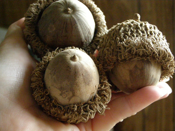
Image search "acorn types" narrowed by "bur oak":
https://www.google.com/search?tbm=isch&q=acorn+types&chips=q:acorn+species,g_3:bur+oak&sa=X&ved=0ahUKEwjY1pCe2MzYAhWCPpAKHbvgAI4Q4lYILigA&biw=1910&bih=1065&dpr=1.5
https://s-media-cache-ak0.pinimg.com/originals/13/1f/4d/131f4d5a543f287859ba222727106f21.jpgThe other thing that I noticed is the teeth. I don't think it works to have one big one on the bottom and a bunch of tiny ones at the top. I'd go with one size or the other--or at least try taking out the one right next to the big tooth.
I don't really know anything about shading, or light & shadow, but you might want to erase the shading on the snail's upper lip and the top of its neck.
Overall, it's really good!
-
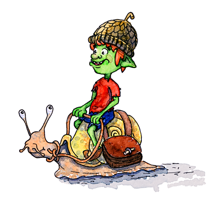
Thank you so much for the feedback, it is so appreciated! I have taken on board what I can, I will probably have to re-work this a few times until I am happy with the character in general as well as the composition, but I have made some major changes!
I have changed his hat (could'nt bring myself to add one to the snail as it wouldnt fit with the story), removed the oak leaf completely, redrawn his nose and mouth, and added some colour! (I am very much a watercolour novice).
Am I on the right track ?
Thank you !!
Adam
-
@abcreative
It's looking good! I really like the painting on the snail, and the changes to his face. The speckled patterns look really interesting & add to the character of the snail.I'm feeling conflicted about the clothing on the rider. You have a hat that he could have just found on the ground, clothes that are either well-worn or rough-hewn, but have bright colors, and a satchel / saddlebag that looks well crafted. The shoes are less noticeable, but they look like they'd take knowledge and skill to make as well. The two characters are very whimsical and fairytale, but the shirt looks almost like a t-shirt. I think this discrepancy--along with the bright colors--draws attention to the clothes instead of the characters. I think even just changing one thing or the other--the style or the saturated color--would reduce the distraction.
Maybe you could think about the world this character comes from. Does he have to make his own clothes and items? Are there skilled workers? Does everyone dress the same, or does it depend on their job / lifestyle? You can have a mix of shoddier items and well-made things, but if you have a story / background behind it--that can help it be more cohesive in your view of the character, and that will come through in the drawing.