Color book page thread (JMKilthau)
-
Hi All! As the title states, I wanted to make this thread for a project I am working on. I want to make pages for a coloring book I want to print sometime in a few months. I'm thinking around 20-30 pictures with a title image for each section/theme. And maybe 4-5 pages for each theme. Right now I'm working on Underwater and using some inktober pieces to get started.
Suggestions, Critiques, and Cools are more than welcome! -
Here is my first image so far, used the Anchor I drew from inktober. I am currently brainstorming what to put in the background to fill the whitespace without taking away from the anchor and its inside.

-
I like the anchor. Maybe put a couple seagulls on the eye of the anchor to fill that space.
Will this be a coloring book for adults or children? I ask because there is quite a bit of small details that may be difficult for younger children to color. Could be a non-issue, but just my thinking. Maybe I should ask my teacher wife. : )
-
@tombarrettillo Thanks! I wish I checked back earlier but I have been busy with OT at work. The seagulls would have been a cool addition. I will have to keep it in mind when I finish all my pages and go back through for any final edits!
I don't plan to have anything to graphic so it could be for children as well. But my initial audience mindset is more young adult/adult .I want to have it ready for print by February but ultimately it needs to be good to go by September and with me physically, because I got a booth at our Portland Comic Con. Which is my first one and I'm pretty excited.
Here is the current "final" anchor.

-
I mentioned the seagulls as I thought you were referring to the white space in the eye of the anchor, but I see now you mean the white of the page. I like the chain and the barnacles. Good luck at the Con
-
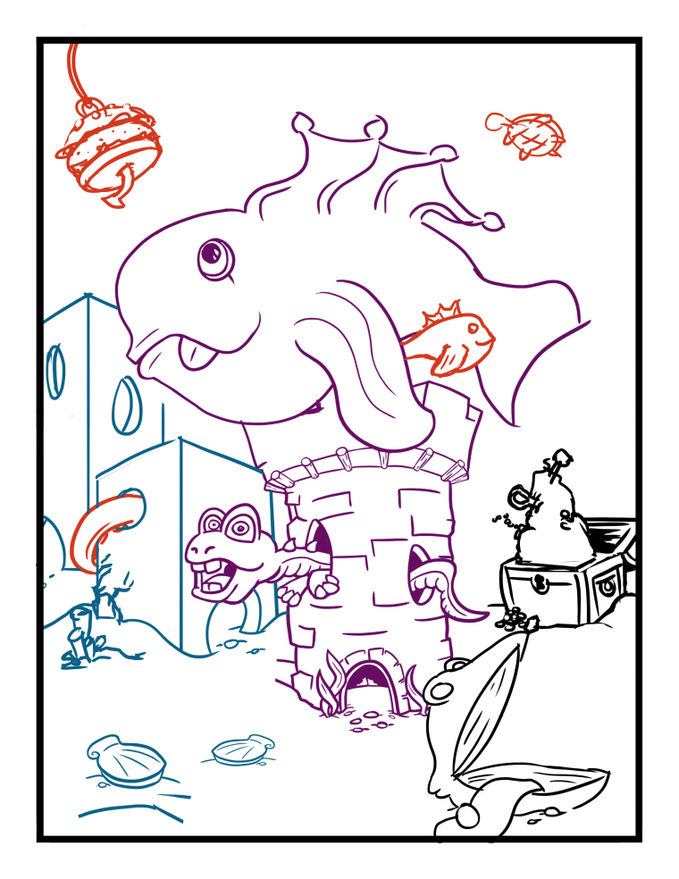
Next page I am working on with the underwater theme. The colors are to help discern certain layers to make it easier to erase when I draw through other parts of it, helps with the whole drawing flow.
-
@jason-kilthau Love the use of barnacle! I'm wondering if the inner link should have a lighter weight on the lines. They seem to distract as both inner liner and outer lines are thick.
-
@amphailin thanks! and thank you for the feedback, I am not sure if you're talking about just the links going over the center or a specific part of each link themselves. But I will make adjustments when I get back around to that page and see how it looks.