October 3rd Thursday: Ostrich
-
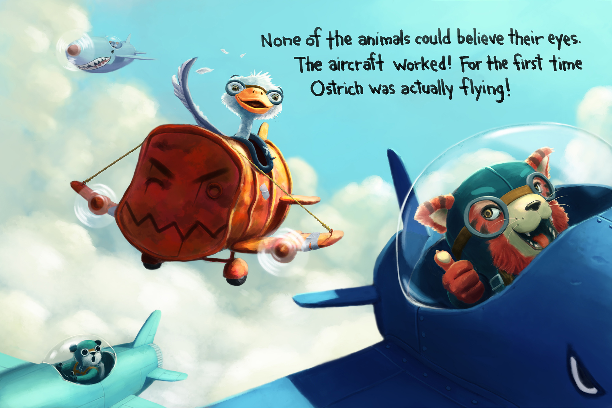
I think I'm ready to submit...I took the advice of those that said to lose the plane in the top right and instead placed text there. And I have to agree, I think it makes it a better composition. Having another plane there would have been more noise than was necessary.

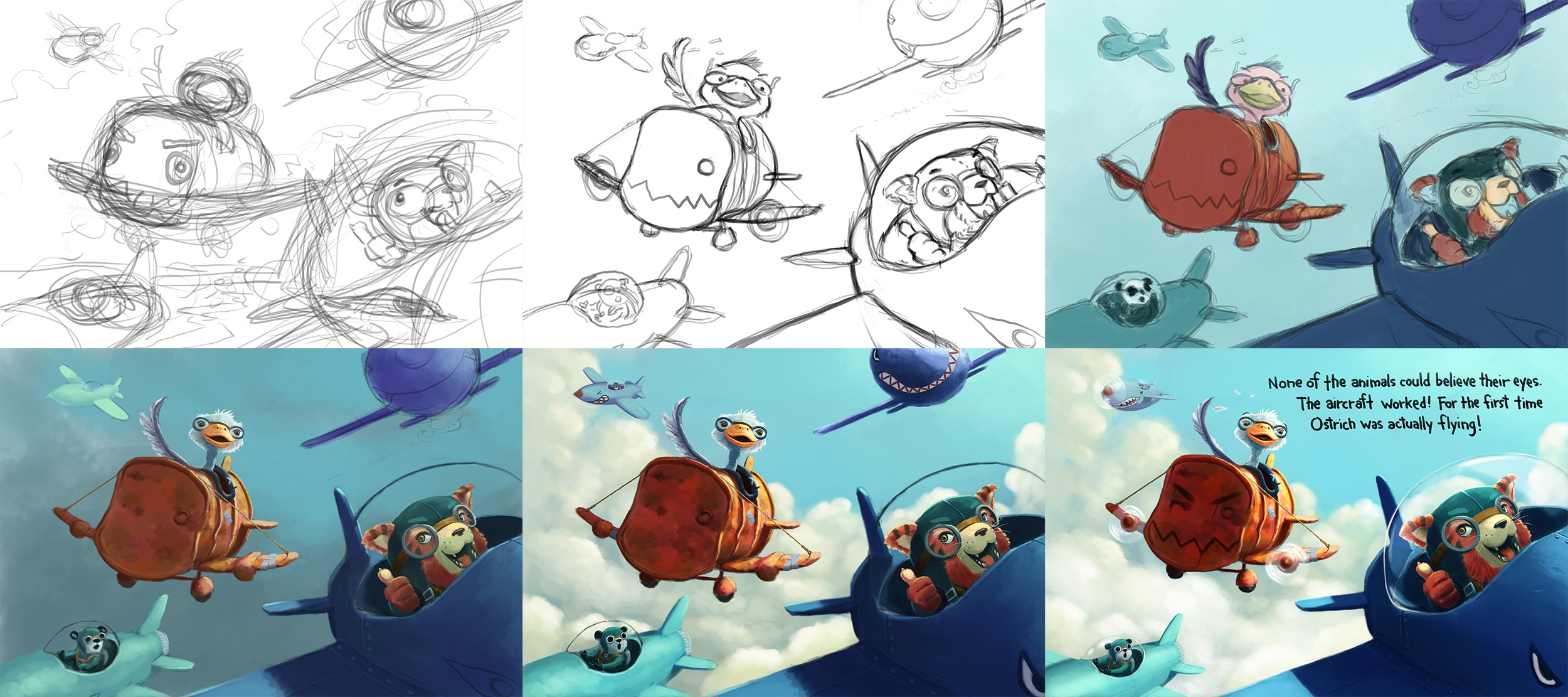
And here are a few progress pics.

-
Love it! Love the colors and the fun they have together! well done! @shinjifujioka
-
@Leontine Thank you, it was fun to work on it

-
Great piece! Wow! Nothing but love here!
-
So much better without that other aircraft. This looks amazing! Well done.
Ace
-
Really nice job on this one and I love the added face on the front of Ostrich's airplane!
-
@Katrina-Fowler Thank you!
@Ace-Connell Agreed, it's a stronger piece without that other aircraft.
@Rich-Green Ostrich wanted to make sure that his plane fit in with the others

-
This is beautiful work, I think the composition of the aircraft is really strong and I love the soft light

-
Excellent! Marvelous! Bravo!!! I love how fun and playful this piece is. The characters are so awesome. The placement of the text looks good too. You are totally ready!
-
This is really really good.
Love the text font too. What is it?
-
@mattramsey Thanks! The text is actually my handwriting. Not my normal handwriting, of course. Just the one I sometimes use on illustrations.
-
@shinjifujioka said:
@mattramsey Thanks! The text is actually my handwriting. Not my normal handwriting, of course. Just the one I sometimes use on illustrations.
Ha ha that's great. You should do all the letters and make a Photoshop font!