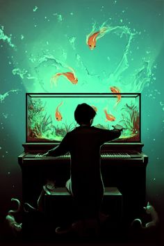
Lion, Ocean and Submarine
-
A long time ago I had asked folks via my art & illustration Facebook page to send me in three words (animal, object, location) and I started making illustrations from them.
But then like so many other things I dropped off doing that and never got back to it.
One of them was from my niece and she said Lion, Ocean, and Submarine.
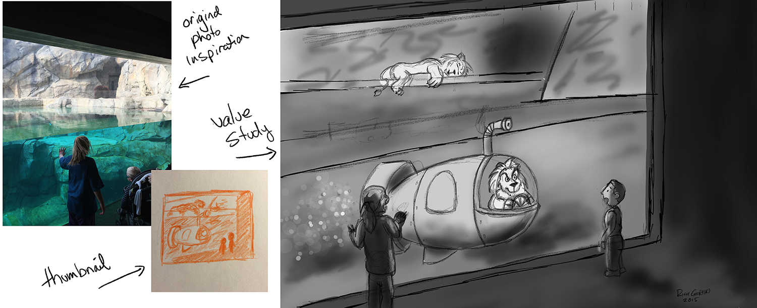
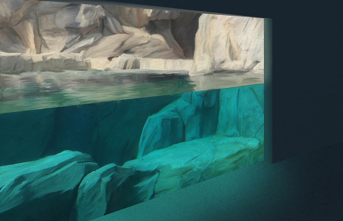
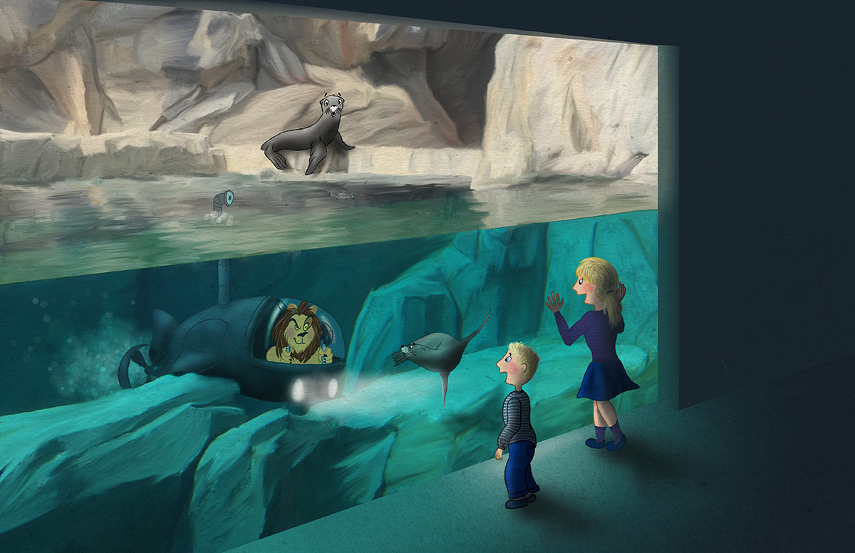
Meanwhile I had taken a few photos of my niece/nephew at the zoo earlier this year and I loved this setup where you could see above/below the water (in what should be a bear viewing area). So I decided to combine the two things and am working on what I hope will become a portfolio piece where the kids are looking at the window and we see a lion sleeping on the rocks above the water in the background and another lion in a submarine pulls up in front of the glass looking back out at them much to their surprise.
I was just working on the value study to see how I want to handle the sub/lions vs the silhouettes of the kids in the foreground. And so far I love that framing and the darkness in the foreground contrasting on what will become a splash of colors in the cool water and on the warm lions.
I am looking for any feedback or suggestions in general.
I also have a few questions:
-
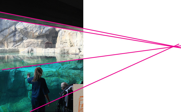
Should the top of the glass window actually go down from the top left to the right side? (Like it appears in the photo) or should it line up with the bottom of the glass like I have drawn in the value study?
-
Is the lion sleeping the background too large? I am struggling with making him too small but I am not sure if he still appears a bit large in comparison with the one driving the sub who is more forward?
-
While I still have to do the refined drawing and will be adding in lots of texture and detail on the rocks and within the water - do you think this is too simple looking overall?
-
In my thumbnail I had both kids on the right side of the glass but for the value study I moved them on either side - do you have a preference of which looks better?
Thanks so much in advance for your input!
-
-
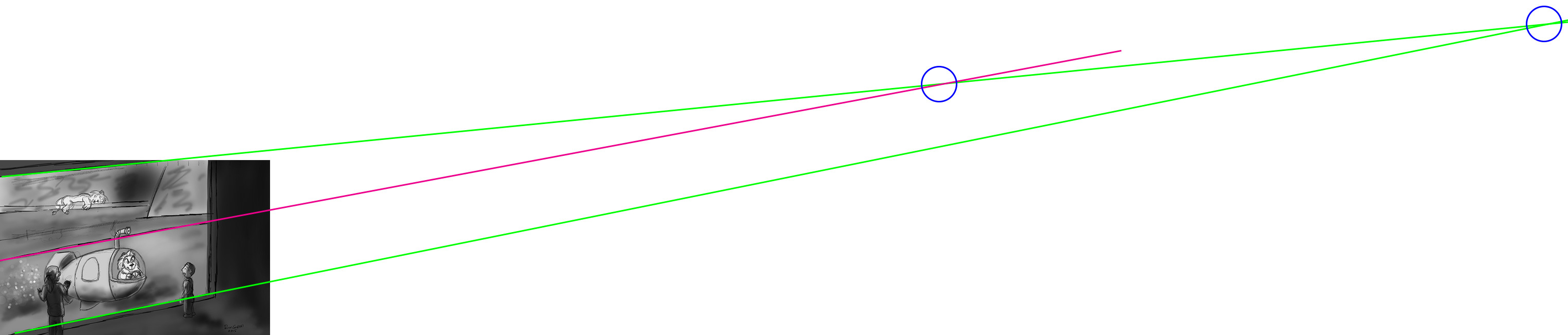
This will be a fun illustration Rich! - my vote goes to the thumbnail version - the eye travels nicely around the page - in the value comp I feel like I am being pulled in many directions - Too early for this type of feedback I'm sure - but if you look at the point where the periscope exits the water it is shown as exiting right next to the glass - there is no water between where the periscope exits the water and the glass - this makes the front of the sub and the bend in the periscope that comes forward read as breaking the plane of the glass - look forward to seeing the next step!
-
@Kevin-Longueil - thanks so much I appreciate this input very much. And yes your point about the periscope is great also - I will be sure to correct that in the next revision for sure. Thanks again! Rich
-
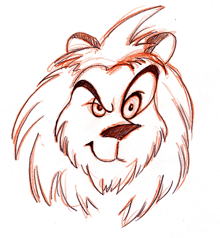
Also here is a more detailed close up on the expression I wanted to give the Lion in the sub. I want him to look like he is a bit mischievous and up to something.
-
@Rich-Green Hey
")
I'm loving this idea! I can't wait to see the colour studies and it fully done
Here are my thoughts...
- The top of the glass really depends on the perspective. Honestly, I prefer the perspective of the photograph as it seems more dynamic and frames the piece nicely. The way you have it set up has a vanishing point for the glass and a separate one for the water and the glass vanishing point is probably as far away from the zoo as the lion's home in Africa haha. I've drawn over so you can see...
-
Honestly, I think this lion's fine. I mean, yeah in real life he'd probably seem a little smaller, but breaking that rule doesn't break the image for me. It's not like it's overly large. Plus, there's no indication that the one in the background is not just a bigger lion or anything like that.
-
Nope, I don't think it looks too simple overall. It reads well and that's the point of the image. I think as artists we have the tendency to try and over-complicate the piece.
-
Compositionally, I'd probably have the kids on the right like they are in the thumbnail. It adds a nice balance to the composition and it's like they've come together and both frozen on the spot to see the craziness happening in front of them.
I hope this helps
They are the only things I'd change if they were my image. The only things really for me is the vanishing point and then the children.Take care Buddy,
Ace -
@Rich-Green Hi Rich, I found this one on Pinterest, It might help you for this wonderful illustration you're working on!
-
@Rich-Green maybe This artist can inspire oyu even more...aquasixio.deviantart.com!
Leontine
"A picture is worth a thousand words."https://leontineillustrator.com
https://www.instagram.com/leontine.illustrator/
http://www.facebook.com/leontineillustration -
@Ace-Connell your perspective lines made this make so much sense in my mind now - thank you so much for taking the time to do that for me. I have watched and practiced the Jake Parker perspective video and yet I totally lost control of it here and never once did I think to draw out the extended guidelines to get me back on the right path. Really appreciate your help and input!
-
@Leontine thank you so much for the reference images - they are going to prove very helpful here!
-
@Rich-Green I agree that the thumbnail is more dynamic. I like keeping the kids together. Then they read as one design element instead of two. I do think the sleeping lion should be smaller (sorry to disagree @Ace-Connell ...but I have your cookies. Pumpkin ok?). Right now you have a lot of shapes/lines that are the same size: the girl, the lions, the horizontal and vertical lines of the rock on the right, and the space between the sub and the right side... Scooting back the sub so the periscope isn't breaking the plane of the glass and making the sleeping lion smaller will vary your shape sizes. I love the lion's facial expression. This is going to be a great illustration!
Twitter: @Joy_Illustrated
Instagram: joy_illustrated
Website: joyheyer.com -
@Joy-Heyer Thanks for the input Joy! I have a few new ideas up my sleeve to give this scene a bit more of a story so I will be changing things like the sleeping lion for a different character completely. Stay tuned for that later today. I fully agree the sub needs to be pushed back a little and the issue with the periscope breaking the plane of the glass also has to be corrected. And I also agree the kids needs to be on the same side of the glass. Thanks so much for your input can't wait to keep posting updates on my progress to show how much better this is looking because of everyone's help here!
-
So far this morning I have worked on completely revising the image based on the perspective issues that Ace did such a great job of helping me see earlier.
I have then been working on all of the backgrounds which you will see here. I have found that using a painterly style really lets me create that rocky environment above and below the water. This style works for me at least based on my current skill level. I always think I am going to set out and create a more simple line work image but then I tend to find myself needing to add details in because I enjoy them so much. So hopefully this is working here.
As for colors I am sampling directly from my original photo as I absolutely love the teals/greens in the water - I think that is why the photo has stayed in my memory for months and I knew when the time was right I was going to do something with it. I just find it so appealing to my eye - so those are the colors I have used here.
I have moved around the brightest underwater rock and felt it will be best on the side where the kids will be placed as it gives a much stronger contrast for their silhouettes once I add them in. And then I left a darker gap towards the middle of the rocks which is where I plan on placing the submarine pushed back a bit like everyone has suggested.
-
Wow....nice!
-
That filtered lighting...friggin sweet.
-
It's looking fantastic! Love the color!
-
@Rich-Green Dude! Yes! This is looking awesome!
Ace
-
Hi Everyone,
Thanks for all the kind comments after my last update. OK so here it is now - I have to send it in this evening for a midnight deadline on an upcoming SCBWI illustration breakout session in November. So while I wont be able to make any changes for that - I am really thinking of using this to make my first ever postcards to send out.
So please let me know if you see anything else I should adjust.
A small change to the story I am imagining for this one.
-
I removed the sleeping lion and instead have turned this into a Sea Lion exhibit.
-
I imagine the Lion getting jealous that the Sea Lions were always getting all the attention from visitors at the zoo. So he got himself a submarine so that he could be a "sea" lion too!
This piece really pushed me in several areas - perspective, backgrounds, trying to really think of that sub in 3D and for that matter creating a machine - something I do not think I ever really do. So it was good fun to push myself like this and I could feel myself getting better and things "clicking" in my mind as I figured out ways to solve the challenges I was facing in that moment.
Anyway - I hope you all enjoy this one as much as I do!!!

-
-
@Rich-Green Hi There Rich, It has turned out great! Love to see the flow your in and how you push yourself! Its a great piece. There is one thing that I think can be approved, thats the color of the lion. Because he is behind glass, he should have a cooler color. now the first thing you see is the lion. It would be nice to keep the first focus on the children, and there surprised faces.
Leontine
"A picture is worth a thousand words."https://leontineillustrator.com
https://www.instagram.com/leontine.illustrator/
http://www.facebook.com/leontineillustration -
@Rich-Green Hey Rich. It's looking great. The only thing standing out to me is the lion. It's not feeling like he's under the water. I'd add a bit go green into it, but still keep a lot of his colour because I like how he stands out. I just did this quickly, but you get what I mean.
Ace
-
Oops. Sorry. I's started typing before @Leontine had posted lol. But yeah, essentially I'm just mirroring what she said
Ace