where was I / where am I ?
-
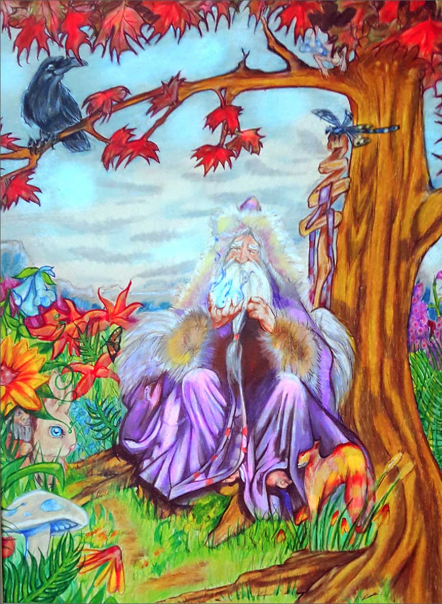
This is a colored pencil drawing from back in 2009. I had forgotten about it and recently came across it. wasn't supposed to be a finished thing, it started out as a doodle but I had just opened a new box of pencils and got a little carried away. I can't really critique my own stuff, there are some things I like about it and too many things I don't. I would appreciate any critiques on this old drawing, as I am trying to find a style for what would be my "childrens" style.
-
This is really cool! I love when doodles find a life of their own. I realize this is traditional, but some things to look for in the future - it would help if the contrast were a little stronger. I love the fur on his cloak, but along the hood it gets lost in the sky, and the flame is lost in his beard. I can see they are well drawn, but have to look a little harder for them. I think limiting your pallet on the flowers would help a bit as well. the eye jumps around with all of the dissimilar colors. Just suggestions
") I love the critter rubbing along his leg hehe
I love the critter rubbing along his leg hehe 
-
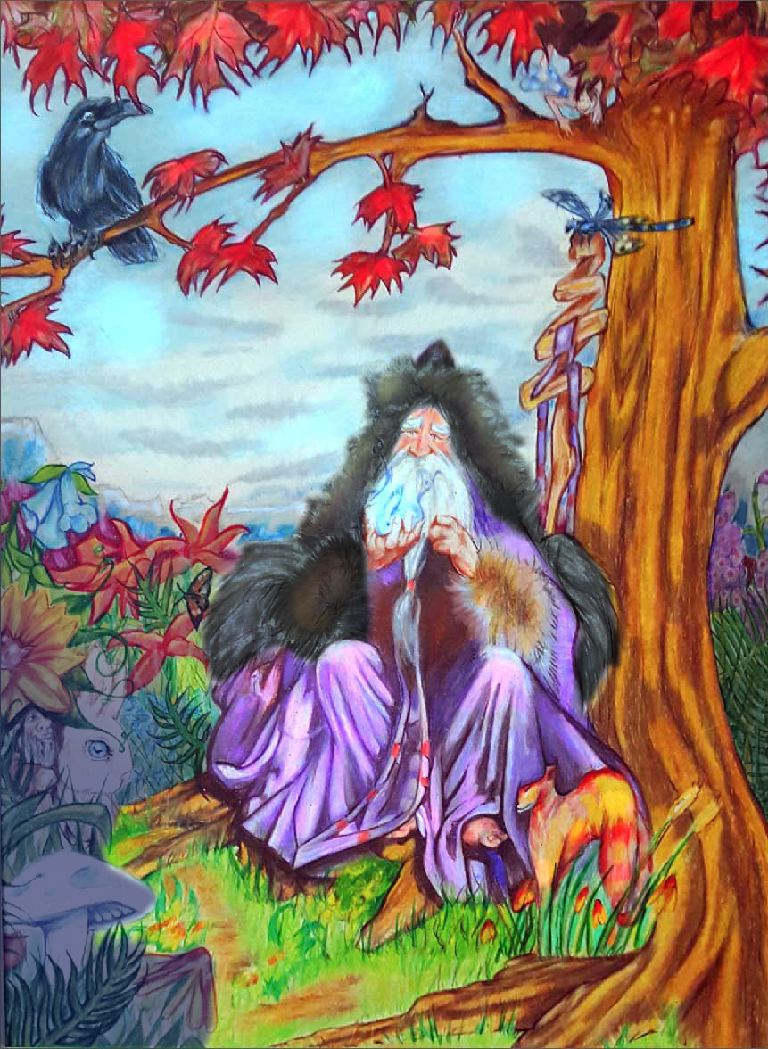
I think this is where digital rescues traditional, I should be able to make those changes digitally. Thanks.
-
this illustration has potential, it;s very nice. like lynn, I would probably start by reworking the values, limiting the palette. And I would make his face darker as well, so it's more readable on the light background
-
This piece really sits well with me and I love the wizard. Coloring is very saturated but it works for the overall feel of this piece. Well done and hope to see more.
-
I'll just repeat what everyone else already said about the colors. One possible way might be to throw it in photoshop, desaturate the whole image on a different layer (plus darken some areas lighten others) and then erase out the bits you want to pop. I'm assuming you want to place the focus on the wizard and especially his face, which seems to be disappearing into the sky because they have the same values. So build up some contrast there by maybe darkening the sky and adding some stronger shadows in the face, especially just under the hood he's wearing or darken up the furry parts of his cloak particularly surrounding his face to create the contrast. Something I noticed was that the leaves and branches on the tree have a hard dark outline ,which looks cool, but is creating areas and shapes that are more interesting than the wizard. I might suggest softening up those leaf edges and maybe desaturating the redness in them which is another factor competing for where you want the focus to be. Hope you don't mind my sloppy drawover. This may not be the answer but I thought I'd give it a shot.
-
@Jonathon-B Stellar critique!
Ace