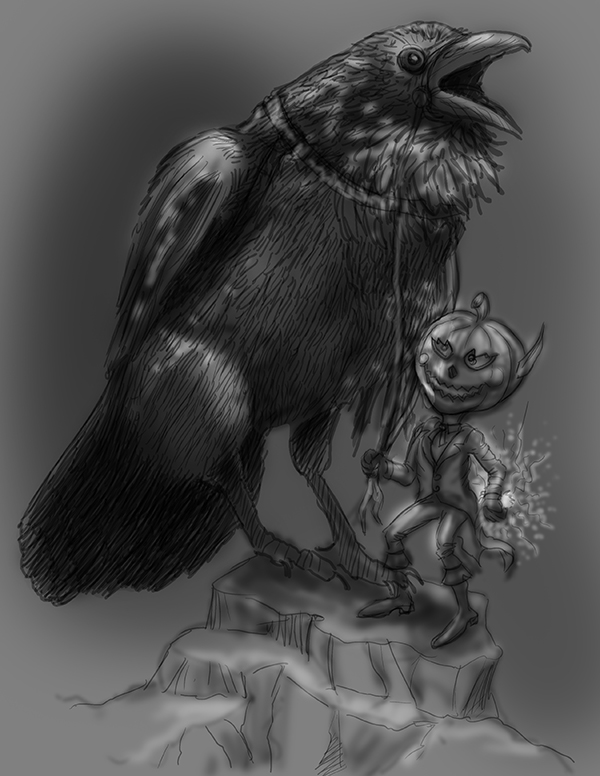
Hallow-ink wip
-
Looking for a critique, help me make this spectacular!
-
@russ-van-dine tell me about this image what are you trying to accomplish? I like the raven, you've found a good reference for the energy I think you were trying to catch. personally, i think there are too many hatch lines evenly distributed over the body of the bird in a uniform fashion, which flattens the bird out but thats a small nit pick.
-
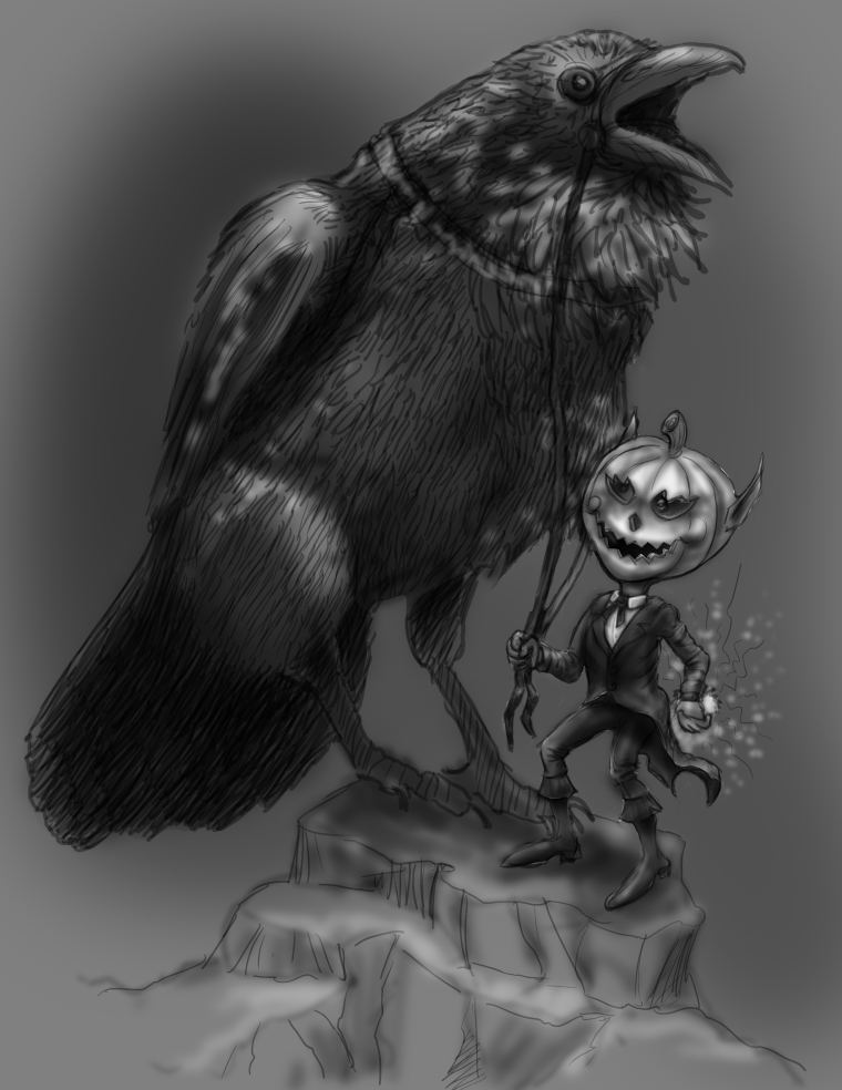
I will work the lines to bring more dimension in the bird, this is an updated version, worked the little pumpkin head a bit. I will add blues, greens and especially oranges with photoshop later. Trying to get the layout and design, and feeling complete with just black and white... thanks for your help.
-
worked on the figure of the Halloween guy, changed arms and legs a bit and worked on his outfit.
-
@russ-van-dine I think the left arm needs to move up a bit and he needs more of a shoulder...
-
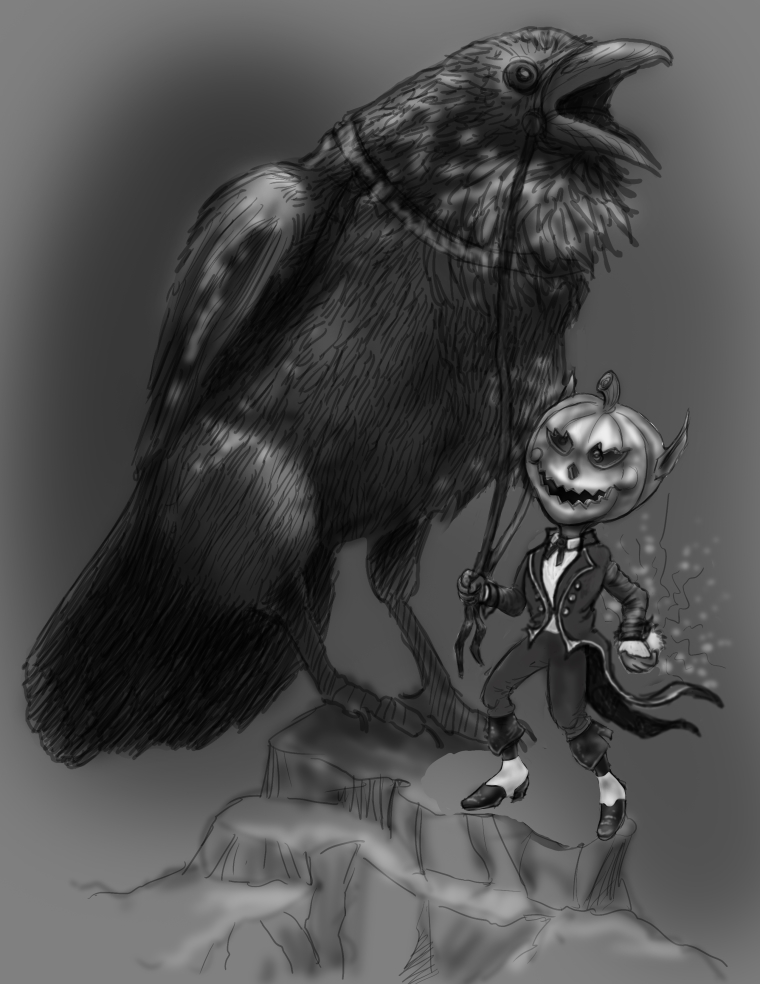
Coming along...
-
the character's head is the illumination point...
-
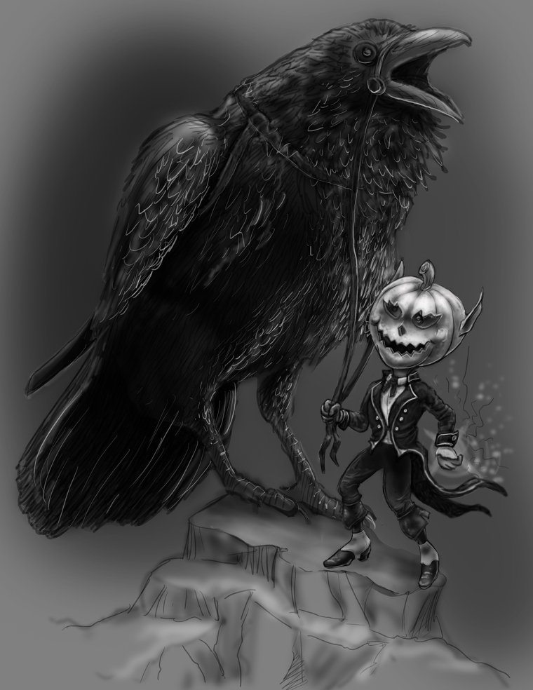
Hi russ I dont really like to give critque but i really like this piece(nice idea) The white highlights seem a bit fuzzy and could be brighter and sharper it maybe needs more contrast or more differences in values.I know everyone wants something different and this is just my opinion.