Help with a character design
-
Hello Svs friends!
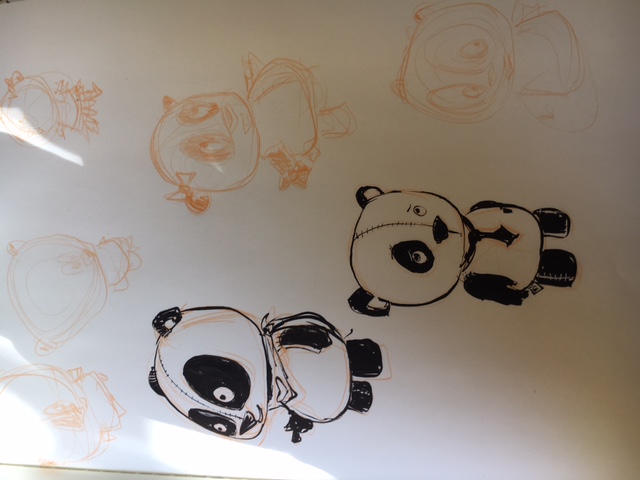
I'm in the initial stages of prepping for a graphic novel and I'm having a bit of a tough time settling on the design for one of the main characters. It's a stuffed animal panda, and I want the design to be appealing/ cute/ convey a good hearted character, but also be able to be expressive and poseable. Here are some initial sketches. It feels like it's just a bit flat/ missing something(s). Any suggestions? -
It didn't load. Make sure the image file is small enough.
-
@tayson
 !
! -
I'm not very comfortable with character design, but in my humble opinion, I think they look good. If I could critique something, it would be to maybe ease off on the stitching on the head. Right now it looks a little macabre, which is ok, if that's what you're going for. Perhaps keep it strong above the nose and in between the eyes, then have it fade off, and then come back again at toward the top of the head. On the lower panda design, I would taper the shoulders and chest in like you've done with some of the others.
-
@tessw this is excellent feedback-- thank you! I'm going to play around with it some more with those suggestions. I appreciate it!
-
in going with what @TessW says, I don't think the stitching is necessary. You can't really see the actual stitching on most stuffed animals, so the line should suffice.
-
These characters look super adorable! Would you mind if I did a draw-over to make my suggestions?
-
@missmarck not at all! Please feel free to go right ahead, and thank you!
-
@tombarrettillo thank you! As you say, I think the stitching does create an opposite feeling for what I'm aiming for. I really like the single line idea!
-
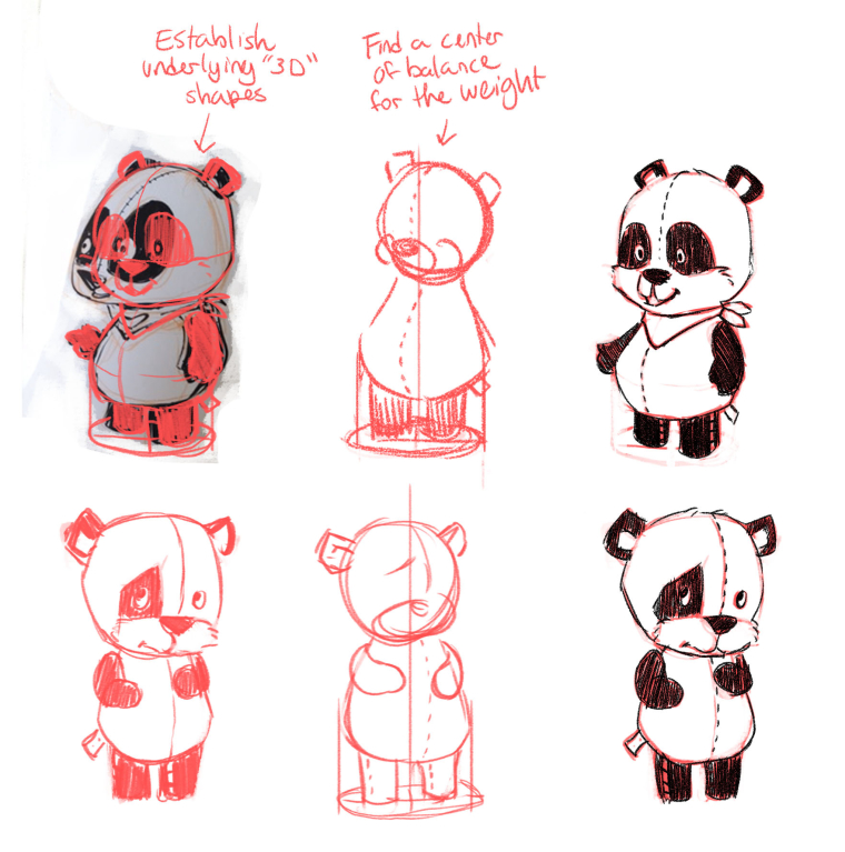
The main thing I noticed was the center of balance seemed off, which tends to flatten a character. Once you have the character firmly balance on their feet, they feel grounded and "real".
The other thing is that the underlying shapes seemed uncertain. I know you said you're in the development stage, but that was the other reason these drawings didn't quite have a 3 dimensional feel.

Once you get the underlying structure nailed down, I think you'll have something to build expressions on
 Hope this all makes sense!
(Also, I kinda thought a dashed line made a friendly/cute seam.) -
@missmarck this is incredibly helpful, and some solid ground for me to work on. Thank you so much for taking the time to help!
-
@tayson awesome! Glad it helps!
-
When you are working on for 3-d constructions make sure they start as basic shapes so you can pose your character without difficulty Jake's video lessons on this subject are very good.