Squirrel transportation WIP
-
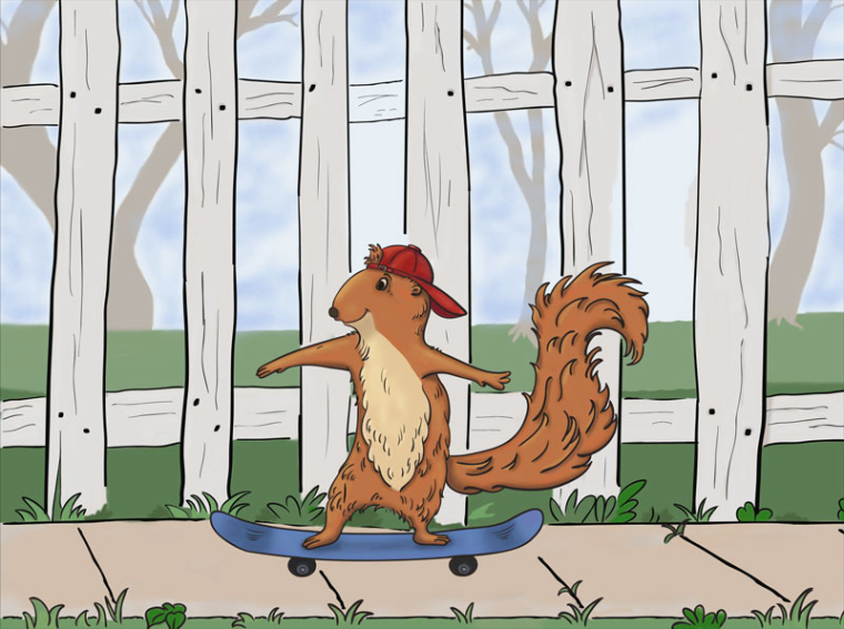
With all your encouragement - you guys are awesome, and I appreciate you - I didn't scrap my image. This is what I have so far for this month's challenge. I reverted back to a more cartoony style with black lines (like I used to do before SVS). I've only got a few hours left in the month to do any tweaks - this month has been really busy - but if you see anything that could be fixed or improved, feel free to let me know. Thanks, everyone!

-
Hi @Kat I'm not very good at this critique stuff, but here is my two cents worth...
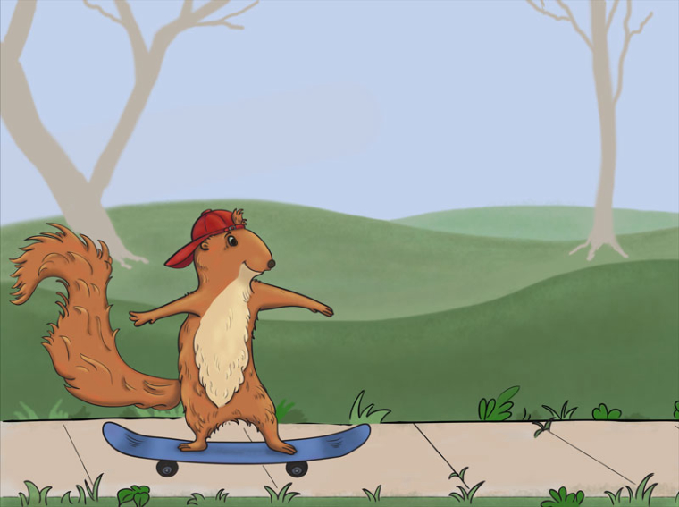
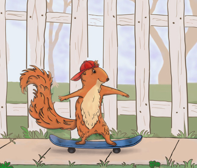
I wonder if you might consider flipping the image so that the squirrel goes left to right? I guess it depends on what you might envisage as the purpose of this image, but if you intended it for picture books, you'll find that the action of picture books often goes left to right. I guess because we read left to right and the page turns have the story sort of unfurl left to right...maybe. So the image going the other way almost seems to stop the action.
Also, maybe there is some way to knock the linework of the fence back so that it's less dominate than the squirrel? Maybe by thinner linework or lighter colour? I brushed a crude tint over it to show you what I meant.
The other thing might be to play with cropping so that the character is coming from one edge and has space to travel. I'm sure there are lots of interesting ways to play with the cropping.
I also added a line to show the dimension of the board and a shadow underneath to try and ground it.
I really like the linework on the squirrels' body because it seems to be more natural and to describe the volume of his shape. I think the heavier line weight on the tail in comparison makes the tail feel less natural. I guess if the squirrel were going at a faster pace you would be able to have fun with the direction of tail and hair being blow by the wind!
I also like the stance because it looks like he has his weight on the back leg...which I think is what they do??
So glad you aren't discouraged and I hope this is of help.
Cheers!
-
Cute squirrel. I think that Marjorie gave some great suggestions. Keep it up!
-
Thank you, @Marjorie , all very good points! It's funny, reading your suggestions makes me say "Right! Why didn't I do that in the first place?" LOL
 I'll work on getting changes made in time to submit.
And @Marsha-Kay-Ottum-Owen, thank you for your kind words and encouragement.
-
@kat LOL! Been there done that!
-
@marjorie I'm in good company, then

I had about a half hour this morning before work to fiddle with the lines. I'm starting to think the fence should just go away entirely. It's almost too busy, especially behind the tail. Making the color of the fence less bright helps, but maybe getting rid of it would be better, adding a few trees in the background instead. -
@Kat glad you didn't scrap your illo. It looks great! And with a few adjustments like @Marjorie mentions, you will have a really good portfolio piece. One suggestion would be to push the fence back some. Squirrel looks a bit crowded. And maybe a bit more variation in your far background—show some tops of the trees, and maybe make the grassy area less flat
-
@tombarrettillo thank you for the encouragement. I don't know about a portfolio piece - I'll just be happy to have something for the contest.
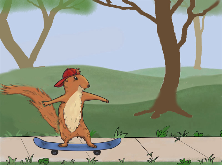
This is where I'm at tonight. Took out the fence entirely, tried to give the tail a slight "blowing in the wind" look, moved the squirrel. Not sure what to do with the background. It's pretty bland, but I don't want it to get cluttered. Maybe a few more trees or bushes? I've started trying to add texture to the grass, but I don't know if it's working or just looking ugly.
Thoughts, anyone? (Disregard the sidewalk - I didn't really do anything with it or the tufts of grass yet.)
Thanks, guys!

-
@kat Nice to see you working on your illustration! Marjorie gave you some great ideas. I liked how she added a dimension line and shadow to the skate board.
The body of the squirrel is great.
I changed the tail to make it look a little more dynamic. Also I moved and enlarged one of your trees to the foreground. I think you are right about adding more trees and maybe some foliage on the trees to make it more of a summer scene. I like the grass, not sure about the tufts though, they are a bit distracting. Hope this helps

-
Thanks, @Elaine-B - more DUH moments for me, but very helpful!
-
Looking good! The only thing that caught my eye is needing a shadow under the skateboard. Glad you kept working on it, I love the expression on his face
