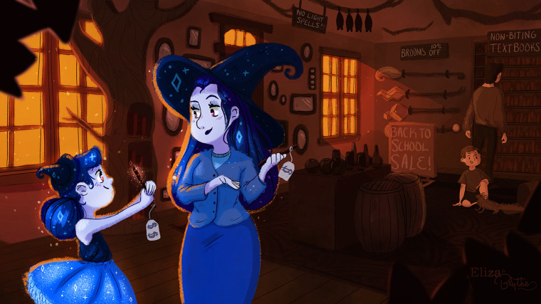
Witchy Back to School Illustration!
-
Hi there! This is my first full illustration I am posting here! So this is my entry for Huion's "Magic School" Contest! I decided to go with a back to school sale for witches! I tried to stick with a monochromatic color scheme with a complementary accent color as the focal point. I ran out of time to create this because of school but I am relatively pleased with how this turned out! Any feedback is welcome, but I probably won't have time to make any changes with it because of school work! Thanks for stopping by!
(Please click on picture for full resolution, this resizes it for some reason)
! -
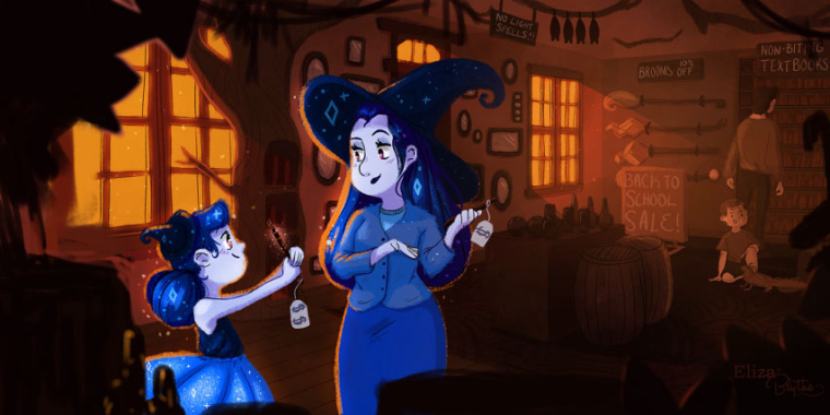
Really nice characters! I think I'd have preferred it totally monochromatic but I see what you're going for. The composition works nicely as well. Great work!
-
@IanS Yeah I wish I had more time to sit and think about the colors and play around with them! Thank you!!
-
This is a super cute illustration! Here are a couple of suggestions I have, which may or may not improve the piece, but are just some thoughts.
-
I feel like my eye gets drawn to and stuck on the mom more than anything else. I feel like if you extended the left side a bit and framed it in with some foreground object, it would move the eye back and forth between the kid and the mom. This will also keep the composition from being cut in half down the middle between the two sides.
-
I think that the skin of the boy and the man in the background could be toned down in value slightly. I think they are standing out a bit too much as second focal points. I also think you could add a bit of atmospheric perspective back there.
I hope you don't mind, but I did a paintover to show what I mean. I really love your piece and think the characters are really appealing. Great job!

-
-
@TessW Thank you so much! I don't mind! Yeah your paintover is a great improvement to it! I agree that this helps the focal point a lot! Thank you for your feedback!!