Feedback?
-
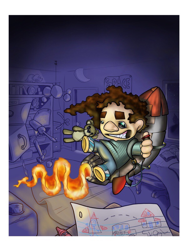
I would really appreciate a little feedback on this piece. Did it on procreate, and if I'm honest I don't think I use that program quite right. That said, I am happy with the outcome. Thanks! -
@jasonandroosmith Hi Jason - your image didn't post - this could be that it's too big - if you make it about 1200 px in the long dimension it should work.
I want to see it!
")
-
Oh man! I'll try again
-
There we go. Thanks for the help @Will-Terry
-
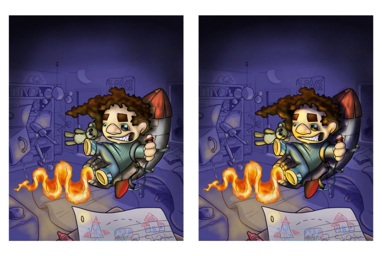
Fun image! I have a suggestion as far as color goes. I personally think you could add the purple of the background into the shadows of the boy and the rocket, and I think you could add more intense color to the light areas on the boy and rocket as well. I didn't do the best job, but here is an idea of what I mean-
Website: www.tessawrathall.com
Instagram: www.instagram.com/tessawrathall_art/
-
@tessw yeah! That's a huge improvement! Thank you for taking the time to do that. I really appreciate it
-
@tessw I'm freaking out on the purple shadow! What a difference! I need to get into some color theory.
-
Nice action and concept! The 2 things that stick out to me are the flames, and the kid's nose. While I understand this is an illustration, the flames still look odd, unless you are suggesting that that is the former path of the rocket, but even then, they are a bit tight. Also, his nose reads more like a stick-on rather than something that is part of his face.
-
@tombarrettillo thanks! Flames are not my favorite thing to draw at all hahahaha in fact, if you look back through my work, I don't think I've ever repeated the same process when drawing fire. As far as the nose, I see what you're saying, I've always had an odd thing for people's noses. Don't know why. I do like to make the nose stand apart, I even make sure it's not quite the same color as the rest of the face hahahaha
-
I agree with @tombarrettillo about the nose and the flames. To me, when I first saw it I didn't instantly see the rocket, I thought that his food was on fire or it was about a kid with flaming farts (sorry to be so crude). I think that if the rocket was bigger it would be more readable. I would also say to be careful of your shadows and highlights. It seems you went for the dodge and burn route or just added black to the dark areas. I would recommend you watch SVS's video on color and light if you are not sure about getting the right colors.
Also I love the idea of him trying to get to school on a rocket, but i'm not sure if he was successful in making it or not. If it's not working right then a more deflated expression would be nice as well as having a few small flames, smoke and sparks flying around............. Actually I just now realised that he is actually flying it in the image. In that case the flames should show the path he has traveled around the room more clearly by having a few things lit on fire or scorched (especially the paper in the foreground) I would also push the reds in the piece (especially at the bottom of the image) because the bounce light from the flames would be pretty strong!
I think the boy's expression should be pushed also to look a bit more tense by raising his eyebrows and widening his eyes.
-
@gary-wilkinson thanks for the input! Making the rocket bigger is a good idea. As far as a trail of flames around the room goes, I feel like he's just pushed the button as the paper, and tools are still mid air. I suppose it could technically be right either way. I agree there should be more movement or action from the flame for sure, I'm going to have to work on my pyrotechnics. I also agree that the bounce light would be stronger, I like the more intense yellow, but if I went further with the yellow do you think it might flatten the image?
-
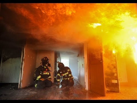
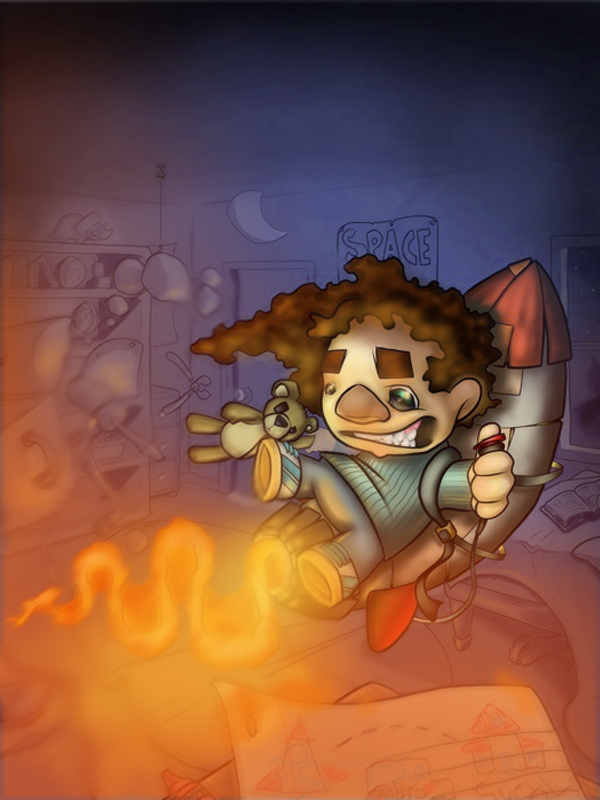
@jasonandroosmith I don't think that the yellow would flatten it out. It would mostly be orange anyhow, look at reference images of fire and especially the gradation of the colors. I know your not going for a "burn your house down" theme, but you can see how there is a lot of depth in the image and how the color of the fire changes. There is even a nice balance of warms and cools (note the left side that's hidden from the fire).
If you do push the flames and warmth in the piece then I would cool down those purples and perhaps shift them over to a cooler less saturated color. Of course that's just my opinion and my style, so it might not be what your going for. I've done a quick paint over for what was on my mind (painting with a mouse sucks...). I added some motion blur which also helps to give that heat mirage look too.
-
When I saw that fire, I thought to myself, "Yep, that's definitely influenced by his tattoo background." That's not a bad thing, and it's not like I know a lot about tattoo fire styles, but it's what popped into my head.
As for the nose, I actually have a weakness for noses rendered like that. In my sketchbook there's a lot of characters with pasted on triangle looking noses like yours.
Sorry, just wandering through, don't mind me. I shall go now.
Website: www.tessawrathall.com
Instagram: www.instagram.com/tessawrathall_art/
-
@gary-wilkinson that looks great! I understand better what you're saying now. Thanks for taking time to do that!
-
@tessw it's definitely a tattoo habit! It's hard to keep in mind that I can work in layers. I feel like everything has to be outlined and instead of using multiply layers I'm trying to paint in what it might look like if it were transparent, or just avoiding it all together. As for the noses, I just can't help myself, it makes me laugh.