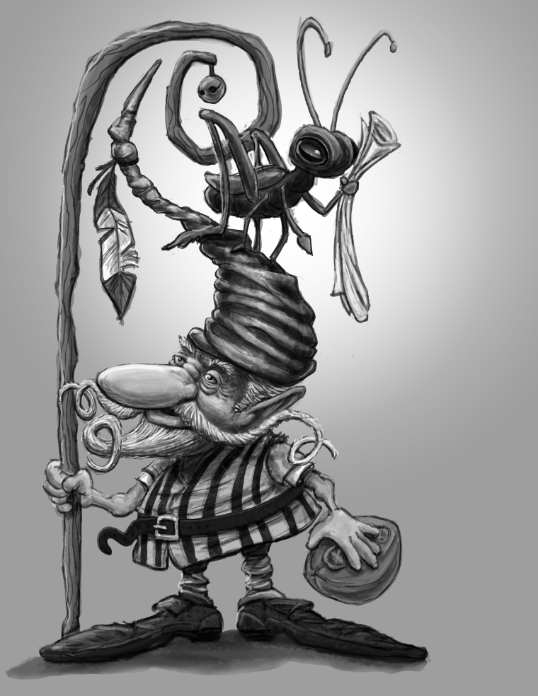
Your critique welcome.
-
Inspired by Jean Baptiste Monge.
-
@russ-van-dine I think you have some really nice values on this piece, and I'm especially drawn to his shirt. Nice details in the belt and beard winding off the character, adds some fun elements for the eye. The arm holding the staff looks a little off perspective to me, like it's attached to the front of his chest instead of his shoulder. I also think his left hand should curve around the object he's holding instead of being straight. Cool character.
www.rhirschillustration.com
https://www.facebook.com/rhirschillus
Instagram: rhirschillus -
@rhirsch good critique, worked them both just a little before I colored. I am really trying to get the values done before I paint. This was fun. Check out the color version and critique that please.
-
Hi, Russ. You did a really great job on this illustration. The character is very fun.
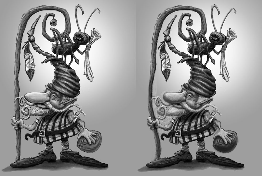
I did a subtle paintover to show some areas I think could be improved ever so slightly.
-
I thought that the staff might look fun with a bend in it, because the rest of the shapes are so curvy and fun.
-
I thought the facial hair was a little too contrasted, so I softened it a bit.
-
The shadows in the face were quite dark, but you weren't pushing them as much in other places, so I darkened the undersides of things like his arms, football, wrinkles in the hat, the scroll, etc, so they would match the value system of the face better.
-
Added some highlights to the grasshopper.
-
I shortened the nose, not because I was bothered by the size, but rather to make a gap between his nose and mustache. I thought it would make the silhouette stronger.
-
-
thanks, I really like these changes.
-
I like the changes @TessW suggested - especially the size of the nose - It really improves the silhouette!
Really great piece!!!
")