Motorbikey
-
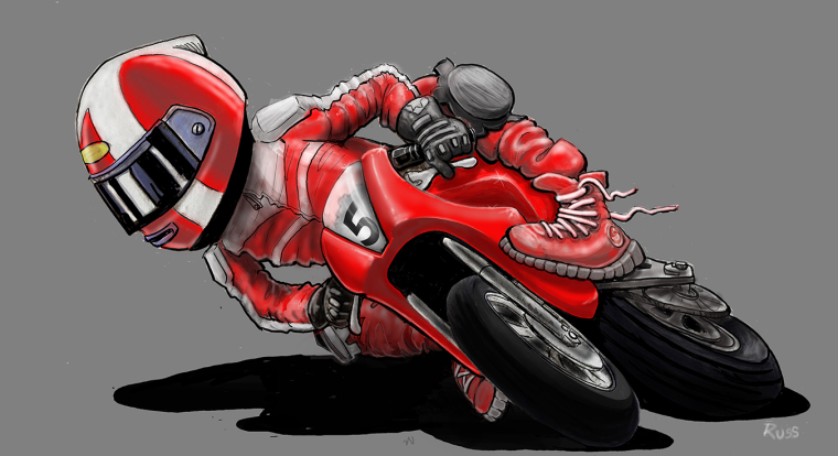
Critiques are welcome...

-
the few things I see real quick are:
head (helmet) seems a bit big
knee needs to be out much farther for balance
the wheels are out of alignment
the left foot looks odd the way it sits on the bike
Some perspective problems with the chain and support for the back tire in relation to the rest of the bike
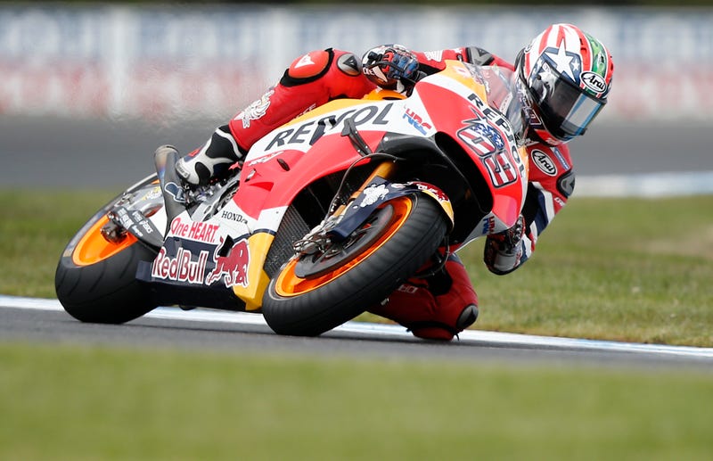
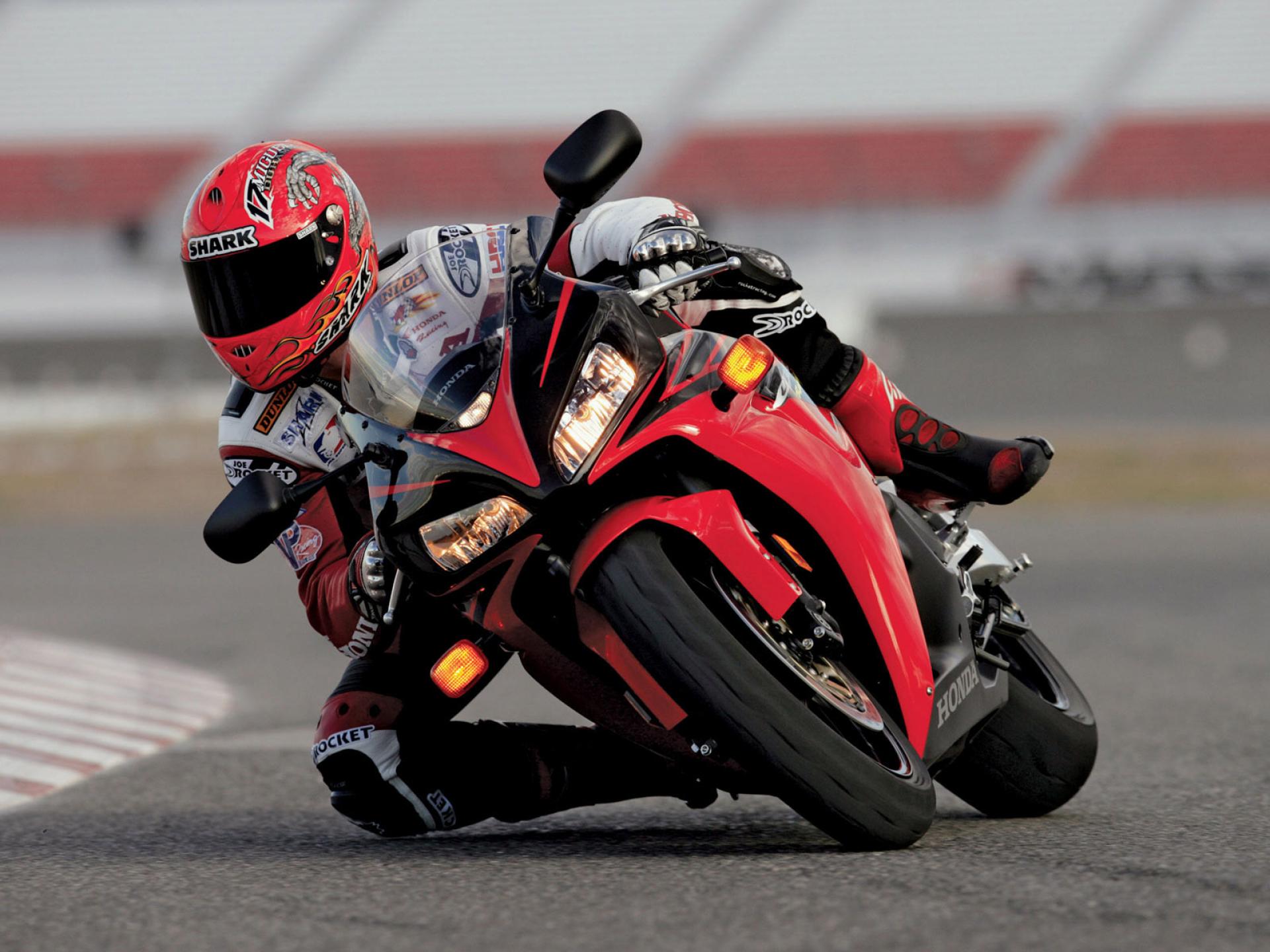
Below are a couple images for reference:


-
I'm agreeing with some of what @tombarrettillo has pointed out.
- The helmet does seem a bit large, but perhaps that was intentional? It's hard to know without what your other work is like.
-The top foot placement also seems awkward to me. I feel like there should be some indication of a foot rest.
-The shadow feels a bit oppressive. I would think about lightening it up and introducing some subtle color into it, and adding some gradation to the background might make it feel a bit more polished.
This was an ambitious drawing to take on, so well done for seeing it through!