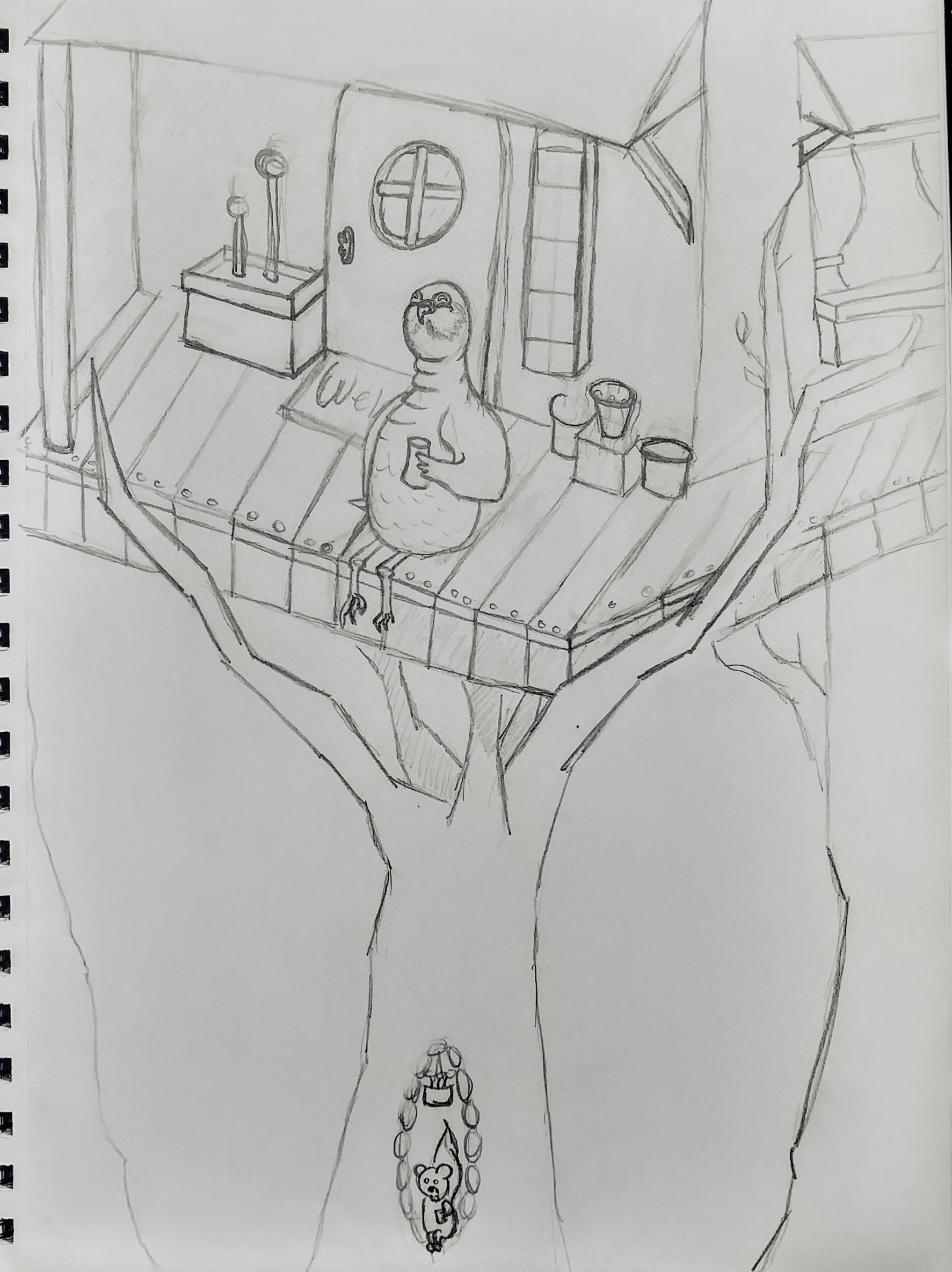
Bird house/ tree house WIP
-
I finally started working on mine this morning. Keeping what ive learned in mind but not letting it overwhelm me so much so that I don't want to draw.. I really want to start adding detail but I want to make sure I got angles and perspectives correct before I start getting into it. Please let me know what you guys think. The story is supposed to be animals enjoying their morning coffee. Thank you in advance
 although ill probably say it a million times more

-
The perspective on the house is not perfect, but I kind of like the effect it gives. Not sure if you intended this or not, but the deck on the right of the piece looks like a ramp that is going on an up angle to a different level, and the side of the house makes it look like the walls meet at a different angle than the typical 90 degrees. That's not necessarily a bad thing, but if you wanted the house to be a square/rectangle shape than it would need to recede at a sharper angle upward. I actually think it's fun that it looks like a ramp going up.
I think the biggest improvement you could make though, would be to push the perspective of the tree so you see it meeting the ground plane. Just my opinion.

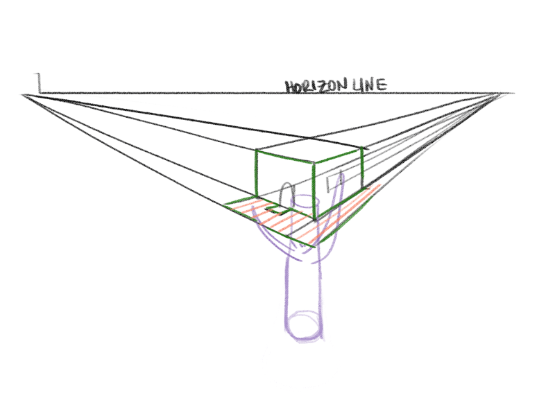
Here is the drawing broken down in simple perspective, notice how the house vanishes to those to points on the horizon. Even the mat and the floor boards recede to the same point. But again, you can totally break perspective rules for effect.

I think you've got a nice little illustration in the works! Love the expression of the bird.

-
@TessW Thank you so much I knew the right hand side looked a bit off and I had started to adjust but I wasn't completely sure the base of the tree idea is awesome I'm definitely going to work into that much more if I can figure it out! I be been trying to work on perspectives and horizons but the past few days I was so focused on it it was giving me a headache so this morning I tried a bit but just kinda went for it with out focusing on it too much
-
Hi, Firs off I like the bird I hope that's a beer he is holding. I would like to suggest you show less of tree under the platform If you look at it now it looks like the tree sits almost inline with the front edge. Possibly one of the full length branches could go trough the floor to help with the concept.
-
I am going to be the devil's advocate and say that, in addition to the perspective, I think the bird needs some improvement. It seems as if you are trying to anthropomorphize the bird, and if so, you need to take it further. From what I have seen, when you anthropomorphize something, the basic anatomy is kept, but obviously modified as necessary to make it more human-like. He needs larger legs that fit with the size of the his body and that attach more like human legs. Maybe a shorter "neck", and, depending on the type of bird he is, bring the features down on his head, unless your intention is for him to be looking up. Look at the Shoe comic, or google "anthropomorphic birds".
-
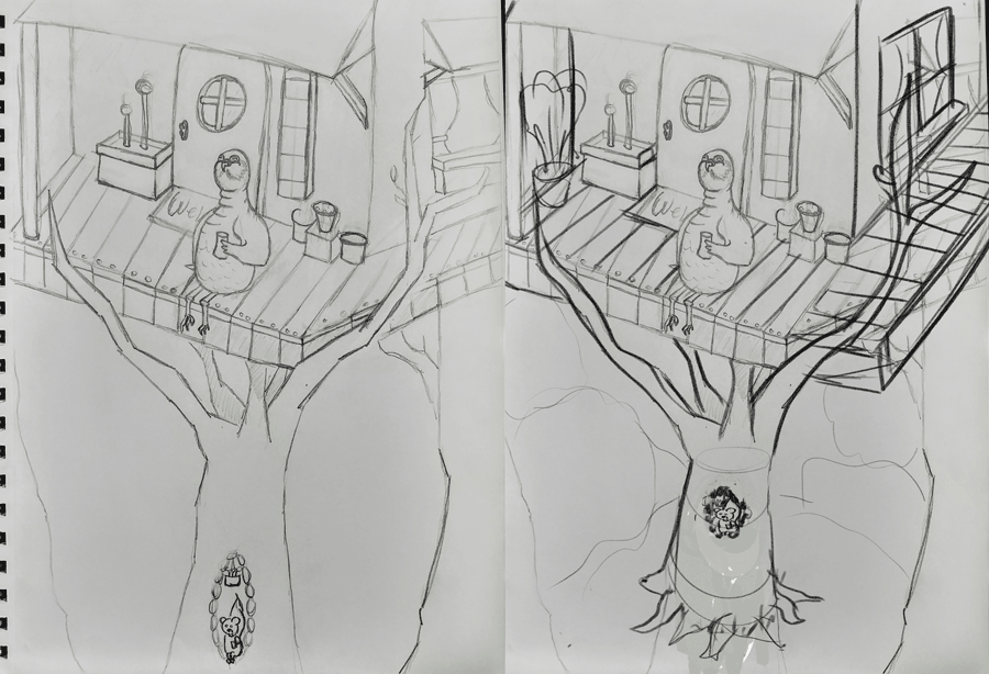
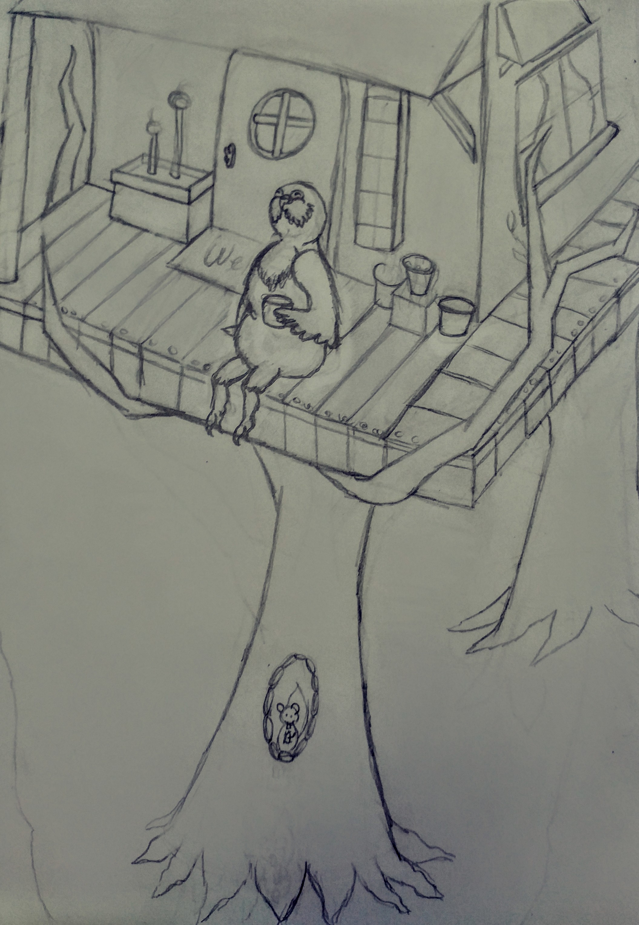
Okay so ive made some revisions I think the perspective is alot better now.. Still adjusting the bird when in color the sun is gunna be coming down so he's just kinda basking in it

-
@ambiirae You're welcome.
 Ah yes, I remember those headaches brought on by studying perspective! You'll get more comfortable with it over time. It takes a little while before you start connecting the concepts to your own work. You've made great improvements to this piece. Can't wait to see how it turns out.
 -
I love the new improvements that you did to the illustration! That bird looks so pleased, it makes me happy! :3 I would love to see how it turns out!